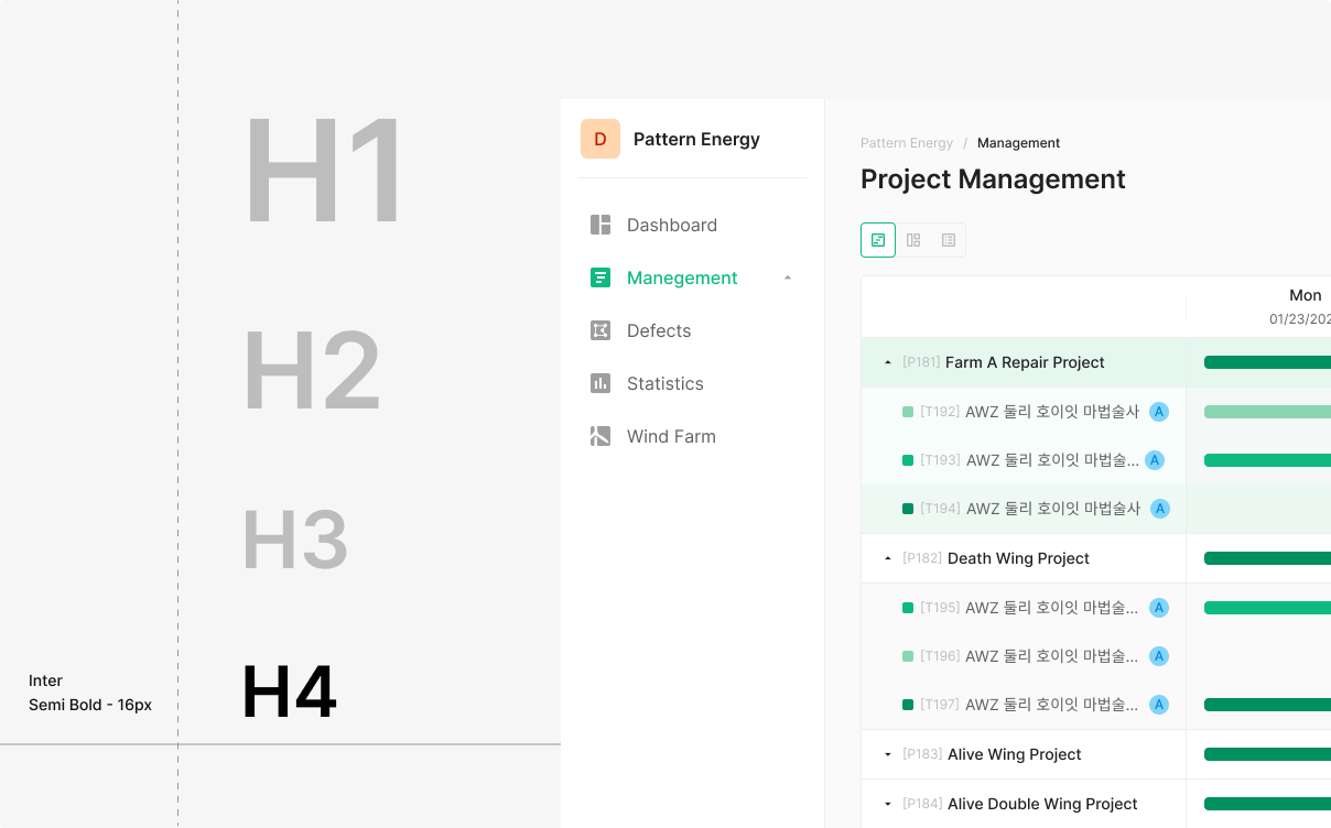
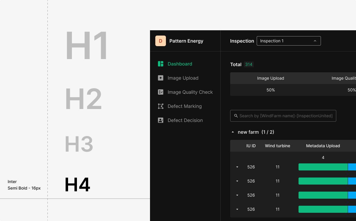
Typography
Typography is the primary surface where the product talks to its users. The system defines a balanced scale, weight palette, and line-height to communicate hierarchy and keep reading effortless. Apply per intent — typeface and weight follow purpose, not preference.
Type Usage
The scale is a recommendation, not a hard constraint.
Locking designers into a single scale removes flexibility. The system suggests font sizes and weights; designers compose freely on top of them.
For readability and accessibility, avoid font sizes below 12pt.
| Scale Category | Typeface | Weight | Font Size (px) | REM | Line Height (px) | Unitless Line Height (LH ÷ FS) |
|---|---|---|---|---|---|---|
| H1 | Noto Sans Display | Semi Bold | 32 | 2.286 | 40 | 1.25 |
| H2 | Noto Sans Display | Semi Bold | 24 | 1.714 | 30 | 1.25 |
| H3 | Noto Sans Display | Semi Bold | 20 | 1.429 | 24 | 1.2 |
| H4 | Noto Sans Display | Semi Bold | 18 | 1.286 | 22 | 1.22 |
| H5 | Noto Sans Display | Semi Bold | 16 | 1.143 | 22 | 1.38 |
| Subtitle 1 (+btn1) | Noto Sans Display | Medium | 16 | 1.143 | 22 | 1.38 |
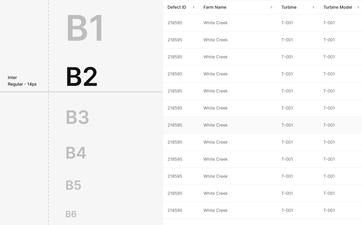
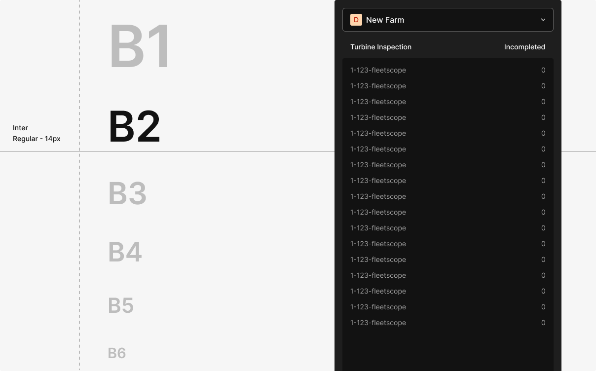
| Subtitle 2 | Noto Sans Display | Semi Bold | 14 | 1 | 20 | 1.43 |
| Subtitle 3 (+btn2) | Noto Sans Display | Medium | 14 | 1 | 20 | 1.43 |
| Subtitle 4 | Noto Sans Display | Semi Bold | 12 | 0.857 | 16 | 1.33 |
| Subtitle 5 (+btn3) | Noto Sans Display | Medium | 12 | 0.857 | 16 | 1.33 |
| Body 1 | Noto Sans Display | Regular | 16 | 1.143 | 22 | 1.38 |
| Body 2 | Noto Sans Display | Regular | 14 | 1 | 20 | 1.43 |
| Body 3 | Noto Sans Display | Medium | 12 | 0.857 | 16 | 1.33 |
| Body 4 | Noto Sans Display | Regular | 12 | 0.857 | 16 | 1.33 |
| Body 5 | Noto Sans Display | Medium | 10 | 0.714 | 14 | 1.4 |
| Body 6 | Noto Sans Display | Regular | 10 | 0.714 | 14 | 1.4 |
Type Scale Logic
The scale starts at 12px and expands its step size every four levels.
Small body up through emphasis and headlines — each level adds enough contrast to read structurally, without breaking the rhythm.
The scale is computed as Xₙ = Xₙ₋₁ + {{ INT[(n−2)/4] + 1 }} × 2 — 2px steps at the low end, 4px in the middle, 6px at the top.
Small steps preserve readability at the bottom; larger steps deliver clearer emphasis at the top.
| n | Calculation | Increment | Final Font Size (Xₙ) |
|---|---|---|---|
| 1 | Initial Value 12px | - | 12px |
| 2 | 12 + (INT[0/4]+1) x2 = 12+2 | 2 | 14px |
| 3 | 14 + (INT[1/4]+1) x2 = 14+2 | 2 | 16px |
| 4 | 16 + (INT[2/4]+1) x2 = 16+2 | 2 | 18px |
| 5 | 18 + (INT[3/4]+1) x2 = 18+2 | 2 | 20px |
| 6 | 20 + (INT[4/4]+1) x2 = 20+4 | 4 | 24px |
| 7 | 24 + (INT[5/4]+1) x2 = 14+4 | 4 | 28px |
| 8 | 28 + (INT[6/4]+1) x2 = 28+4 | 4 | 32px |
| 9 | 32 + (INT[7/4]+1) x2 = 32+2 | 4 | 36px |
| 10 | 36 + (INT[8/4]+1) x2 = 36+6 | 6 | 42px |
| 11 | 42 + (INT[9/4]+1) x2 = 42+6 | 6 | 48px |
| 12 | 48 + (INT[10/4]+1) x2 = 48+6 | 6 | 54px |
Type Weight
The system uses Pretendard as the base typeface, with weights at Regular (400), Medium (500), and Semi Bold (600).
PRETENDARD REGULAR
NEAR, EARTH, LABORATORY ABCDEFGHIJKLMNOPQRSTUVWXYZ abcdefghijklmnopqrstuvwxyz 1234567890~!@#$%^&*()[]{};’",.<>/?
PRETENDARD MEDIUM
NEAR, EARTH, LABORATORY ABCDEFGHIJKLMNOPQRSTUVWXYZ abcdefghijklmnopqrstuvwxyz 1234567890~!@#$%^&*()[]{};’",.<>/?
PRETENDARD SEMI BOLD
NEAR, EARTH, LABORATORY ABCDEFGHIJKLMNOPQRSTUVWXYZ abcdefghijklmnopqrstuvwxyz 1234567890~!@#$%^&*()[]{};’",.<>/?
Type Scale
Use the same scale for screen-level hierarchy and the hierarchy inside a component.
Weight Usage
Usage Notes
Main navigation uses Subtitle 1, Body 1 (letter spacing −0.5%).
When subtitle or body text wraps to two lines: 12px → line-height 120%; 14, 16px → line-height 140%.
Header 24, Subtitle Medium 14, Info text Regular 14.
Use 10px.
Title — 14px / Medium · Body — 12px / Regular.