Badge
Badge surfaces status or quantity information visually. In Wind, Badge is most often used to communicate status through intuitive color mapping.
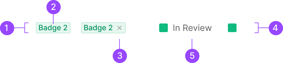
Anatomy
1. Badge Container
2. Text Label
3. Icon Btn
4. Badge Box
5. Extra Label
Usage
Badge splits into six categories by the type of information it carries.
1. Box Badge
2. Contained Badge
a. Text Type
b. Number Type
3. Count Badge
4. Severity Badge
5. Button Badge
6. Text Badge
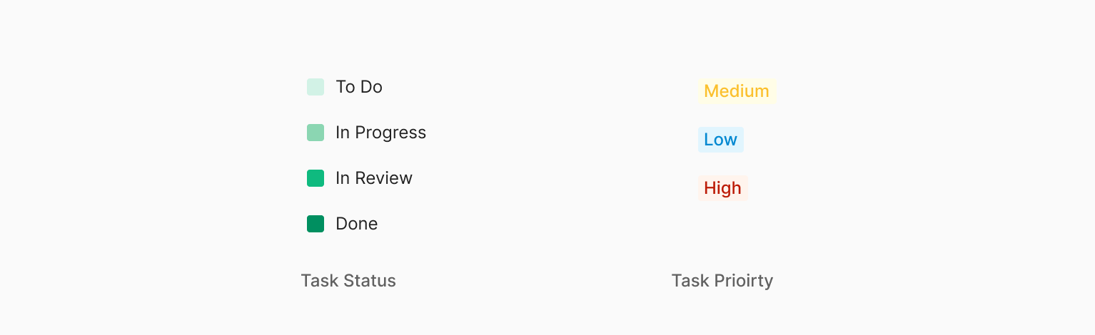
Box Badge and Label Badge surface progress or status through color mapping. Count Badge surfaces the total count within a given scope. Beyond these three primary types, Severity Badge, Button Badge, and Text Badge are also used.
1. Box Badge
Box form. Carries no label inside — communicates information through color alone.
2. Contained Badge
Label can be Text or Number. Text Type often pairs with an external label.
3. Count Badge
Used to surface an overall count as a single discrete value.
4. Severity Badge
Used in Zoomable to mark Zoomable's five defect levels plus an unconfirmed defect — six tiers in total. A Box-form Badge with the defect tier as text inside.
5. Button Badge
Button Badge executes a specific action on click.
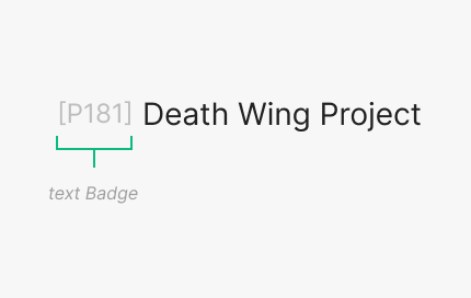
6. Text Badge
Text Badge executes a specific action on click.
Semantic Variants
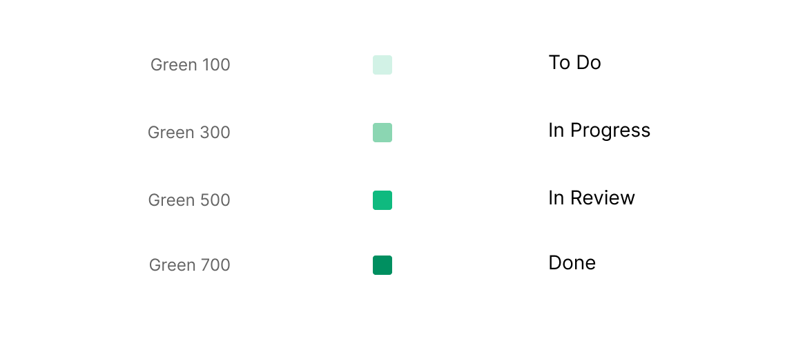
Severity Badge uses six (plus one) colors to express severity tier by tier. Box Badge uses four colors to express progress stages.
Contents
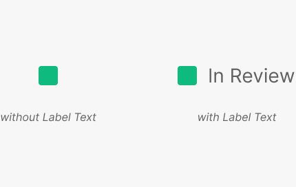
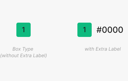
Because each Badge maps information through color, content beyond text is mapped to the color region — both text and color carry the badge's meaning. Badge content supports a text label inside the container or an Extra Label outside (text-only). For Count Badge and Severity Badge, the inner Text Label is restricted to numbers. When Box Badge uses an Extra Label, the text marks a specific progress stage — it's fixed text, not user-editable.
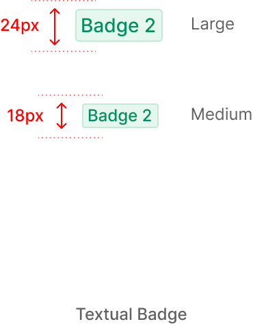
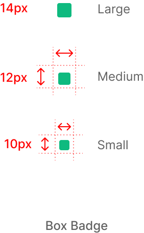
Sizing
Badge sizes are Large, Medium, Small — determined by Height. For Contained, Count, and Severity Badges, Height changes drive the size; text length adjustments are validated independently of Height. Width follows either an equal-to-Height rule or a minimum-size + padding rule that auto-fits content.
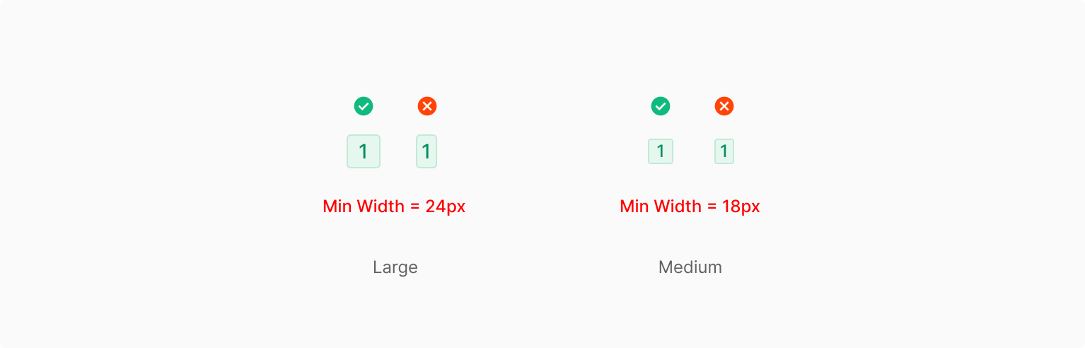
1. Text Character = 1
For single-character Badges, padding stays constant and the badge follows a fixed Width-to-Height ratio. Auto mode doesn't use a fixed Height.
2. Text Characters > 1
For multi-character text, the same padding values apply consistently. The size stays stable across text-length changes — character count drives only Width within a single line, and the variable-Width rule doesn't extend beyond a single word (Single Words: Medium, Only). Size requires explicit values.
Variants
Table of Properties — Textual Badge
| Property | Values | Default Value |
| Size | Large, Medium | Medium |
| Type | Green, Mint, Red, Yellow, Gray | - |
Table of Properties — Box Badge
| Property | Values | Default Value |
| Size | Large, Medium, Small | Medium |
| Status | To Do, In Progress, In Review, Done | - |
| Text | False, True | True |
| Outline | Unoutline, Outline, None | Unoutline |
Table of Properties — Severity Badge
| Property | Values | Default Value |
| Item Number | 1, 2, 3, 4, 5, ? | - |
| Text | False, True | False |