Button Components
Buttons set a clear visual hierarchy for the actions a user takes. Follow the style guide per hierarchy — avoid ad-hoc styling. Use them to trigger an action or to navigate to another page.
Components
Buttons split into four types by style and intent — Primary, Secondary, Tertiary, and Extra. Each splits further by icon presence and background-color treatment. The first three are the main types used across the system.
1. Main Type (Primary, Secondary, Tertiary Type)
Primary is the most common type — used with a text label, or with an icon paired alongside. Secondary mirrors Primary's shape but with a different color treatment for second-tier actions. Tertiary is icon-only — and Tertiary itself splits into Primary and Secondary by action hierarchy.
A. Primary Button Type (Contained Button)
B. Secondary Button Type (Outlined Button)
C. Tertiary Button Type (Icon Button)
2. Extra Type
Extra Button types — Segment, Progress Status, Text, and Combo — aren't primary actions, but they show up frequently across Zoomable. Each is shaped by its specific function and purpose.
D-1. Extra Button Type — Text Button
D-2. Extra Button Type — Segment Button
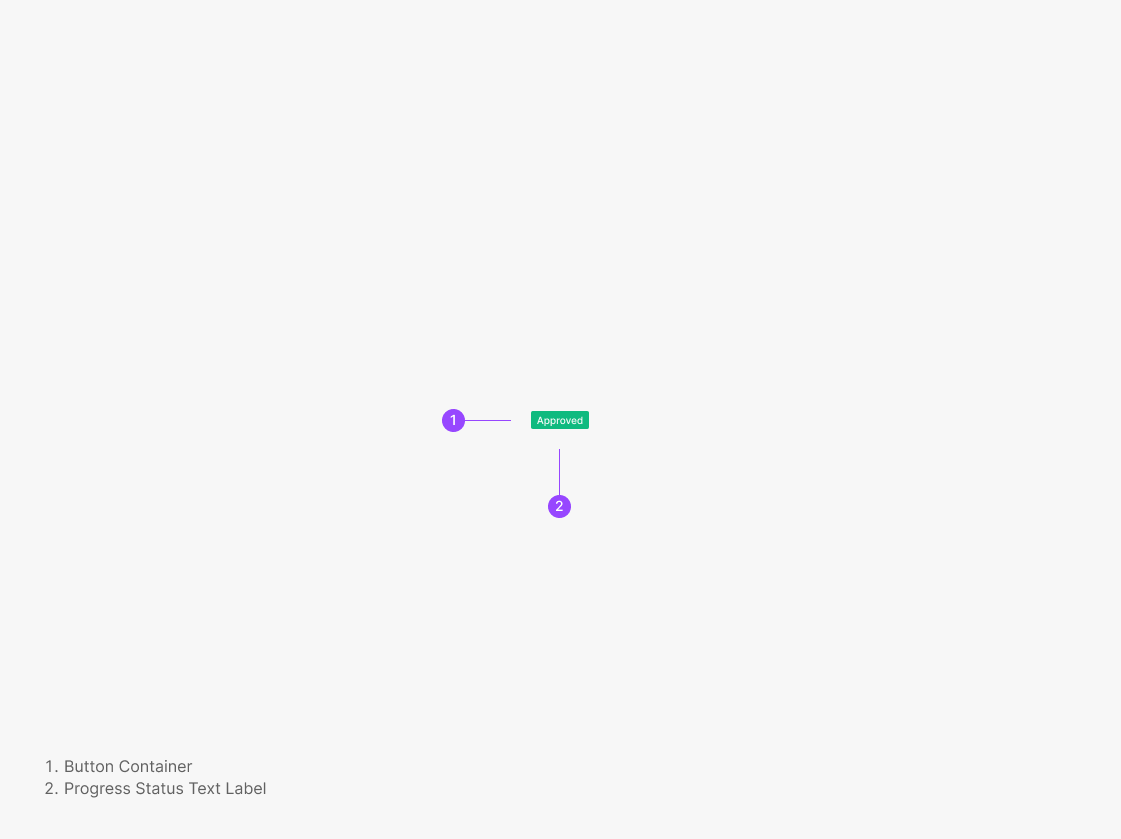
D-3. Extra Button Type — Progress Status
D-4. Extra Button Type — Combo Button
Primary & Secondary Button
Buttons set a clear visual hierarchy for the actions a user takes. Follow the style guide per hierarchy — avoid ad-hoc styling. Use them to trigger an action or to navigate to another page.
Button
The base button. Adjust detail properties based on hierarchy and intent — see Variants and the Figma Properties table below.
Delete Task
Are you sure you want to delete the "AWZ Unit 1 Repair"?
Standard Primary + Secondary pairing example.
Anatomy
Variants
Primary
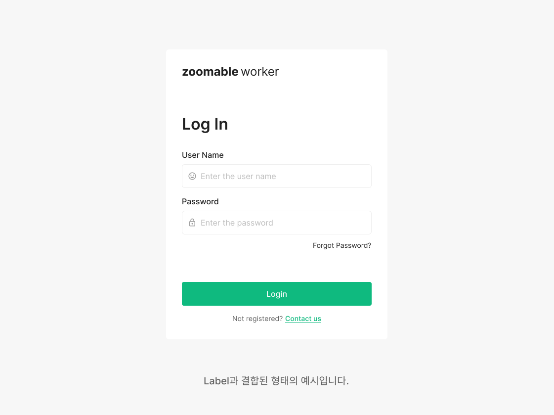
Primary buttons mark the key action on a page — use at most one per page. Examples: the Login button on the sign-in page, the Start / Done action on the Image Quality Check page.
Secondary
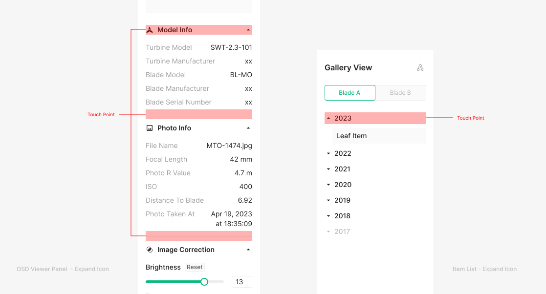
Secondary buttons support the Primary action. Examples: Back to Login on the sign-in page, Reset All on the OSD Viewer.
Size
Sizes use height: Large, Medium, Small, xSmall, 2xSmall. Font size, icon size, radius, and padding vary per size. Heights below 28 (Tiny) are avoided — they fall below the minimum touch target.
Table of Figma Properties
Spec
Sizes
Heights — Large (48px), Medium (40px), Small (32px), xSmall (28px), 2xSmall (24px). Font size, icon size, radius, and padding vary per size. Heights below 28 (Tiny) are avoided — they fall below the minimum touch target.
Minimum Width
Buttons reserve a minimum of 16 padding for a 2-character label or more. Below that breaks the minimum size rule. Page-level buttons (outside modals) hold a minimum width of 80px.
Full Width Buttons
Buttons fixed in position on scroll inherit padding from their containing frame. OSD Viewer cases typically use 16px padding on all sides.
Usage & Placement
Rule for Full Width Buttons
By default, buttons hug their text label, except when below the conventional minimum widths (64px, 71px, 80px, 90px). When the remaining container width is less than the button width, divide the container width equally for each button. A single button can also fill the full width for visual consistency or by intent.
(e.g. OSD Viewer, Login)
Placement of Button Group
Buttons hug their text label by default. Within frames that satisfy the Full Width rule, button groups align right. Common pattern inside modals.
Requirement Feedback
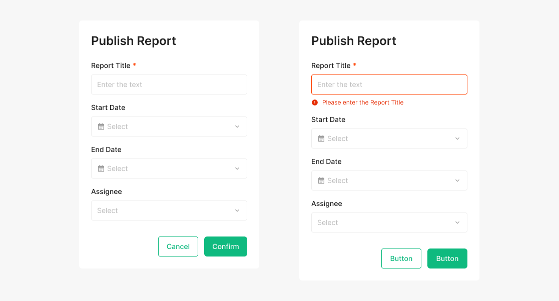
Rule for Button Activation
Buttons inside modals default to active, even when required fields aren't filled. If a user triggers an unmet state, surface the missing requirements through an Alert.
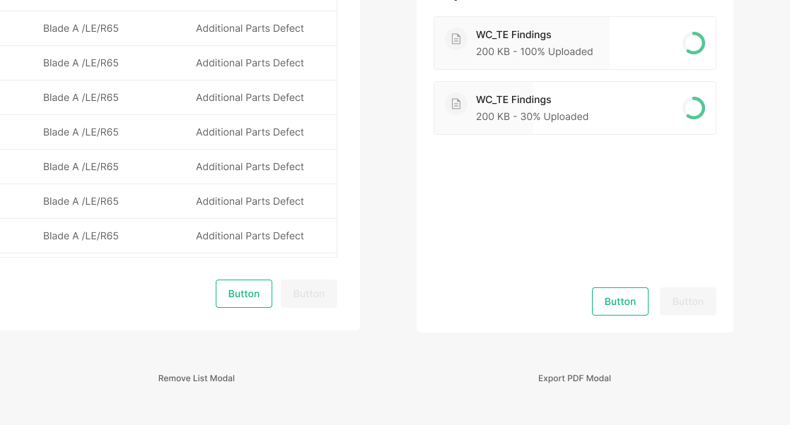
Exception Case of Button Disabled
Two exceptions where a modal button stays disabled — when the action's task is unmistakable inside the modal. Today: PDF Export while the file is processing, and Remove List when no checkbox is selected.
Loading Status
Loading Type
Loading type differs by Primary or Secondary. Icon presence doesn't change it — loading renders on the container. Primary surfaces it on the Green 500 container; Secondary on white.
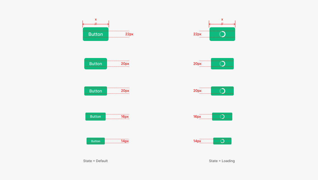
Loading Spinner Size
The spinner inside a button matches the text height for that button size. While loading, the width stays equal to the width used immediately before the loading began.
Tertiary Button (Icon Button)
Icon Buttons are buttons without a text label — icon only.
Icon Button
Icon Buttons have no text label. Prefer a labeled button when possible — but when space is limited, or when the icon is clearly understood on its own, an icon-only button is acceptable. Icon Buttons can also act as toggles (On / Off selection). Icon Buttons must always pair with a Tooltip.
Anatomy
Variants
Primary Type
Icon Buttons split into three types — Primary, Secondary, Tertiary — applied flexibly per content. Use at most one Primary Icon Button per page.
Secondary Type
Icon Buttons split into three types — Primary, Secondary, Tertiary — applied flexibly per content. Use at most one Primary Icon Button per page.
Tertiary Type
Tertiary Icon Buttons have neither container nor outline — their treatment shifts with the surrounding background color. Three variants apply flexibly per content. Use at most one Primary Icon Button per page.
State
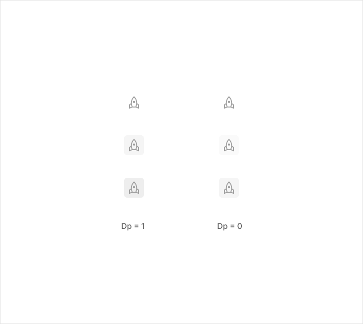
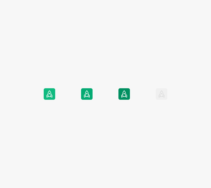
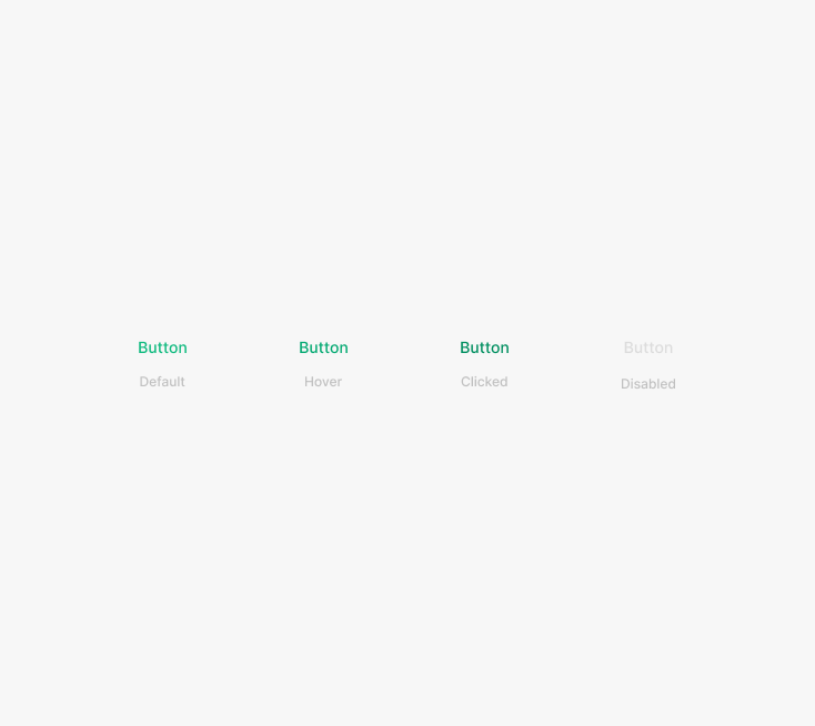
Icon Buttons have four base states — Default, Hover, Clicked, Disabled.
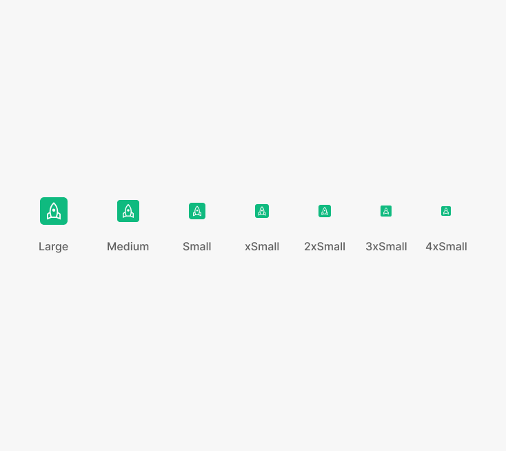
Size
Heights — Large, Medium, Small, xSmall, 2xSmall, 3xSmall, 4xSmall. Container size, icon size, radius, and padding vary per size.
Table of Figma Properties
Icon Button in Table
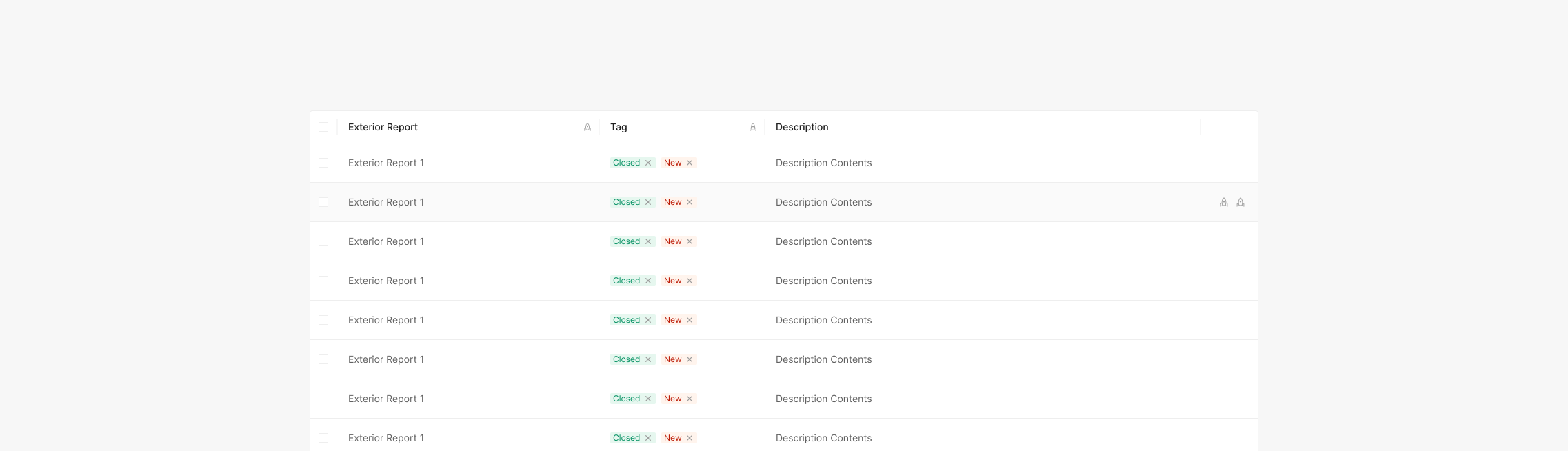
Space Icon Buttons 4 or 8 px apart. When combined with table headers, watch the margin. Inside a table, Icon Button groups drive per-row actions and align right.
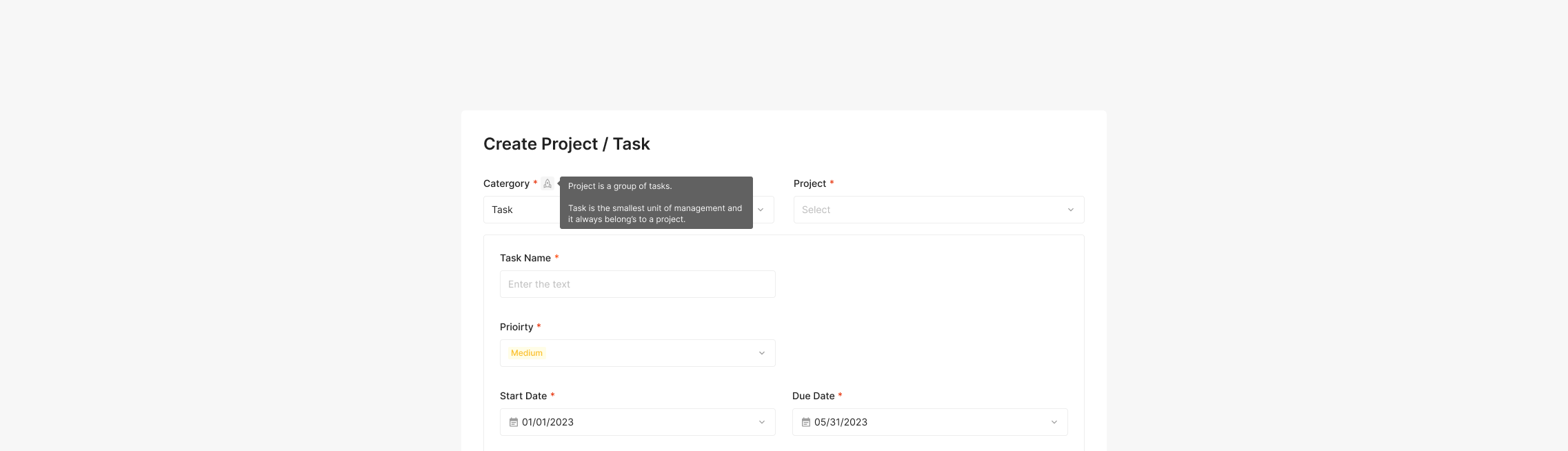
Popup Tooltip
Use a Tertiary Icon Button with an Information icon to surface a Popup Tooltip. State matches the standard Tertiary Icon Button, paired with a Header. The button's action shows a contextual Tooltip; clicking the button again — or anywhere outside — dismisses it.
Usage & Placement
Header with Icon
When an Icon sits inside a Header, the entire row acts as the touch target — and the action is signaled through the icon. No state styling on the Icon Button itself — it stays clickable without Hover or Clicked states.
(e.g. Item List → Expand Icon, OSD Viewer Panel → Expand Icon)
Extra Button (Text, Segment, Progress Status, Combo Button)
Extra Button types aren't primary actions, but they appear frequently across Zoomable. The family includes Segment, Progress Status, Text, and Combo — each shaped by its specific function and purpose.
Text Button
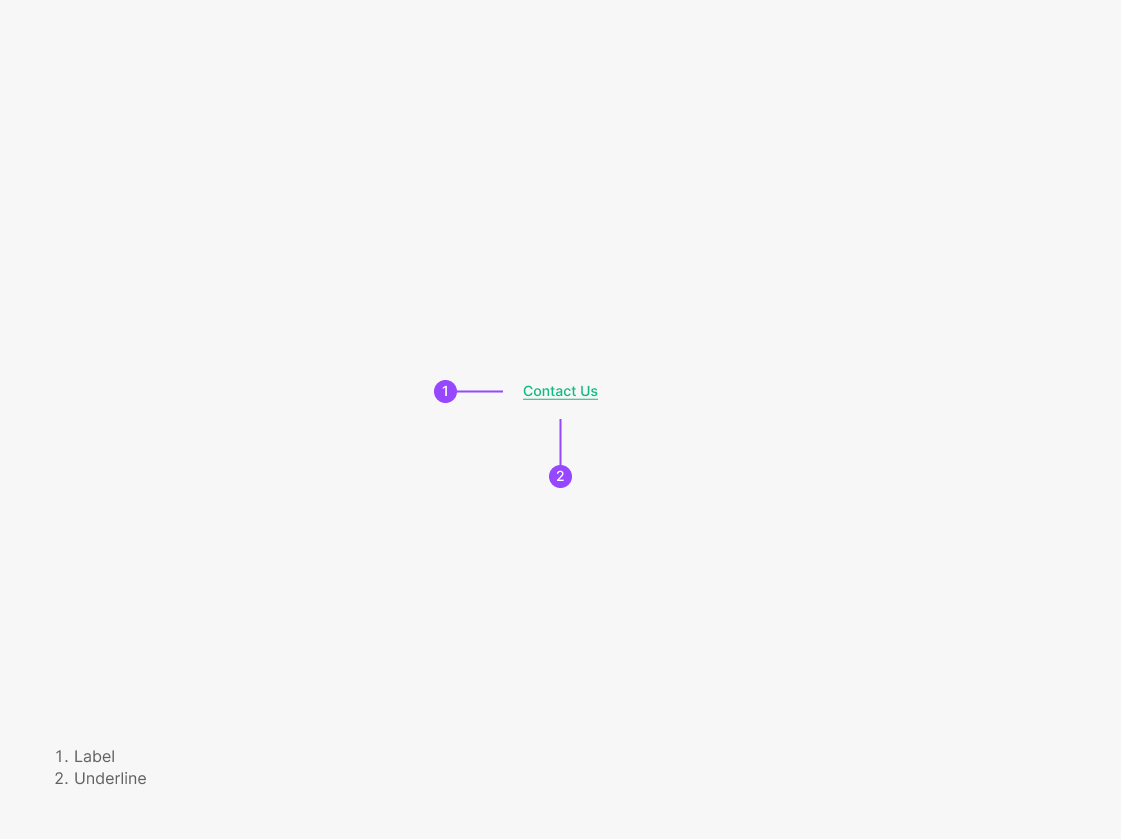
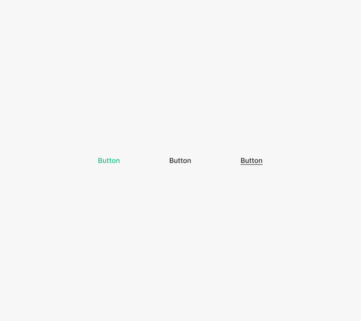
Text Buttons render without a container or outline — used inline. They combine with text (label) or appear as a linked underline. Used as part of a sentence or standalone — for navigating to another page, moving within the current page, or surfacing additional info.
Variants
Type
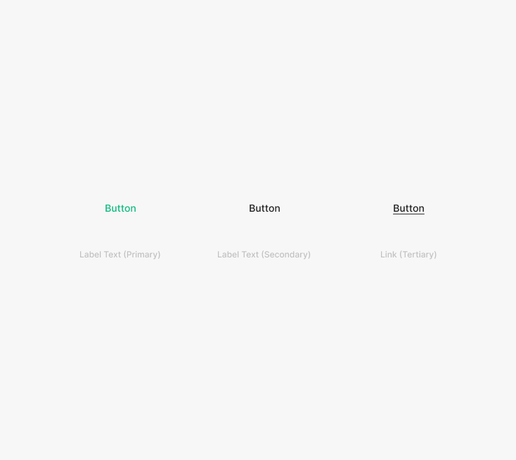
Text Buttons split into two types — Label (Primary, Secondary) and Link — applied flexibly per content.
State
Text Buttons have four base states — Default, Hover, Clicked, Disabled.
Size
Text Button sizes match the body scale — Medium, Small, Xsmall. When used for navigation (e.g., "See more"), match the body font size.
Table of Figma Properties
Segment Button
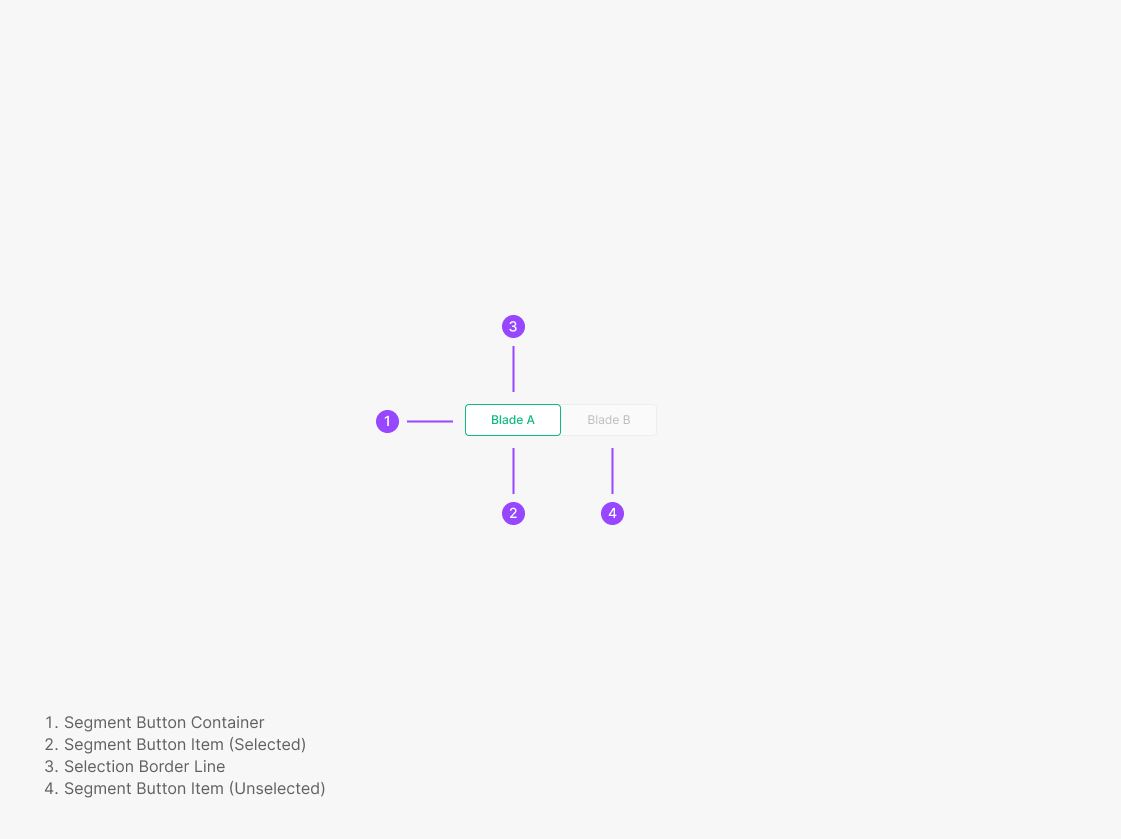
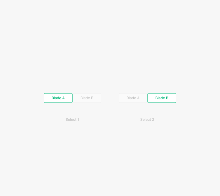
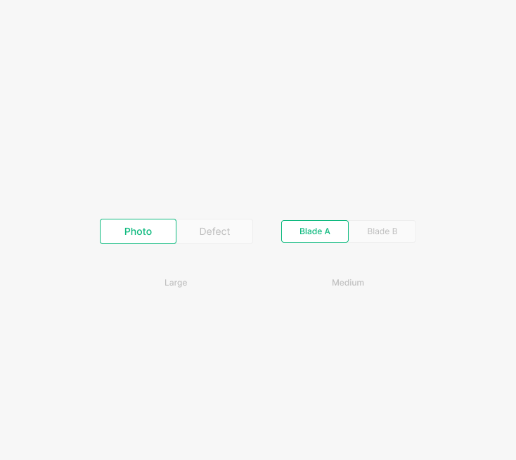
Segment Buttons group similar content on a page and let users move between sections without leaving. They expose hierarchy-equivalent content for browsing in place. Visual consistency matters — selected state communicates location quickly. Segment Buttons always have one item selected; no unselected-all state.
Variants
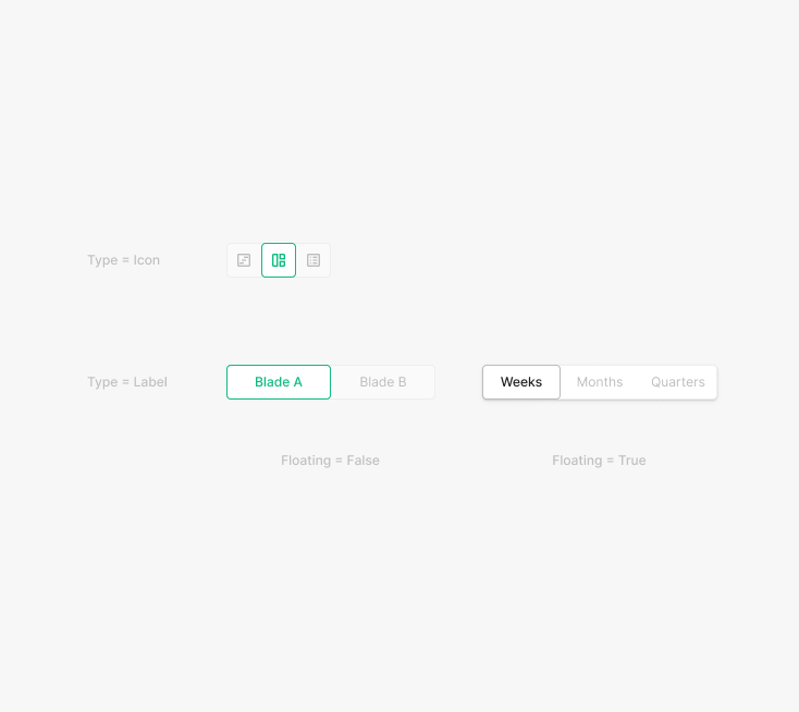
Type
Segment Buttons take two shapes — Label or Icon — and two placements — Floating=true or Floating=false. Applied flexibly per content and resolution.
State
Two states — Clicked, Unclicked. Clicked uses Inter / Medium weight and Green 500 color.
Size
Two sizes — Large, Medium. Standard Large is 40px elsewhere; Segment Button Large is 36px.
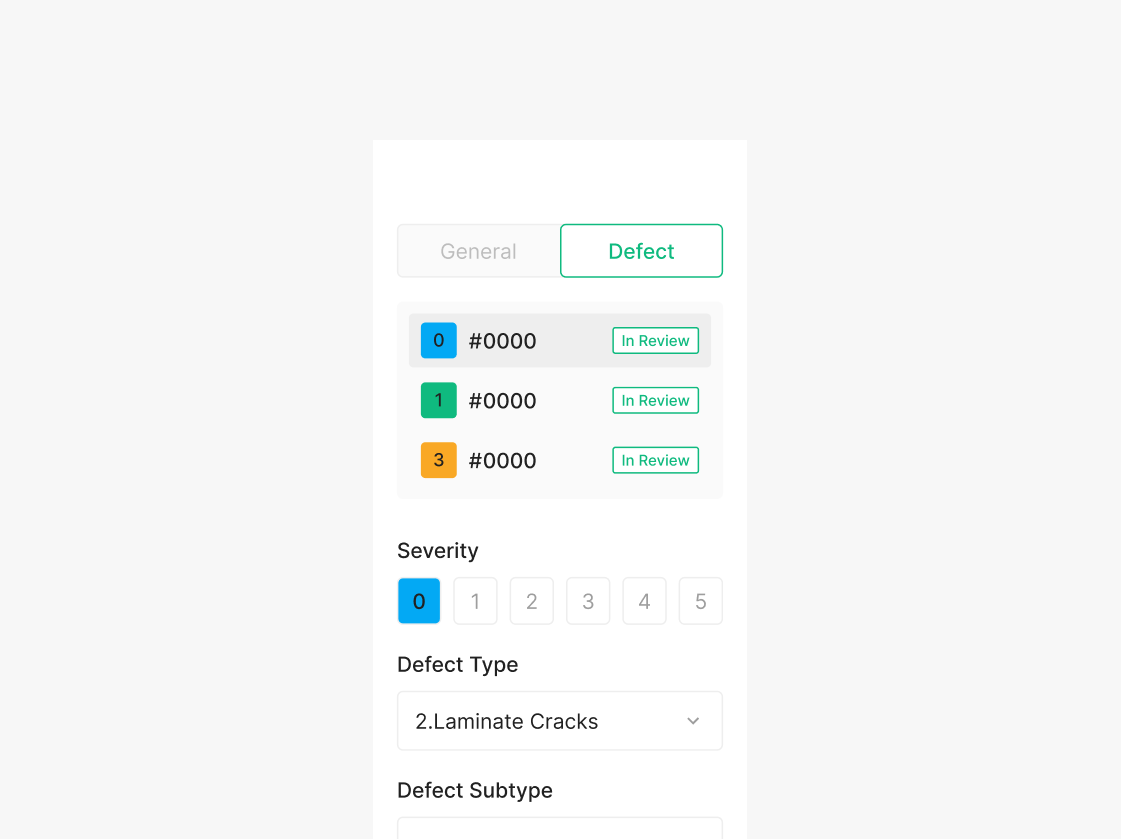
Progress Status Button
Progress Status Buttons signal a stage-level hierarchy for the user's task progress. Follow the style guide per stage — avoid ad-hoc styling. Used in the Wind OSD Viewer's Progress Status to surface state and workflow per step.
Variants
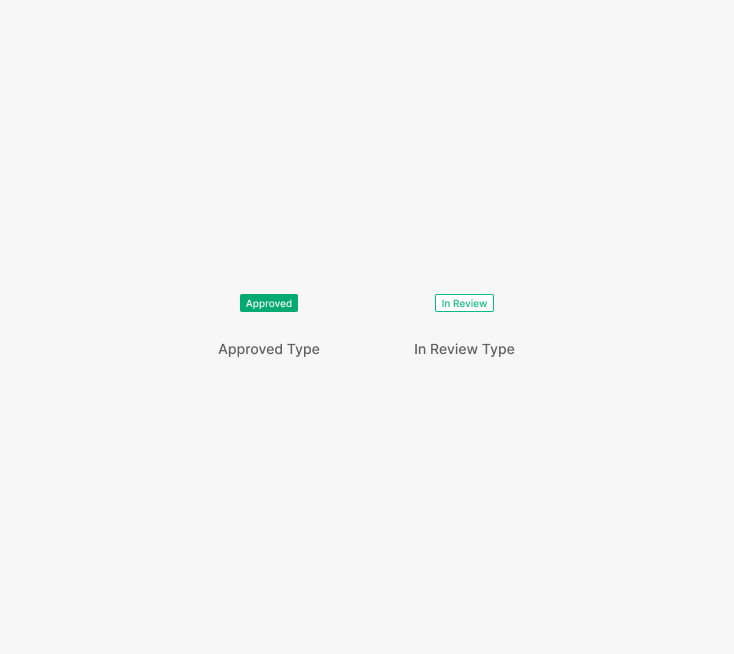
Type
Two types — Approved, In Review — applied flexibly per stage and situational hierarchy.
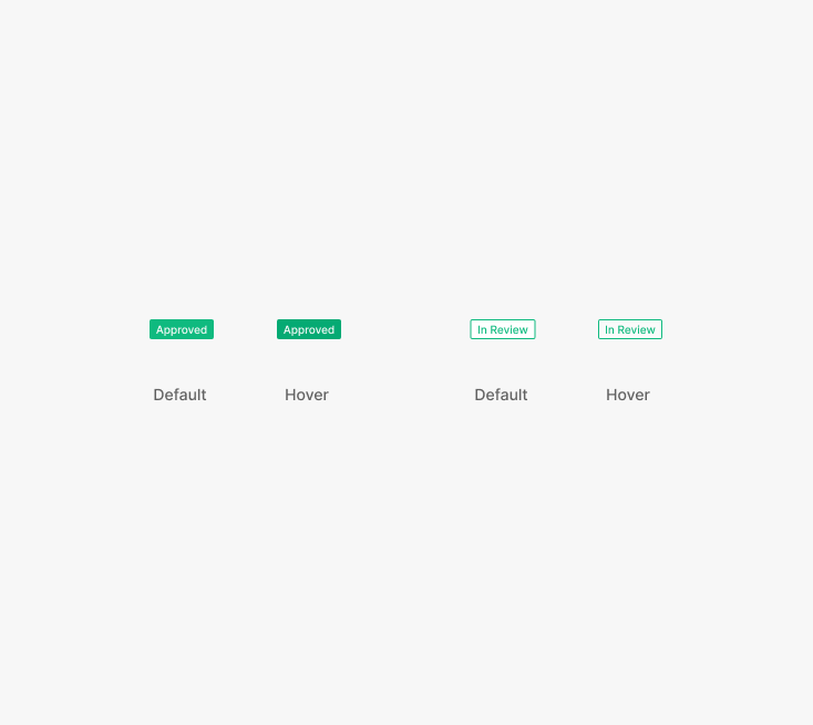
State
Two states — Default, Hover — matched to the progress stage.
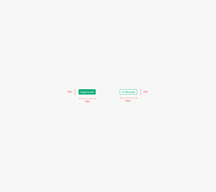
Size
A single size — Width = 58px, Height = 18px.
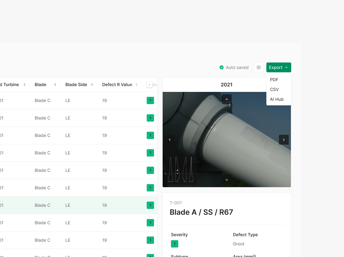
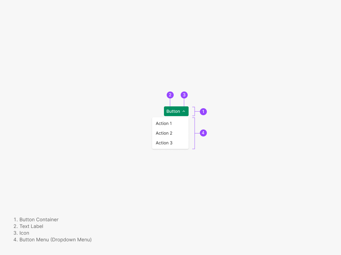
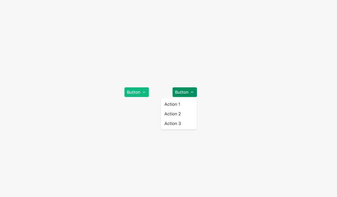
Combo Button
A button paired with a dropdown list — used when related actions need multiple options. In the Wind Do Task view, supports multi-format export (Export PDF, CSV, AI Hub). Uses a Primary Button with an icon.
Variants
Type
Currently a single type — a Secondary-styled Combo Button can be composed if needed.
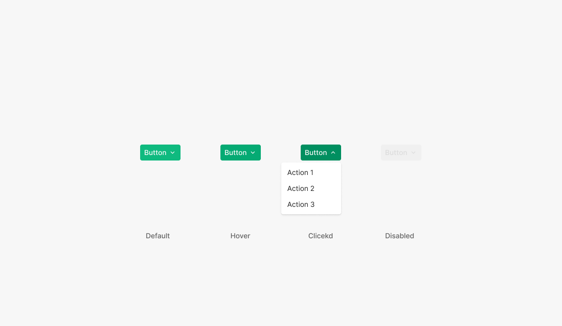
State
Four states — Default, Hover, Clicked, Disabled — mirroring Dropdown's state set.
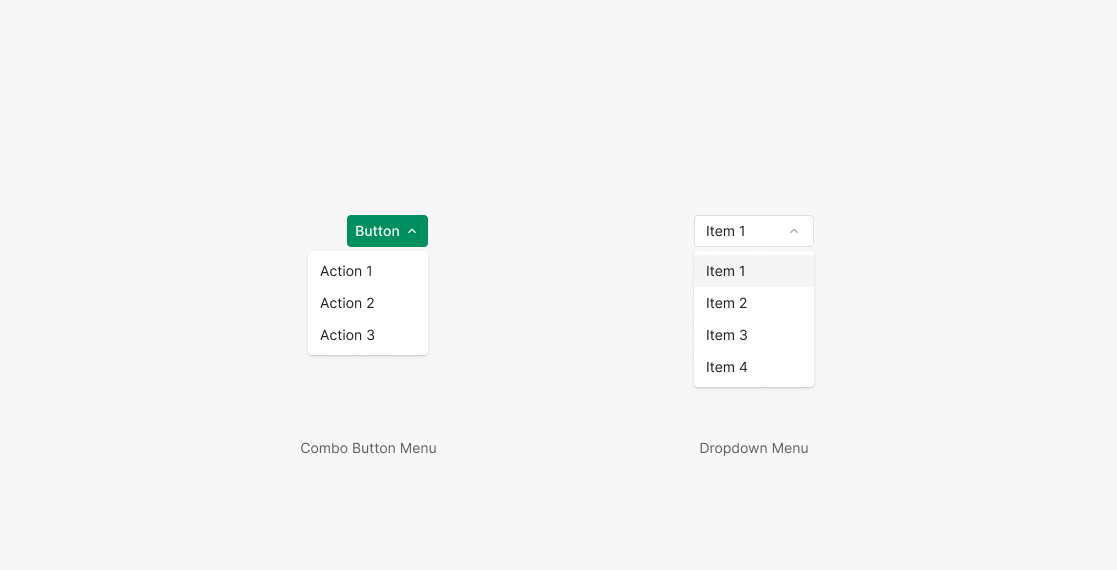
Combo Button Menu
The menu surfaced on Combo Button selection uses the same Dropdown Menu component at matching size. Menu items hold the same width as the button.