Toolbar
Toolbar is the component that surfaces the actions needed to complete a task.
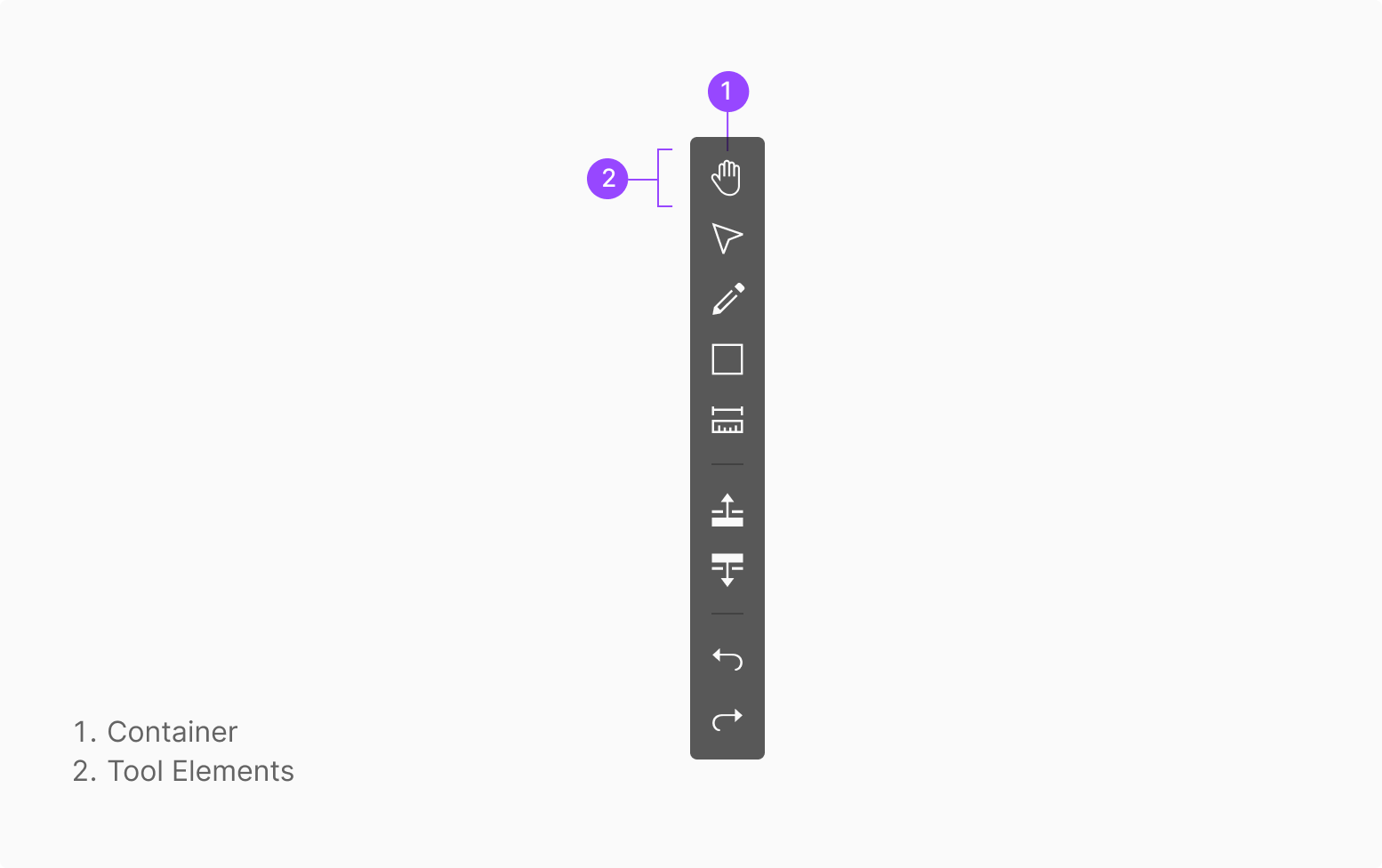
Anatomy
Usage
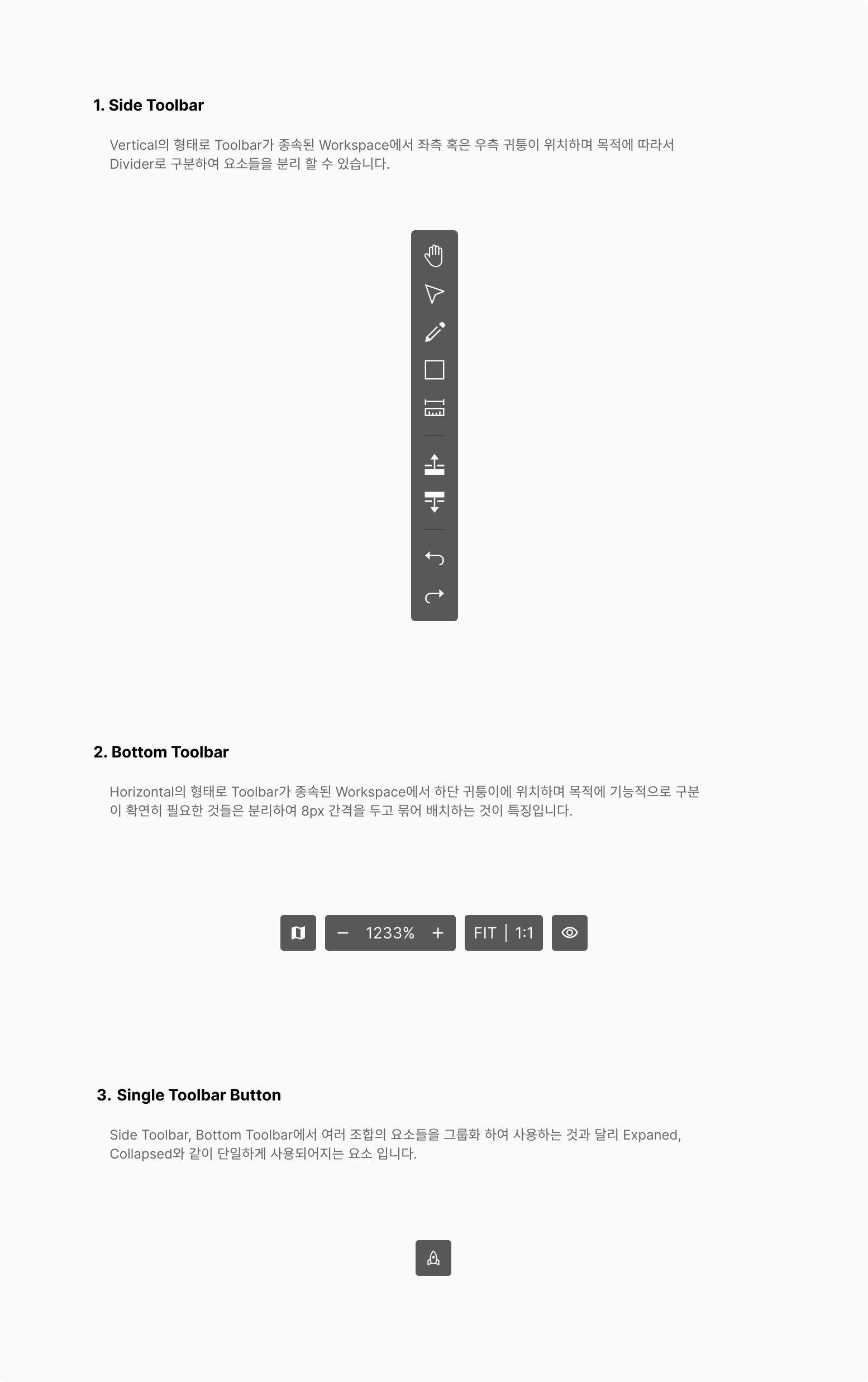
Toolbar is used in the Worker OSD Viewer, in two main placements: • Side Toolbar • Bottom Toolbar A single Toolbar Button can also be used standalone.
Positioning
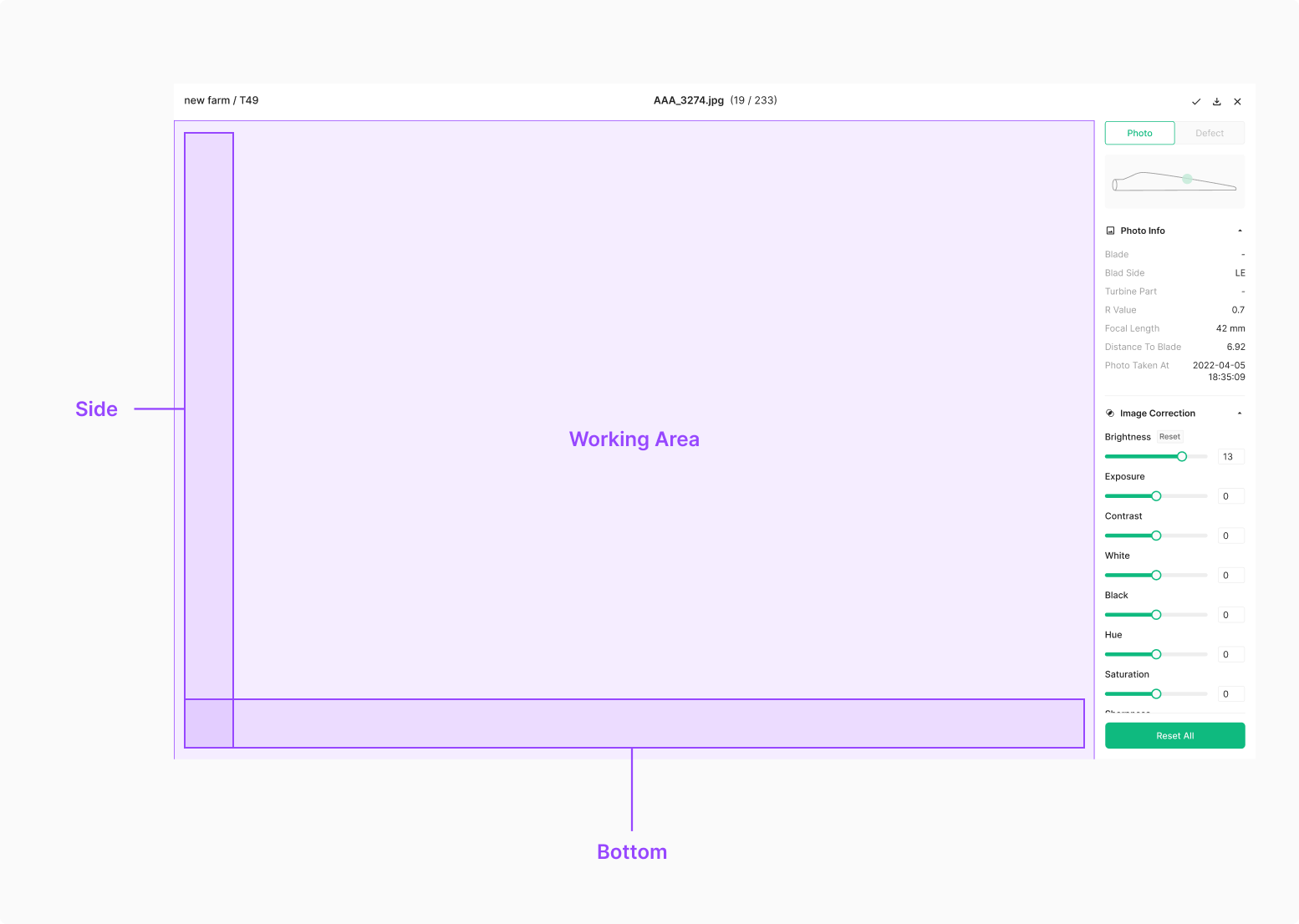
Toolbar sits above the working section. Place it where it doesn't interfere with the work — top, bottom, or side.
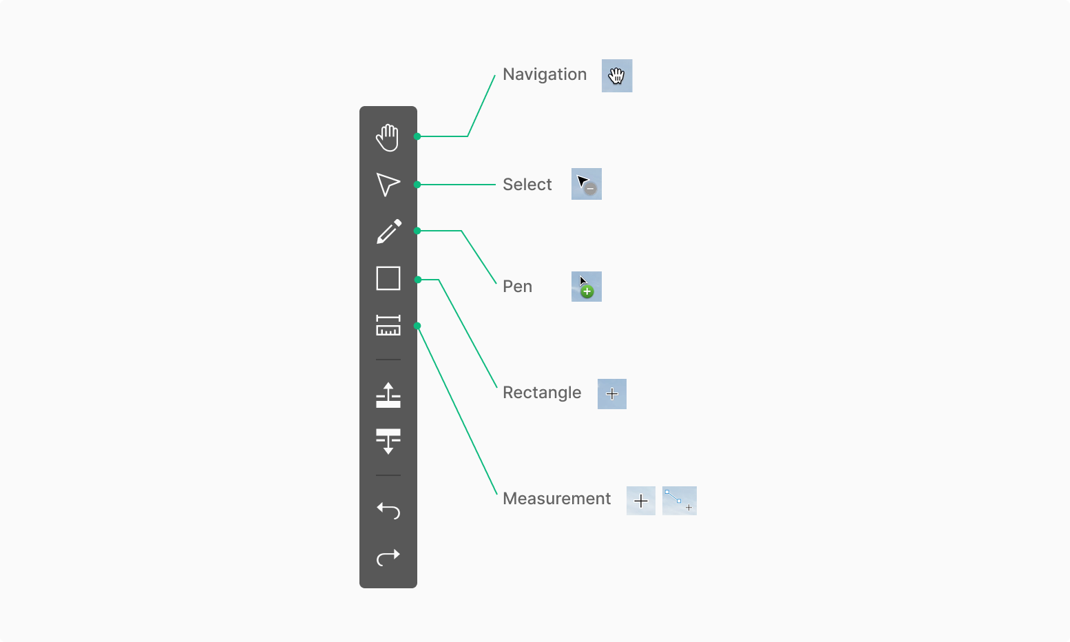
Components
Toolbar surfaces the actions needed to complete a task.
Side Toolbar
Vertical form, anchored to the left or right edge of the host workspace. A Divider can separate elements by purpose.

Bottom Toolbar
Horizontal form, anchored to the bottom of the host workspace. Functionally distinct groups separate with an 8px gap.

Single Toolbar Button
Unlike Side and Bottom Toolbar groups, this element runs standalone. Roles and types vary widely.
Extra Case
Toolbar can adapt to different purposes in the workspace.

Variants
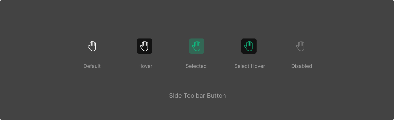

State
Toolbar Button has 5 states — Default, Hover, Selected, Select Hover, Disabled. Selected and Select Hover may be omitted depending on intent.
Hover
Hovering over a Toolbar element should surface a Tooltip describing the tool. Omission is permitted by context.
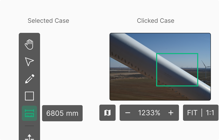
Selected & Clicked
When a specific tool requires a separate component in Selected state, position it using the Tooltip placement convention (4px). Unlike Selected, when a Clicked action surfaces a separate component (no dedicated Clicked Toolbar Button state defined), use an 8px gap.
Clicked & Change
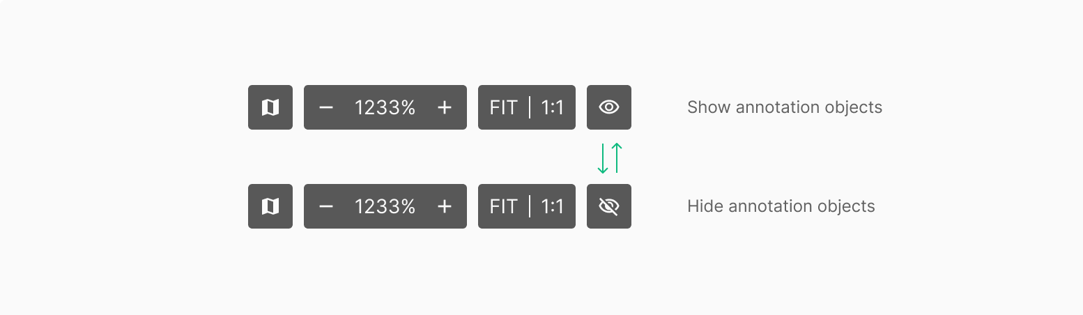
Bottom Toolbar buttons typically don't change visually on click — they just execute. Exception: Show / Hide directly reflects the current Annotation Object state in the Viewer for an intuitive read.
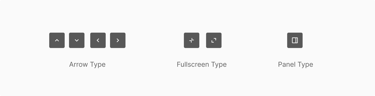
Type of Toolbar
State of Side Toolbar
Tool Guide
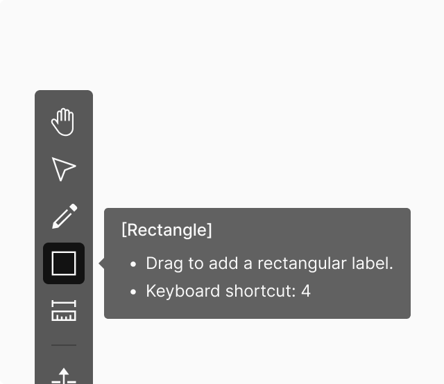
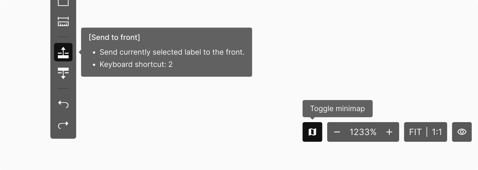
Tooltip
Icon-based Toolbar tools surface their description through a Tooltip. The Tooltip typically holds name, description, and keyboard shortcut. Self-evident tools can omit description; tools that don't need a shortcut within the workspace can omit shortcut info. Tooltip behavior follows the standard Tooltip policy — surfaces on Hover.
Cursor
Toolbar elements expose a wide range of behaviors. The cursor shape shifts based on the function each Toolbar Button activates.