Image Gallery
Image Gallery surfaces multiple images at once, pairing each thumbnail with select pieces of information.
Anatomy
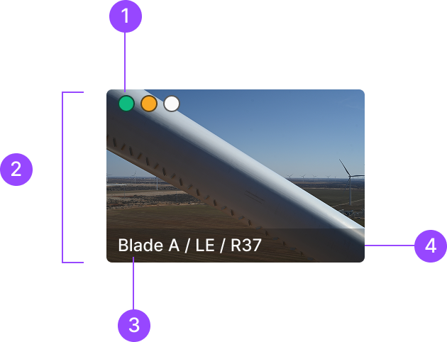
1. Severity Label
2. Image Container
3. Text Label
4. Label Container
Usage
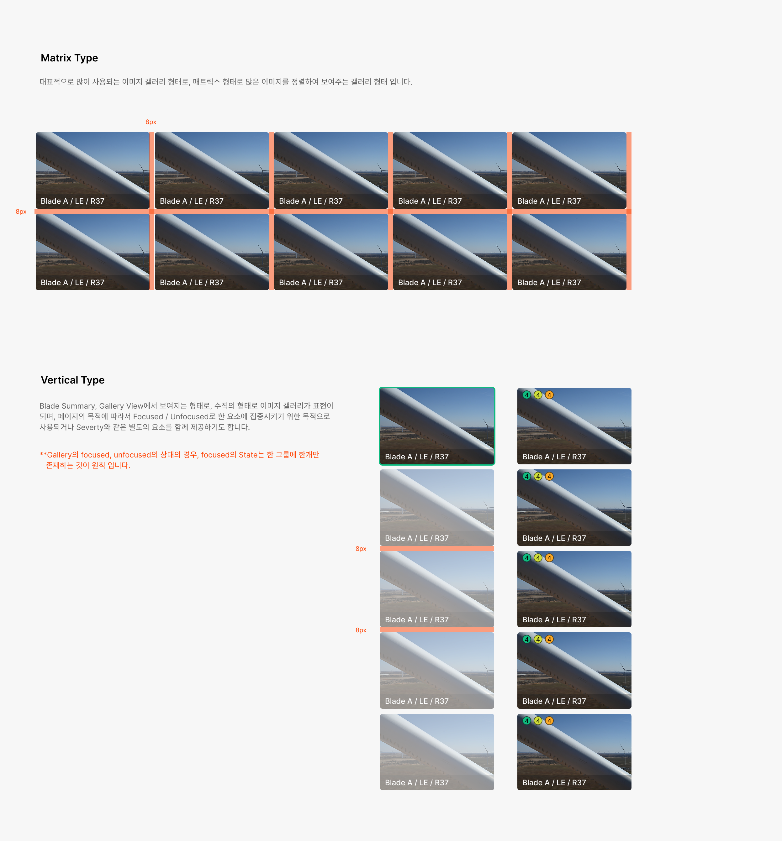
Image Gallery splits into four categories by data type and state. The four types reflect the nature of the content. Each of the four also carries separate Selected and Unfocused statuses.

Default Image
The base form of an image element.

Image with Severity
The form when the content carries severity information.

No Data
The state when no data exists.

Image Empty
The form when metadata exists but the image hasn't loaded.
Status
Alert splits into two categories by composition — Container Alert and Text Alert. Built on a Basic Info Box of Info Text plus Info Icon. Text Alert and Container Alert are used when the information requires an action, or when information needs to be condensed and summarized.

Default
The base state when accessing the image gallery.

Focused
State for concentrating on a specific image content to perform an action tied to that element.

Unfocused
Works alongside Focused — lowers the prominence of elements other than the focused one.
Spacing
Image Gallery image sizes flex to the gallery area assigned per screen. Top/bottom/left/right spacing stays fixed at 8px.
Contents
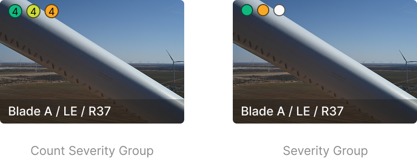
Severity Group
Severity Badges in Gallery use the Circular Type, split into Count Severity Group (with count) and Severity Group (without count).
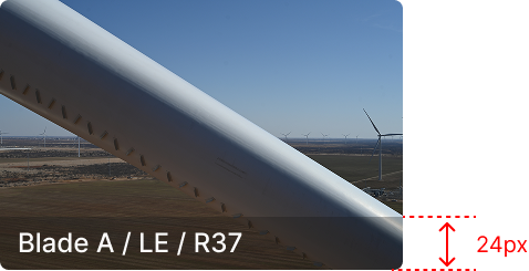
Text Label
Surfaces image information as text below the image. Displays 'Blade / Blade Side / R Value' fields.