Modal
Modal is an overlay surface used to deliver task-related information or to collect confirmation and light input from the user. The user must address what's inside before continuing, which helps focus attention on the current task. Modal pairs with a Dim layer that disables background interaction — directing the user's attention to the task at hand. Because of this, Modal is best for short, focused work; avoid using it for long or complex flows. When content volume grows or steps lengthen, prefer Drawer or a dedicated page over Modal.
Anatomy
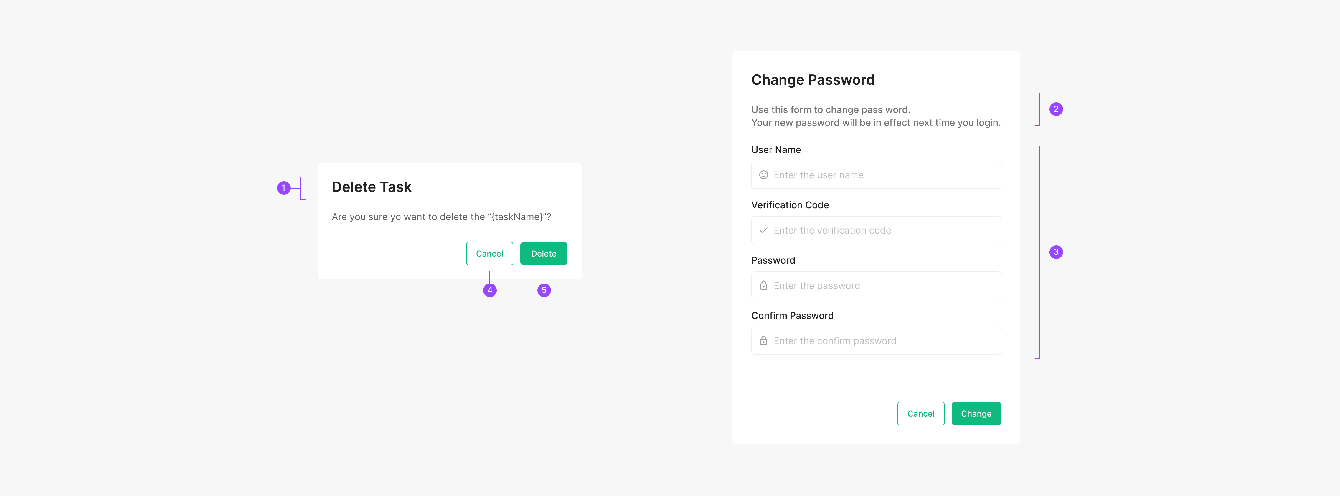
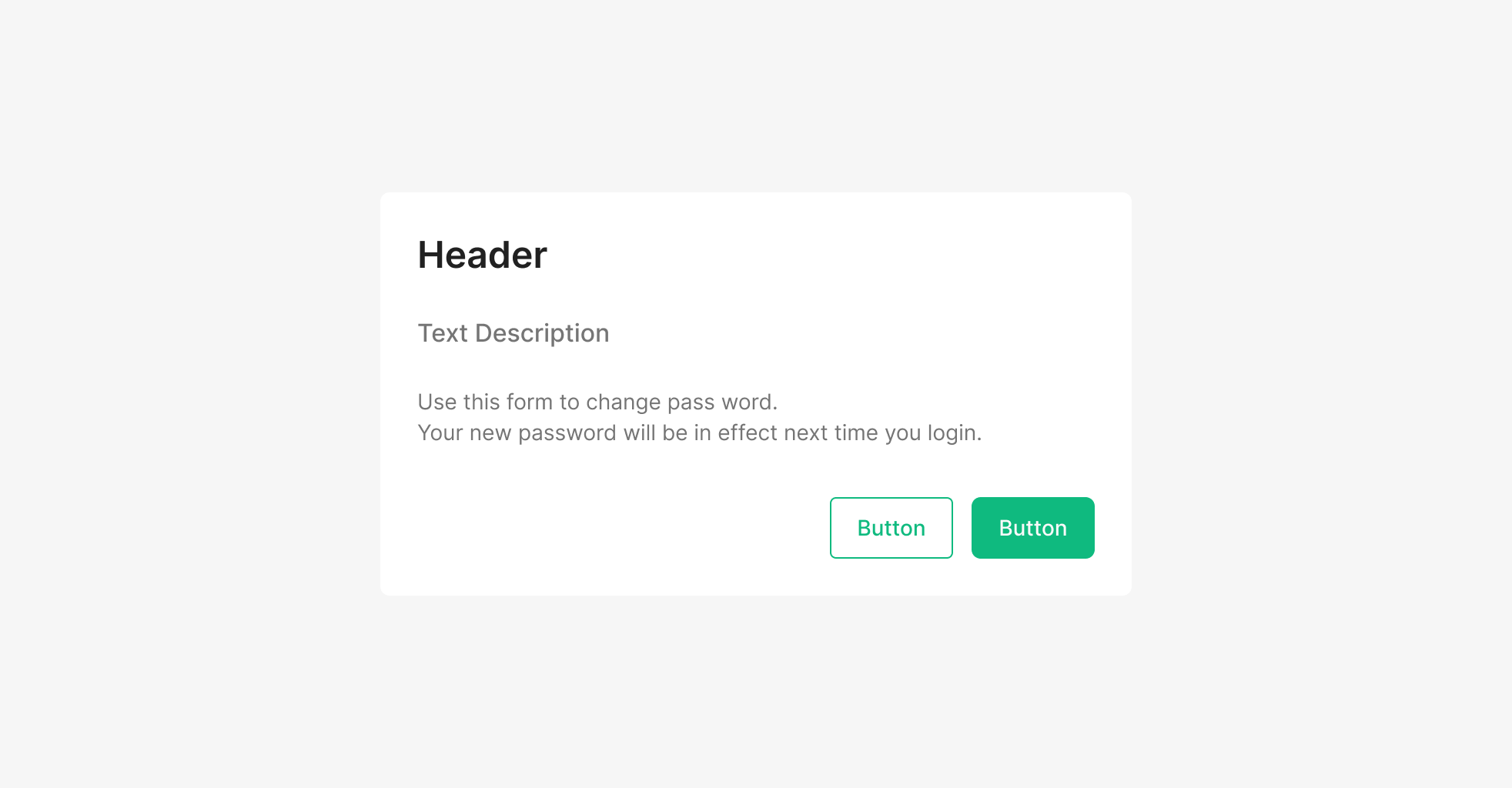
1. Header 2. Text Description 3. Contents 4. Secondary Btn 5. Primary Btn
Buttons
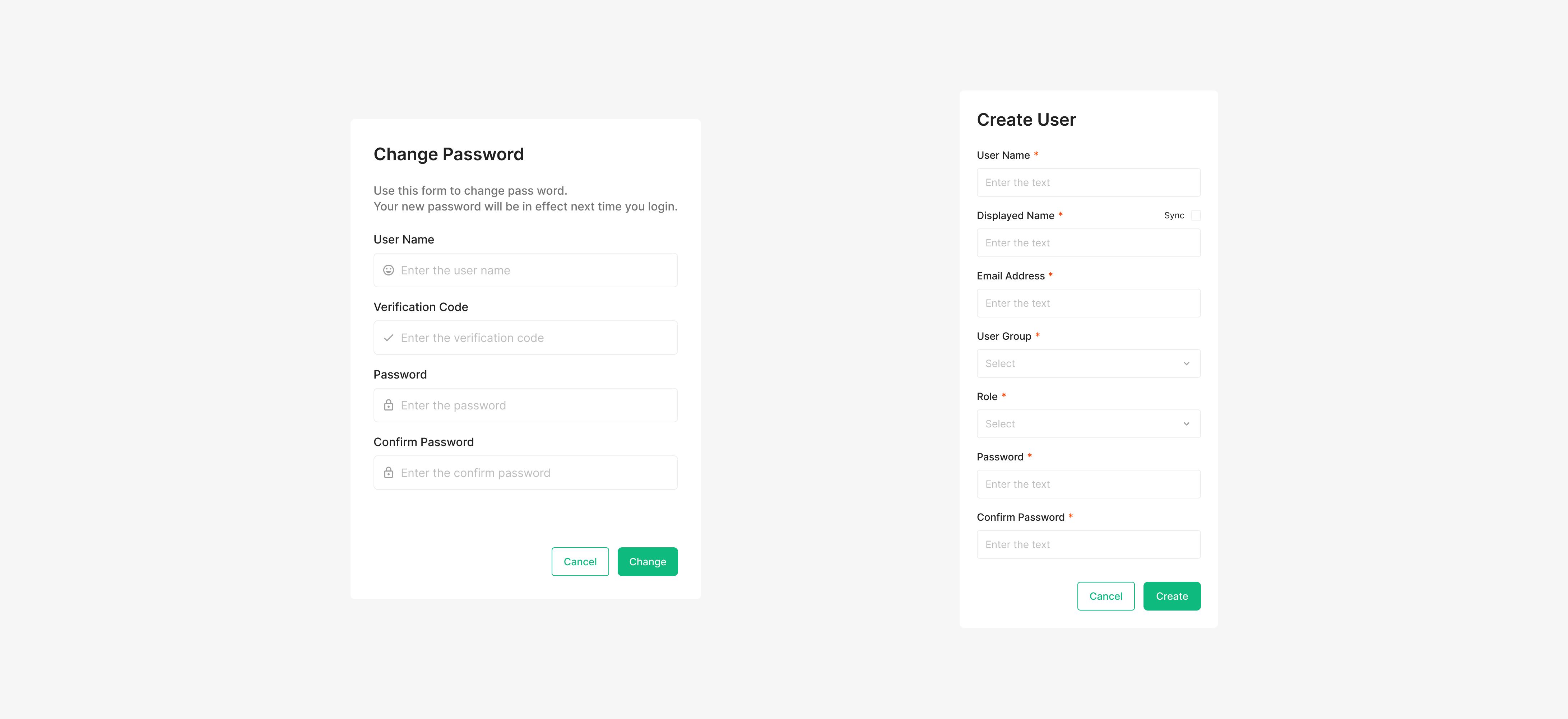
Modal supports one to three buttons, with two as the recommended default. The highest-priority button uses Green-500 text and sits in the leading position. A button that backs out of the flow must always be included.
| Property | Values | Default Value |
| Buttons | 1, 2, 3 | 2 Buttons |
Modality Criteria & Checklist
Use these criteria and the checklist when deciding whether to introduce a modal. Criteria split into Required and Recommended — Required must be served as a modal because they demand focused attention. Modal in Modal: stacking modals makes it hard for users to retrace their steps and breaks the task context. When a second modal would otherwise appear, prefer a normal view unless the Required criteria apply. *Task modal, *Confirmation modal
Modality Criteria
Required
| Task-orientation | The modal task is immersive content (exception: full-screen experiences) |
| Completeness | The modal task has a clear start point and end point |
Recommend
| Context mismatch | The modal task sits outside the existing context |
| Isolation | The user should be prevented from navigating to other screens while the modal task is in progress |
| Non-primary | The modal task is unrelated to the primary task of the host screen |
| Return | The user must return to the host screen after completing the modal task |
Modality Checklist
Required
| Immersion | Does the surface provide enough focus to complete the task? | ✓ |
| Completeness | Does the task run from start to finish on a single linear flow? | ✓ |
Recommend
| Context mismatch | The modal task sits outside the existing context | ✓ |
| Can the user grasp the volume of information on the entry screen at a glance? | ✓ | |
| Is the entry menu structure simple rather than nested? | ✓ | |
| Does another modal rarely appear after entering this one? | ✓ | |
| Isolation | Is there a clear benefit to limiting navigation until the task is completed or canceled? | ✓ |
| Non-primary | Is there a clear benefit to limiting navigation until the task is completed or canceled? | ✓ |
| Return | Must the user return to the host screen after completing the task? | ✓ |
Scrim Area (Overlay)
The Dim layer is a transparent surface that separates the background from the Modal. It signals that the rest of the screen isn't reachable and focuses attention on the modal. Overlay uses Black at 60% opacity. Clicking the Dim area doesn't return the user to the host screen — surface a Cancel button for that path.
.png)
Spacing
Spacing
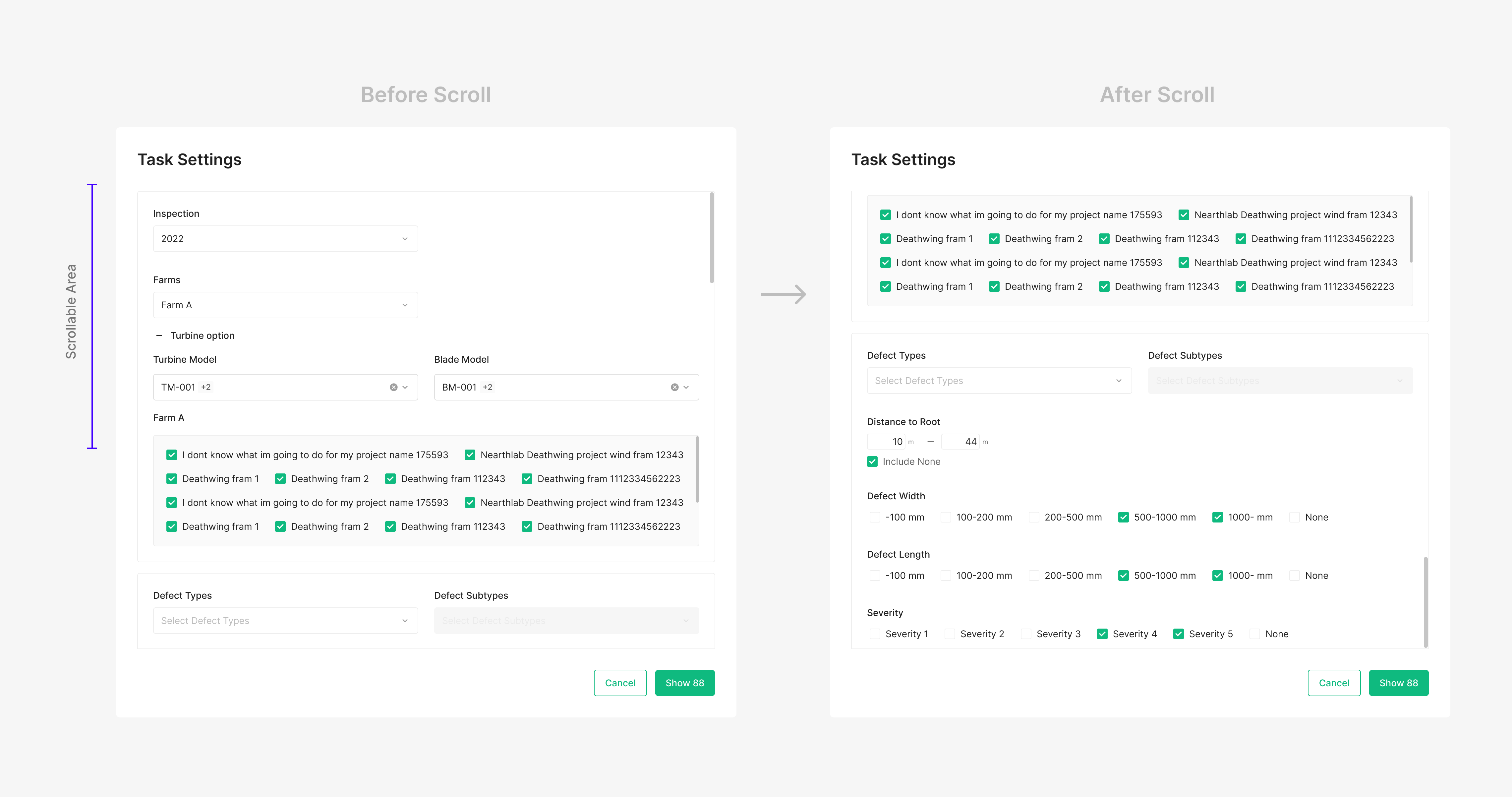
Modal's default width is 448px; both Width and Height are flexible. The contents area uses 24px or 32px margin on all sides depending on Modal size and content. The gap between Header and Contents Area is 24px. Within Contents Area, the typical gap is 16px (24px when needed). The gap between Contents Area and the Footer button row is 32px. Buttons use Medium size at 40px. Modal scroll begins when the content occupies more than 84% of the viewport.
Font
Modal uses Inter. Heading: H2 (Inter / Semibold / 24 / Gray50). Subtitle: Subtitle1 (Inter / Medium / 16 / Gray400). Body: Body2 (Inter / Regular / 14 / Gray700).
Content & Action Area
Modal separates content from action. The footer action area uses right-aligned horizontal buttons by default — Primary + Secondary combinations are recommended, and groups of three or more should be avoided. A Dismiss action that closes the Modal must always be included. When content exceeds the max height (or the configured height), only the body area scrolls while the action area stays fixed. This keeps primary actions reachable while users review long content.