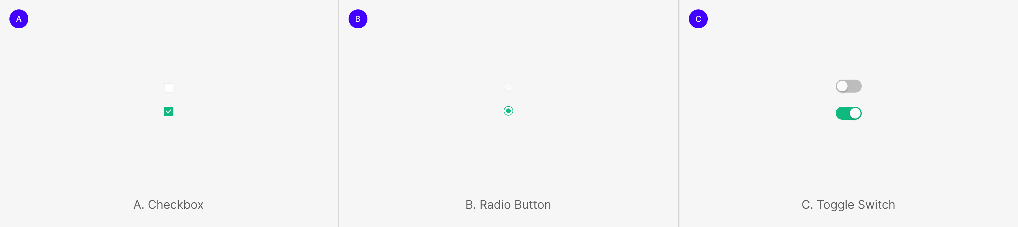
Selection Controls
Selection controls help users pick options. The family splits into Checkbox for multi-select, Radio Button for exclusive single-select, and Toggle Switch for on/off binary state.
Components
Selection Control includes Checkbox (one or more, multi-select), Radio Button (one of many, single-select), and Toggle Switch (immediate on/off state change). Apply the right control for each use case.
Selection Control Group
Selection controls also group as multiples within a single purpose. Within the group, controls form either mutually exclusive or independent relationships.
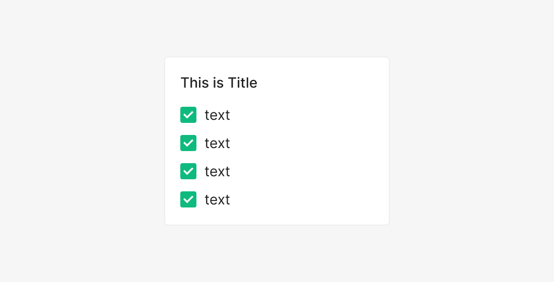
Checkboxes Group
Groups single or multi-selectable items together as a selection set. Most commonly used for multi-filter purposes.
(e.g. Statistics and Defects Side Filter, Task Settings)
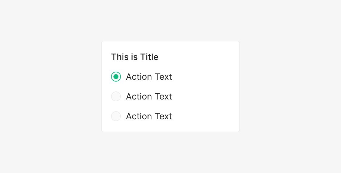
Radio Buttons Group
Used when only one option may be selected from many. Currently not used inside Zoomable Wind.
ds.components-toggle-radio-checkbox.group.radio.example
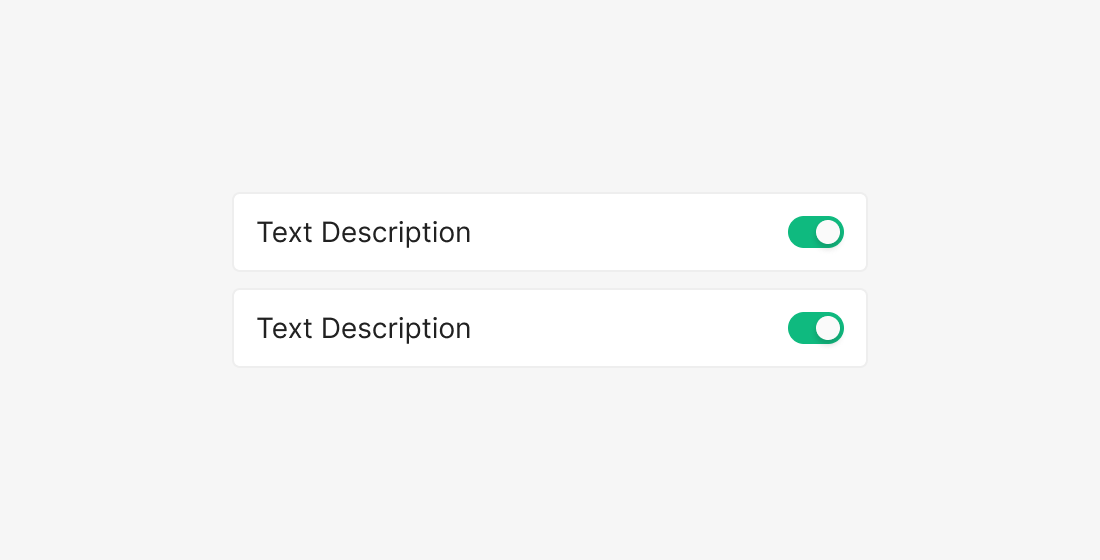
Toggle-Switches Group
Toggle Switches already act as Checked / Unchecked (On/Off) by themselves — typically used singly. When grouped, place toggles serving similar roles together, each with its own Label.
(e.g. Management Settings, Table Settings)
Selection Control
(each option is independent)
(options are mutually exclusive)
(each option is independent)
Checkbox
Checkbox is used when there are one or more independent options, and the user may select none, one, or many. When standalone, a Checkbox can act as a feature on/off toggle.

Unchecked / Checked
Anatomy

- 1. Container
- 2. Label
Variants
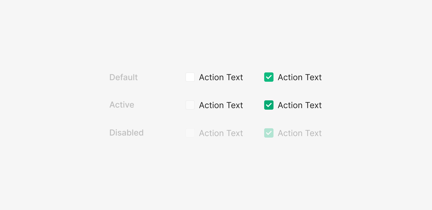
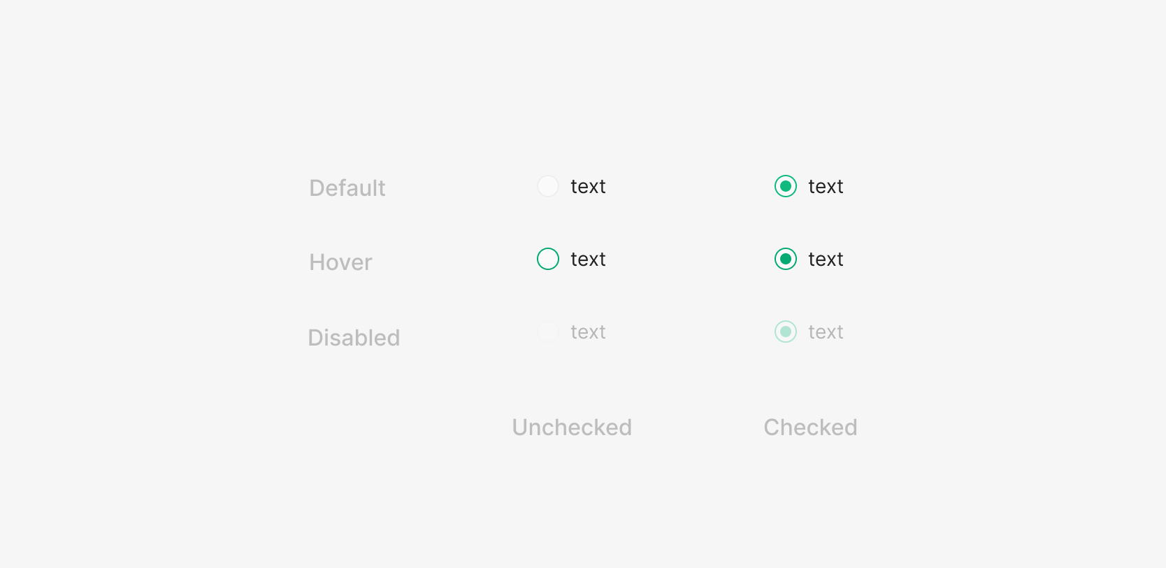
State
Checkbox states split by Checked / Unchecked into Default, Active, Disabled. Inside Selection Control, Active behaves as Hover — the user-facing rest states are Default and Disabled.
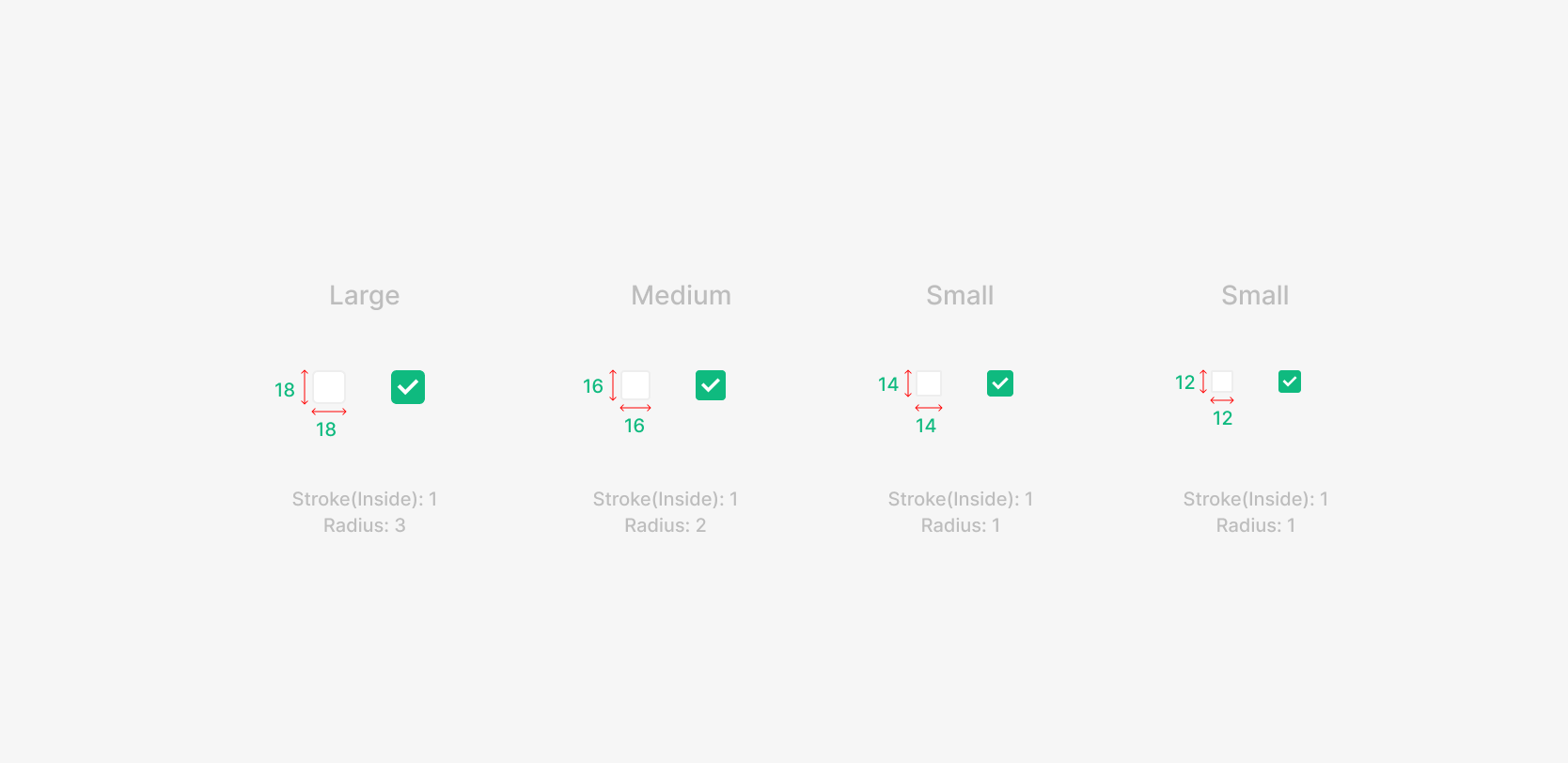
Size
Four sizes — Large, Medium, Small, Xsmall. The default is 16 × 16. Pick sizes to create hierarchy between elements when needed.
Table of Figma Properties
Spacing
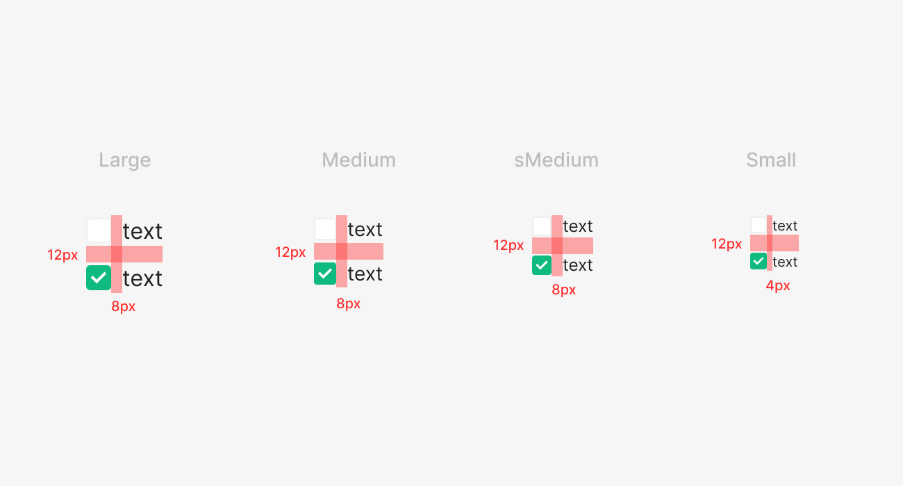
Checkbox-to-label margin is 8px at Large, Medium, sMedium; 4px at Small. List items use 12px padding to avoid mis-selection from neighboring items. Checkboxes typically sit to the left of the text, though right placement is allowed for layout or spacing reasons.
Usecase
.png)
Side Panel Filter (Statistics, Defects)
Used as a filter in a Data Table to surface only the data the user wants.
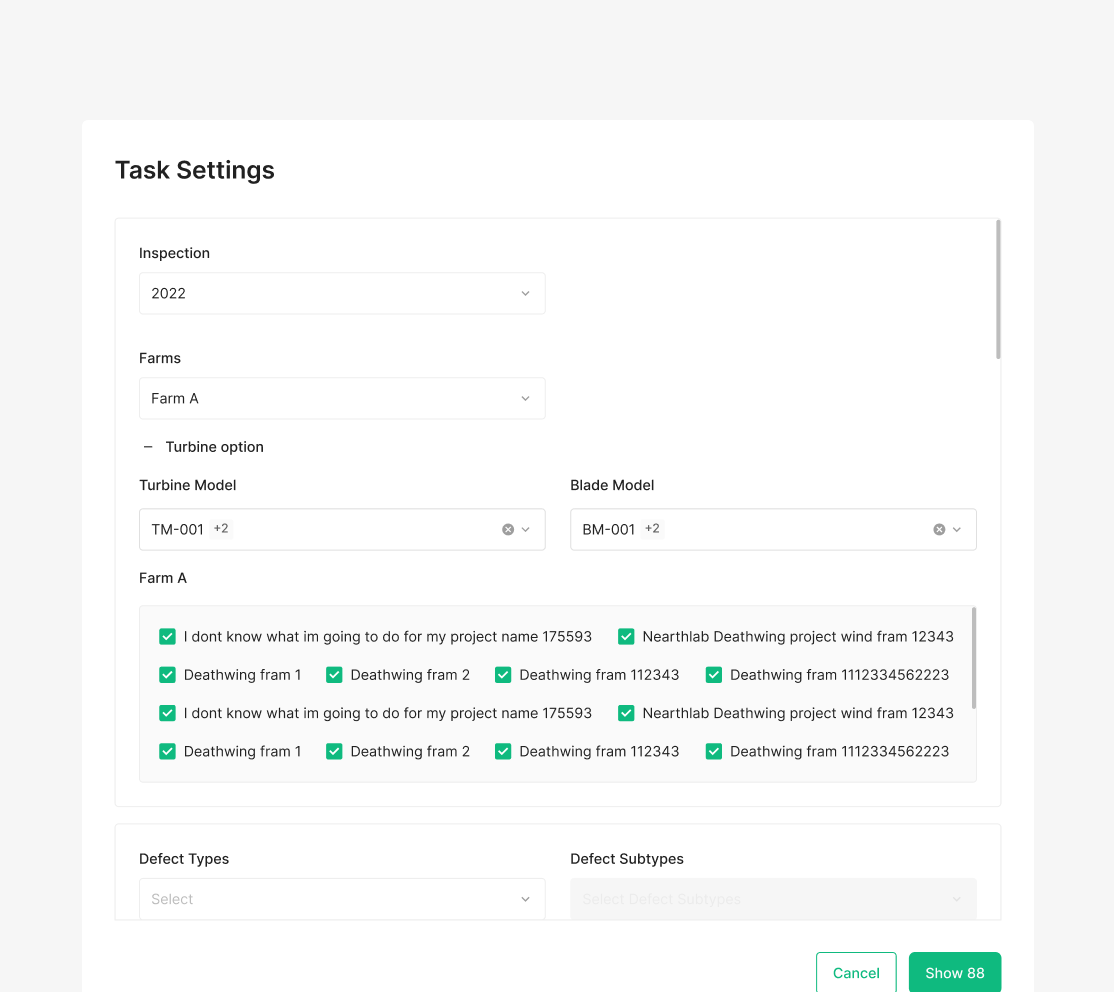
Task Settings Farm Selection
Used to multi-select items with the same characteristic.
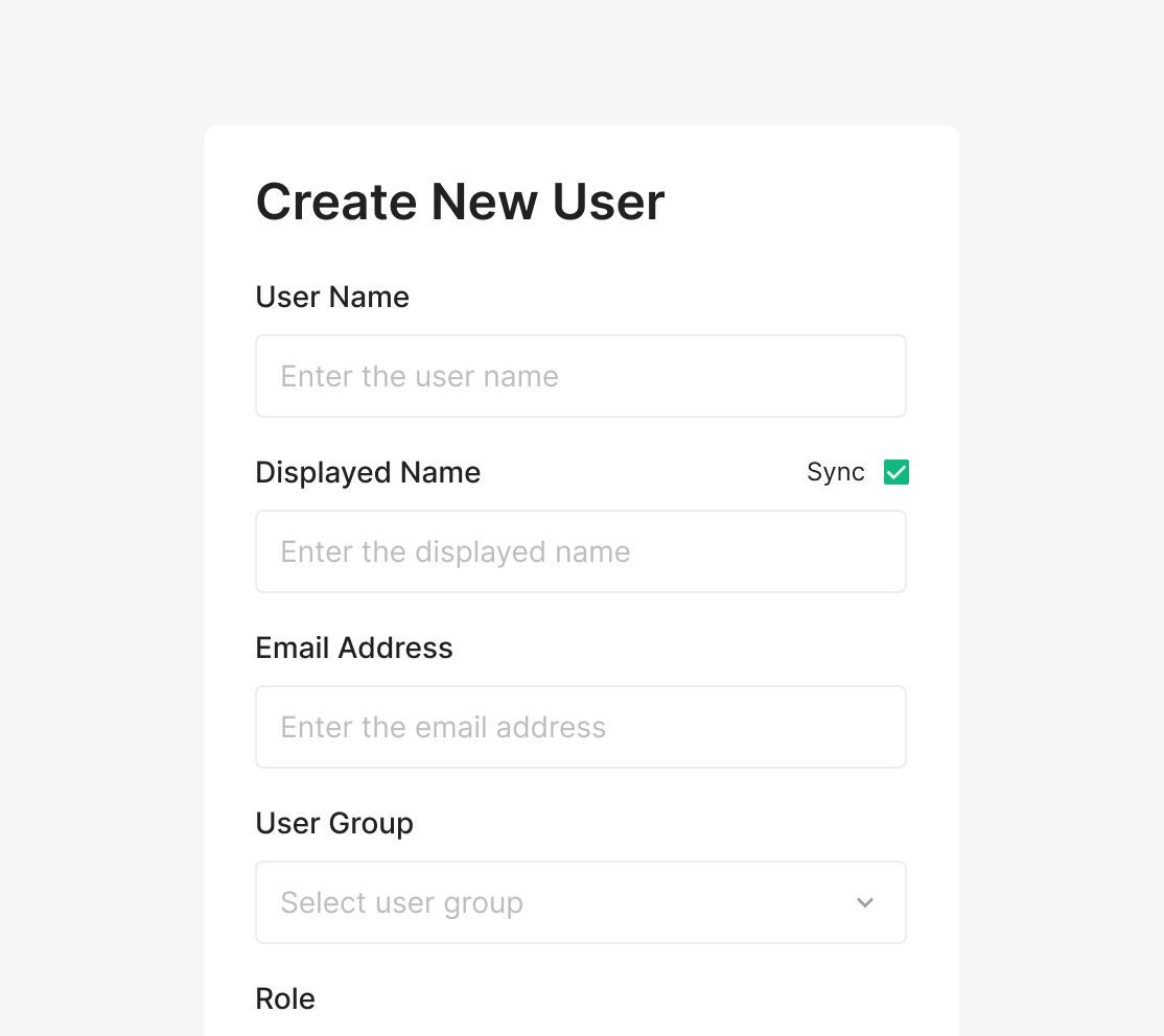
Sync User name Data
Used standalone to toggle data sync on or off.
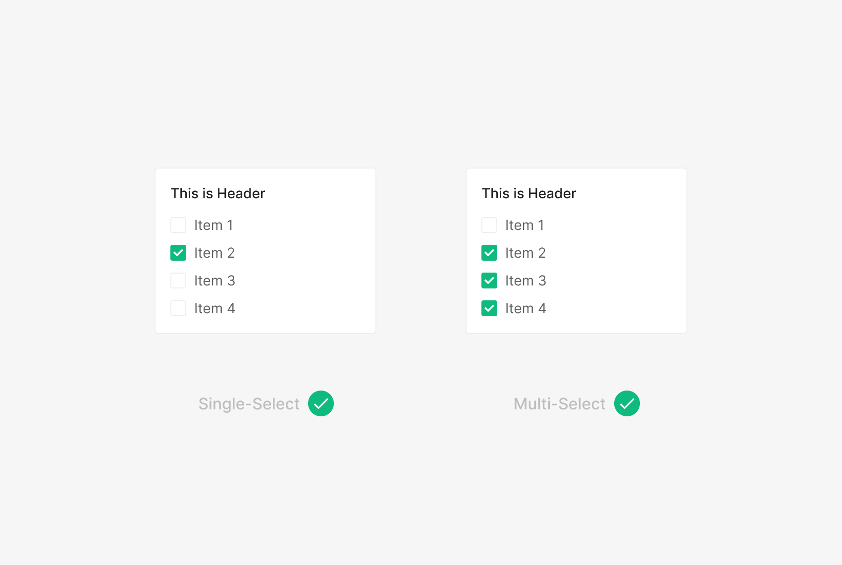
Multiple Select Option
In a Checkbox Group with multiple items visible, one or more items can be selected (Checked).
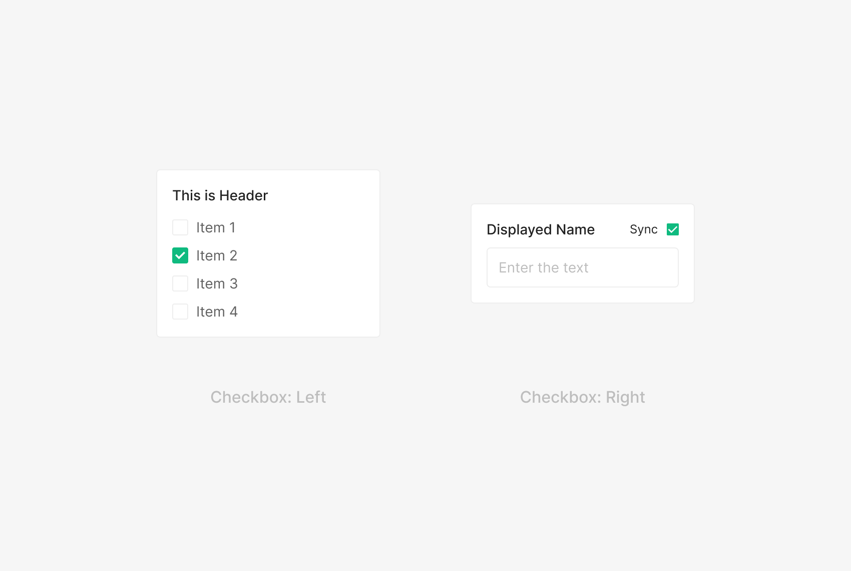
Right and Left Arrangement
When grouping multiple items, place the Checkbox on the left to align the text labels consistently. Right placement applies when the Checkbox isn't part of an item list — for example, a standalone optional filter that triggers a data load.
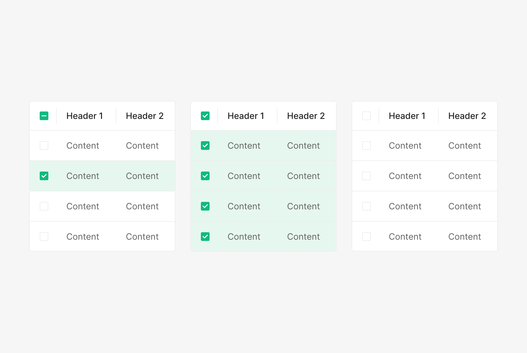
Indeterminate State
The Indeterminate state applies when sub-items mix Checked and Unchecked. The parent reads Checked when all sub-items are Checked, and Unchecked when all sub-items are Unchecked.
Radio Button
Radio Button is used when two or more options are mutually exclusive and only one can be selected. Note: one option must be selected by default.

Unselected / Selected
Anatomy

- 1. Radio Button
- 2. Label
Variants
State
Radio Button states split by Selected / Unselected into Default, Active, Disabled. Active behaves as Hover — user-facing rest states are Default and Disabled.
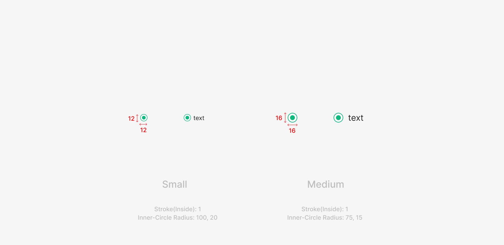
Size
Two sizes — Small and Medium. Size pairs with the Label's font size; default is 16 × 16. Small is allowed when hierarchy between elements requires it.
Table of Figma Properties
Spacing
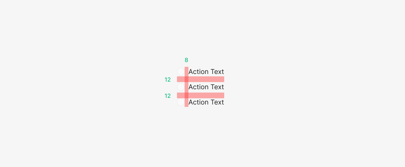
Control and Label Spacing
Radio Button uses 8px between the control icon and the label. List items maintain 12px between options to avoid mis-selection. The Radio icon defaults to the left of the label; right placement is allowed for layout or spacing reasons.
Usecase
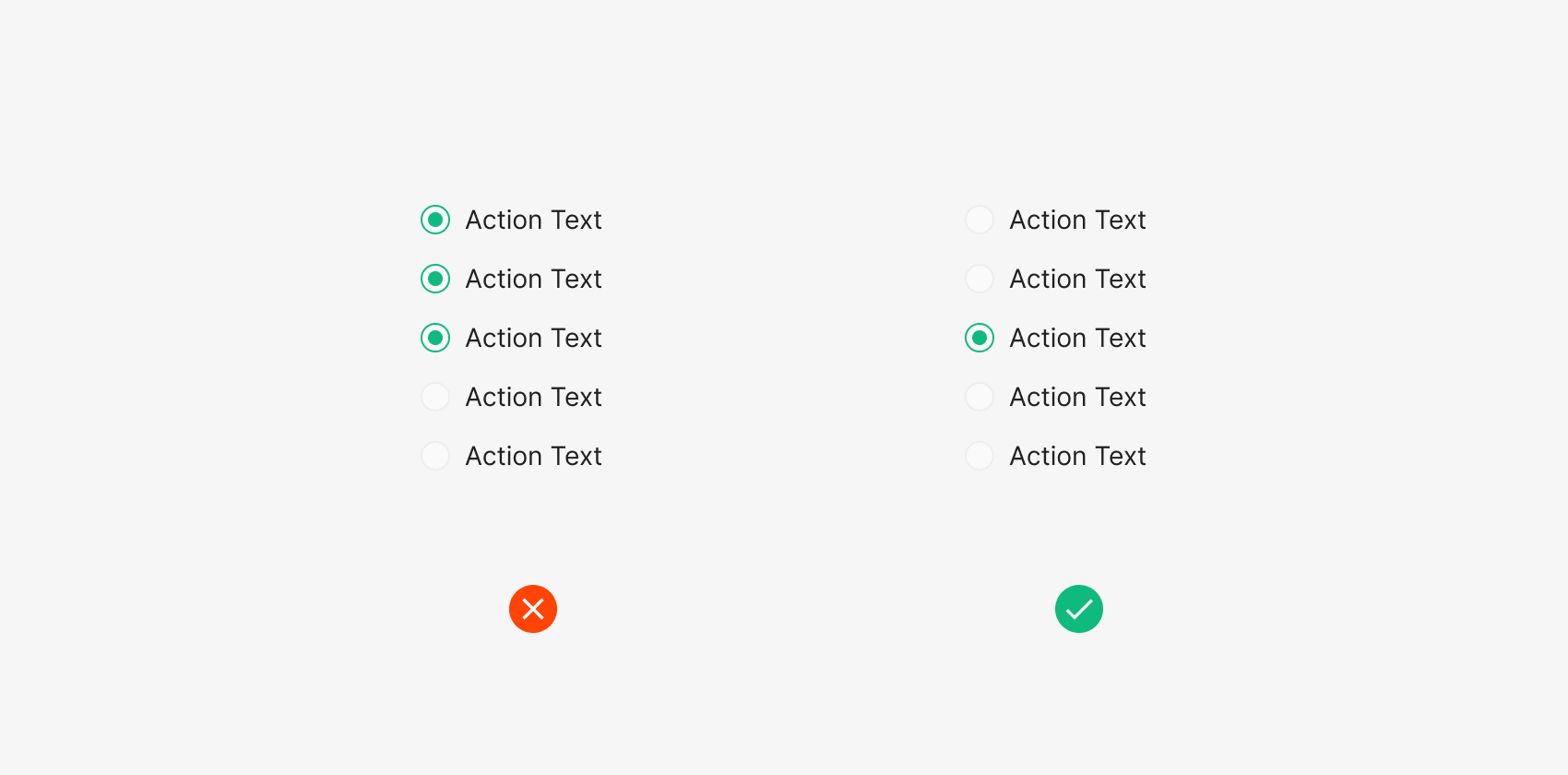
Select Exactly One
Within a single Radio Button Group, only one Radio Button can be in the Selection (Checked) state.
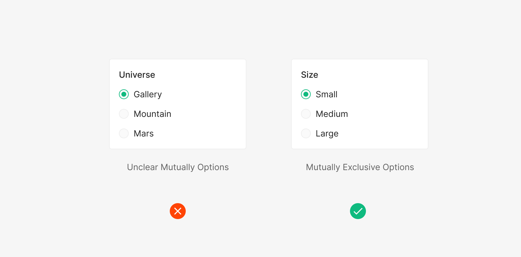
Mutually Exclusive Options
Radio Buttons present mutually exclusive options for single-select. The label content inside the Radio Button item list should also be mutually exclusive.
Toggle-Switch
Toggle Switch is used when binary, mutually exclusive options require an immediate effect change.

Unchecked / Checked
Anatomy

- 1. Track
- 2. Thumb
Variants
State
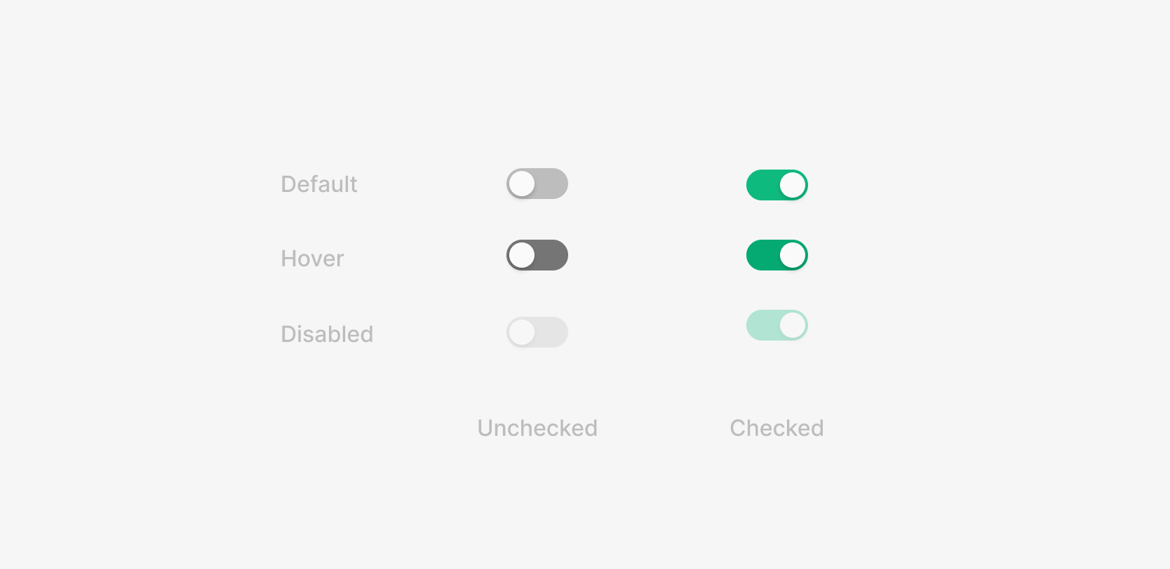
Three states — Default, Active, Disabled — each holding Checked / Unchecked (On/Off).
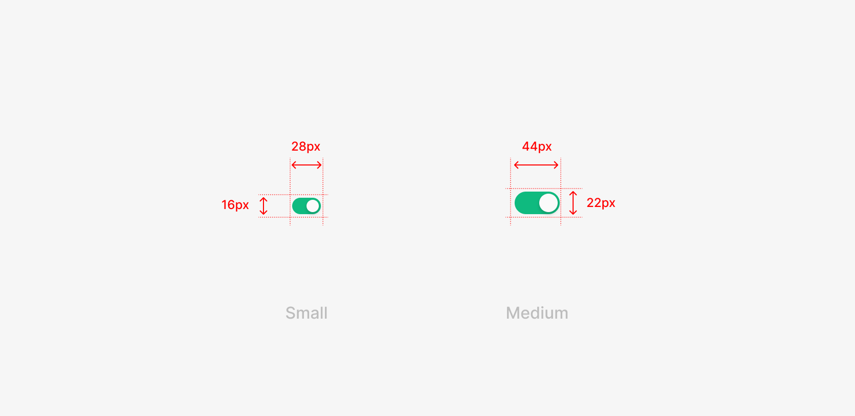
Size
Two sizes — Small and Medium — chosen by the Label's hierarchy and size. Even with the same Label font size, hierarchy may shift the Toggle size.
Table of Figma Properties
Spacing
Control and Label Spacing
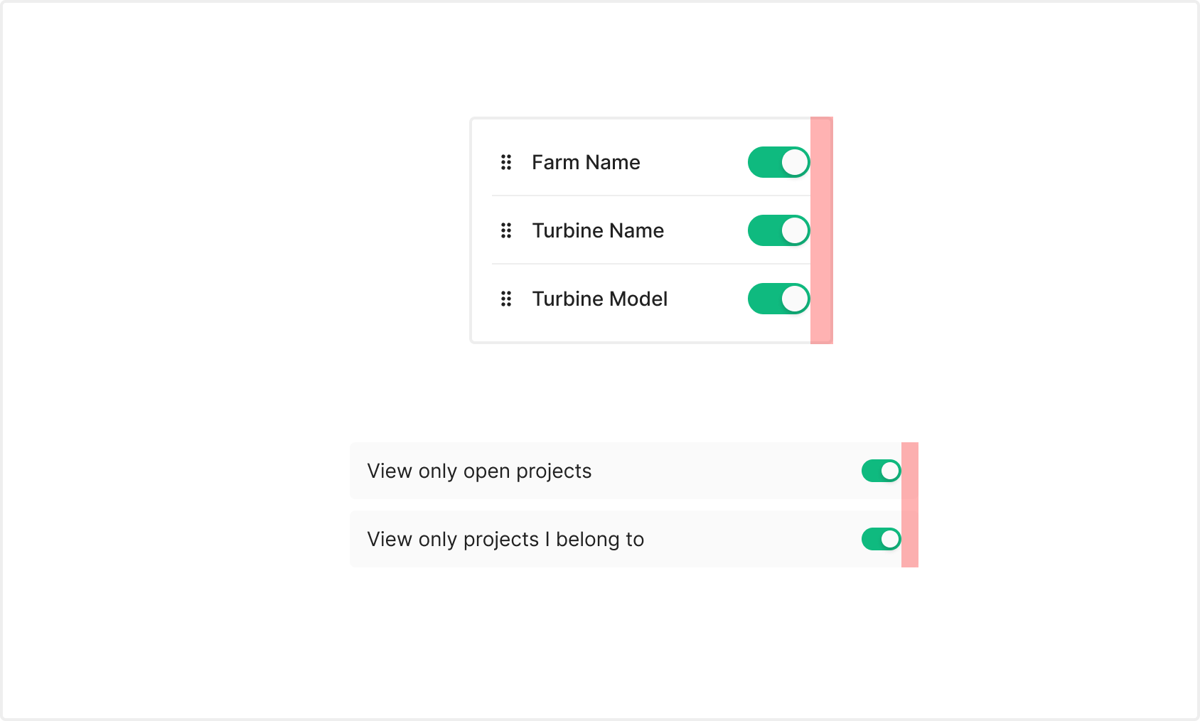
Typically placed at the right of a list. Right padding shifts by the container's area and size — Medium uses 16px, Small uses 12px.
Usecase
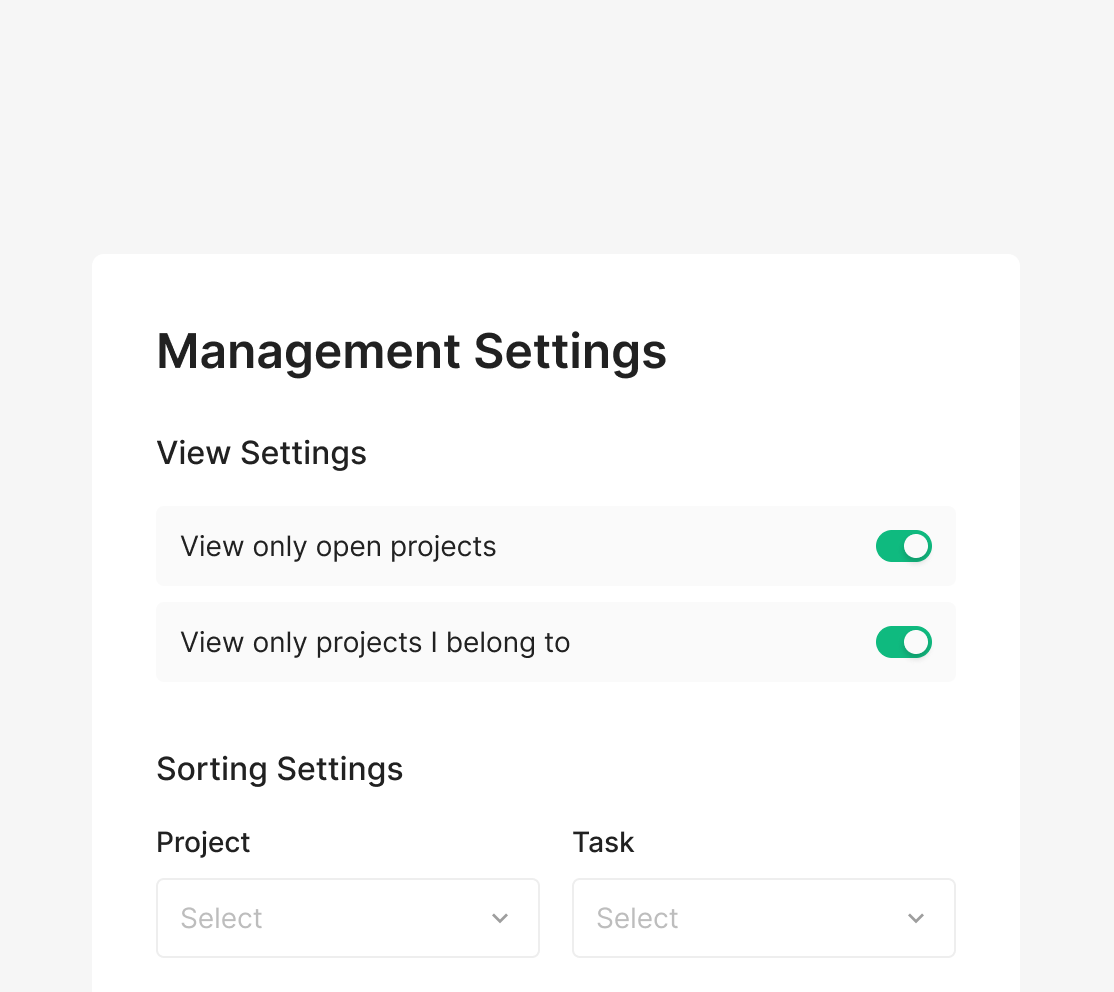
Management View Settings
Toggle each setting on or off within View Settings.
.png)
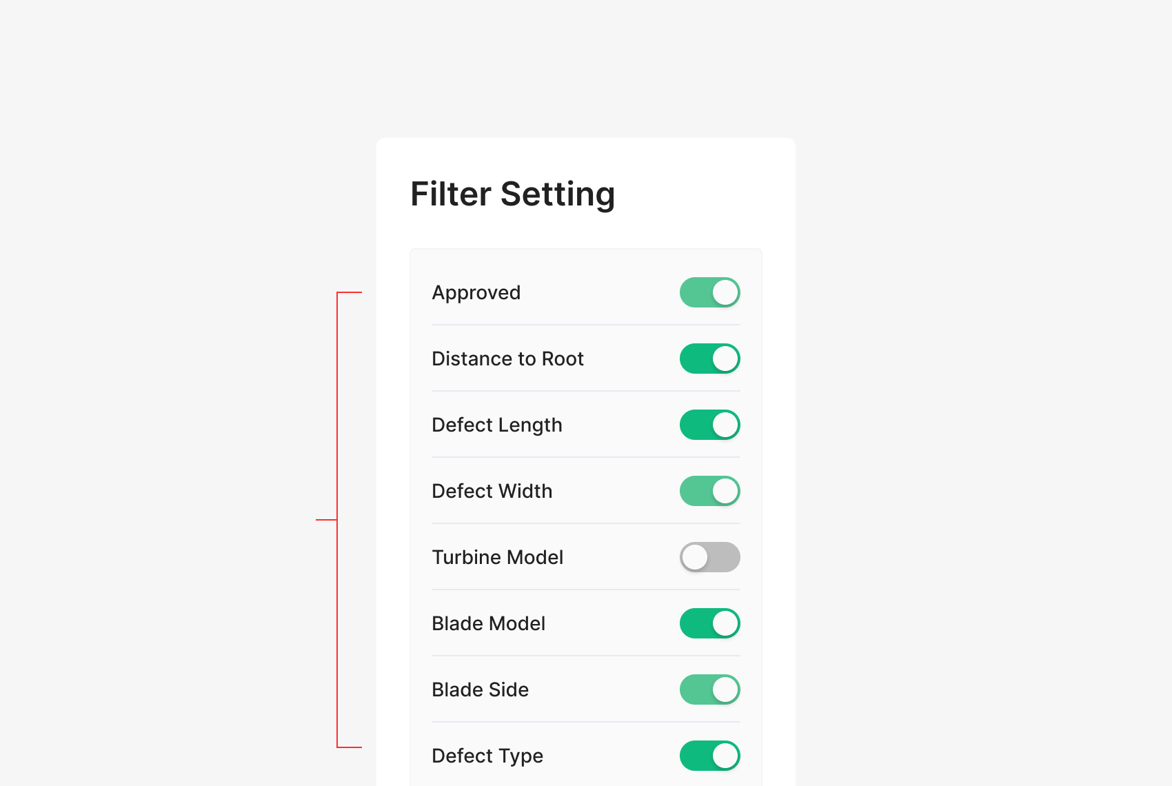
Filter Settings (Statistics)
Toggle table columns on or off, per item.
.png)
Table Settings (Defects)
Toggle table columns on or off, per item.
Toggle Switch with Label
Toggles typically pair with a label describing their role. Placement (left or right) depends on the surrounding container — right placement is the convention.
Toggle Switch Group
Toggle Switches handle On/Off for their target area. When grouped, the surrounding items belong to the same hierarchy as a coherent set.