Slider
Slider is the visual control for setting a value by moving along a horizontal track.
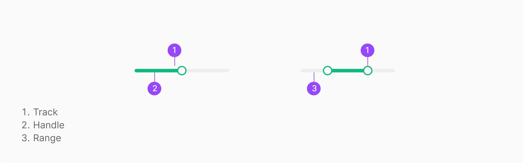
Anatomy
Usage
Slider is used to define an approximate boundary — not a precise quantitative value. Two range-setting modes are supported.
Components
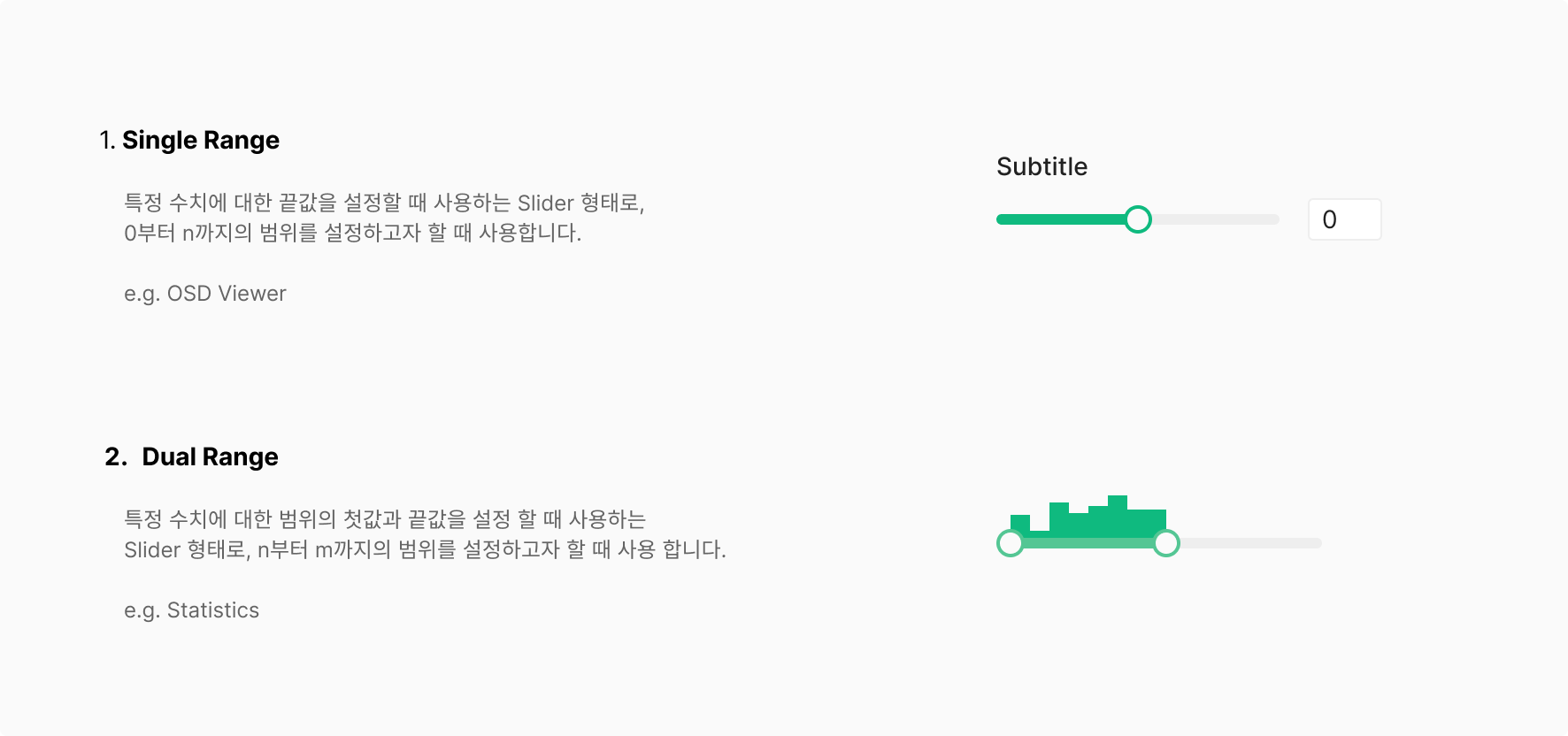
Slider splits by range-setting mode into Single Range and Dual Range. Additional elements may compose alongside based on use case.
1. Single Value Slider
The most common type — the low end of the range is fixed at 0, and the user sets a one-direction value. Typically used in Image Correction filters with a Numerical Input and Label.

2. Range Slider
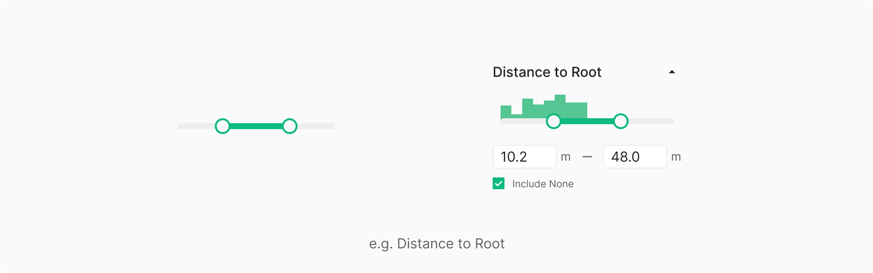
Lets the user set both the low and high ends of the range. Typically used in Distance to Root filters with a Numerical Input and Label.
3. Pop-up Slider
For space-constrained contexts where the Slider surfaces inside a separate Pop-up. In Wind, used for the Rotate action in Blade View. The Pop-up follows the same placement rules as a Dropdown Menu. The Pop-up surfaces toward the related content by default; when the conditions are equal, it aligns to the left.

State
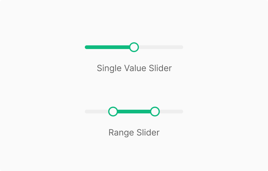
Slider splits by range-setting mode into Single Value Slider and Range Slider. Additional elements may compose alongside based on use case.
Table of Figma Properties — Slider / Handle
Table of Figma Properties — Slider
User Case
State
Slider splits into Single Value Slider (a fixed reference point of 0 with one-direction value) and Range Slider (both low and high values configurable). Additional elements like Input may compose alongside based on use case.
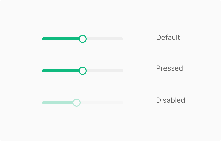
Handle
Handle has 3 states — Default, Pressed, Disabled — and no Hover. Disabled isn't applied per-handle; it follows the Slider's state.