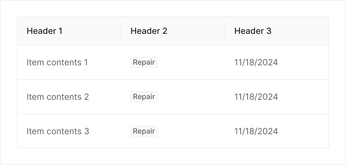
Table
Table is a grid-based visualization of rows and columns. By ordering data, it helps users scan large volumes quickly and surface patterns and insights.
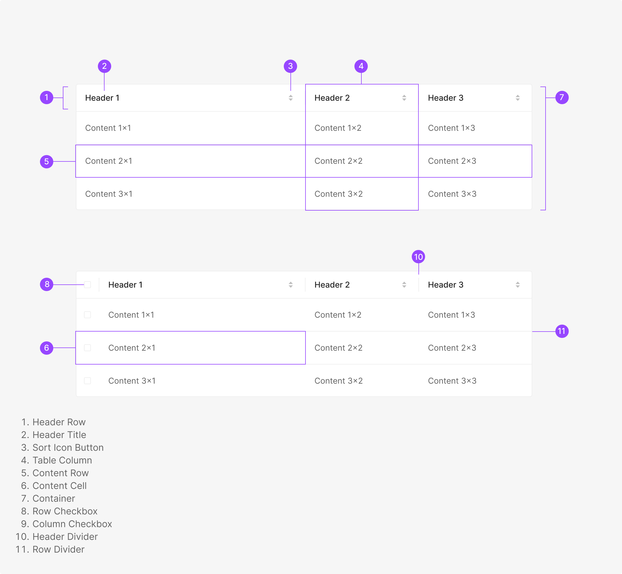
Anatomy
Usage
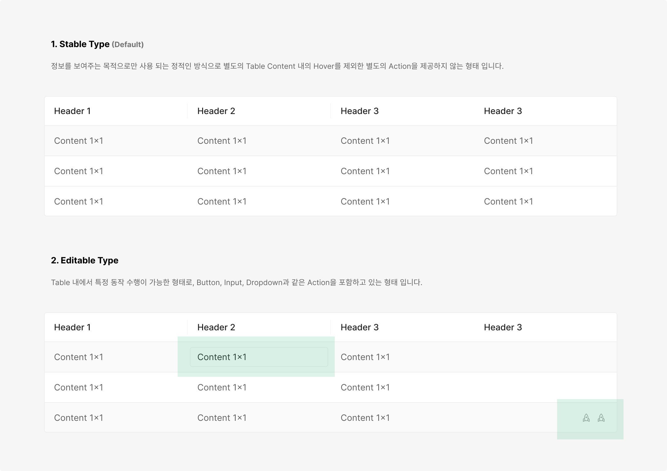
Tables split into two by functional behavior — Stable Type and Editable Type.
Tables also split into two by container behavior — Fixed Type and Flexible Type.
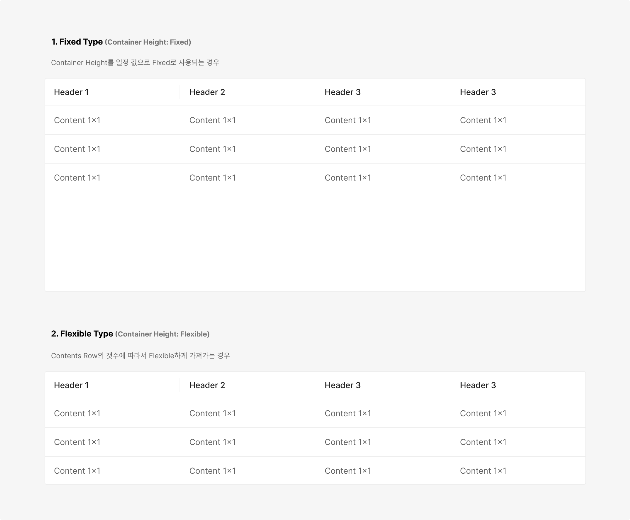
Table Style
Table style varies by data type. Wind and Wind Admin use separate styles for visual distinction; aside from color, the same visualization rules apply across both.
Wind Page Header
Wind Admin Page Header
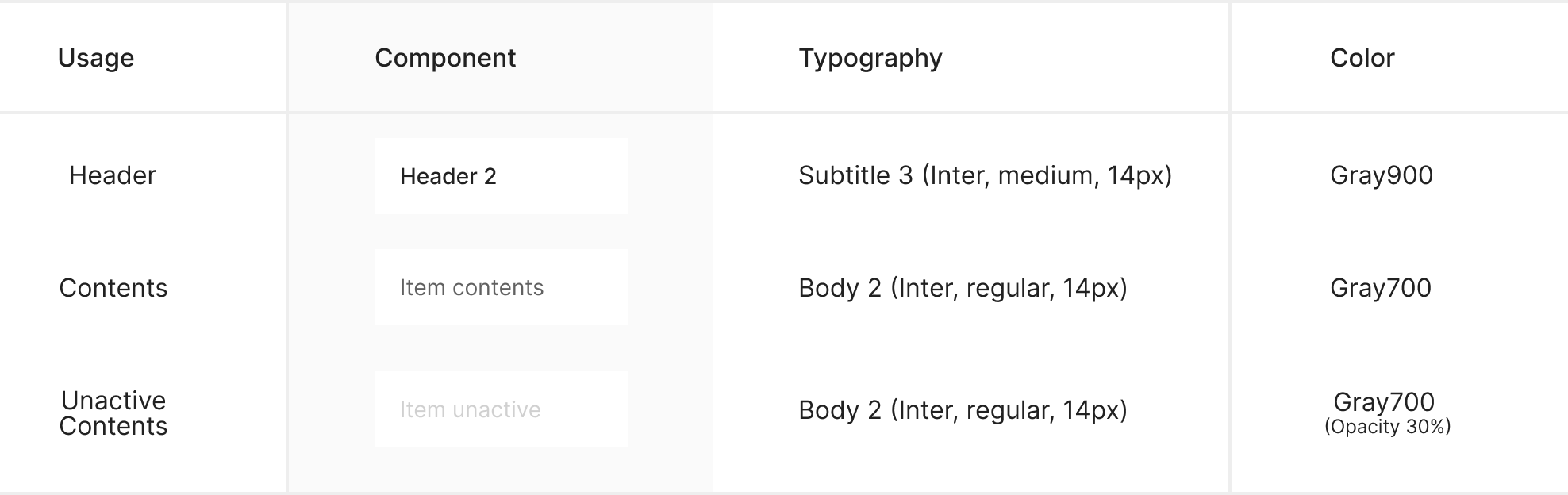
Typography
Border
Three border categories — an Outline that separates the table from its background, a Horizontal Line that separates rows, and a Vertical Line that separates headers within the Header Row.
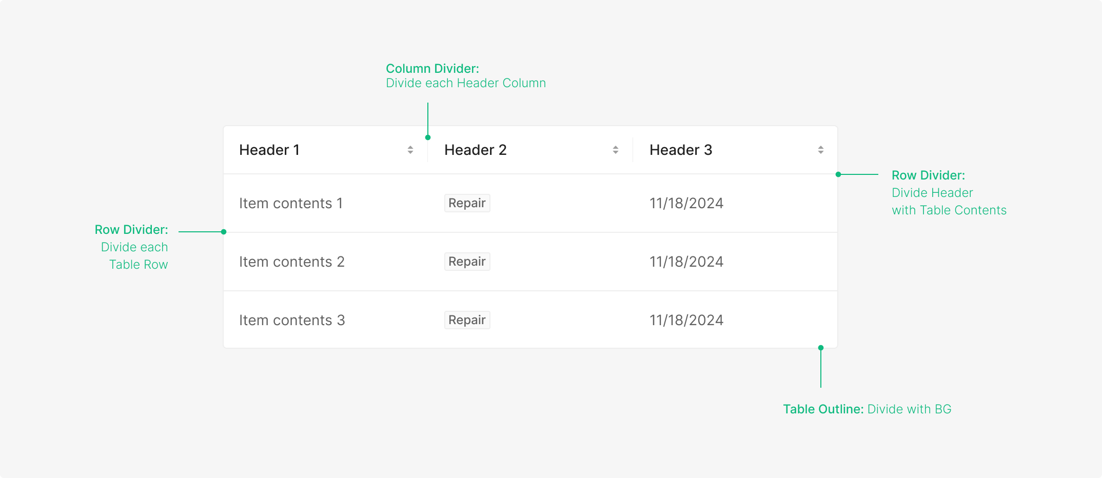
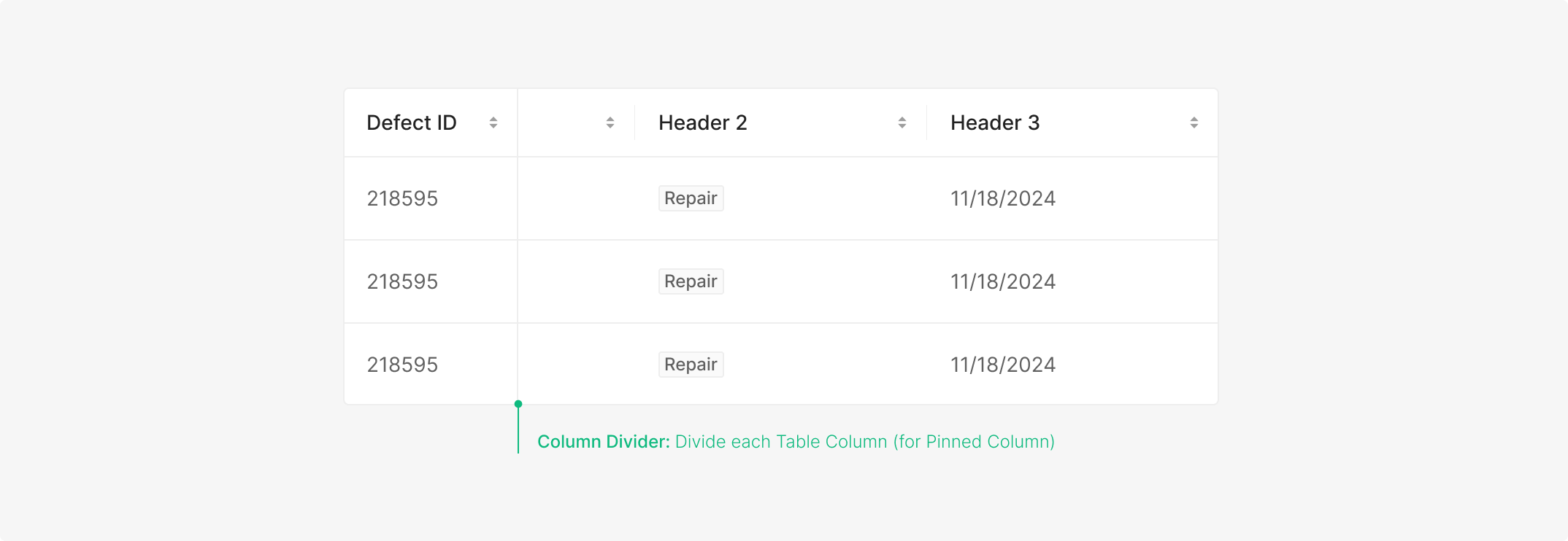
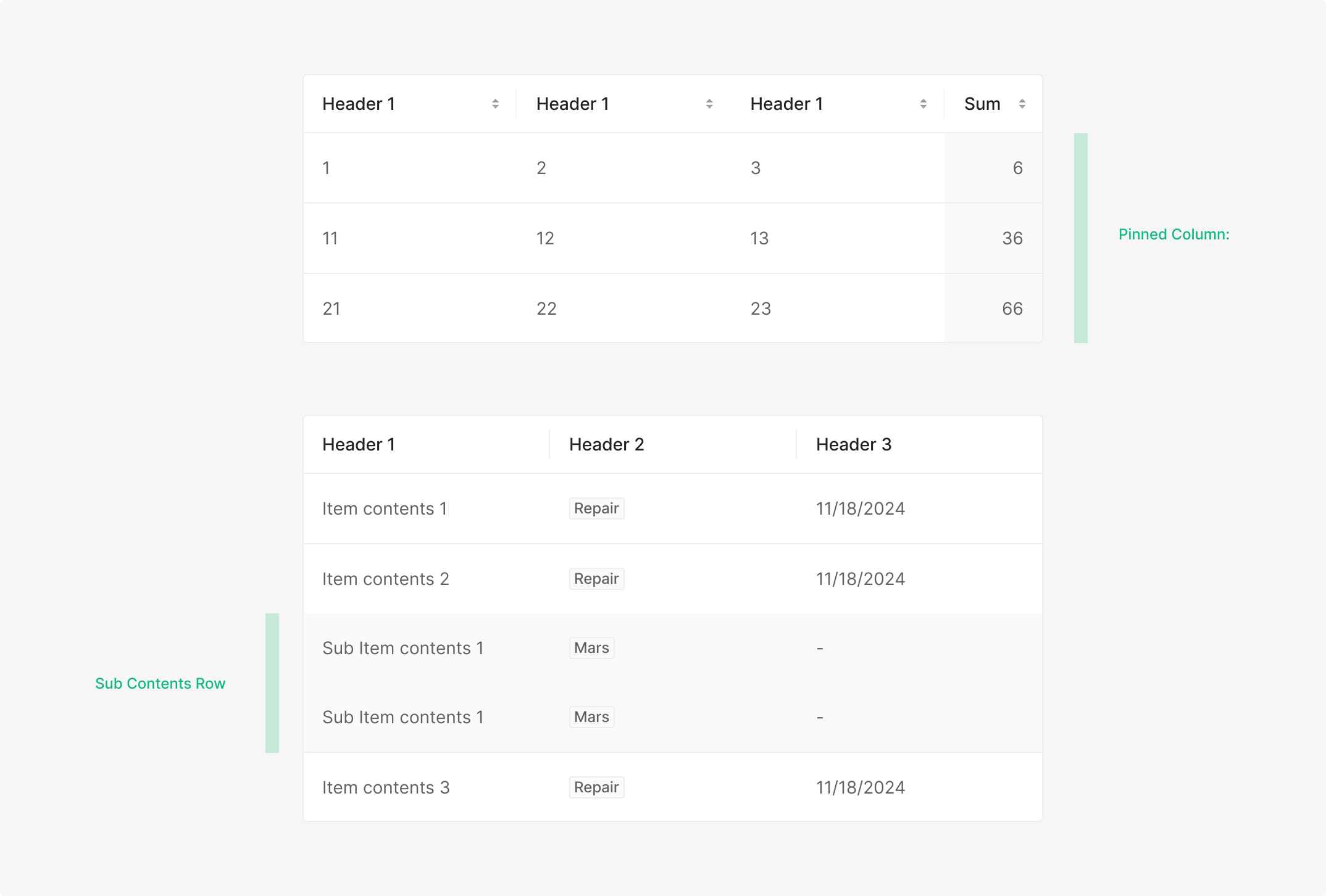
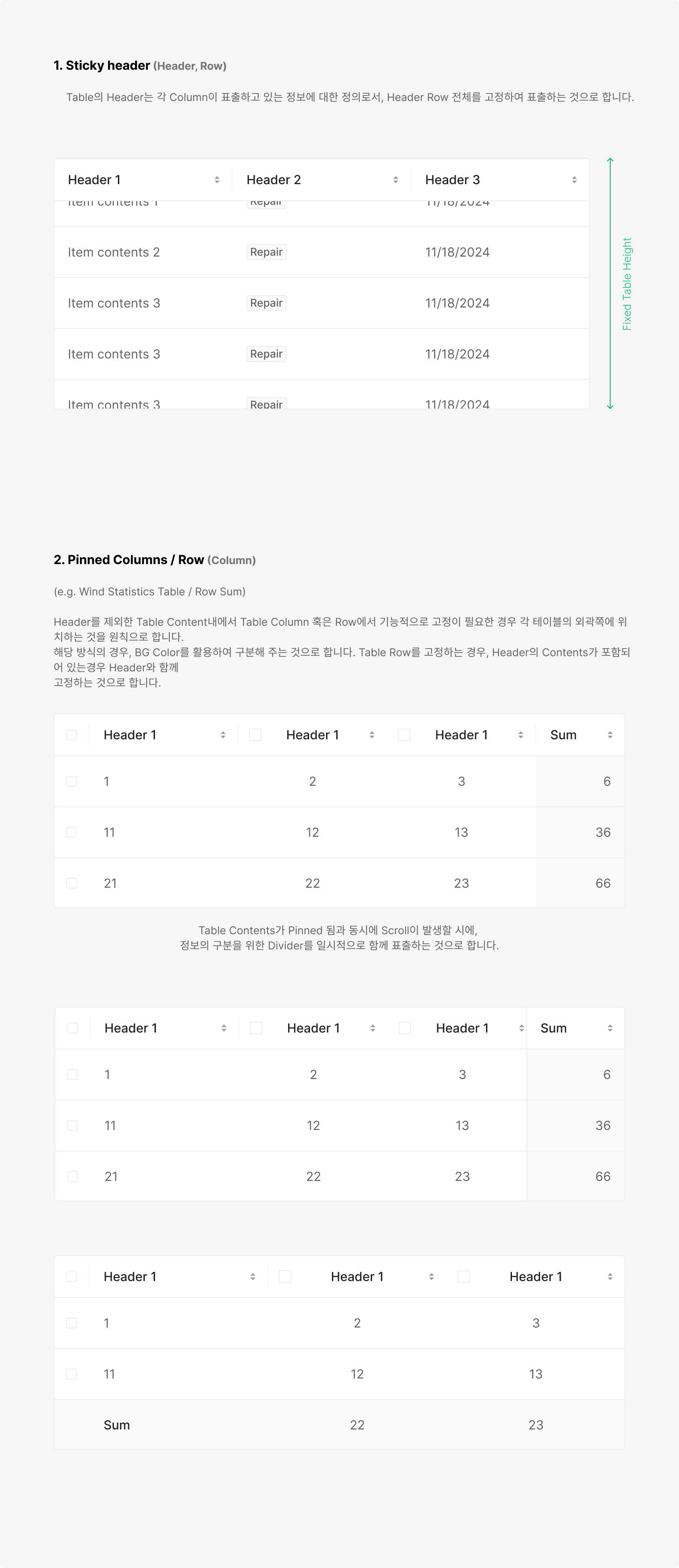
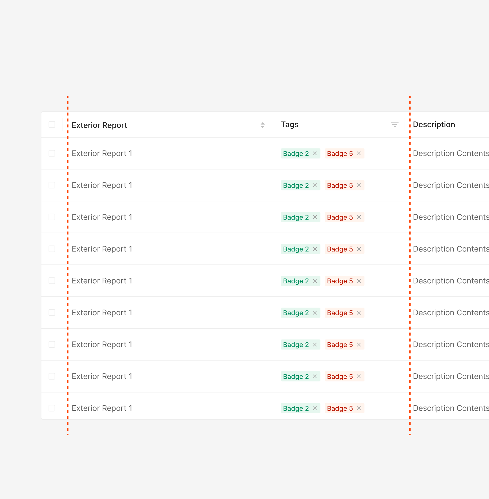
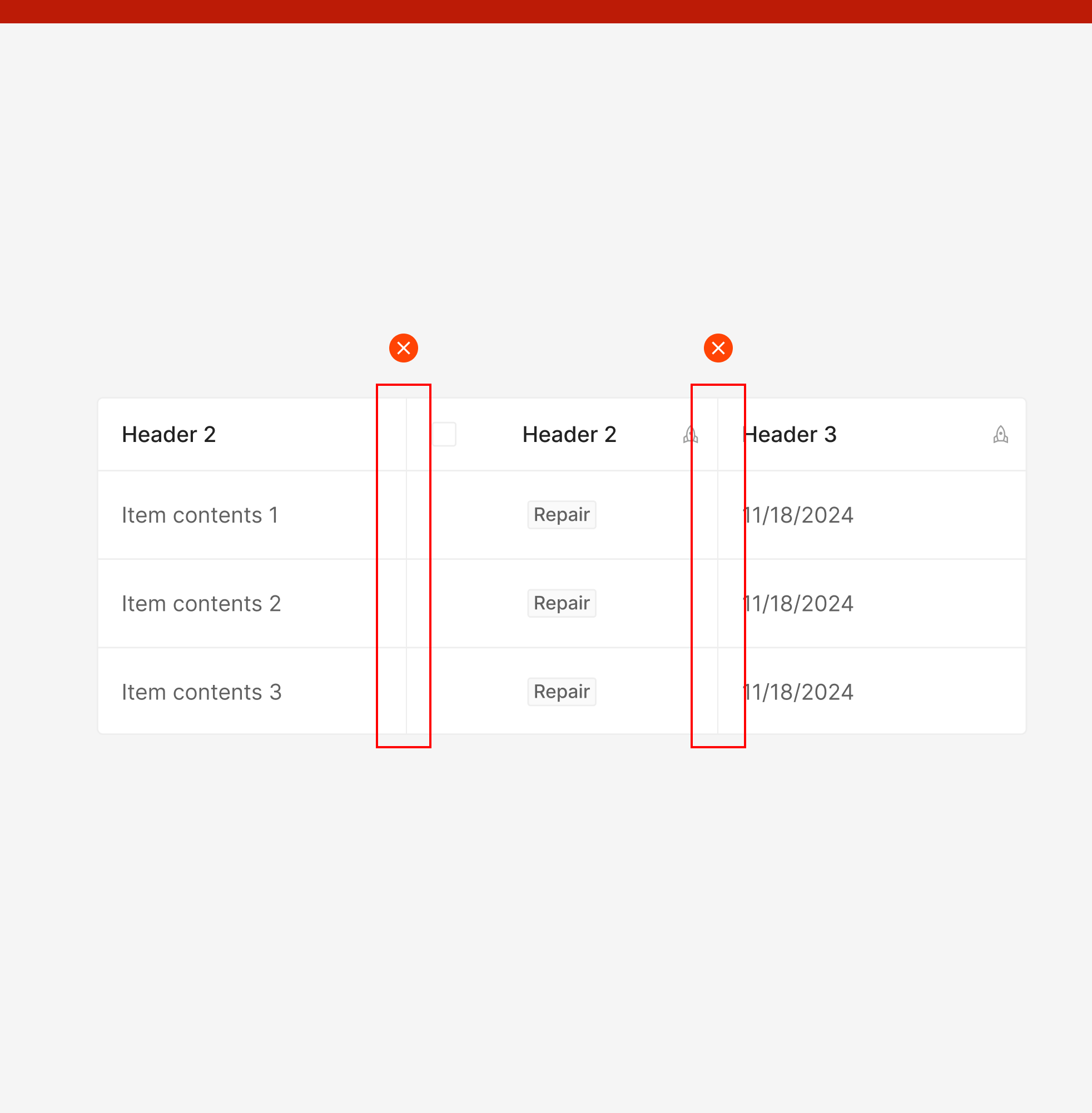
As column count grows, the table scrolls horizontally. To keep key information visible, a Vertical Divider can pin priority columns on the left.
Visual Cue
Used for expanded item states or for marking Pinned Column / Row. Zebra Stripe.
Content Data Alignment
Header and content alignment varies by data type and position within the table.
Left Align
Textual data and component data inside content cells (e.g., Avatar, Badge) align left. Numerical data defaults to right-align, but when a single column mixes content types, numerical data follows textual data to the left as a unified rule.
Right Align
Numerical data aligns right to make numeric comparison easier. Component data — such as Button Icons that surface on hover at the right edge of a column — also aligns right.
Middle Align
Textual, component, and numerical data all align center when the header arrangement matches Type 3, Selection with Filter.
Interaction
Table supports four interaction categories. They aren't mutually exclusive — combinations are common.
Sorting (Header)
Sorting toggles column order via the Sorter Button Icon bound to each header. Used alongside the Header Title, the icon-sort flow exposes three states — initial, ascending, descending.
.png)
Maintain Column or Row when Scrolling
Table contents scroll rather than paginate by default. When specific information is critical to interpreting the data, fix the relevant column or row in place.
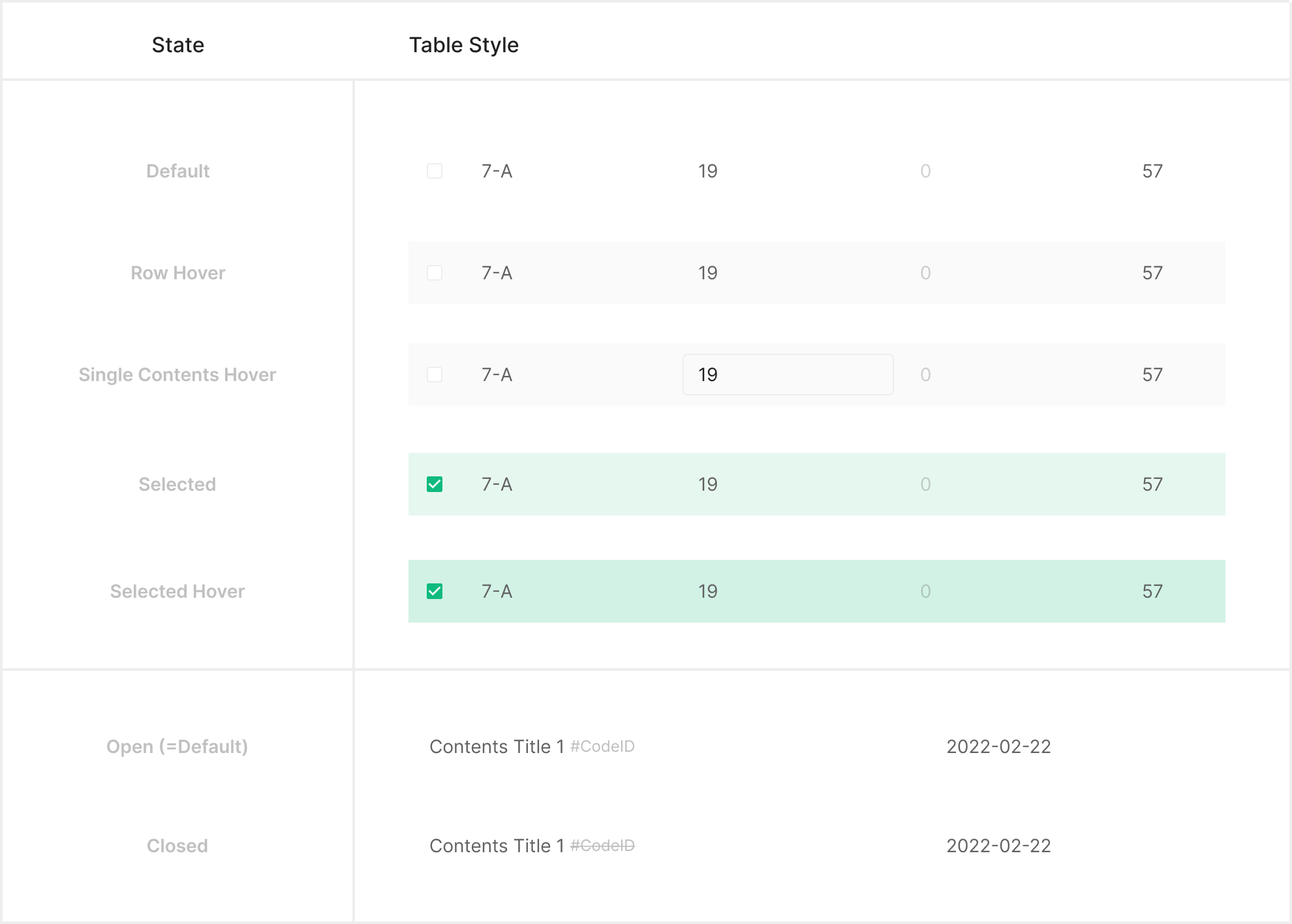
State
Table state splits into three categories — Main, Pinned, and Empty — each driven by a distinct feedback path.
Main Table Contents State
Sub Table Contents State
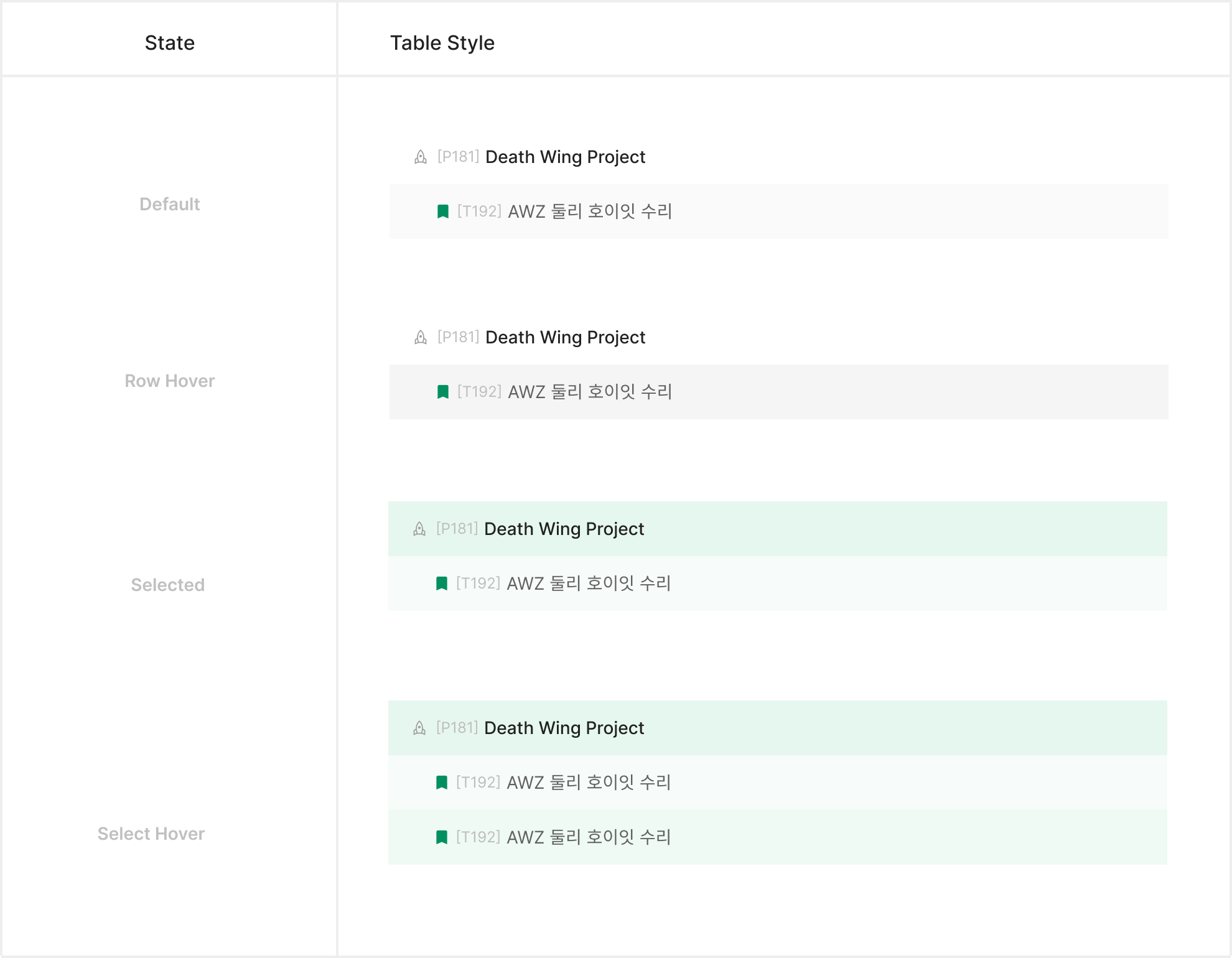
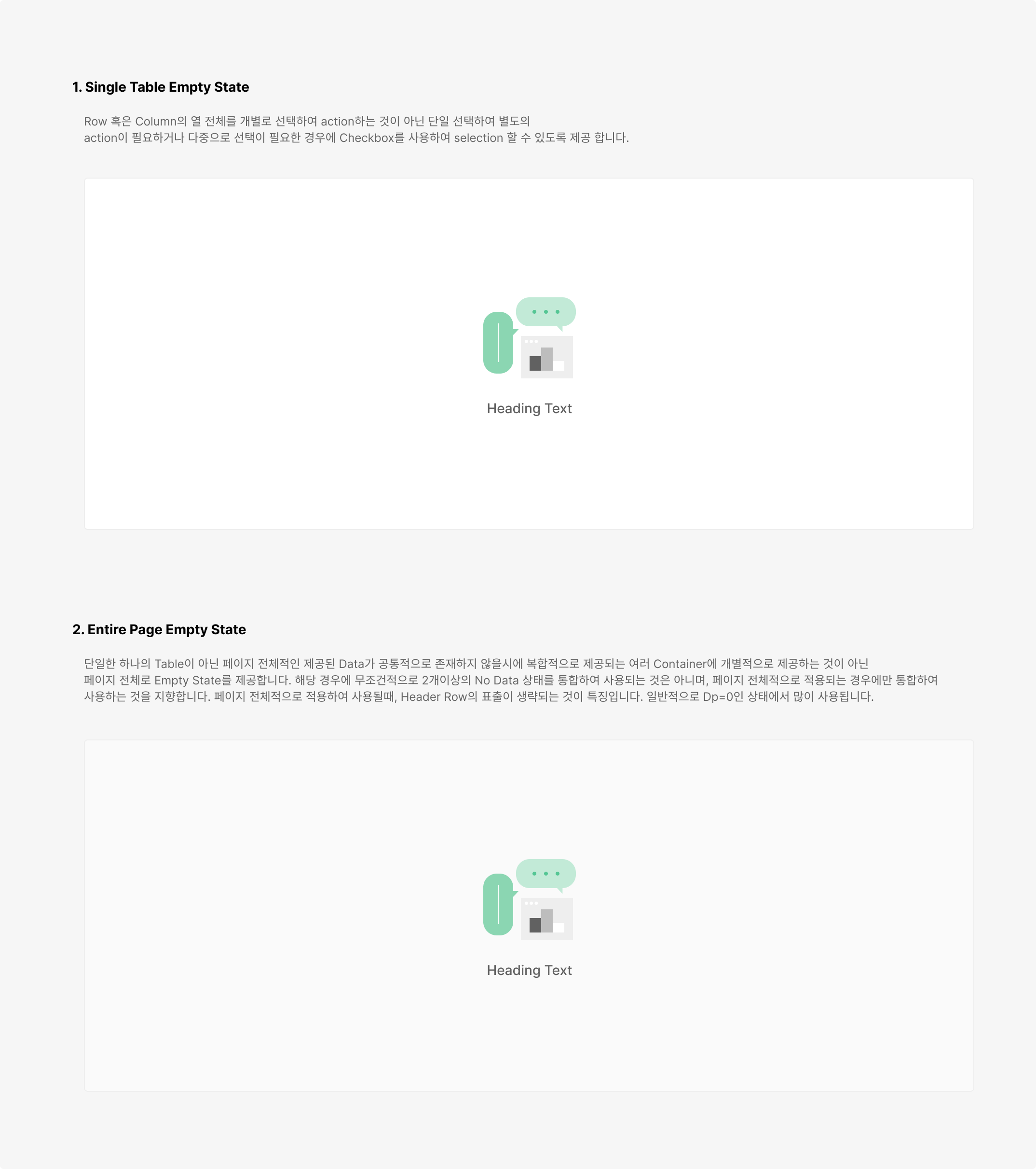
Table Empty State
When data is absent, Empty State signals that the table has no contents — or that data is still being prepared. Apply Empty State based on the table's purpose; include illustration and CTA freely when needed.
Sizing
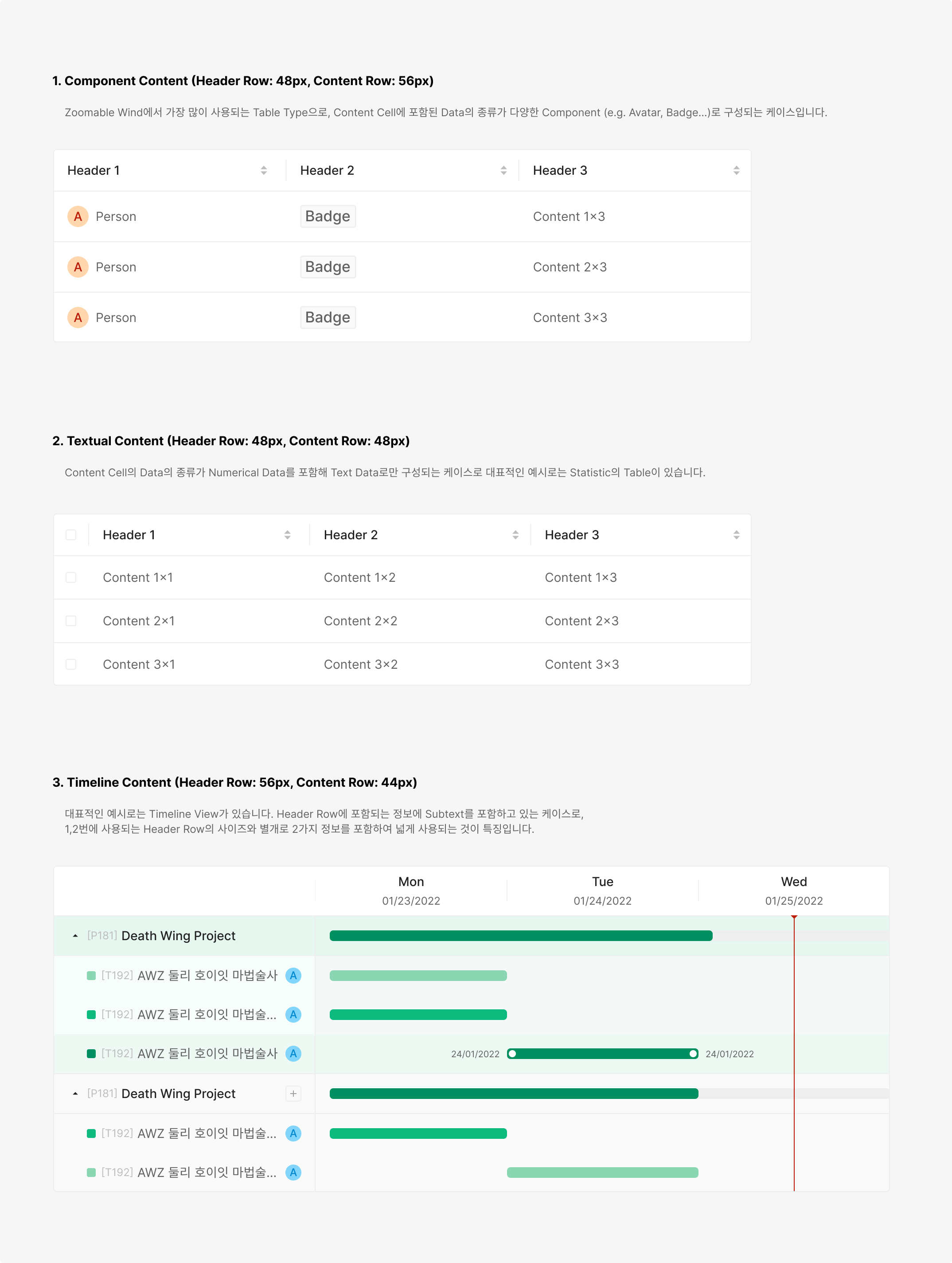
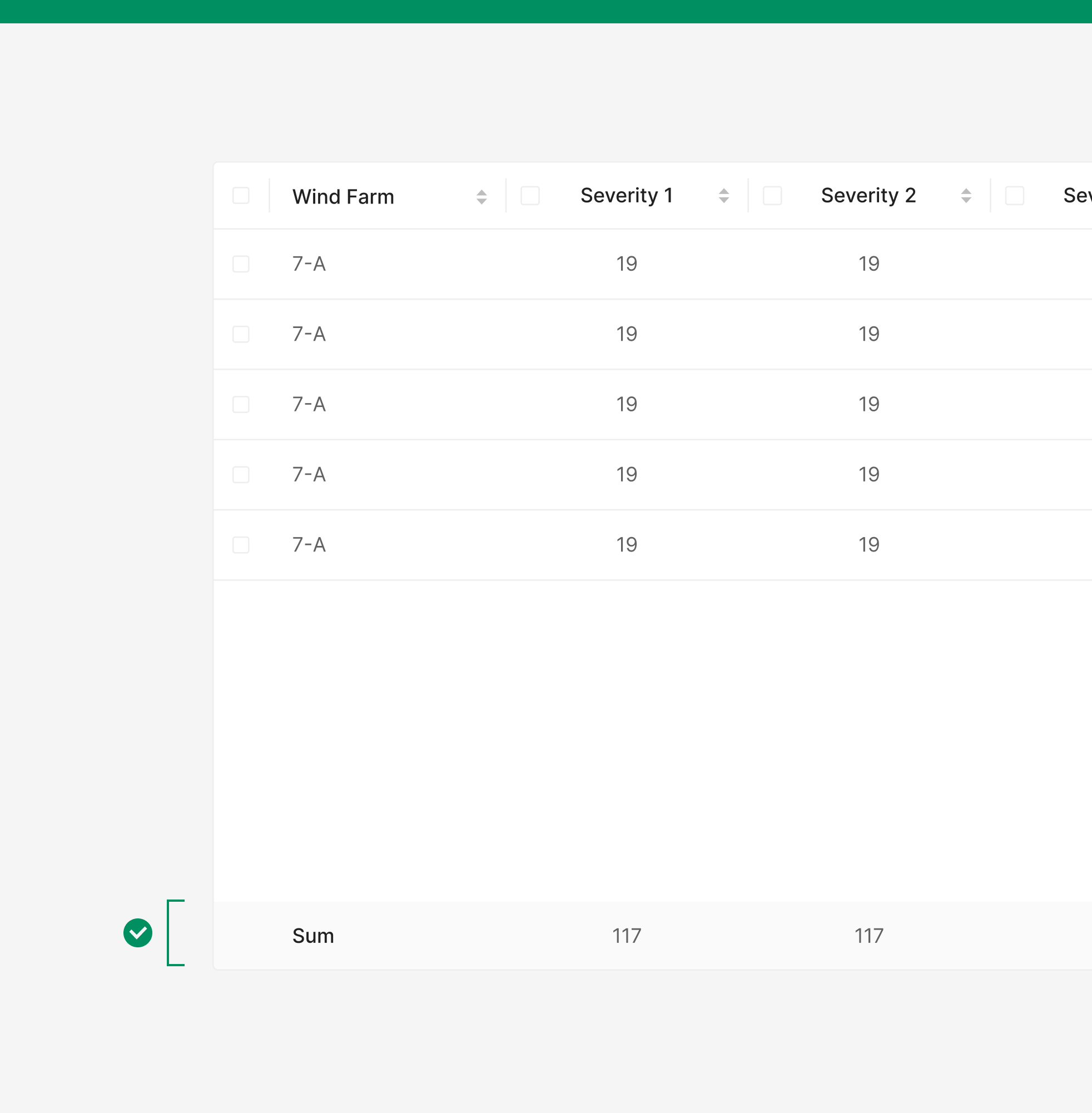
Each column carries Header Row and Content Row dimensions. Row heights use four defaults — 32px, 40px, 48px, 56px — picked by data density and intent. Column widths distribute by content type and hierarchy. Minimum width, cell padding (16px left/right), and inner spacing follow the same rules across all cells to keep grid density readable. Column height should match the size of the components inside its contents.
Header Style
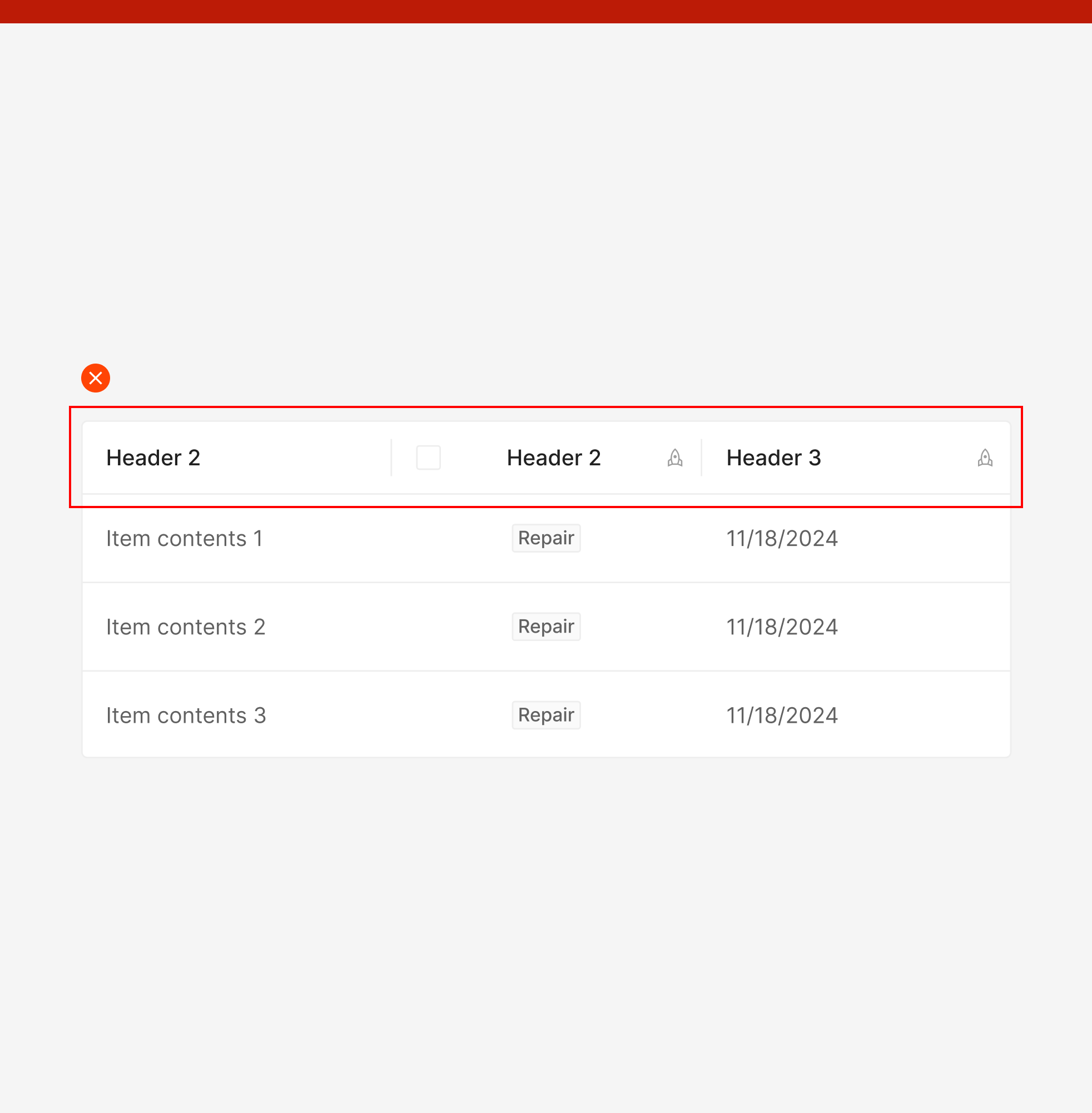
Table Header clarifies each column's meaning and pairs with auxiliary actions like selection and sorting as needed. Built on Text Label Type by default, it can extend to include Filter or Selection elements based on the table's purpose and interaction depth.
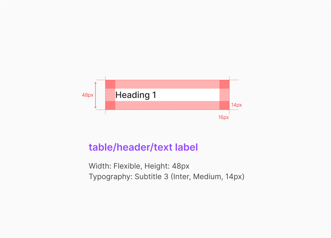
1. Text Label Type
The most basic header form, conveying column names or data attributes through text. Suitable for read-focused tables that don't need additional interactions like sorting or selection.
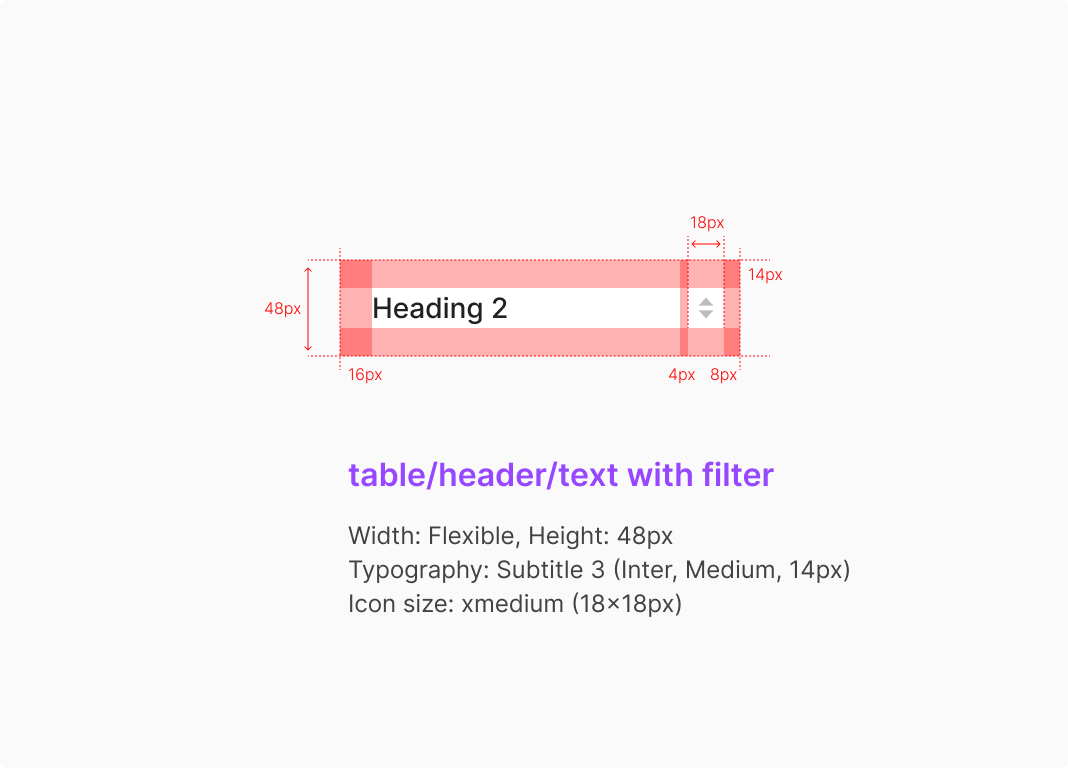
2. Text with Filter Type
A text label paired with secondary actions like sort or filter. Users adjust data order and conditions directly from the header.
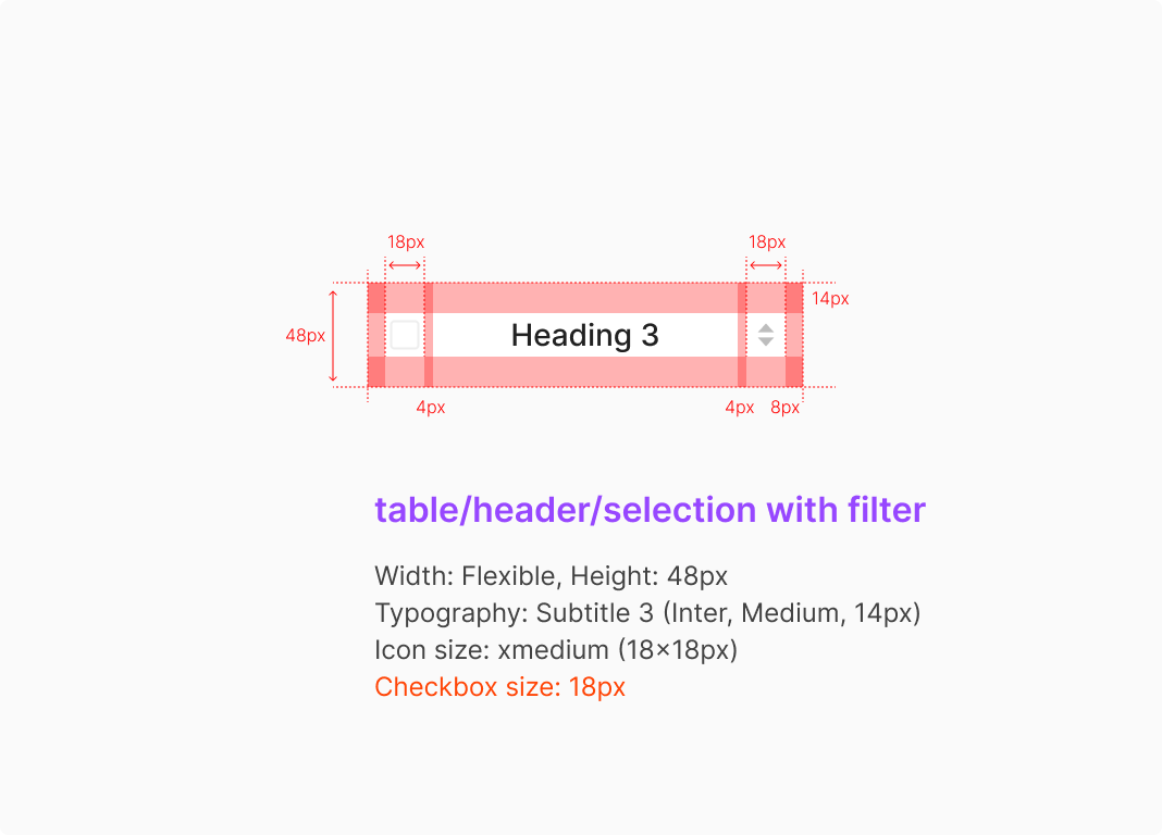
3. Selection with Filter Type
Combines selection and filter together. Suitable for multi-select tables that need both select-all and column-level sort/filter.
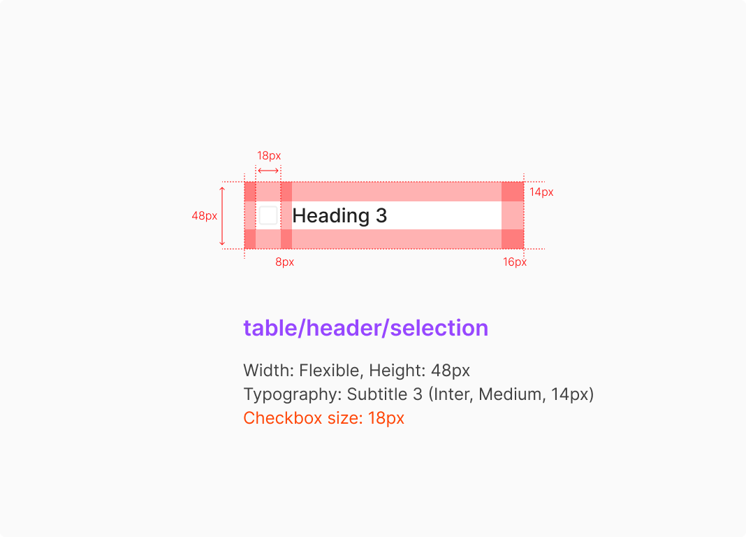
4. Selection Type
Header carrying only a Selection Control, used to drive row selection. Typically pairs with checkbox-based multi-select tables to control the select-all state.
Table Contents Style
Cell content padding defaults to 16px left/right; in Editable state, it shifts to 4px left/right relative to the Dropdown or Input container.
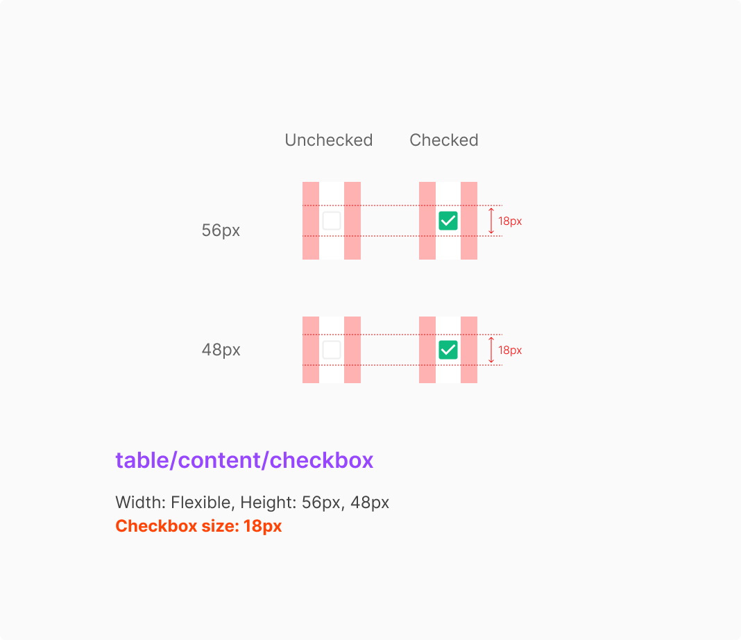
1. Checkbox Type
Checkbox columns use 12px left/right padding. Checkbox Type sits at the leftmost position of the table row by convention.
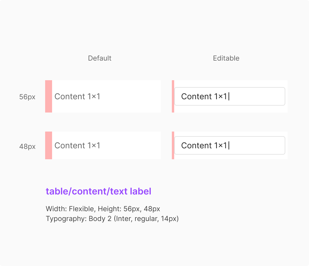
2. Text Label Type
Text Label Type is the most basic content form for text-based data. In Default state it conveys information stably; in Editable state it extends to an Input that supports direct editing.
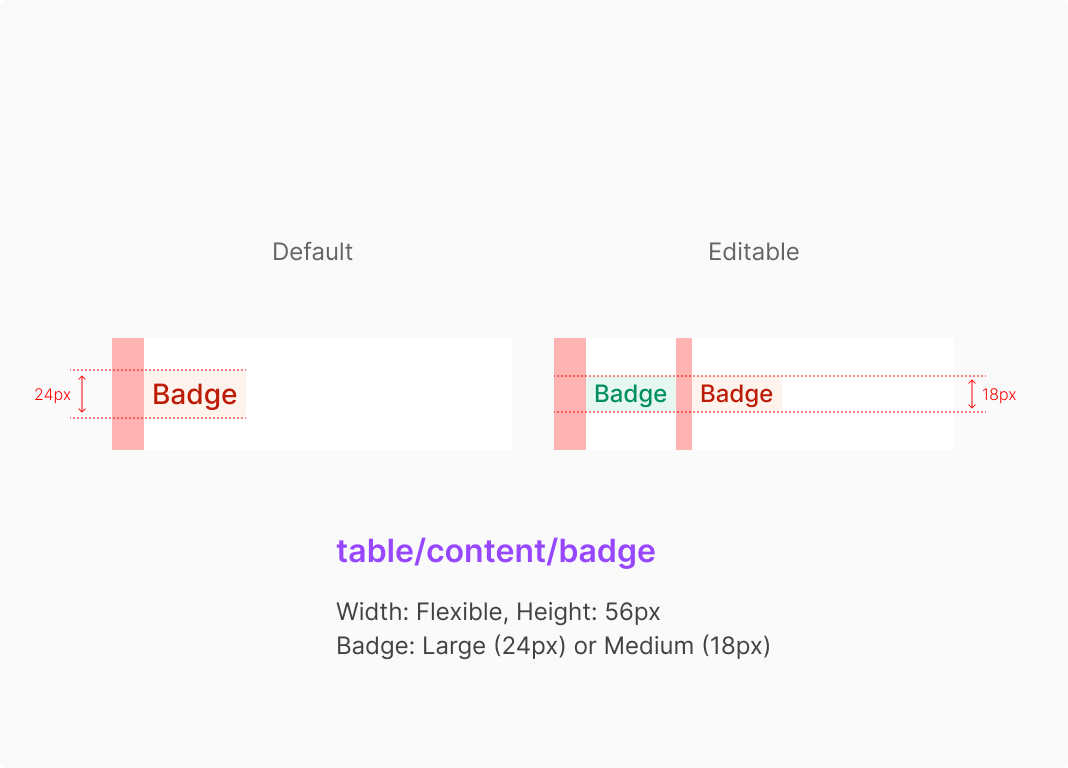
3. Badge Type
When a cell contains a Badge, the sizing differs between editable cases (modifiable within the table) and stable cases (read-only).
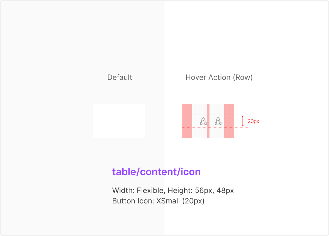
4. Hover Action Icon Type
Button Icons inside a cell sit at the right edge of the row. Available for both 56px and 48px row heights. Minimum width is defined by the Button Icon Group with 16px left/right padding.
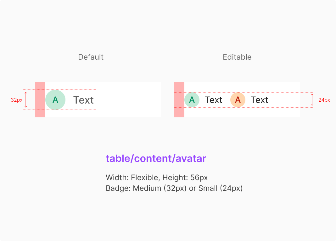
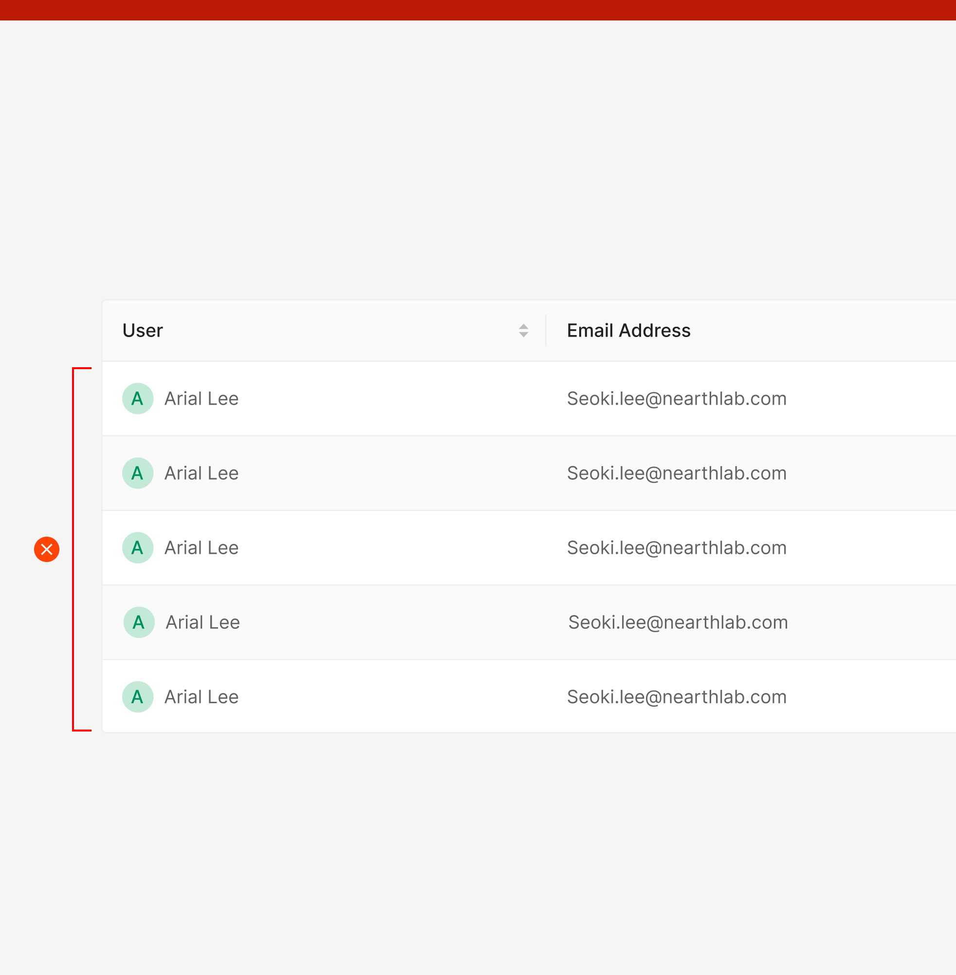
5. Avatar Type
Avatar Type pairs an Avatar with text to represent identifiable entities — users or objects. Suitable for data that needs quick recognition, like names, owners, or assignees.
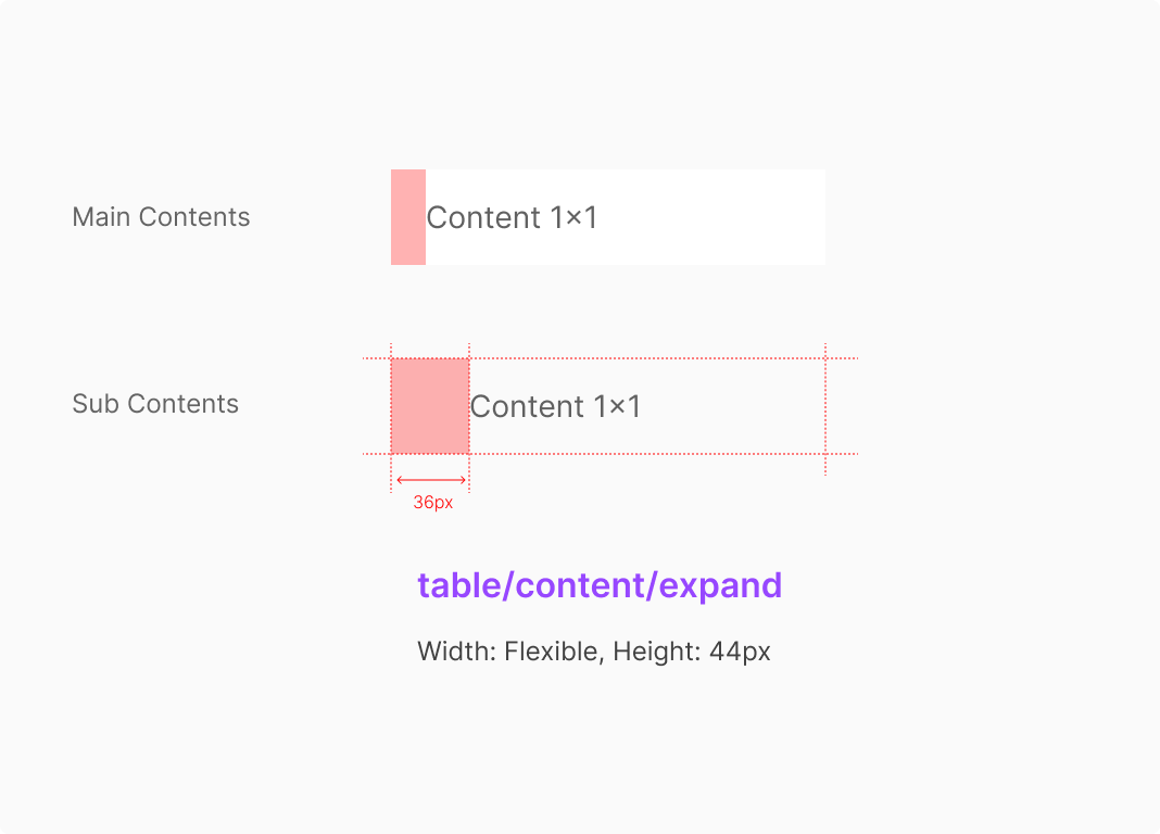
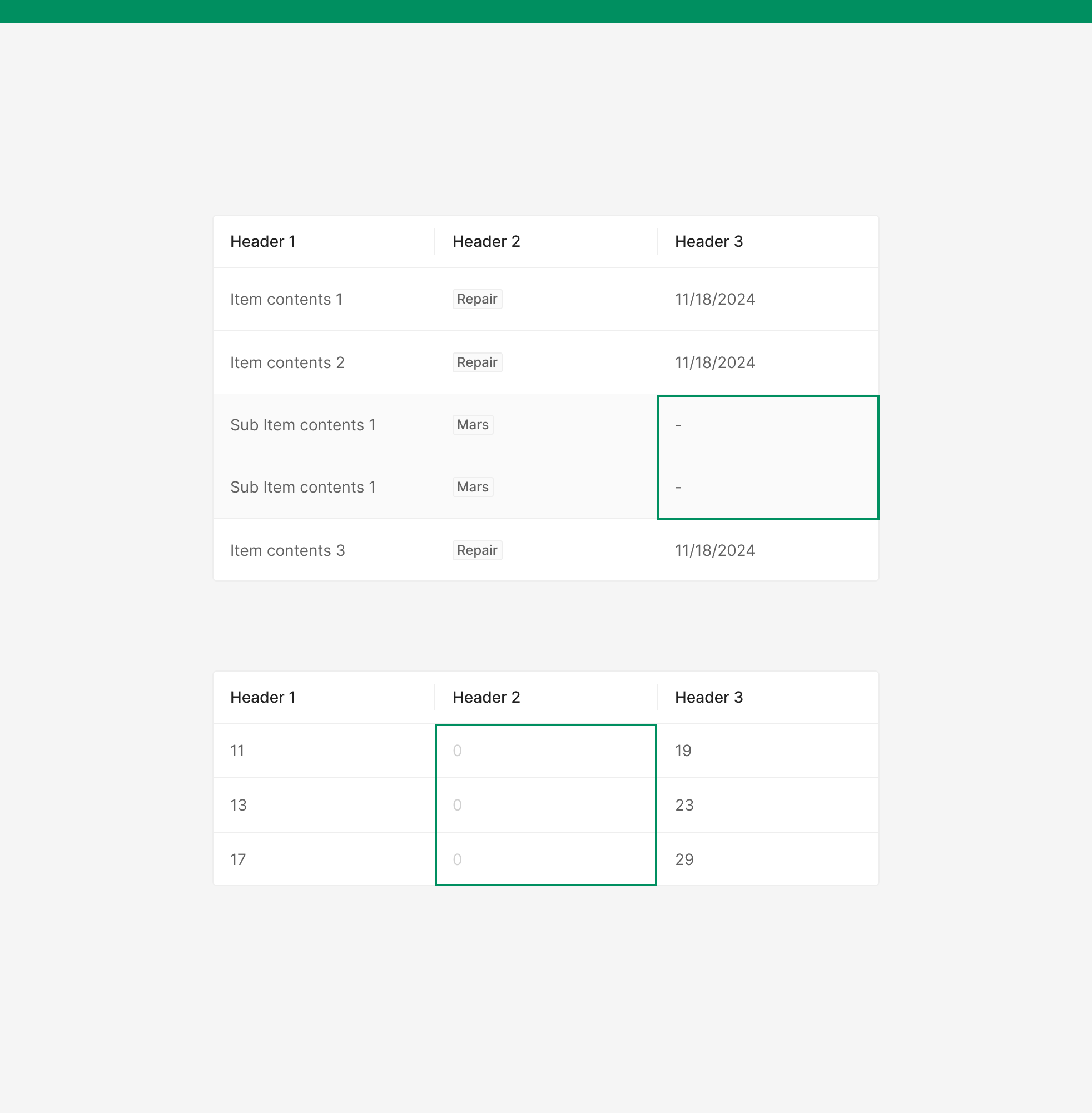
6. Expand Type
Expand Type displays main and sub-information together to convey hierarchy and relationships. Used when supplementary descriptions are needed, with structural distinction between Main and Sub aiding comprehension.
Usage Guidelines
Do: Categorize text by repetition pattern.
Textual data should be repetitive; numerical data should reflect numeric quantities. When mixed, split numerical data into its own column whenever feasible.
Don't: Avoid Zebra Stripes.
Zoomable Design System's Table doesn't use Zebra Stripes. Row separation is handled through Dividers by default.
Do: Vary expression by data state.
When data is absent and the cell isn't editable, use gray 100. Country info follows the same rule.
Don't: Avoid mixing multiple header types.
Size Separation Type works best with limited header variety — keep it under two. When headers share the same type, use a single header style rather than visually splitting them for the reader.
Do: Visually separate data with different contextual meaning.
Different data sources within the same hierarchy should share row size and structure — but remain visually distinguishable.
Don't: Avoid Vertical Lines in content rows.
Vertical Lines separating columns are only applied to the Table Header in Wind Design System — not in content rows.