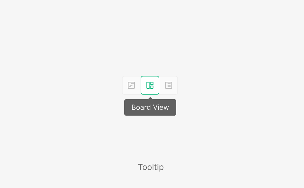
Tooltip
Tooltip is a message component that delivers a brief, intuitive description for a specific UI element. It typically explains unfamiliar features, icon buttons, or contextual nuance — helping users quickly understand what they're looking at and what it does. By default, Tooltip is meant to deliver a short description tied directly to its target element. Keep the surfaced information as concise as possible. When more — or multi-part — information is needed, use Popup Tip instead to differentiate the information density and interaction model.
Anatomy
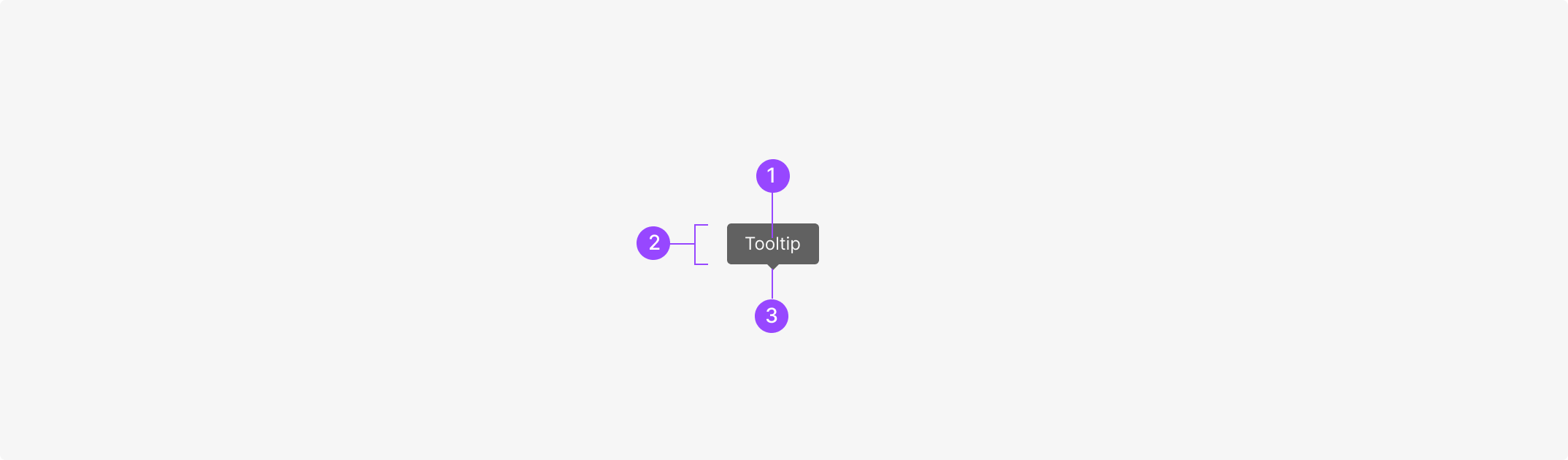
1. Label txt 2. Container 3. Tip
Usage
Tooltip text should be a minimal, summarized description — it complements primary content rather than replacing it. Best for explaining icon buttons or function-focused actions, used as supporting information that helps users make decisions more easily. Tooltip fits these cases: · Explaining the meaning of an icon button · Briefly clarifying the purpose of a feature or action · Adding context to an element or surrounding context · Surfacing a tool's role and shortcut within a Toolbar Conversely, avoid Tooltip for sub-elements of a component or for icons inside dropdown items — these already carry enough context.
Spec
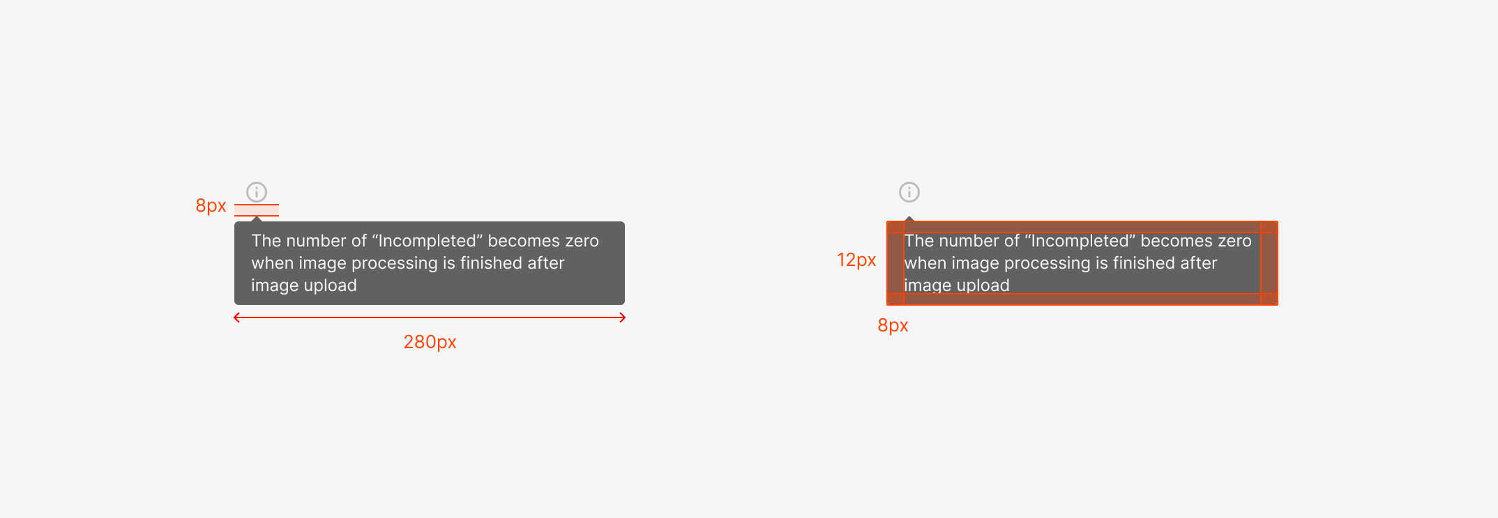
1. Spacing, Offset & Maximum Width
Default Tooltip uses 12px horizontal and 8px vertical inner padding around the Label Text. An 8px offset separates the Tooltip from its target element, making the relationship between the element and the message visually clear. Max width is capped at 280px; height flexes with content length. Keep Description to three lines or fewer for readability and information density.
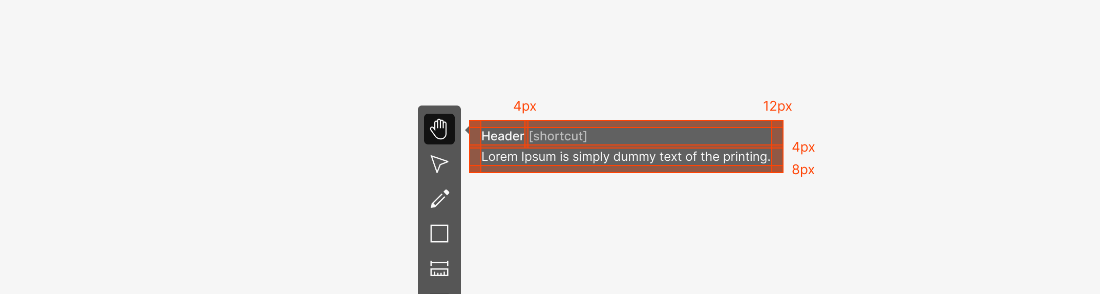
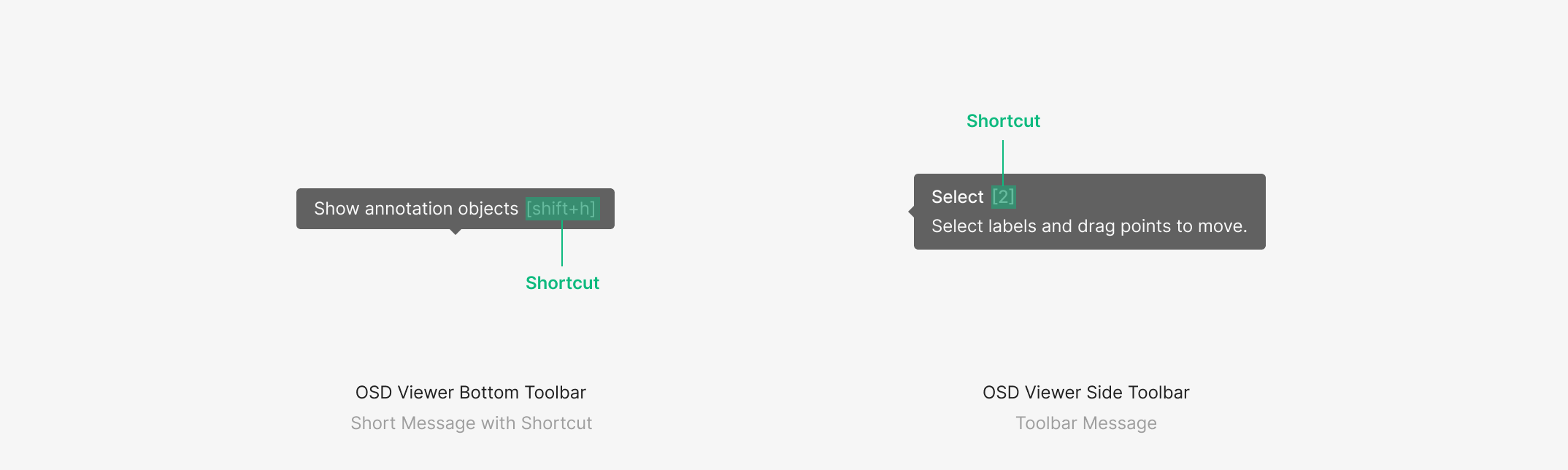
2. Toolbar Tooltip Spacing
Toolbar Tooltip is an extended Tooltip that holds multiple information elements — Header, Shortcut, and Description. It keeps the same 12px horizontal padding as a default Tooltip, but inter-element spacing follows information hierarchy. Header and Description sit 4px apart; 8px margin sits below Description. Shortcut typically aligns to the right of Tooltip Contents — when a Header is present, it aligns to the right of the Header.
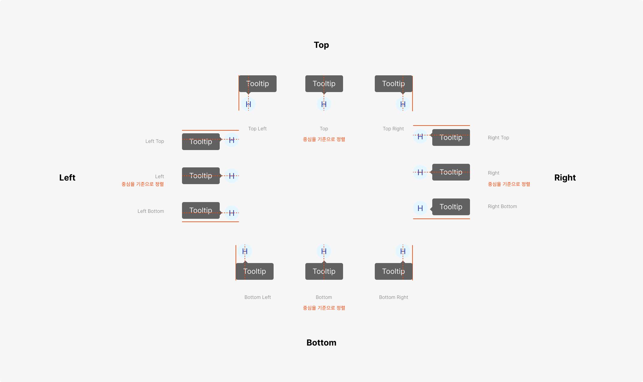
3. Placement System
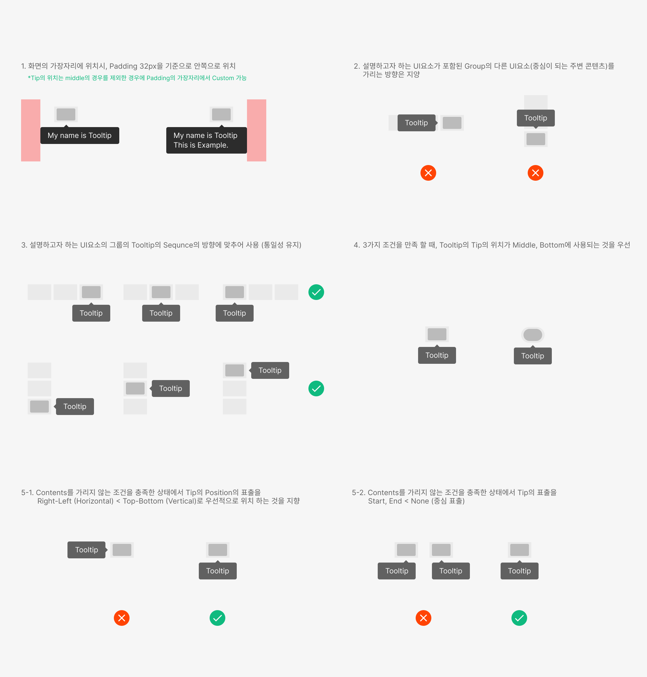
Tooltip places within a 32px inset from the Browser Window. Twelve placements anchor by centering the Tooltip Tip against the target element. Near screen edges, the position adjusts to stay within bounds; in Middle Space, Bottom Placement is the default priority.
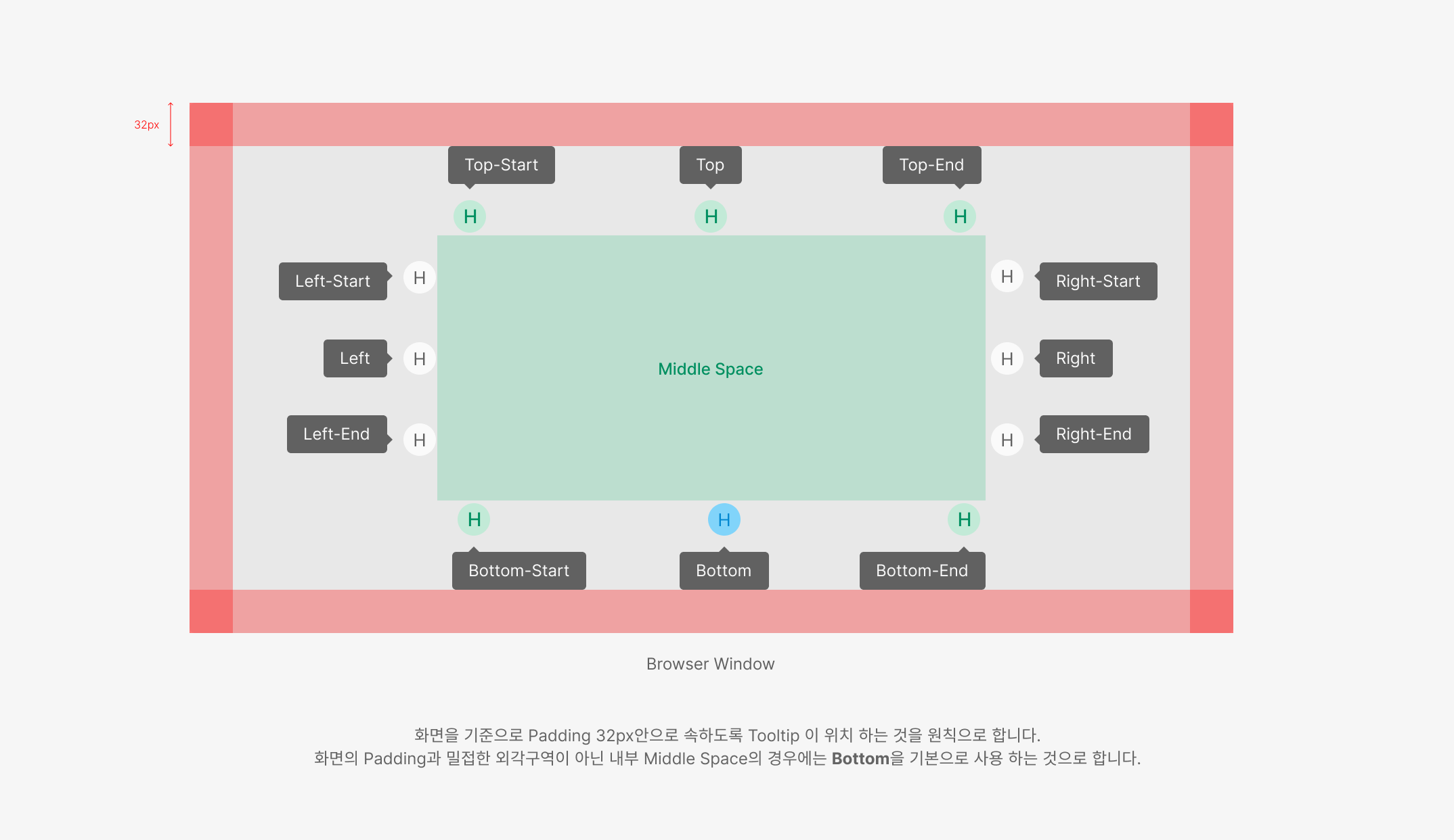
4. Middle Space Placement Priority
Within Middle Space, Tooltip must avoid covering critical surrounding content. Direction stays consistent within a group; while keeping content visible, prefer Vertical over Horizontal, and Center over Start/End alignment.
Contents
1. Contents Priority
Tooltip should avoid covering content where possible. When unavoidable, follow a content priority hierarchy. · Contents Priority: GNB > CTA button > filter/search bar > other content · "Don't cover" means the content inside a container is not obscured. Following this priority, surface the Tooltip in a way that doesn't obscure higher-priority content.
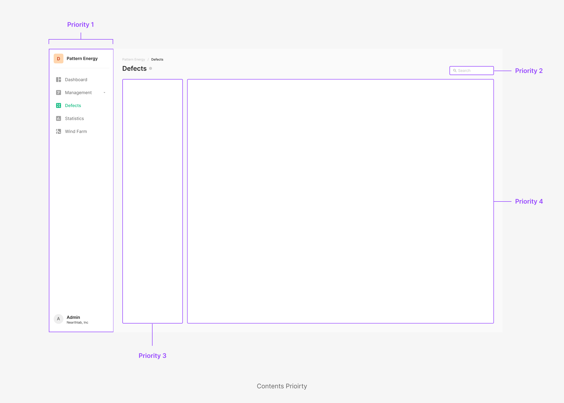
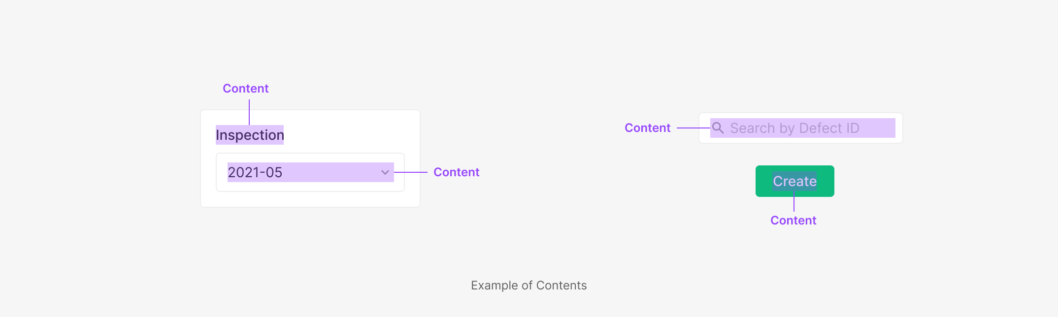
2. Boundary of Contents
Each area's content boundary is defined as the minimum set of elements carrying information inside its container. Tooltip must surface without covering the defined content area.
3. Tooltip Contained Shortcut
Used when a context — such as a Toolbar action — needs to surface shortcut information alongside the tool description. Conventionally positioned at the right of Tooltip Contents; when both Header and detailed contents are present, the shortcut sits at the right of the Header.
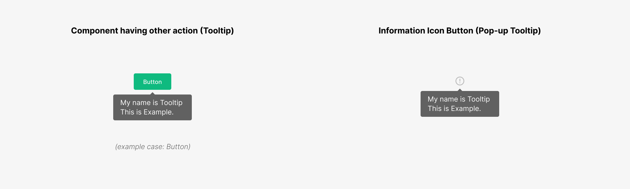
Tooltips & Popup Tips
Two types of Tip surface supplementary information. Tooltip surfaces directly on interaction with the target component. Popup Tip surfaces through an auxiliary Information Icon. Tooltip uses hover so it doesn't interfere with the component's primary action. Popup Tip uses click — appropriate when the information is multi-part or longer, with a more focused reading experience.
Tooltip
Tooltip carries a description for a single content item and stays within one sentence as a rule. When step-by-step explanation is needed (e.g., a Toolbar), use bullet points. All Icon Buttons should surface a Tooltip by default.
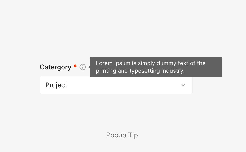
Popup Tip
Carries one or multiple pieces of information, surfaced through an Information Icon. Used when the description runs longer than one sentence or holds two or more pieces of content.
Interaction
1. Exposure Rules
Tooltip surfaces through hover; Pop-up Tooltip surfaces through click.
Tooltips Exposure Rules
| Action: Hover | |
| Exposure Rules | Tooltip surfaces when the user hovers over the component. (Although named "hover," it surfaces from the Cursor's Focused state until just before Out Focused.) |
| Disappear Rules | Tooltip disappears when the cursor leaves both the component and the surfaced Tooltip area. |
Pop-up Tooltips Exposure Rules
| Action: Clicked | |
| Exposure Rules | Popup Tip surfaces when the user clicks the component. |
| Disappear Rules | Popup Tip disappears when the user clicks outside the component and the surfaced Popup Tip area. |
Components
.png)
Composition of Words (Icon Button)
Used to describe an Icon Button that performs a specific action. (e.g., Segment (Icon) Button, More Icon Button)
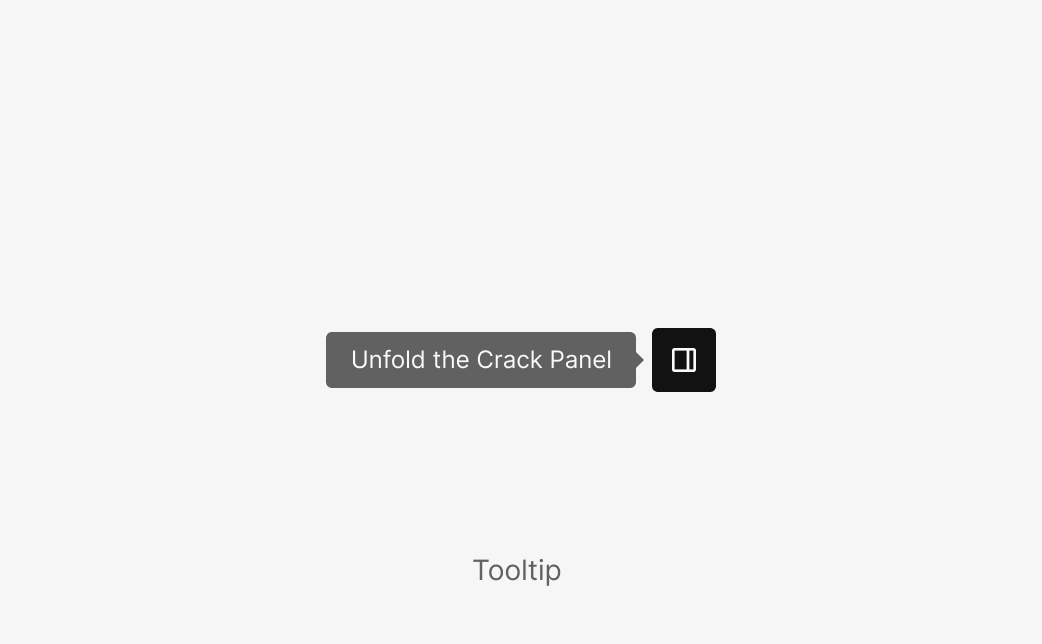
Short Sentence
Used to describe specific content with a short sentence. (e.g., Unfold/Fold the Crack Panel)
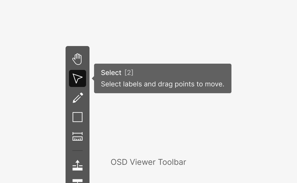
Explanation of Tool
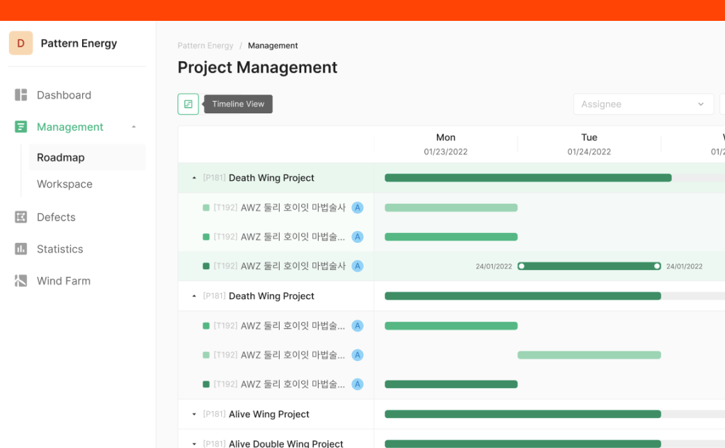
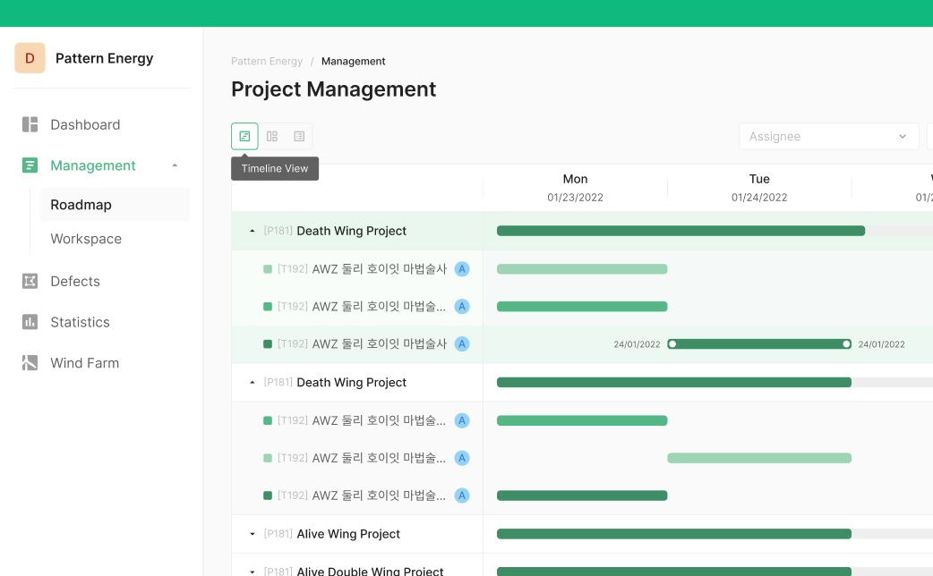
Used to surface a tool description. Uses Toolbar Type Tooltip — Header, Keyboard Shortcut, and Explanation combined. (e.g., OSD Viewer Toolbar)
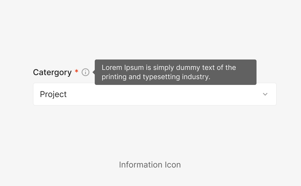
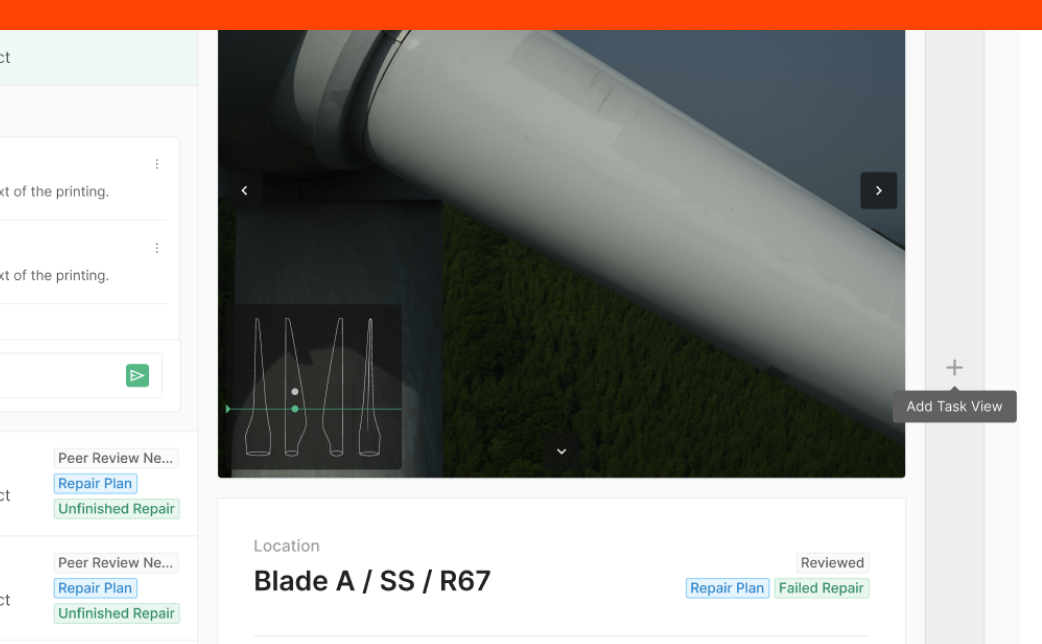
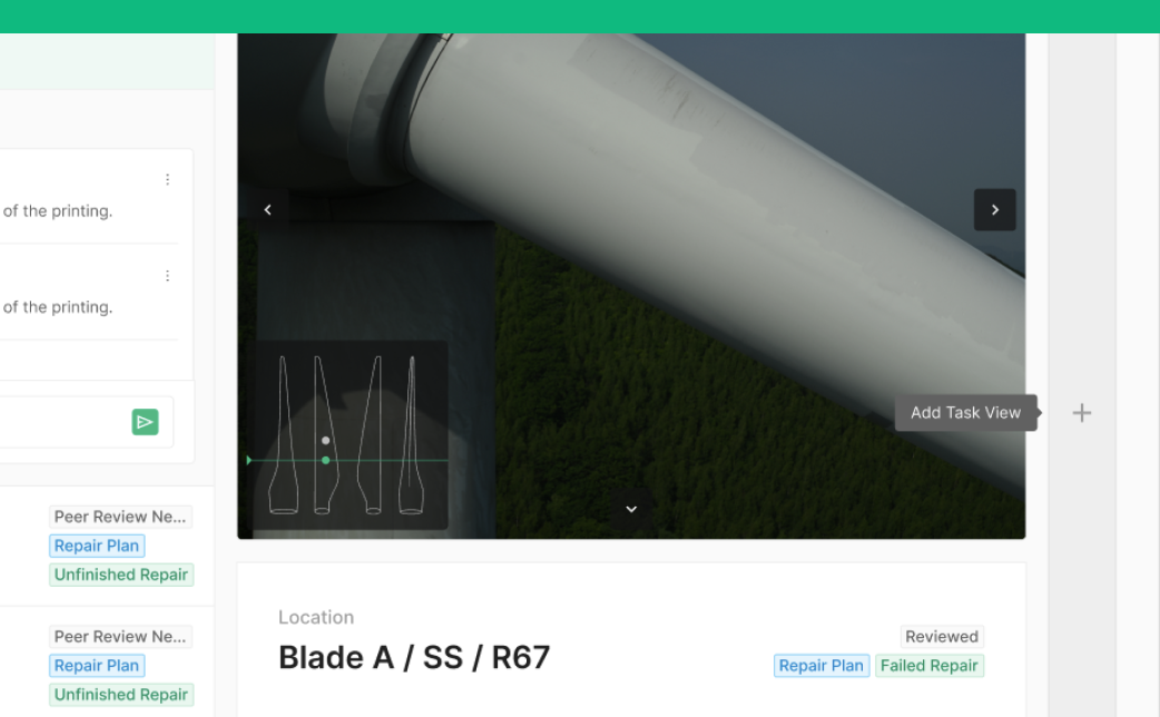
Information Icon Button (Pop-up Tooltip)
For elements that need detailed explanation, use an Information Icon. Common in flows like Create Project/Task, where Project and Task need supplementary context.
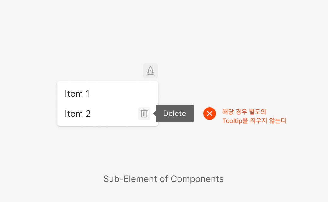
Sub-Element of Components
Don't surface Tooltip on Icon Buttons embedded within a component's sub-elements. Even for non-icon-button elements, avoid surfacing Tooltip for descriptive purposes. (e.g., Dropdown Menu Item / Icon Button)
Usage Guidelines
Don't: Tooltip Exposure Policy
Tooltip must never cover the content it points to. Vertical-direction Tooltips take exposure priority.
Do: Tooltip Exposure Policy
Tooltip must never cover the content it points to. Vertical-direction Tooltips take exposure priority.
Don't: Tooltip Anchor Position
When a vertical Tooltip would cover surrounding content of its target, surface the Tooltip horizontally instead. Always prefer positions that don't cover the target's hover area.
Do: Tooltip Anchor Position
When a vertical Tooltip would cover surrounding content of its target, surface the Tooltip horizontally instead. Always prefer positions that don't cover the target's hover area.
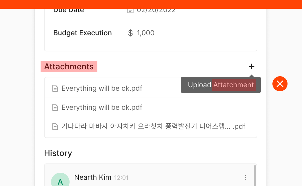
Don't: Avoid wording that duplicates the Header
When a Tooltip pairs with a component that already has a Header, don't repeat information that already appears in the Header. (e.g., Upload Attachment)
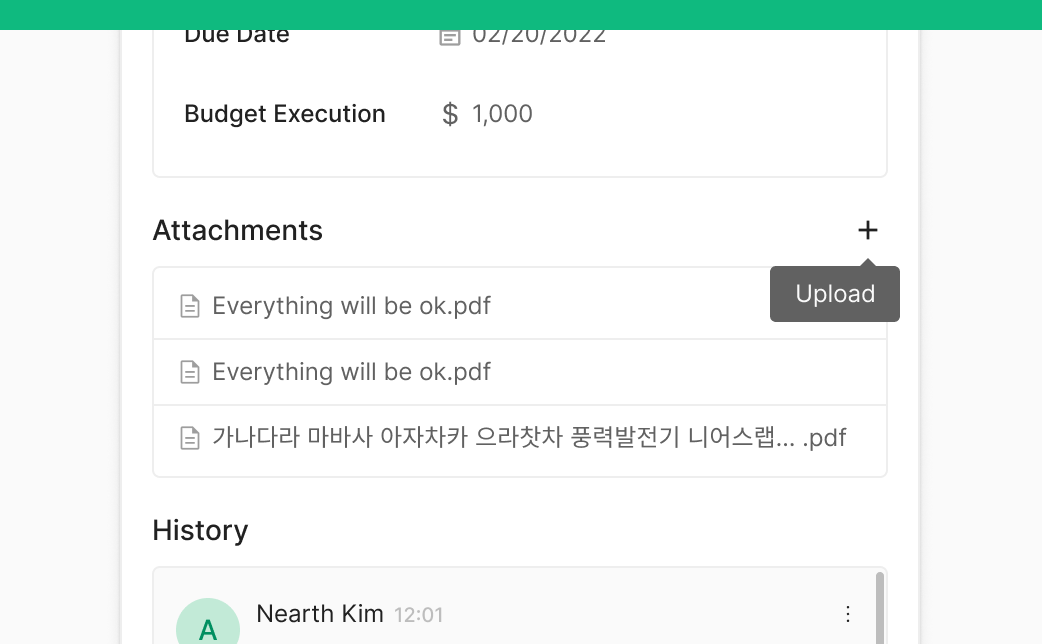
Do: Omit wording that duplicates the Header
When a Tooltip pairs with a component that already has a Header, don't repeat information that already appears in the Header. (e.g., Upload Attachment)