Avatar
Avatar represents a specific group or user. In Zoomable Design System, it ships in Square and Circle types.
Anatomy
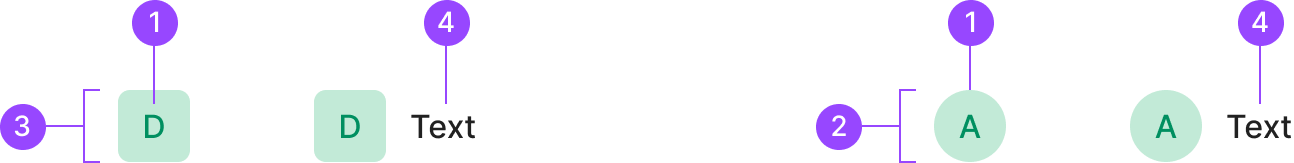
1. Avatar Label
2. Circle Container
3. Square Container
4. Text Label
Usage
Avatar splits into two by shape. Each type represents a different kind of entity and should be used distinctly.
| Component | Type | Usage | Used |
D | Square | Used as a thumbnail to represent an organization. | Farm, Fleet |
A | Circle | Used as a thumbnail to represent an individual person. | User |
Design Spec
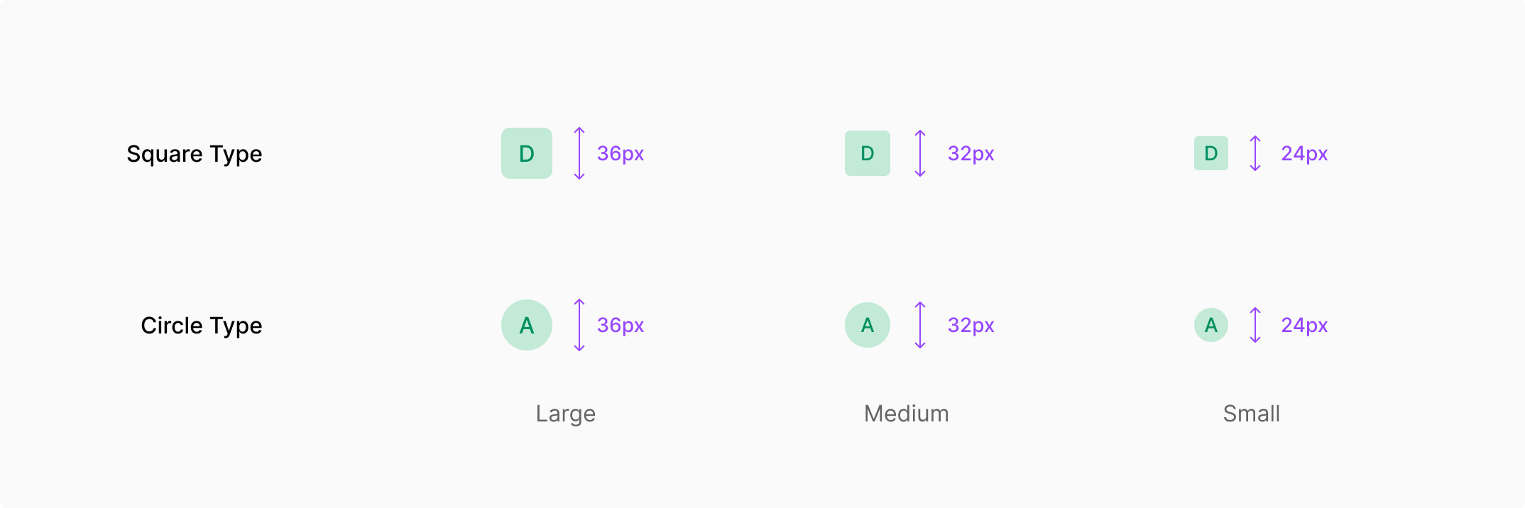
| Property | Values | Default |
| Size | 36px (Large) / 32px (Medium) / 24px (Small) | 32px (Medium) |
| Image | Image / Empty | Empty |
| State | Default / Disabled | Default |
Size
Avatar is available in three sizes.
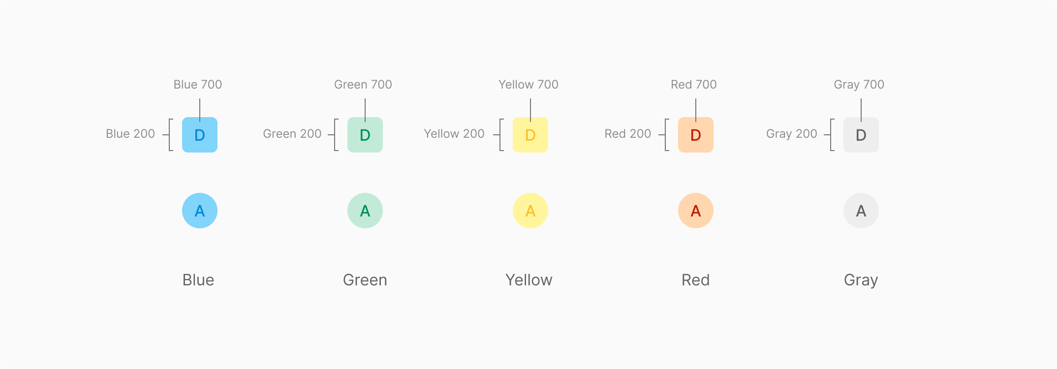
Color
Avatar's empty-state background uses five colors, assigned randomly. Drawn from the existing Color Palette, it pairs the 200 and 700 values of Blue, Green, Yellow, Red, and Gray.