Filter
Filter is a Data Entry composition that lets users narrow visible data against specific criteria.
Components
Filter splits into two by how it surfaces — Exposed Filter, visible alongside data by default, and Hidden Filter, tucked away behind an extra interaction layer.
1. Exposed Filter
Exposed Filter sits next to data. It comes in two forms — a horizontal Filter Bar and a vertical Side Bar. Filter Bar splits further into Primary Type (wrapped in a container) and Secondary Type (an Input + Dropdown composition without a container).
2. Hidden Filter
Hidden Filter handles filtering criteria that don't belong directly next to data. It stays out of view and surfaces through a separate action, typically as a modal — so it carries an extra interaction depth compared to standard filter types. It's defined as Modal + extra (currently undefined).
Surfacing through a specific action — usually a modal — is the conventional pattern. When a table and filter coexist, align the filter's order with the table's heading order.
Data Entry for Filter
Filter is built from Data Entry components that establish the criteria for narrowing data. Within Zoomable, six Data Entry components are available for Filter — Dropdown, Input, Filter Chip, Check Box, Toggle, and Slider.

Dropdown
When no sequence is defined, sort menu items alphabetically. When a sequence is defined, follow that sequence.
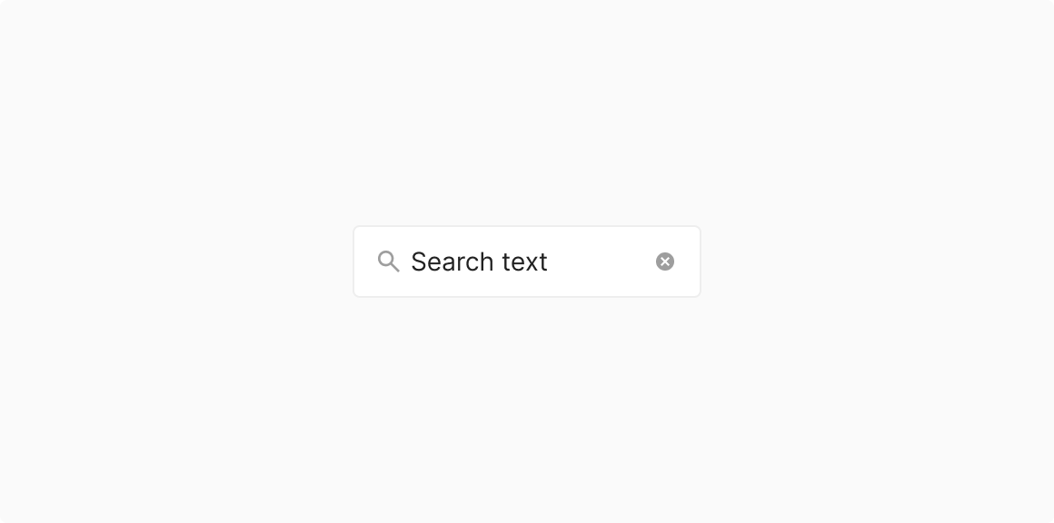
Input
Filters specific items by text entry.
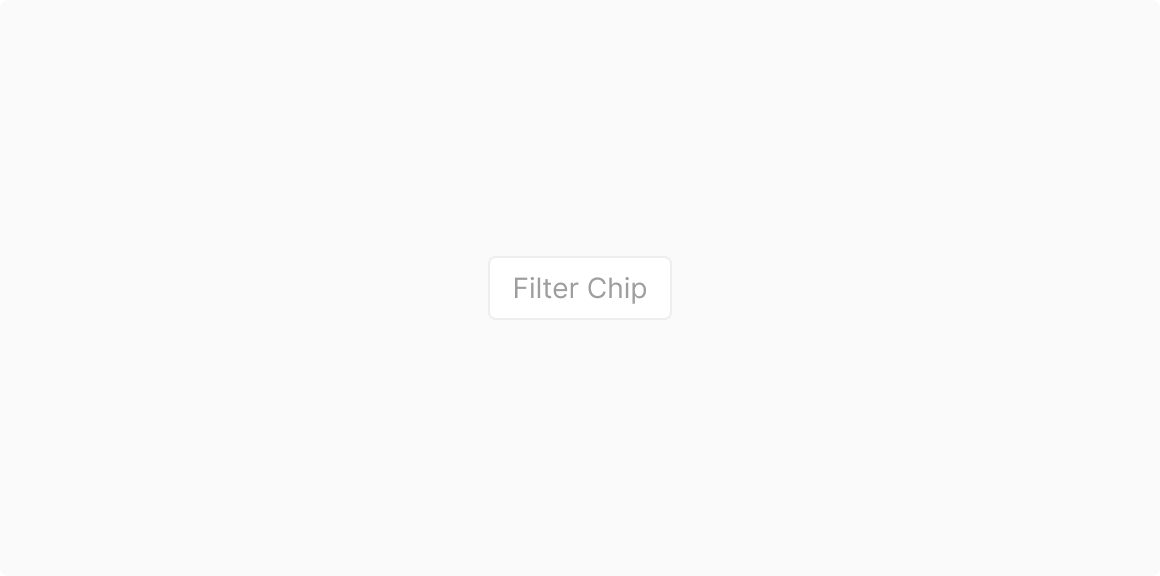
Filter Chip
Toggles specific items On/Off.
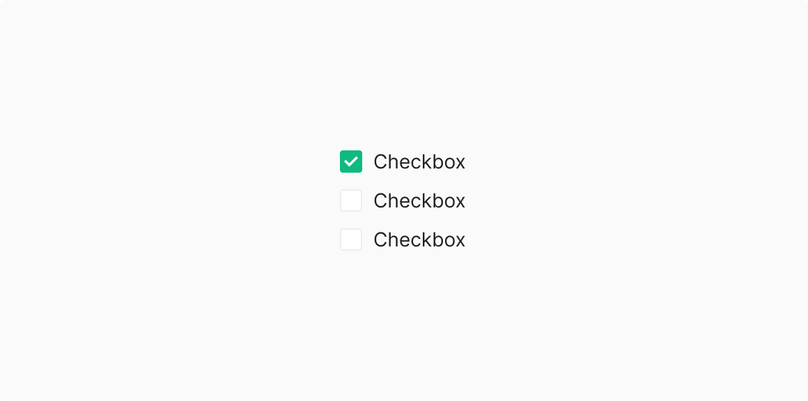
Check Box
Toggles specific sub-items On/Off.
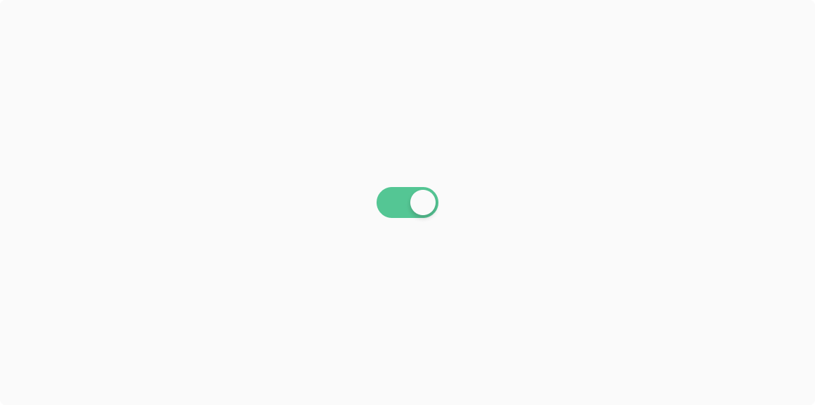
Toggle
Recommended for mutually exclusive options (On/Off) only.
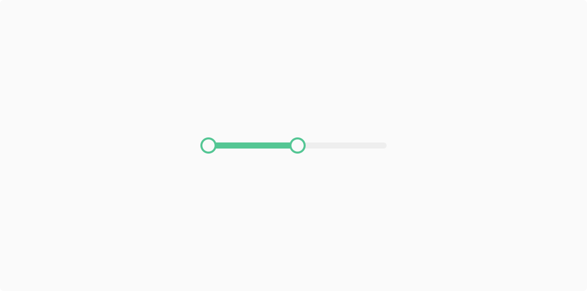
Slider
Recommended for qualitative data only.
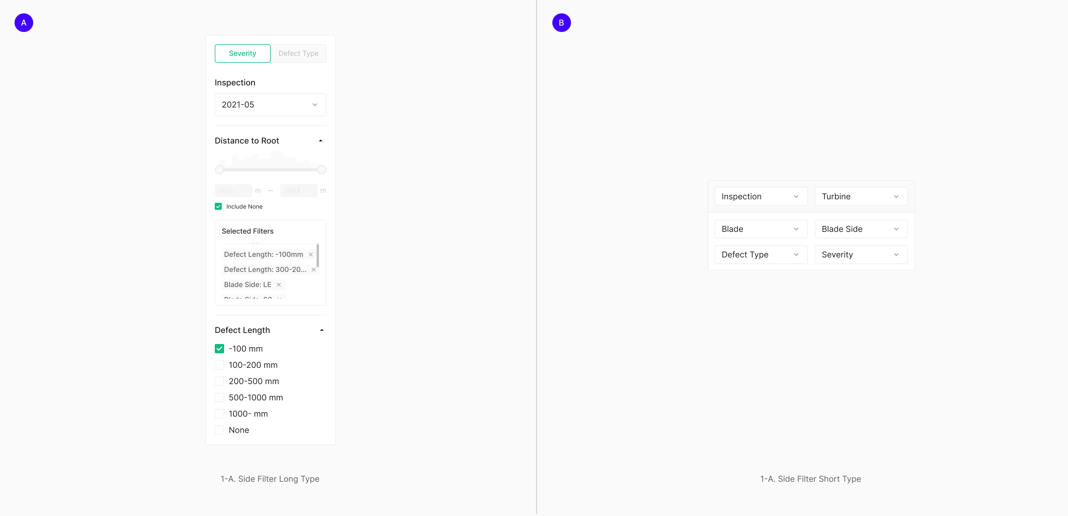
Exposed Filter
Exposed Filter sits next to data. It comes in two forms — a horizontal Filter Bar and a vertical Side Bar.
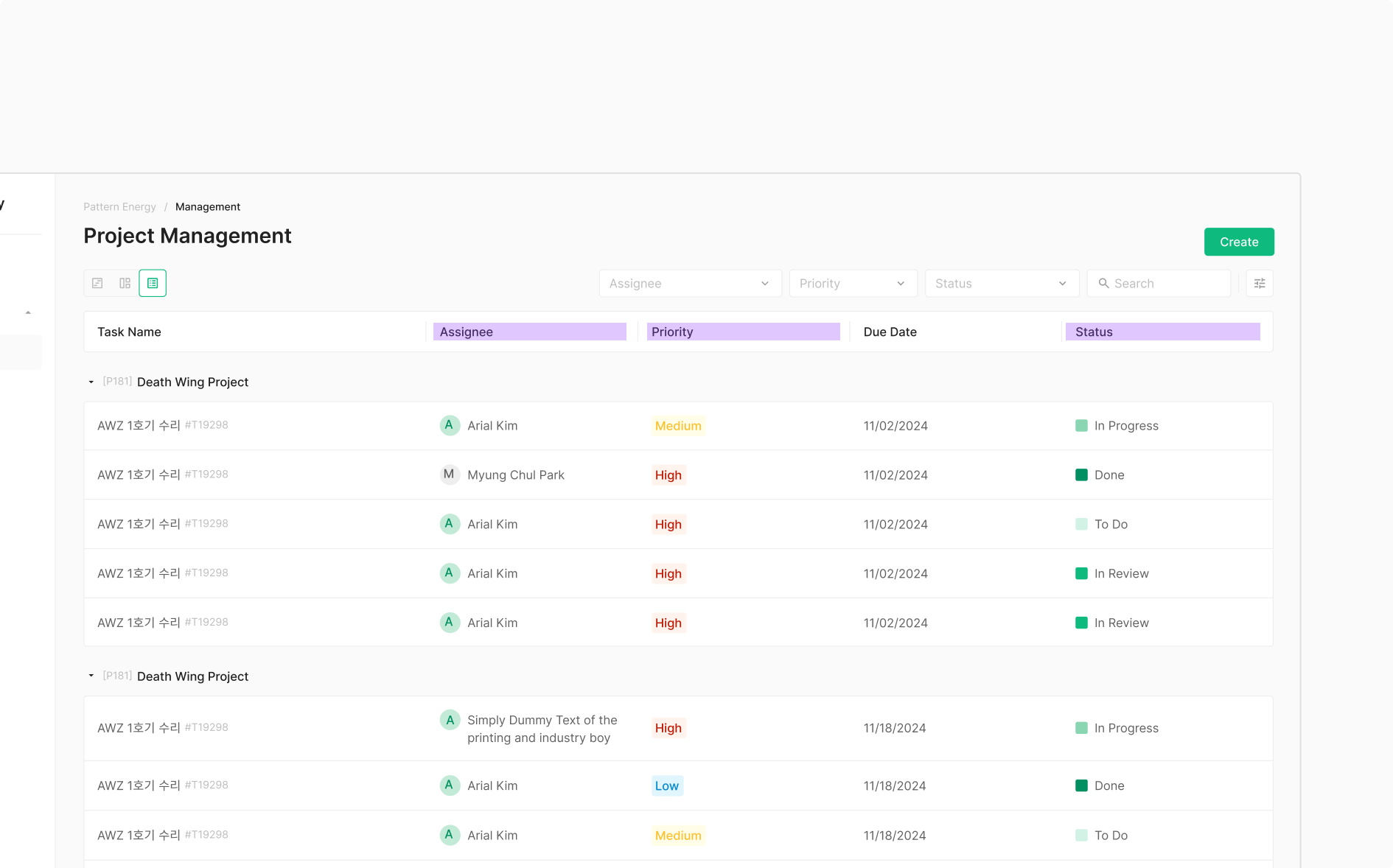
Filter Bar
Filter Bar takes two forms — Primary Type, wrapped in a container, and Secondary Type, an Input + Dropdown composition without a container. Both are most commonly composed of Chip, Dropdown, and Button. When a Chip acts as a filter, it pairs with a group label that names the criteria.
1. Primary Type
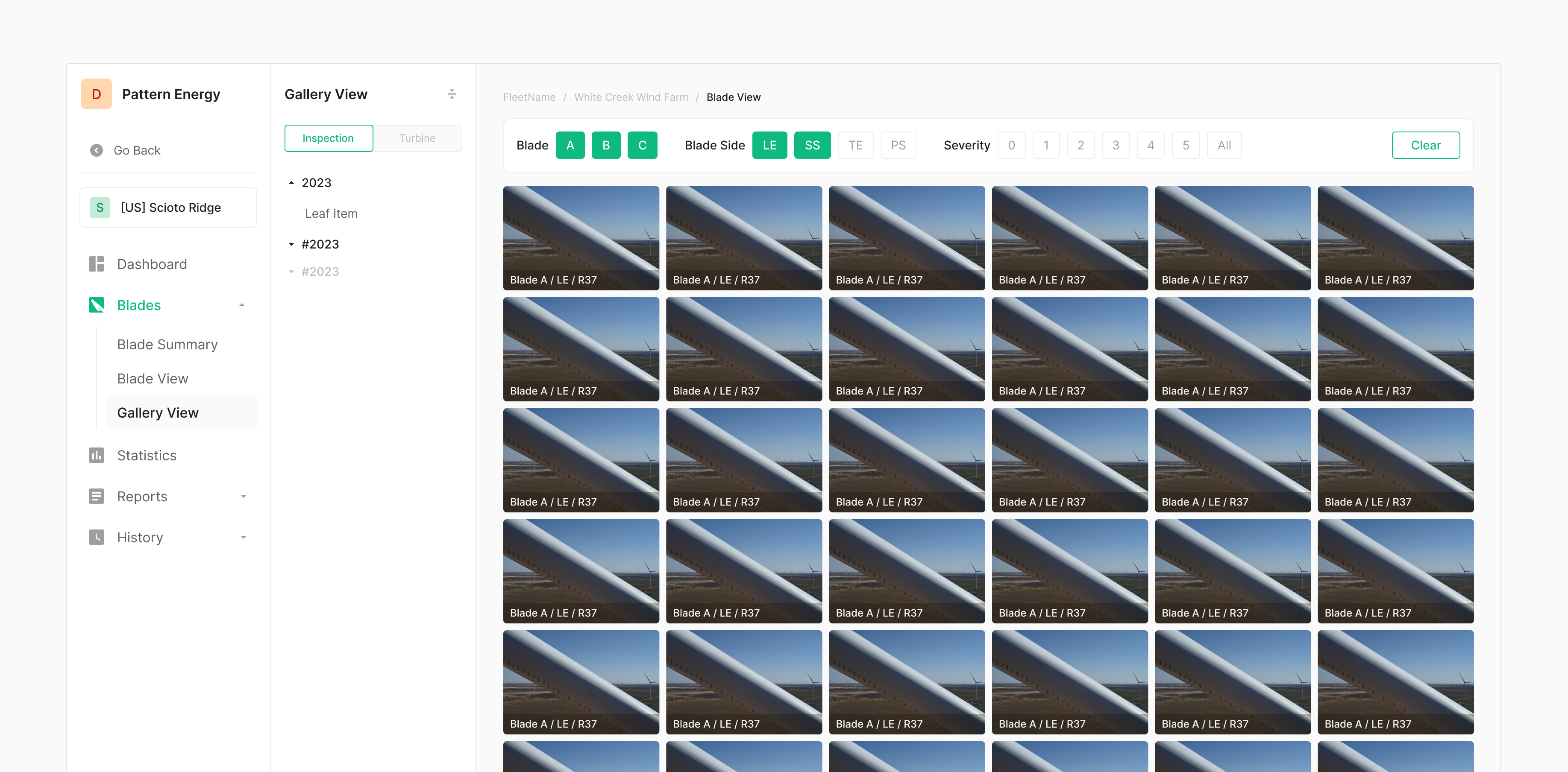
Primary Type uses Chip as its Data Entry component, grouped under labels. In Zoomable, it's primarily used to filter photos — most notably in Zoomable Wind's Gallery View, where it narrows the gallery by a specific criterion.
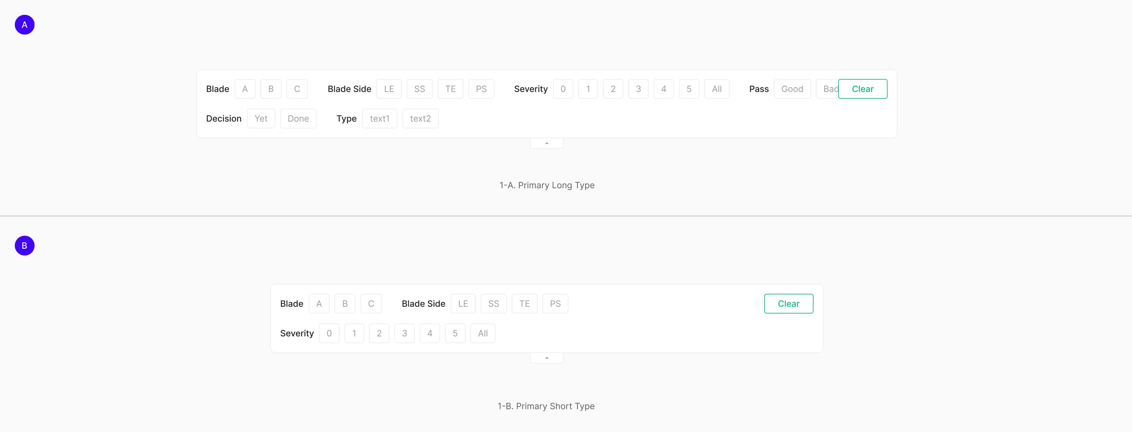
Table of Figma Properties — Filter Bar (Primary)
| Property | Values | Default Value |
| Line | 1, 2 | 1 |
| Size | Long, Short | Long |
| Expansion | False, True | False |
2. Secondary Type
Secondary Type composes Dropdown, Input, and (Button Icon) — unlike Primary Type, it lives as a bare arrangement of components without a wrapping container. Typically aligned by height. Non-filter elements can sit in the same arrangement; in that case, use a Divider to separate them by purpose.
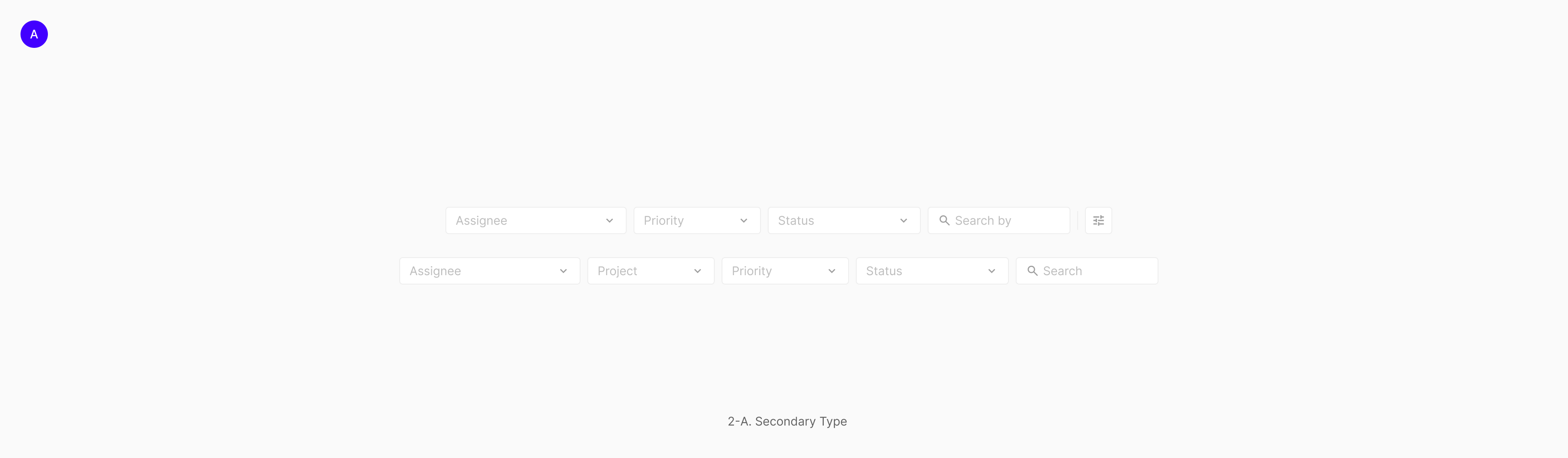
Spacing
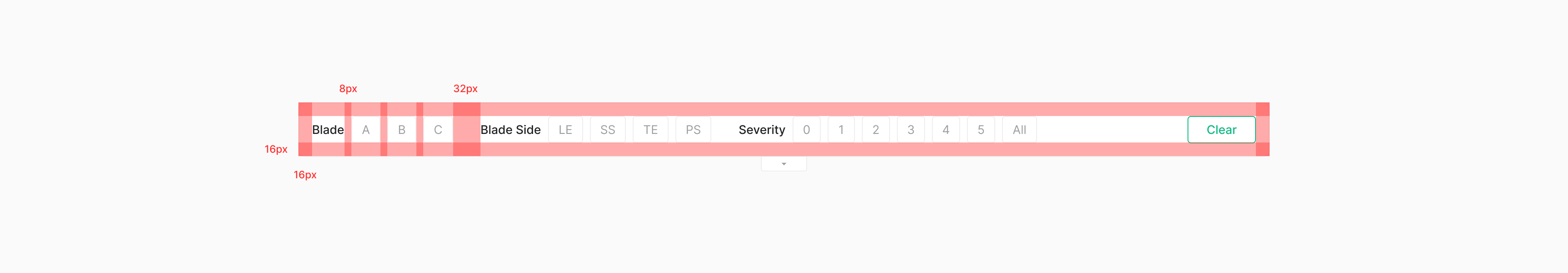
A Primary Type with a container uses 16px padding on all sides. Chip Groups (including their labels) sit 32px apart from each other; the label-to-chip gap is 8px. Filter-capable Chip Groups align left; non-filter actions align right.
Position
Filter Bar sits above its Data Set (e.g., Gallery). After filtering, the data (e.g., Image Gallery) surfaces below.
Single / Multi-Selection
Single- and Multi-Selection both apply, depending on the underlying Data Entry's nature and purpose. Selection rules carry over from each Data Entry component as composed in a group — if a component allows multi-select when grouped, the filter does too. Filter Bar's Chip-based group supports Multi-Selection. Selecting none yields the same result as selecting all.
Contents Arrangement
Header Align with Filter Arrange
When a Secondary Type Filter Bar filters table-column-level data, align the Filter Bar's order with the table's column header order.
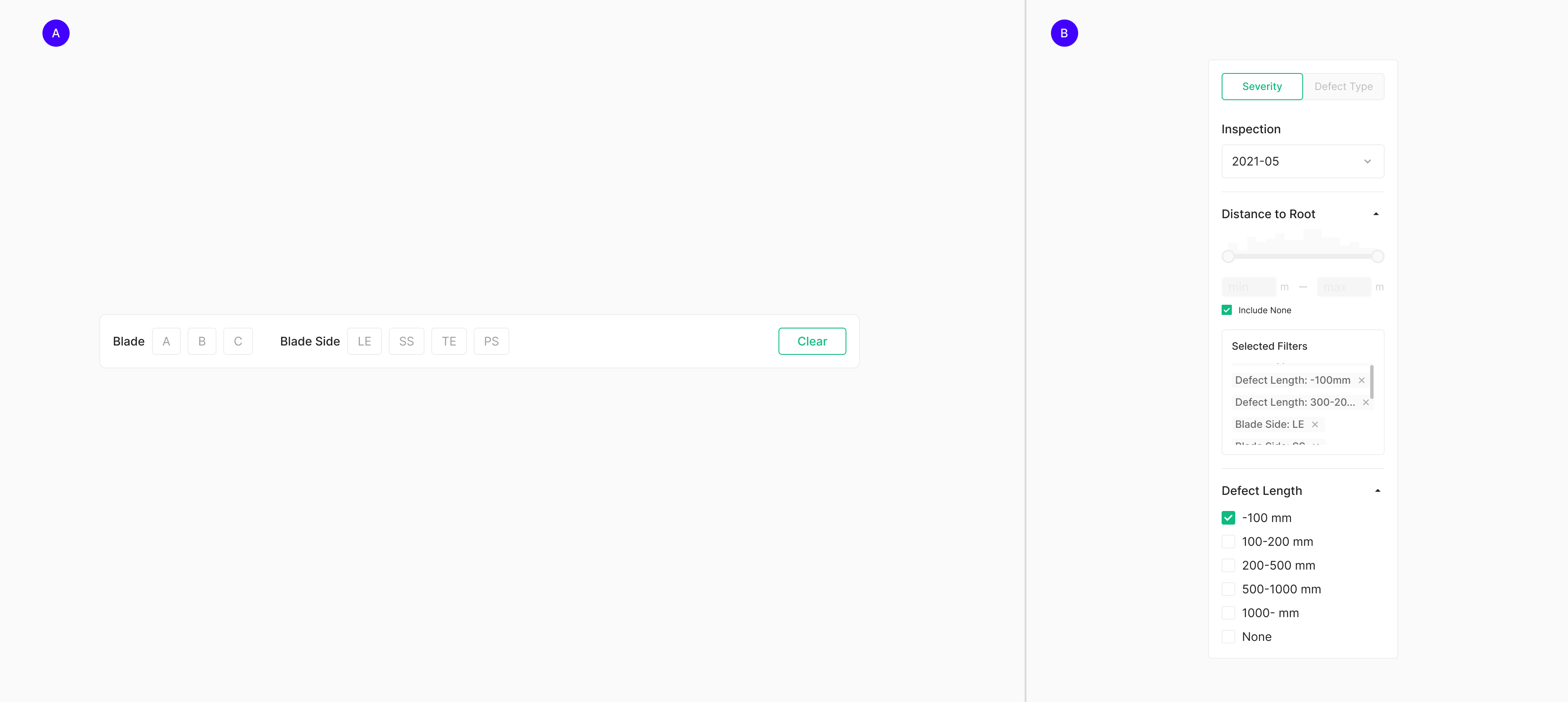
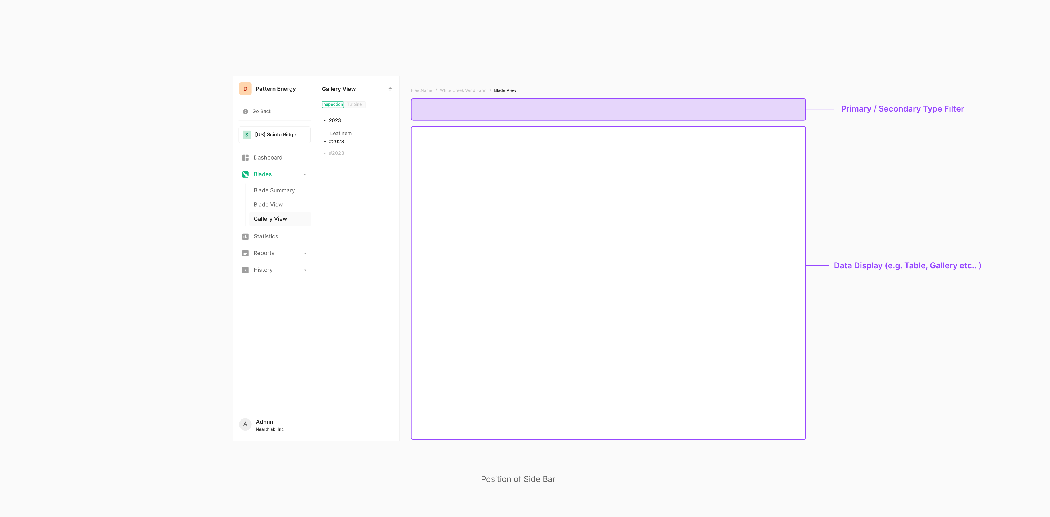
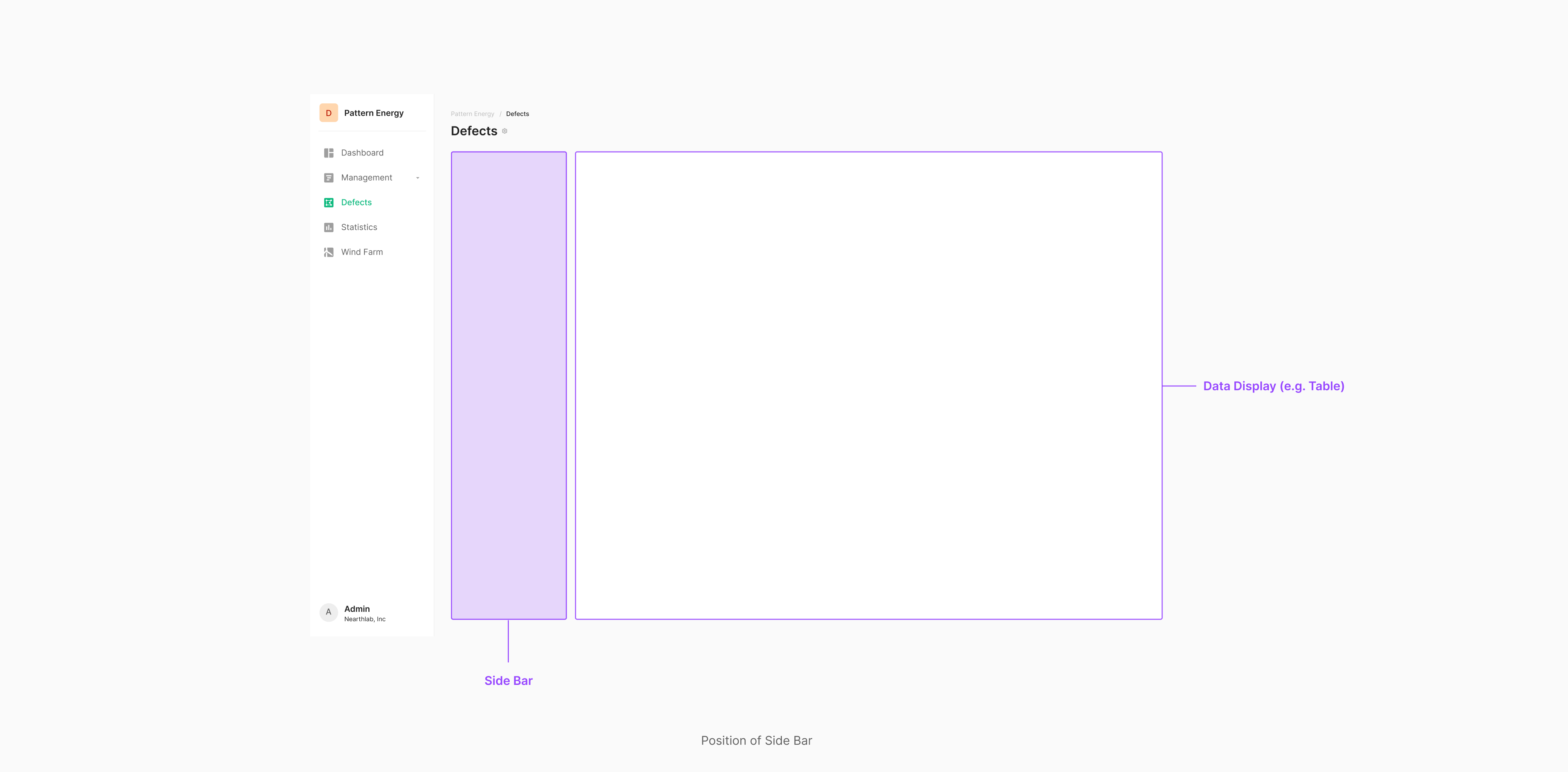
Side Bar (Side Panel)
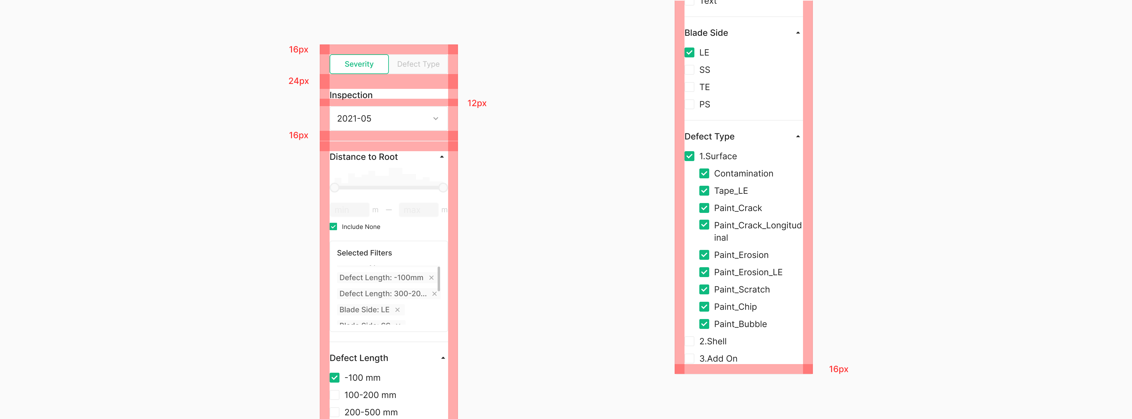
Side Bar is used in Wind only — appropriate when the filter inventory is large and granular customization is required. It's also classified as a Side Panel. Composition typically mirrors Filter Bar: Chip, Dropdown, and Button. When a Chip acts as a filter, it pairs with a group label.
Spacing
Side Bar applies 16px padding on all sides of its container. Filter groups are separated by a Divider, with a 16px gap on either side. Labels sit 12px from their corresponding filter components. Filter-capable groups align right.
Position
Side Filter sits to the left of its Data Set (e.g., Table). Following the natural reading flow, the data (e.g., Table) surfaces to the right after filtering.
Selected Filter
Selected Filter condenses the user's filter choices into a single view when the Side Bar carries many filter groups. It sits at the top of the panel's filter groups and stays fixed during scroll — always visible within the Side Panel.
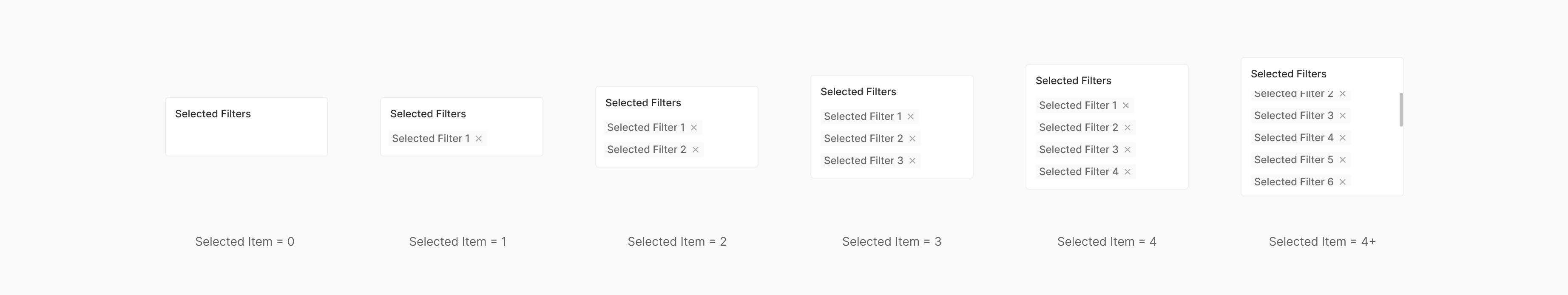
Table of Figma Properties — Selected Filters
| Property | Values | Default Value |
| Item | 0, 1, 2, 3, 4 | 0 |
Use Case
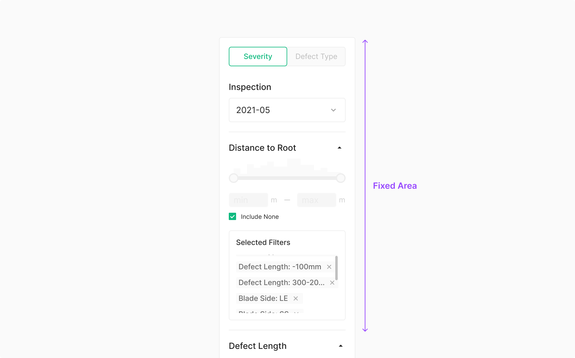
Fixed Area
Side Bar filters table data against criteria beyond what the table itself shows, surfacing detailed and varied Data Entry components. Because users tune many filters at once, Selected Filter exposes the active selections back to them. Typically used in a fixed position.
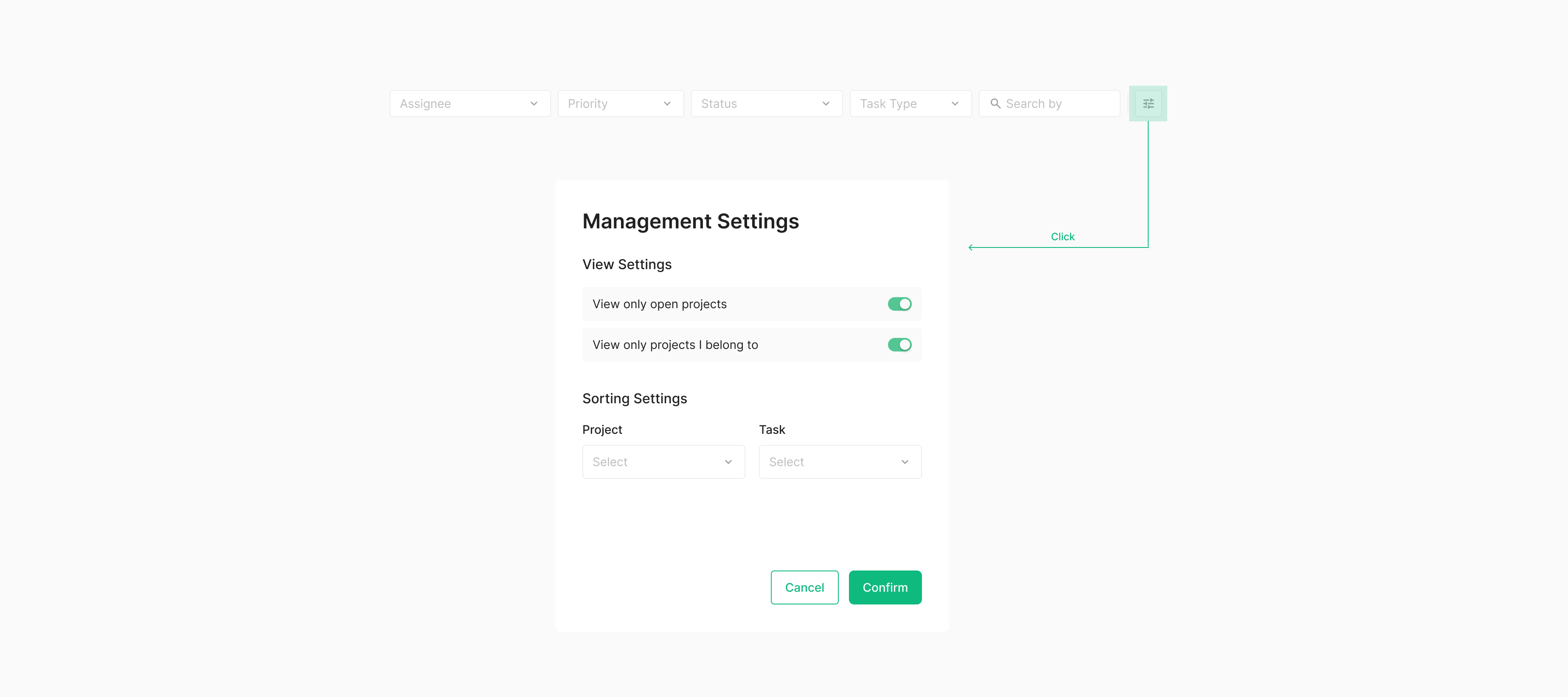
Hidden Filter
Hidden Filter holds filtering elements that don't fit directly alongside data. It stays out of view and surfaces through a separate action, typically as a modal — so it carries an extra interaction depth compared to standard filter types. Conceptually it's Modal + extra (currently undefined). Surfacing through an action — usually a modal — is the conventional pattern.
Modal Filter
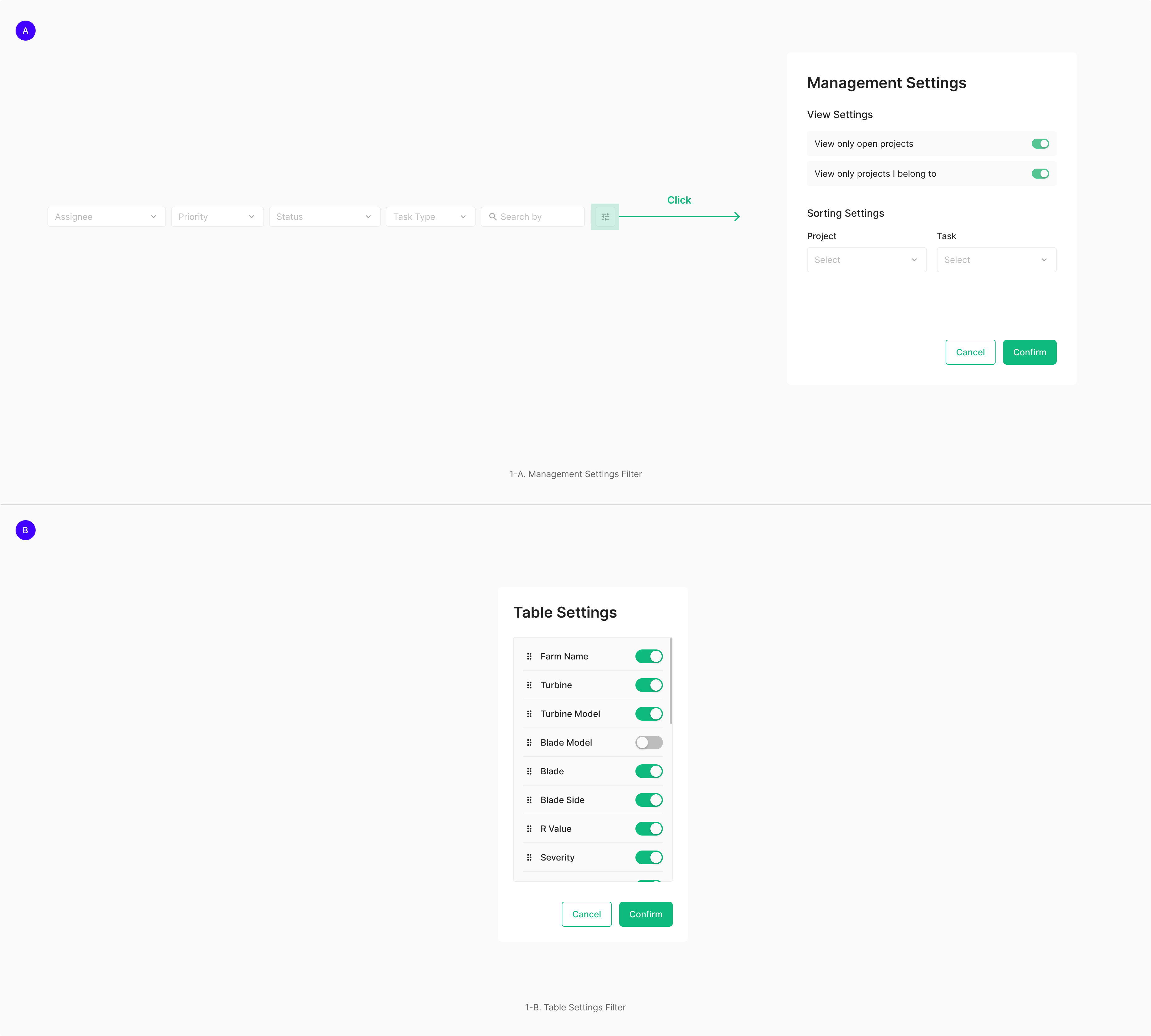
Use Case
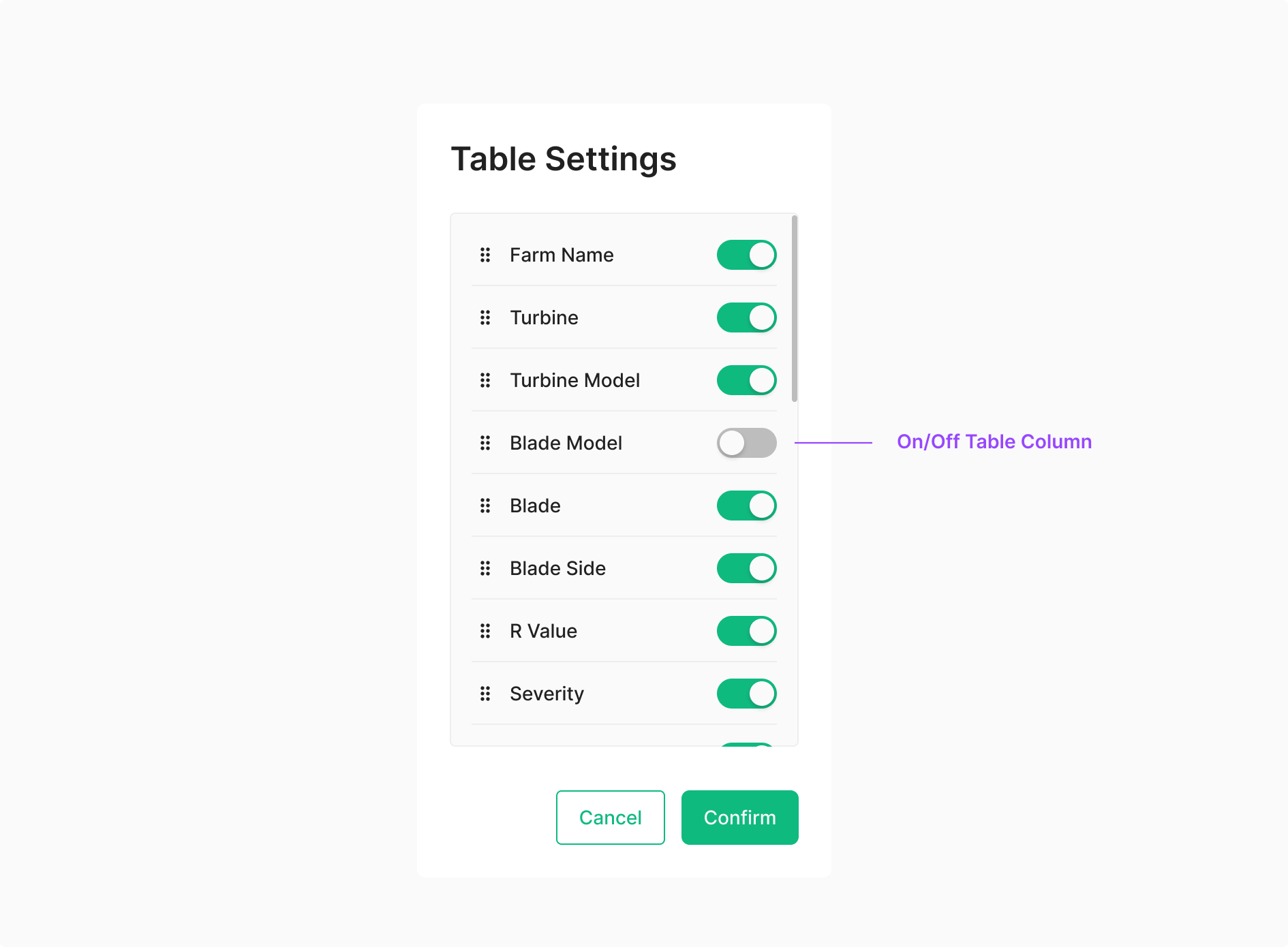
Table Settings — Hidden/Show Toggle
Hidden Filter typically surfaces as a modal and lets users toggle the visibility of specific viewers. In a Table Settings modal, the distinction lies in whether each column carries a Viewer Toggle.
 Toggle.png)
Management Settings — Hidden/Show (Off/On) Toggle
Used to toggle specific information-bearing data On/Off.