Navigation
Navigation helps users find what they need and signals where they are. It powers top-level wayfinding across the product — moving between hierarchy-equivalent screens or menus.
Wind GNB
Wind GNB anchors to the left of the screen and gives users a fast jump to any top-level destination. Five icons each route to their connected top-level target. GNB stays intuitive and predictable — fixed on the left even while scrolling. The default state is Expanded. Wind GNB splits into three flavors: Wind, Wind Farm, and Admin.
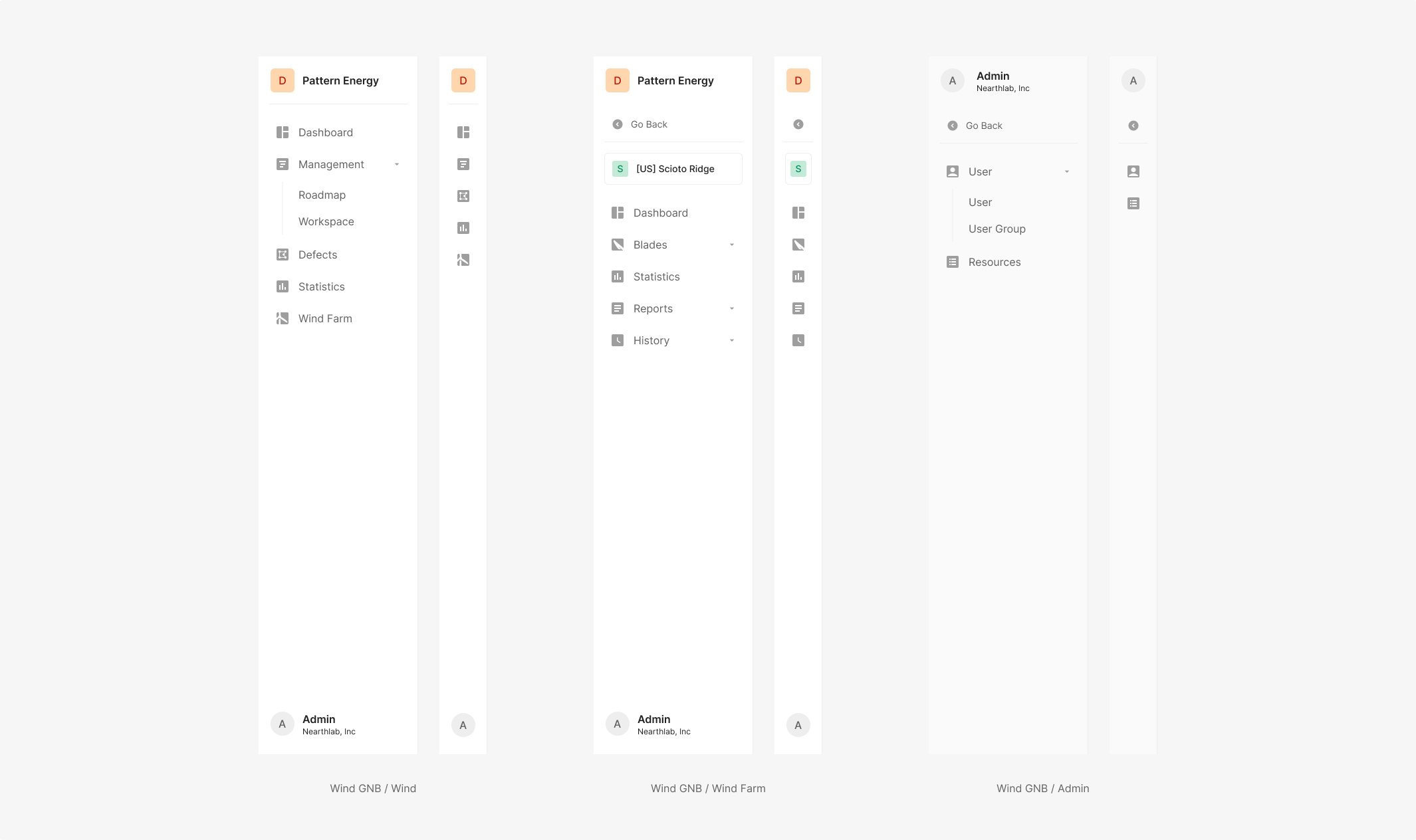
On app entry, 'DASHBOARD' in the Main Navigation Bar is Active by default and stays surfaced.
Anatomy
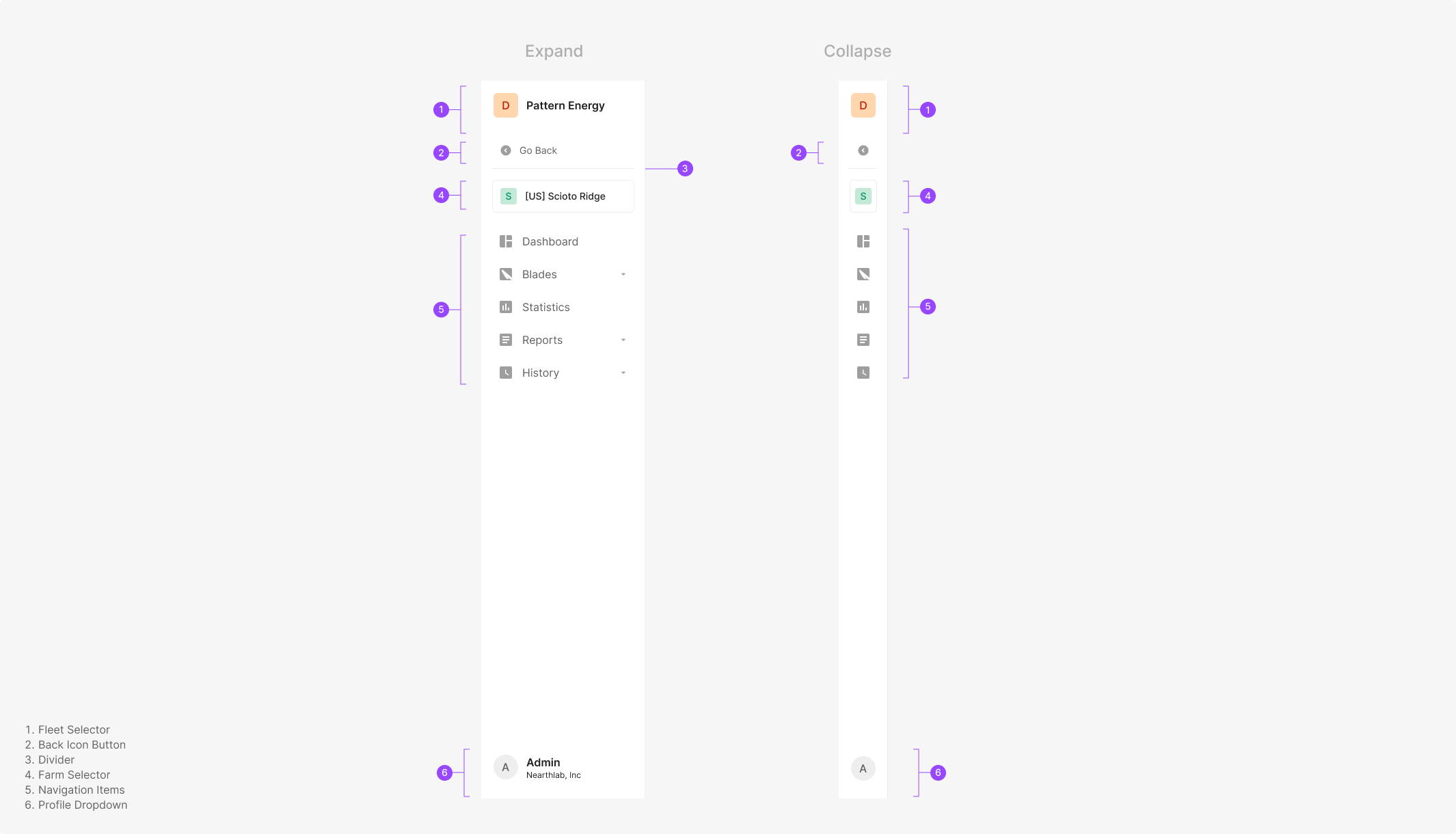
Variants
Main GNB icons split between Active and Inactive (Selected, Unselected). Active icon color is Green 500; Inactive is Gray 500 — preserving visual consistency as the user moves through the product. One navigation icon is always set Active by default (e.g., Dashboard on first login).
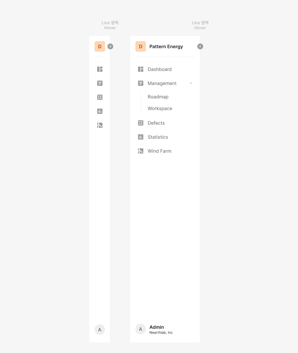
GNB Fold
GNB can collapse and expand based on usage. The action's Icon Button reveals on hover at the GNB edge.
Scroll Bar
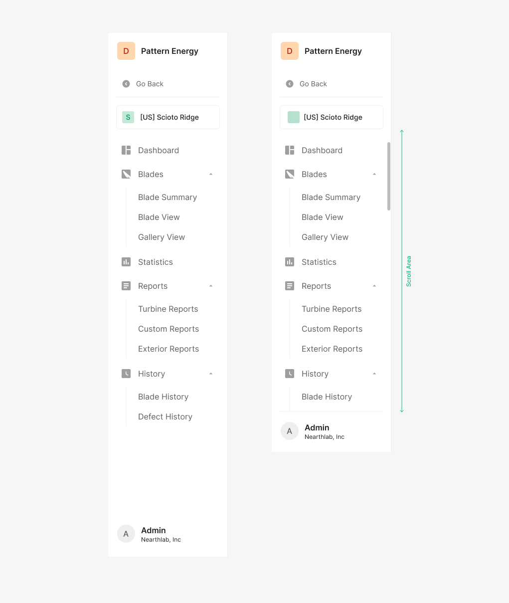
When GNB items overflow the visible area, a scrollbar appears. The scroll area is constrained to the item region.
Table of Figma Properties — Wind GNB
Table of Figma Properties — Wind GNB / Item
Table of Figma Properties — Item
Table of Figma Properties — Menu
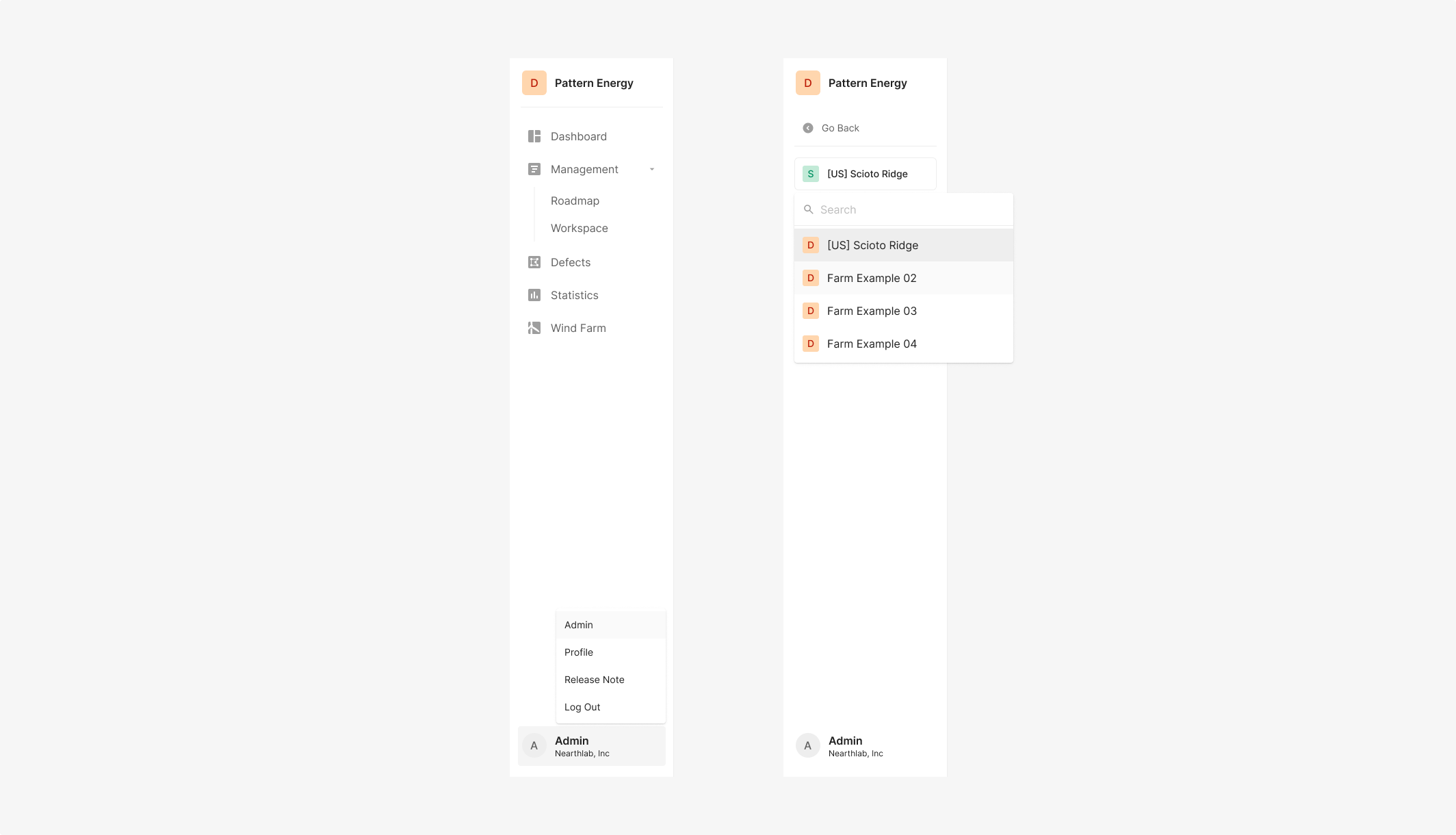
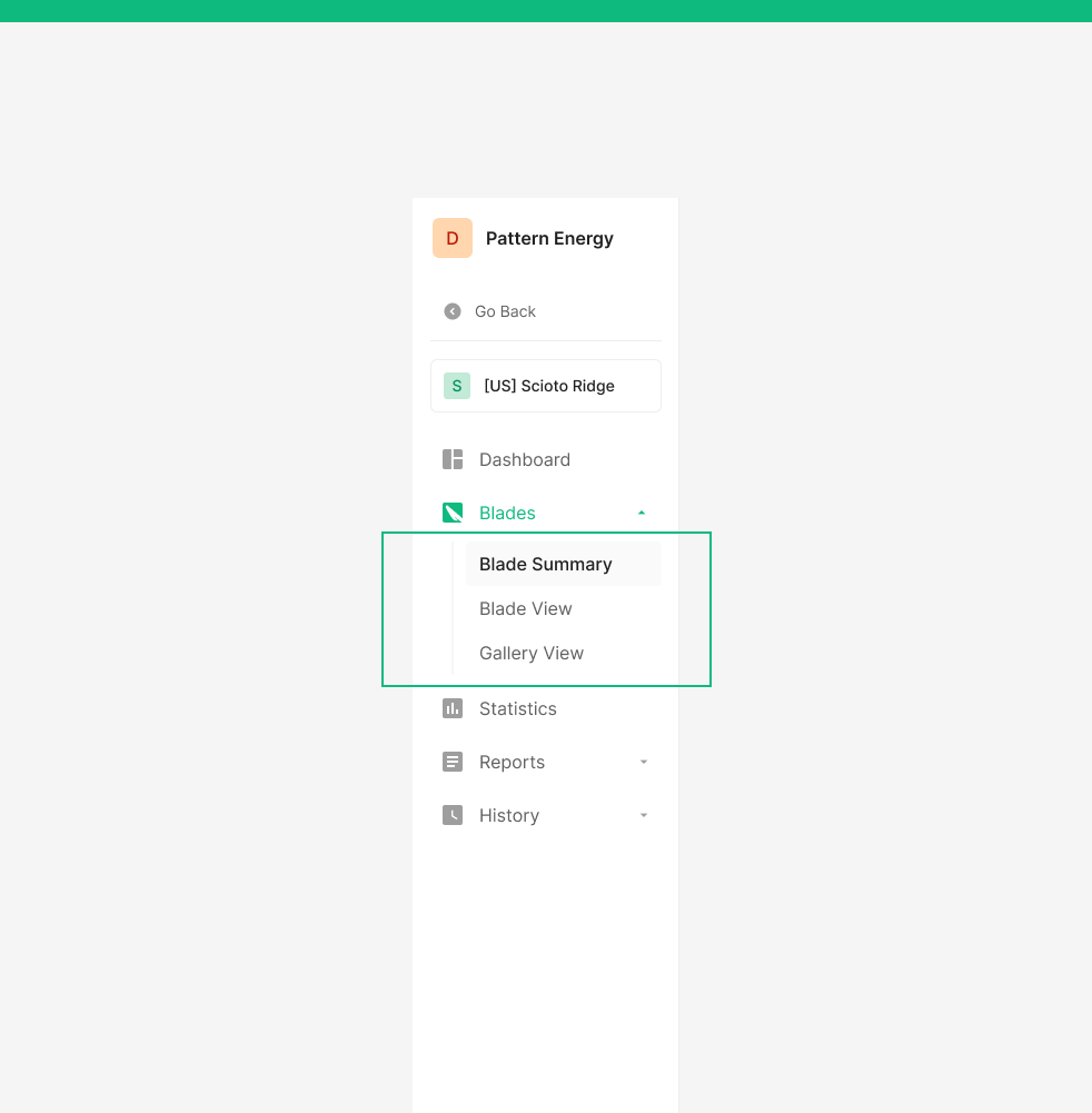
GNB Dropdown
GNB Dropdown is used to pick a single option from a list. When the option count is large, a dropdown menu surfaces the values. Selecting an item navigates to the display screen tied to the chosen value.
Spec
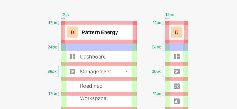
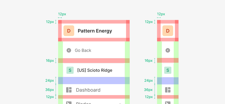
Spacing
GNB containers stand at 36px height. The gap between Dashboard and Inspection starts at 24px. Between tabs and icons, use 12px vertical spacing from the container center. Icon-to-label gap is 12px.
Extended Structure
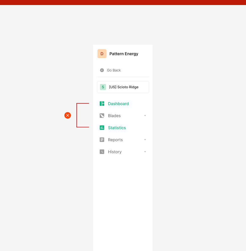
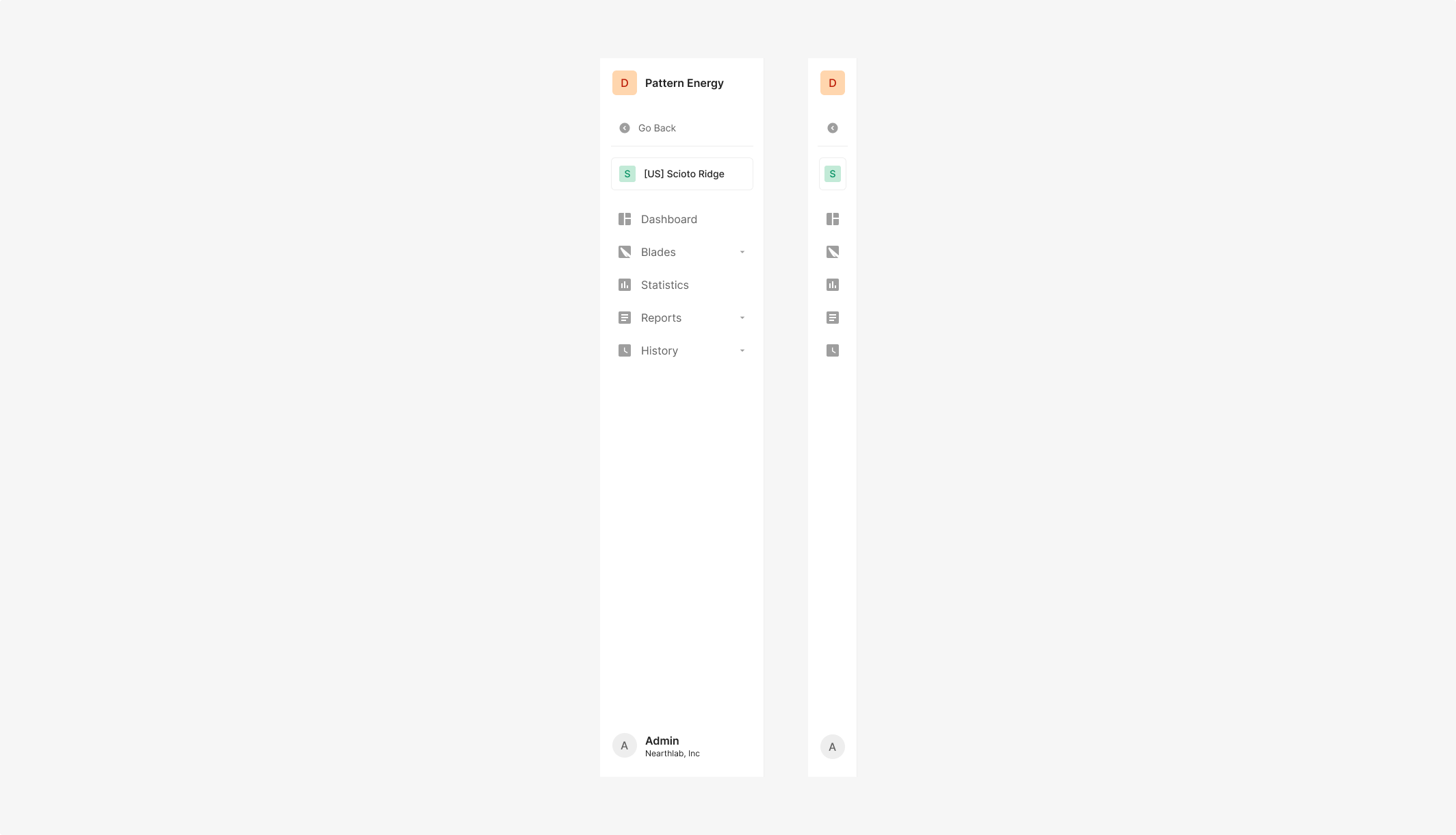
Wind Farm uses an extended GNB structure on top of the base. A Back Button surfaces at the top to return to the previous screen, paired with a Dropdown Button for switching farms. Users keep their current context while moving up the hierarchy or switching between farms quickly.
Usage Guidelines
Main GNB icons split between Active and Inactive (Selected, Unselected). Active icon color is Green 500; Inactive is Gray 500 — preserving visual consistency as the user moves through the product. One navigation icon is always Active by default (e.g., Dashboard on first login).
Do — Menu items inside GNB don't use Icons
Items at the same hierarchy group together. Reserve the Icon for top-level items only.
Don't — Active GNB items stay single
Don't use icon or label colors outside the defined Default state. Avoid multiple Active states across GNB items.