Expansion Panel
Expansion Panel is a panel that can be expanded and collapsed inline within the page.
Anatomy
Usage
Zoomable's canonical Side Expansion Panel is the work panel surfaced during OSD Viewer tasks. Its contents are composed from various components depending on purpose. Side Expansion Panel typically anchors to either the left or right side of the page.
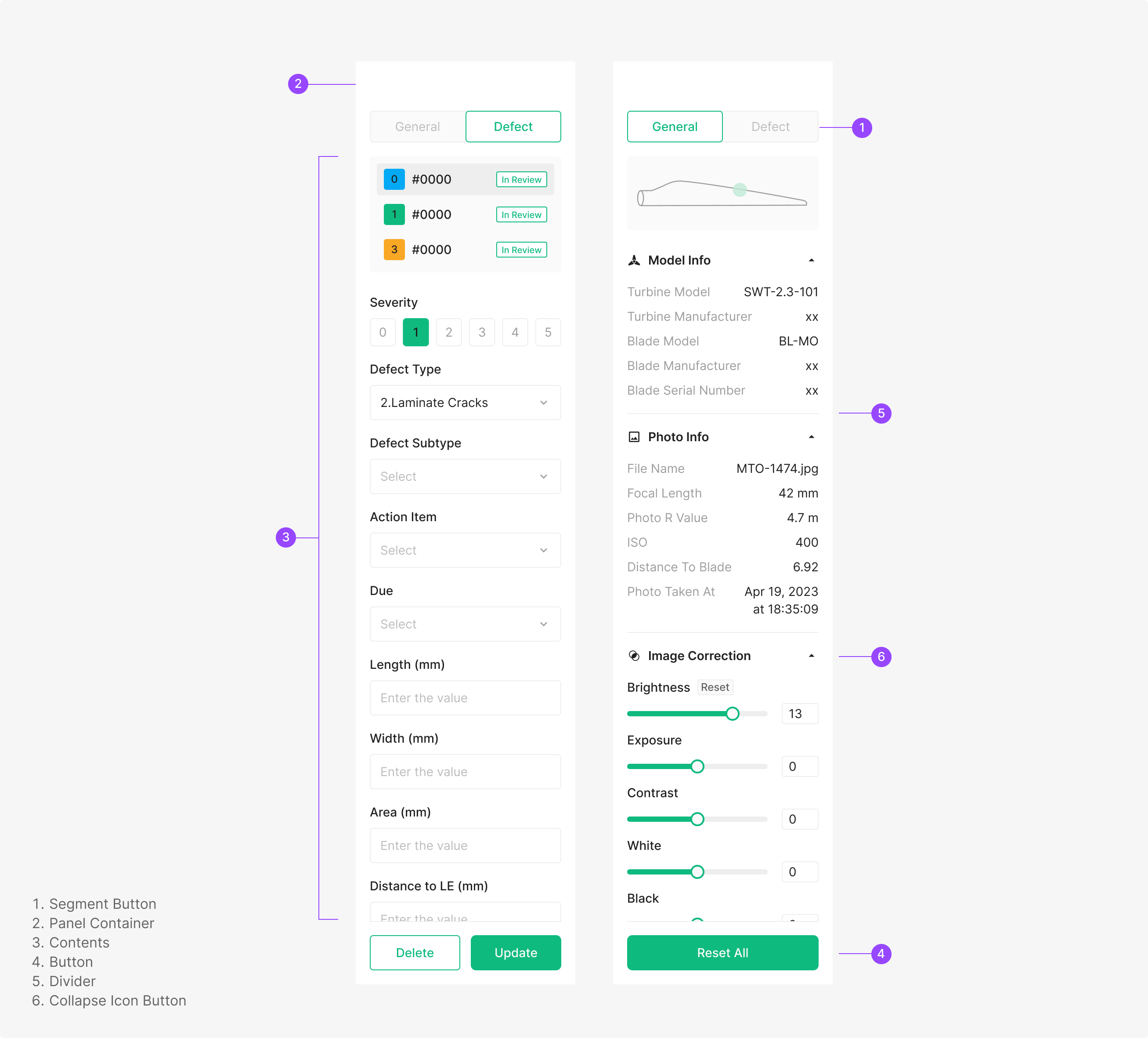
Side Expansion Panel
A vertical surface containing the actions available for the page within its panel area. It carries a dedicated Button area at the bottom.
Variants
Zoomable's canonical Side Expansion Panel is the work panel surfaced during OSD Viewer tasks. Its contents are composed from various components depending on purpose. Side Expansion Panel typically anchors to either the left or right side of the page.
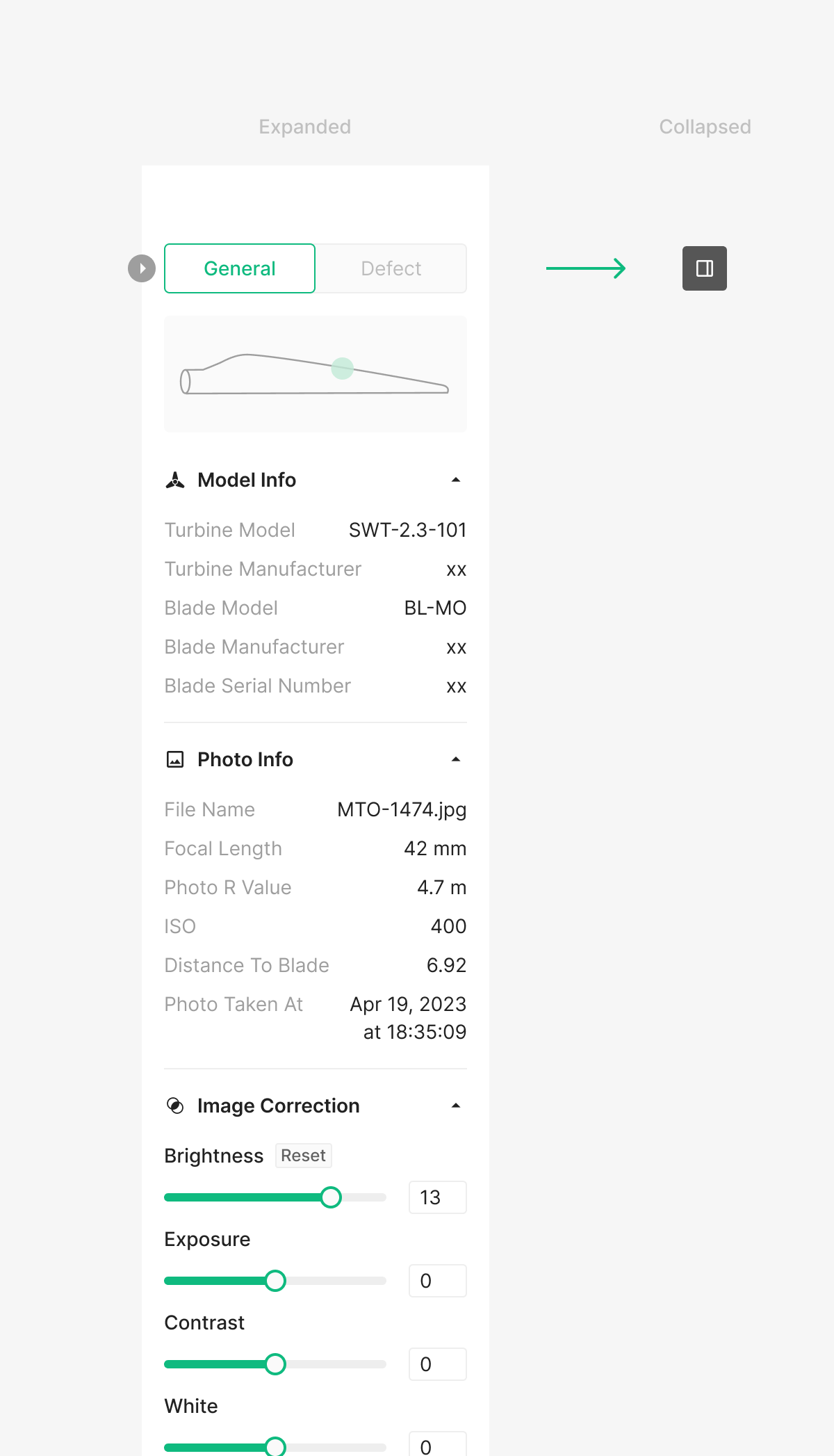
Panel Fold
Side Panel can be folded and unfolded based on usage. The Icon Button that triggers this action surfaces on hover at the panel edge. Unlike GNB, the collapsed state collapses down to a single icon button.
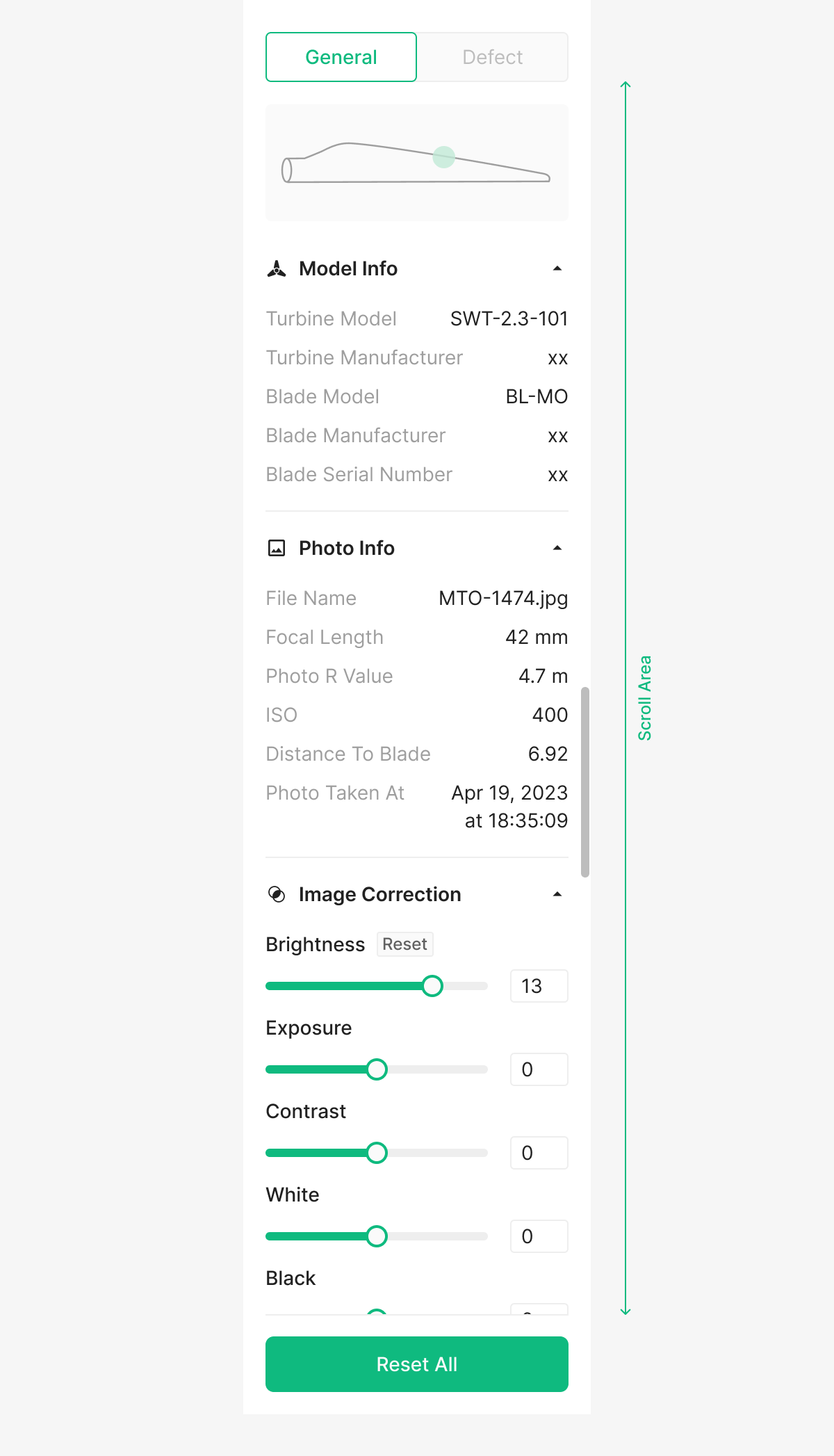
Scroll Bar
When panel items exceed the visible area, a Scroll Bar appears. The Scroll Area is sized to the items' bounds.
Table of Figma Properties — Expansion Panel / OSD Viewer Panel
| Property | Values | Default Value |
| Type | Defect Panel, Photo Panel | None |
| Empty | False, True | False |
| Position | Full, Screen | Screen |
Table of Figma Properties — Expansion Panel / OSD Viewer Panel / Entry Type
| Property | Values | Default Value |
| Type | Dropdown, Severity Filter, Short Input, Slider with Input, Toggle with Input, Checkbox, Range, Slider with Input (Reset) | None |
Table of Figma Properties — Expansion Panel / OSD Viewer Panel / List
| Property | Values | Default Value |
| State | Default, Hover, Selected, Select Hover | Default |