Date Picker
Date & Time Picker lets users pick a single date or a date range — including year and time.
Anatomy
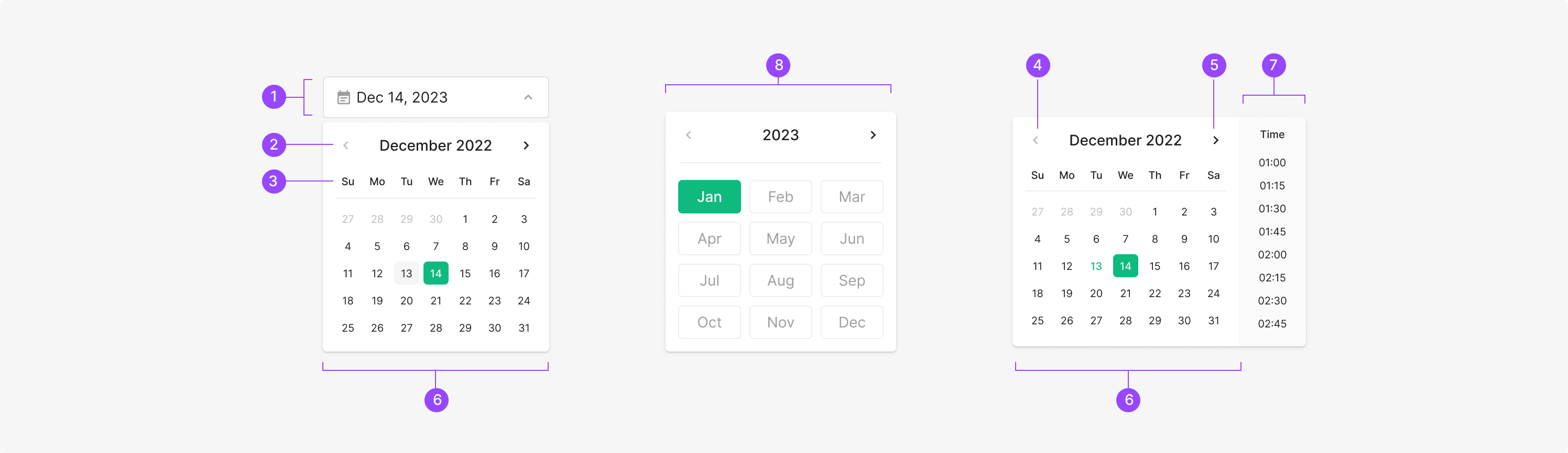
Components
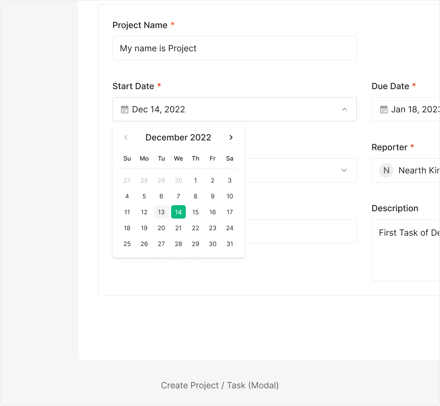
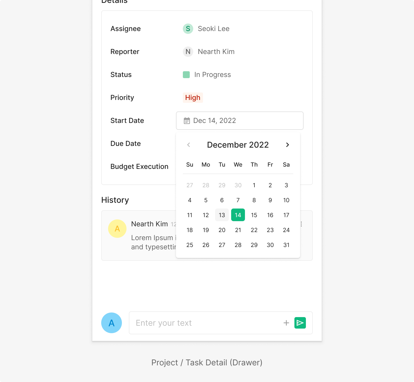
Date Picker includes Date Picker for picking a specific date, Year Picker for picking a year, and Date and Time Picker for picking both. Typically surfaced as a Dropdown Menu item with a Schedule icon.
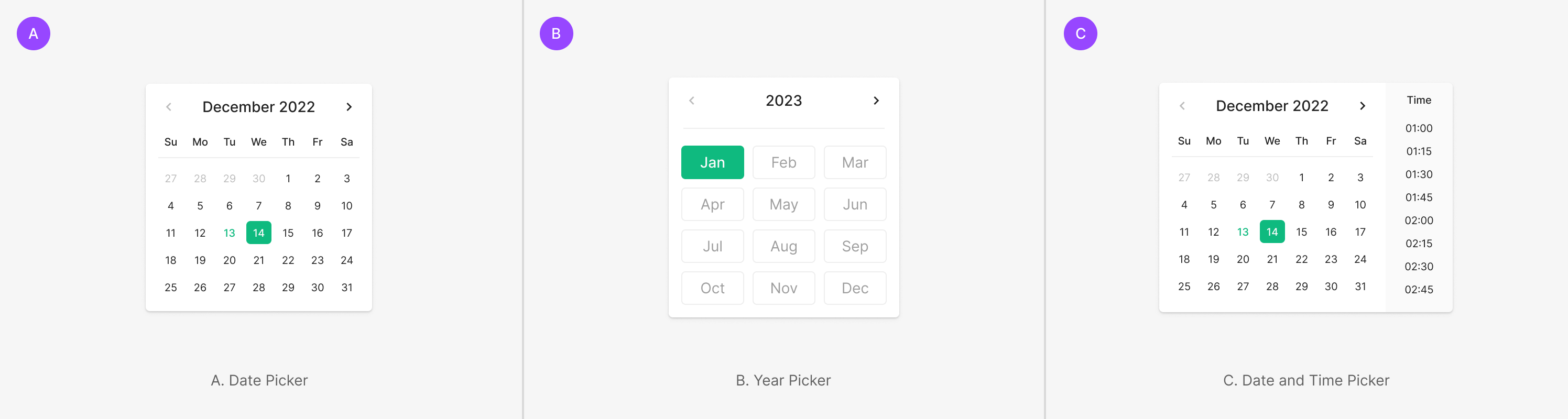
Table of Figma Properties — Date Picker with Dropdown
Sizing
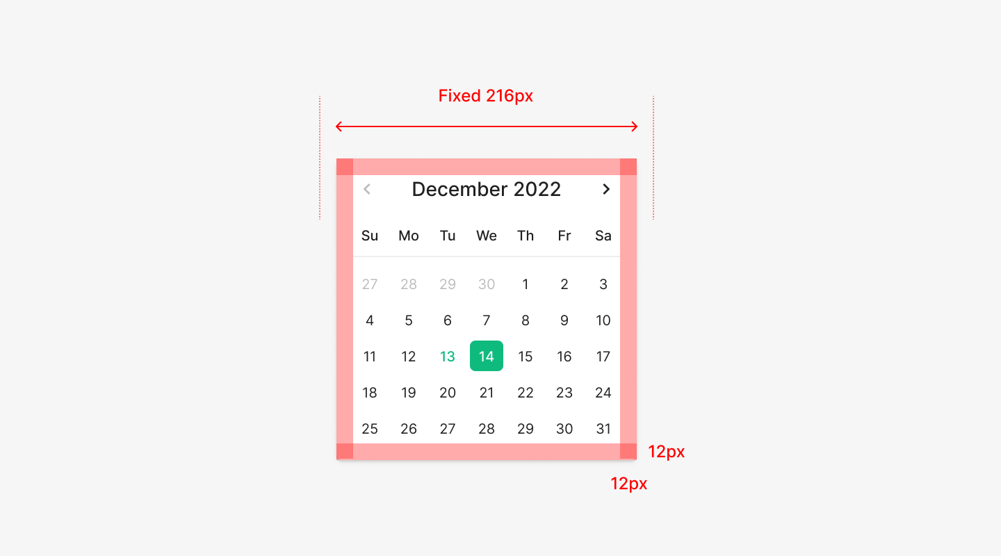
Width & Padding
Unlike a typical Dropdown Menu, Date Picker doesn't flex with content length — it uses a fixed width. The outer area uses 12px padding, keeping the internal Calendar Grid and Header within a stable spacing rhythm.
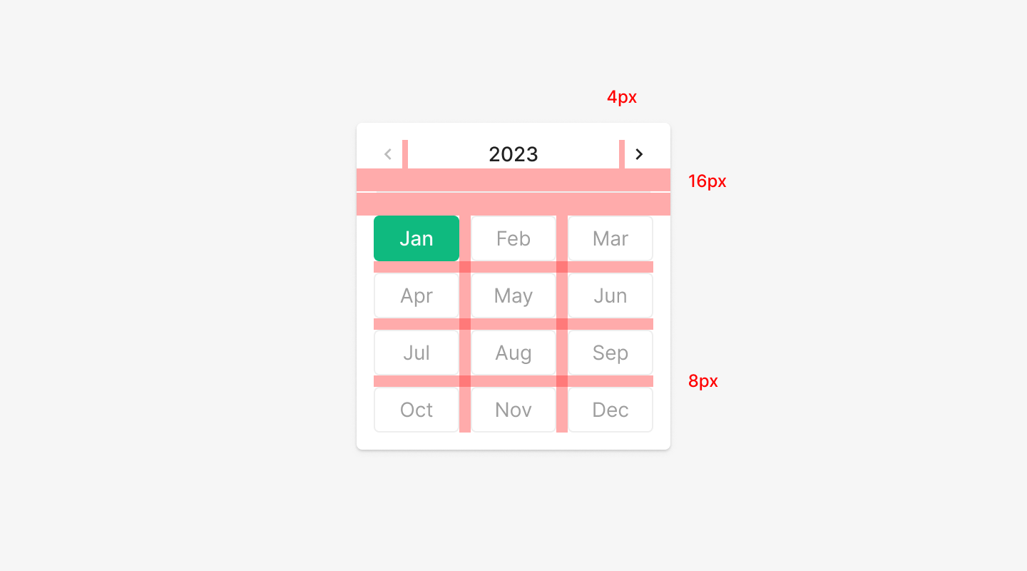
Internal Spacing
Internal elements — Header, Navigation Control, Calendar Cell — follow a defined spacing system. The top Header and the body Grid hold a clear separation, and per-cell spacing follows the same rule.
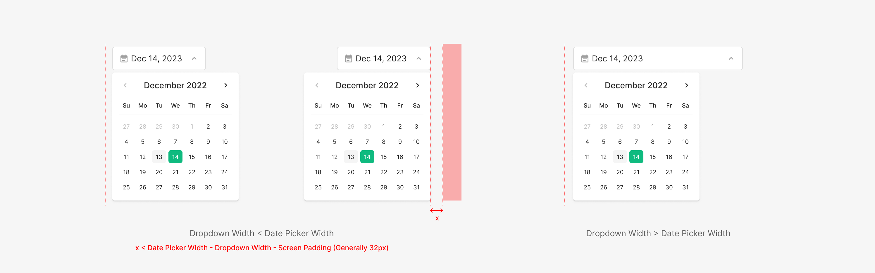
Alignment
Default alignment anchors to the left of the Dropdown. When a screen barrier interferes, alignment shifts to the right. Barrier conditions: the Dropdown width is smaller than the Date Picker, or the Dropdown sits near the right edge of the screen and blocks the picker area — in which case it aligns right.
Picker
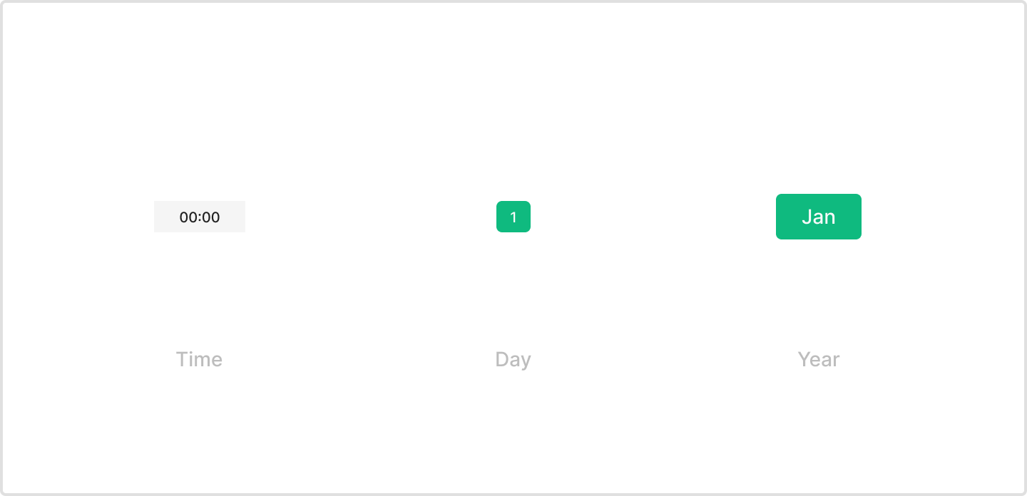
Type
Date Picker supports three types — Time, Day, Year. Time and Day use dedicated Picker components; Year uses the existing Chip component from the design system.
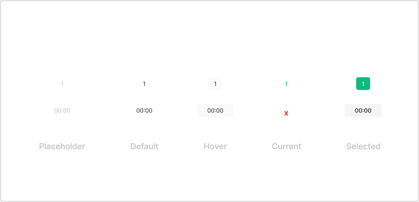
State
Year uses Chip — its states match Chip's definition. Day has 5 states — Placeholder, Default, Hover, Current, Selected. Time has 4 — Day's 5 states minus Current.
Usecase