Chips
Chips let users input information or pick a value. A single Chip can act as On/Off; when multiple Chips appear together, they default to single-select.
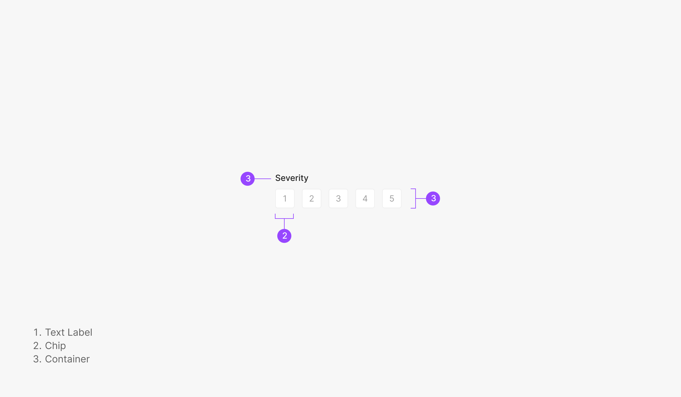
Anatomy

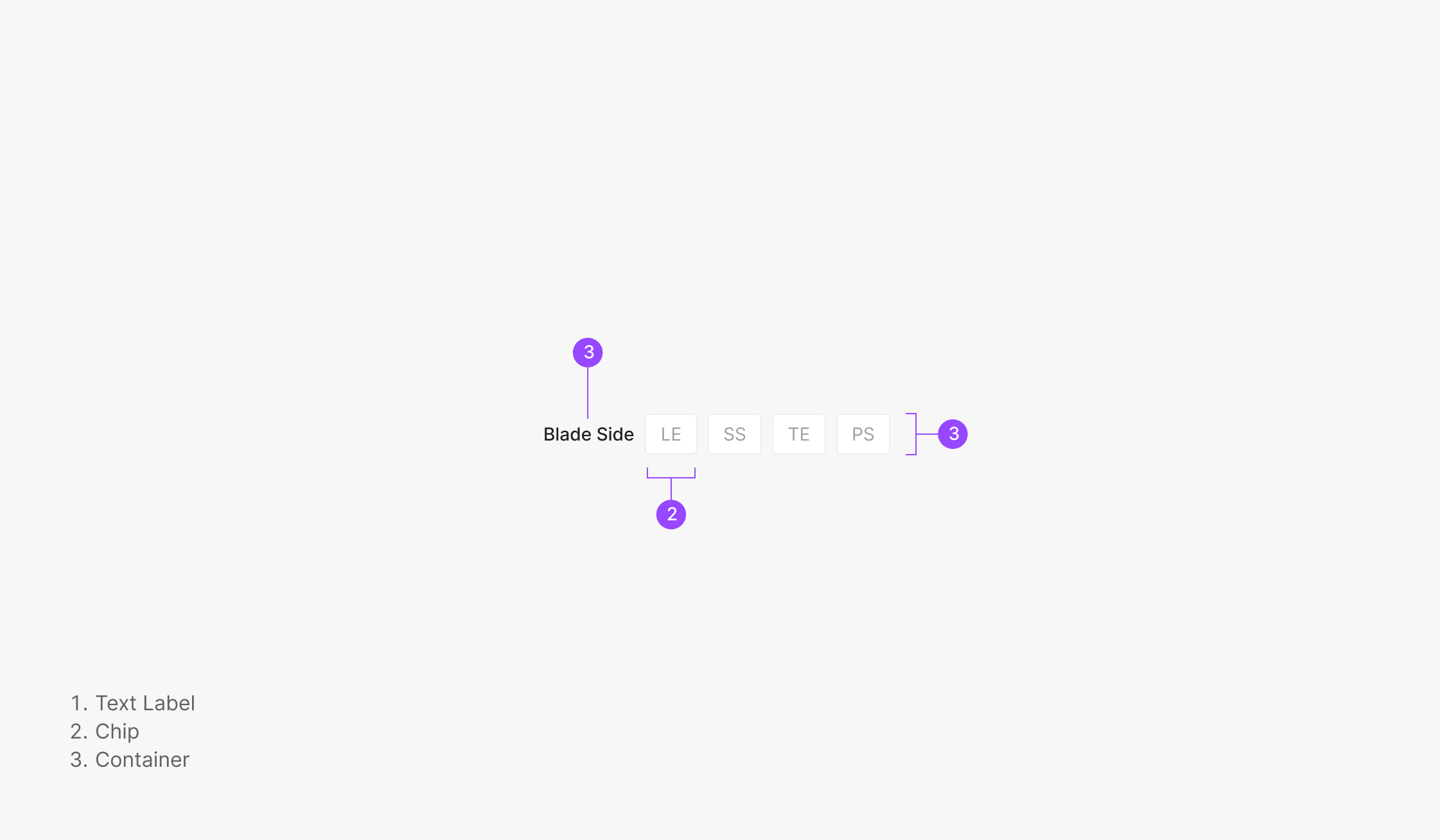
- 1. Filter Container
- 2. Text Label
Components
Selecting a Chip immediately reflects the action and surfaces the resulting data. Basic Filter Chips and Severity Chips filter when there are at least two options. Filter Chips share one selected-state color across labels; Severity Chips differentiate by severity level — each tier maps to its own color.
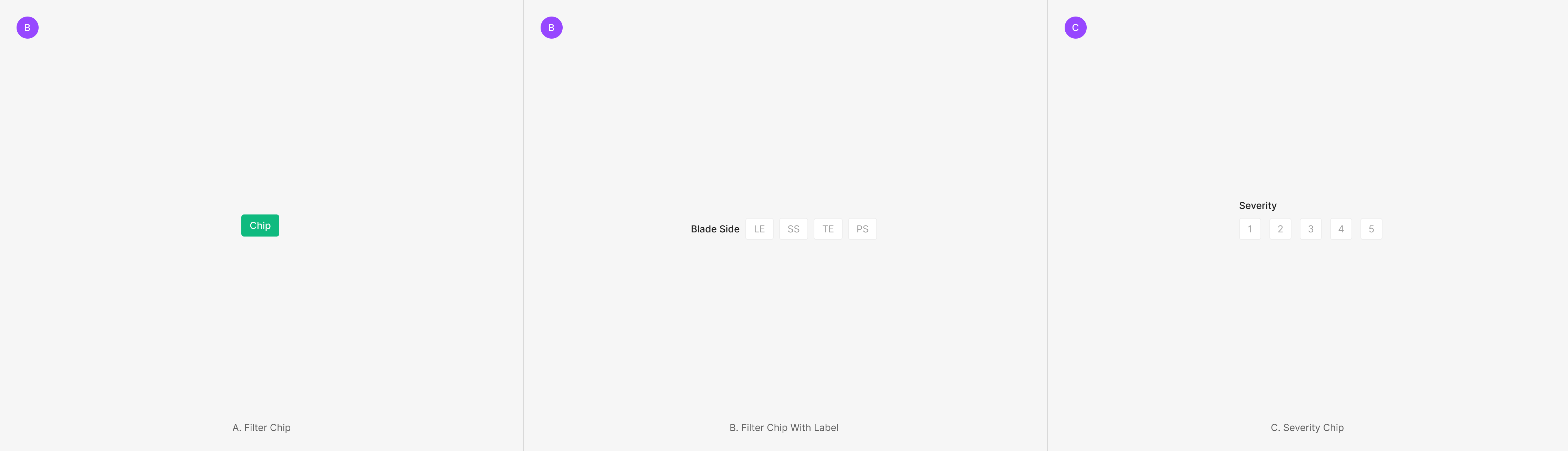
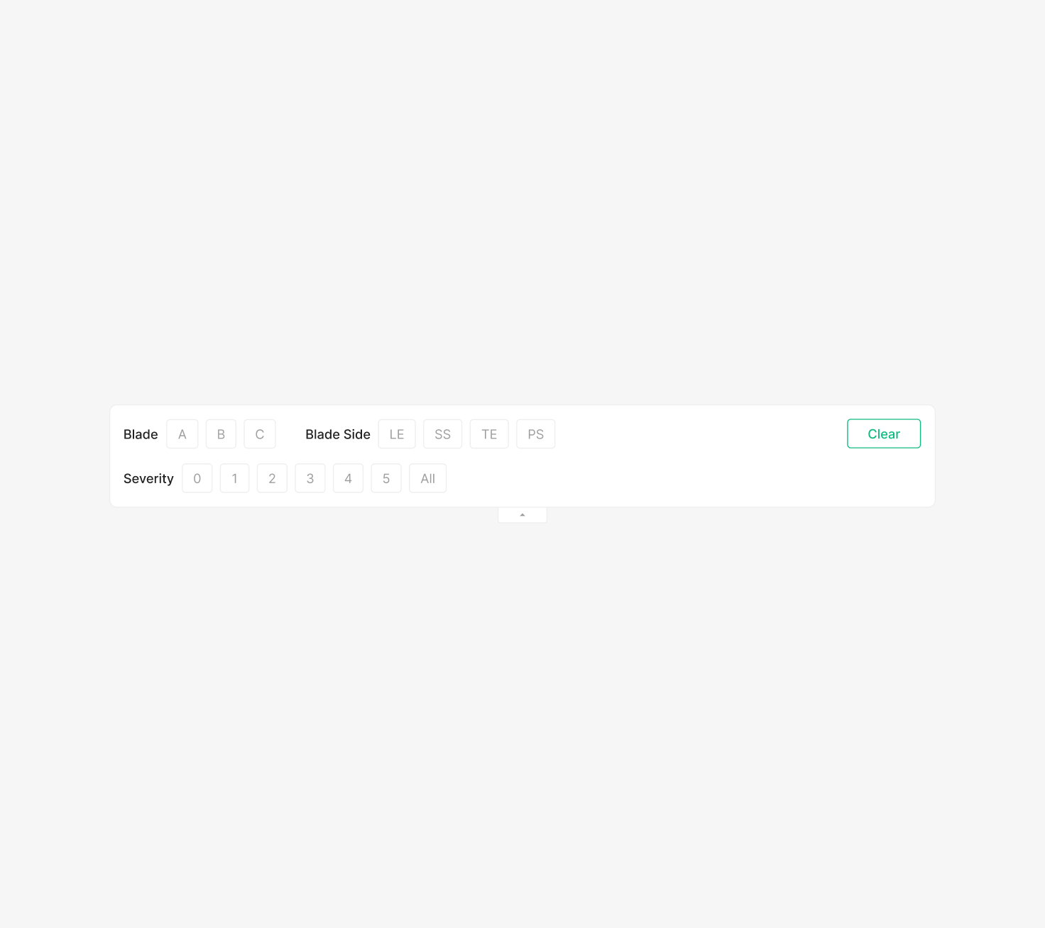
Filter Chip
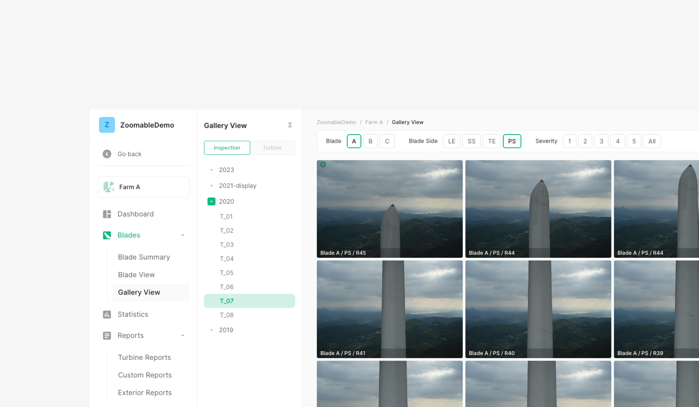
Filter Chip labels are configurable. In Wind, Filter Chips appear inside a Filter Bar. Each Chip Group's Label Text marks a distinct filter, and all Filter Chips use the same Selected-state color.
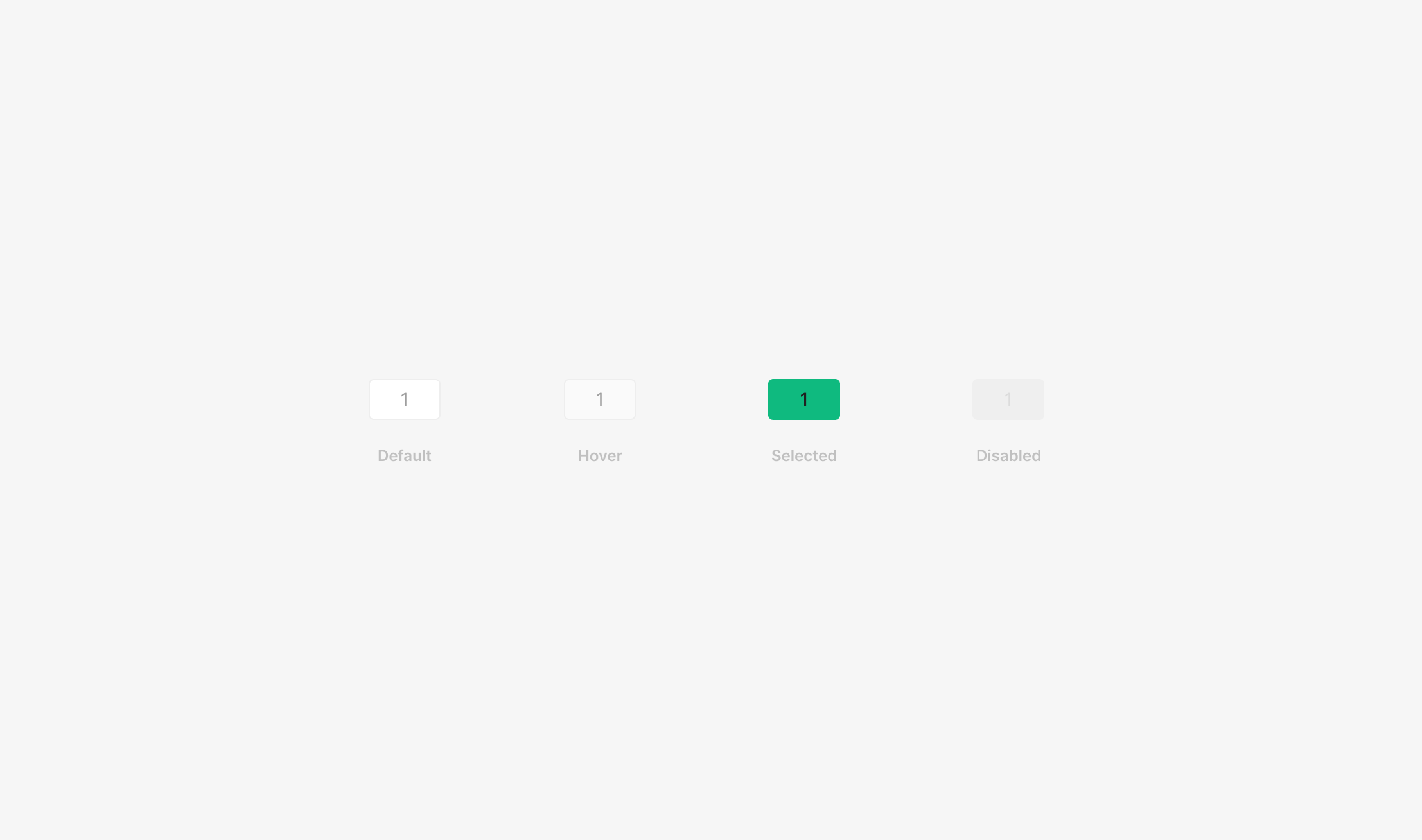
Variants
State
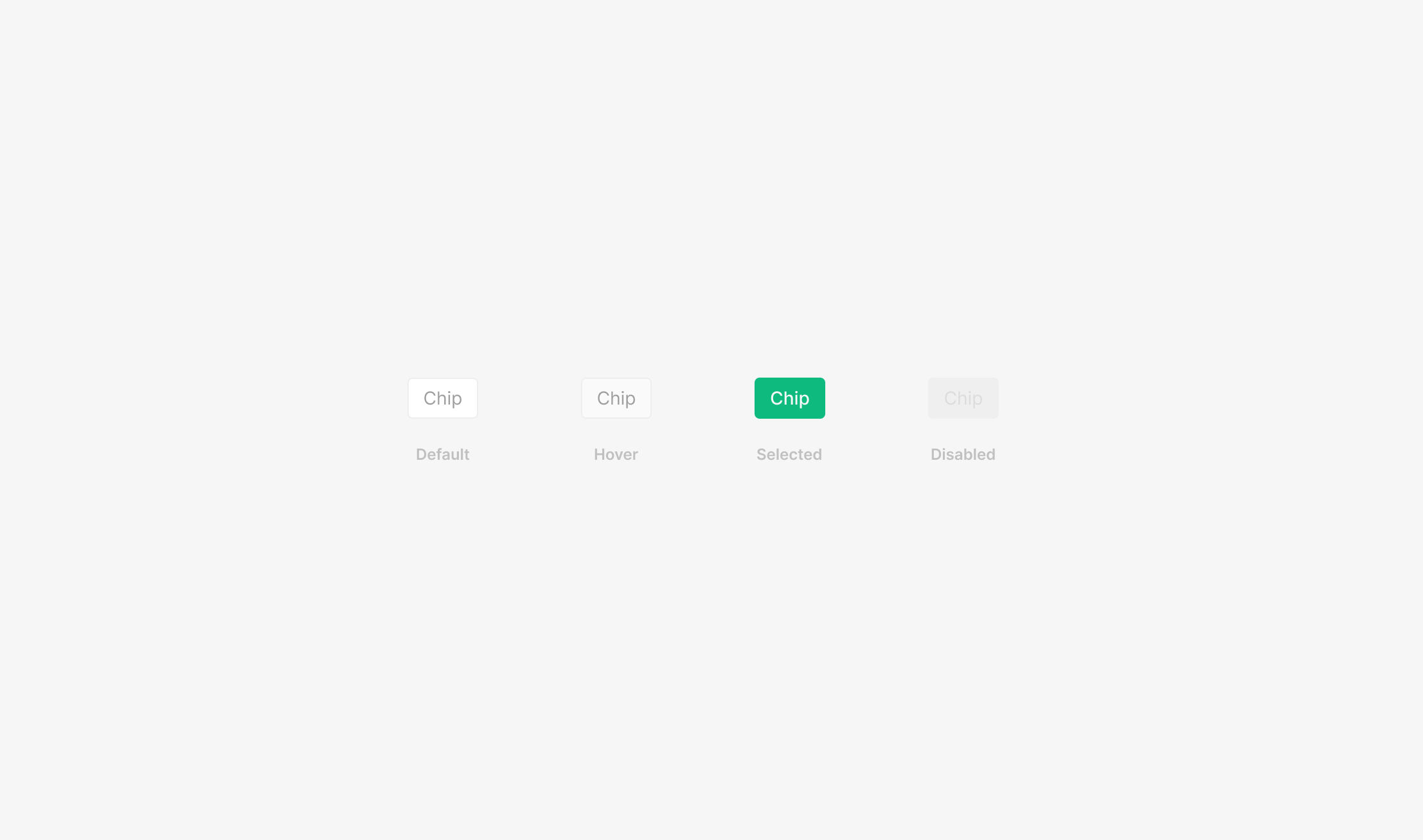
Basic Filter Chips split by Selected/Unselected into Default, Hover, Selected, Disabled. Selected is treated as the Active state.
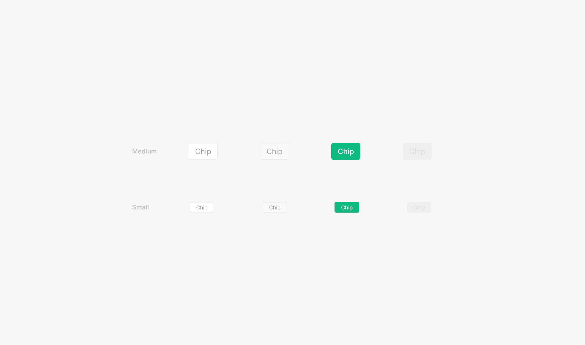
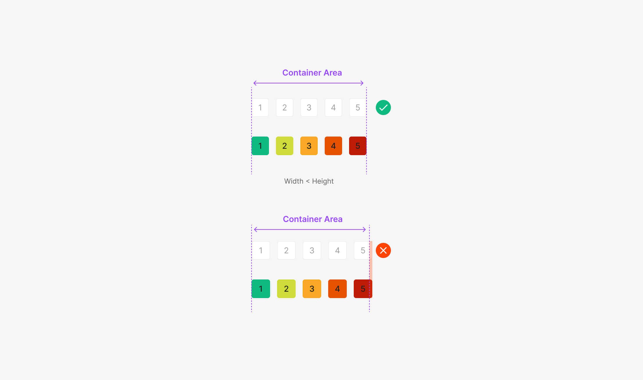
Size
Width flexes; height uses 32px (Medium) or 20px (Small). Font size, icon size, radius, and padding vary per size. Heights below 20 (Small) are avoided — they fall below the minimum touch target.
Table of Figma Properties
Spec
Color
When Active, Filter Chips inherit their category color.

Text Byte
Each chip caps at 10 characters (22 bytes, including spaces). Beyond that, truncate with an ellipsis and surface the full text in a Tooltip.
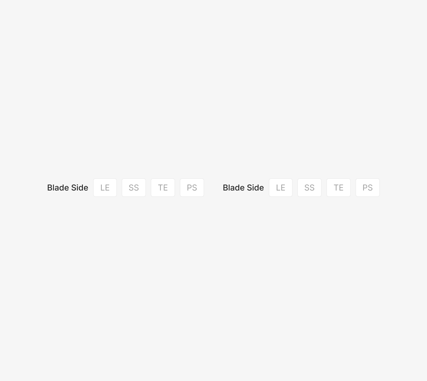
Placement
Filter Chips inside a Filter Bar default to left-aligned, with two-line layouts allowed. Horizontal margins lock at 16. Label-to-chip gap is 8. Group-to-group horizontal spacing is 32; row spacing is 16.
Severity Chip
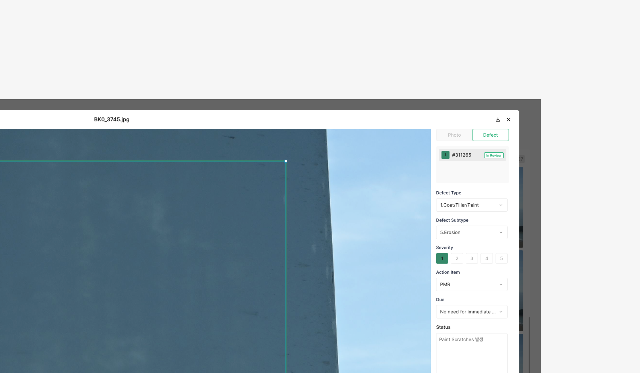
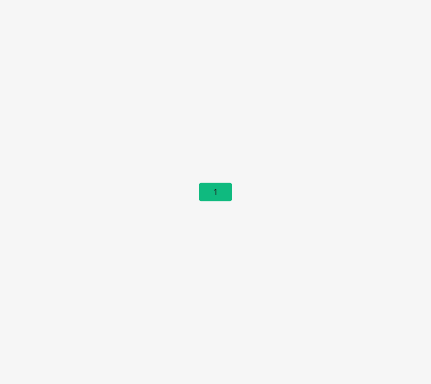
Severity Chip lets users pick a level for status or defect severity. Each Chip's numeric value represents a fixed Severity Level, and the user picks one value within the defined range. Unlike a typical text-based Chip, Severity Chips deliver a number-centered selection experience within a consistent size and structure. The selected value gets visual emphasis, and a level-based color scheme can apply to make the current severity readable at a glance.
Variants
State
Basic Filter Chips split by Selected/Unselected into Default, Hover, Selected, Disabled. Selected is treated as the Active state.
Size
Width flexes and can be adjusted by situation. Color, severity order, and the number of visible chips shift with the customer's severity policy; chip width flexes by the available area. Default width inside the OSD Viewer: {(container width) − 12 × (total severity count − 1)} / (total severity count). Inside a Modal: {(container width) − 8 × (total severity count − 1)} / (total severity count). Minimum chip width should not exceed the chip height. When the group overflows the container, fitting within the container takes priority.
Table of Figma Properties
Spec
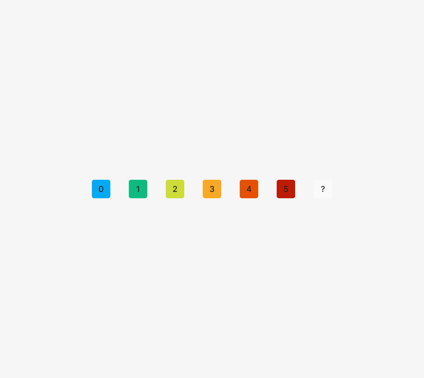
Color
When Active, Severity Filter Chips inherit their category color. Severity levels can differ by customer; apply colors starting from the extremes (1 and 5) and work inward.
Text Byte
Severity Chips use the assigned severity number — typically up to 2 digits.
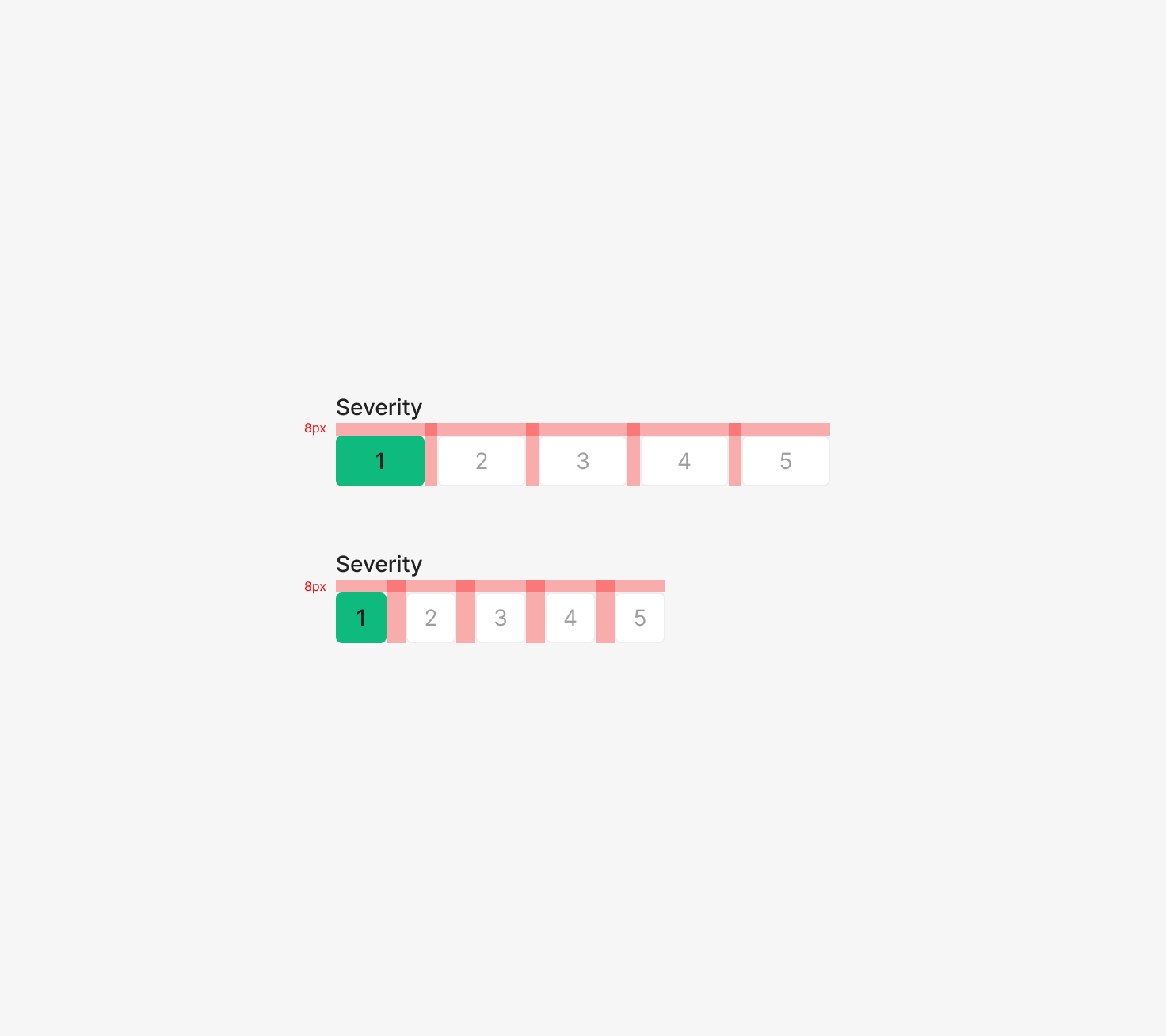
Placement
Default left-aligned, with two-line layouts allowed. Label-to-chip vertical gap is 8. Group-to-group margin is 8 at Medium, 12 at Small.