Input
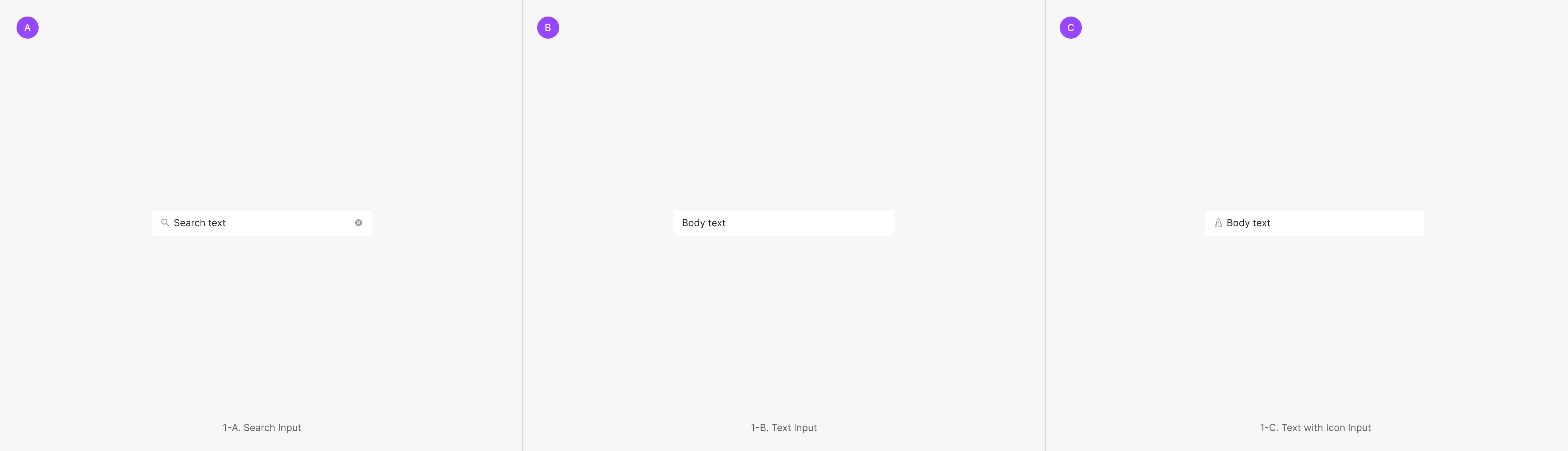
Input lets users enter and edit text. The family includes Text Input, Text Input with Icon, and Search Input — used to query and retrieve specific values.
Anatomy

Dropdown Type
Dropdowns surface Menu Items used to filter or sort page content. Variants split by Dropdown Button type — Primary (Label), Secondary (Avatar & Badge), and Tertiary (Non-Outlined).
Components
Input splits into Primary and Secondary by style, intent, and field shape. Within each, sub-types — Text (with Icon) Input and Search Input — apply per use case.
Text (with Icon) Input
The most common type — composed of a text-only Label Input or a Label with Icon Input.
Secondary Type
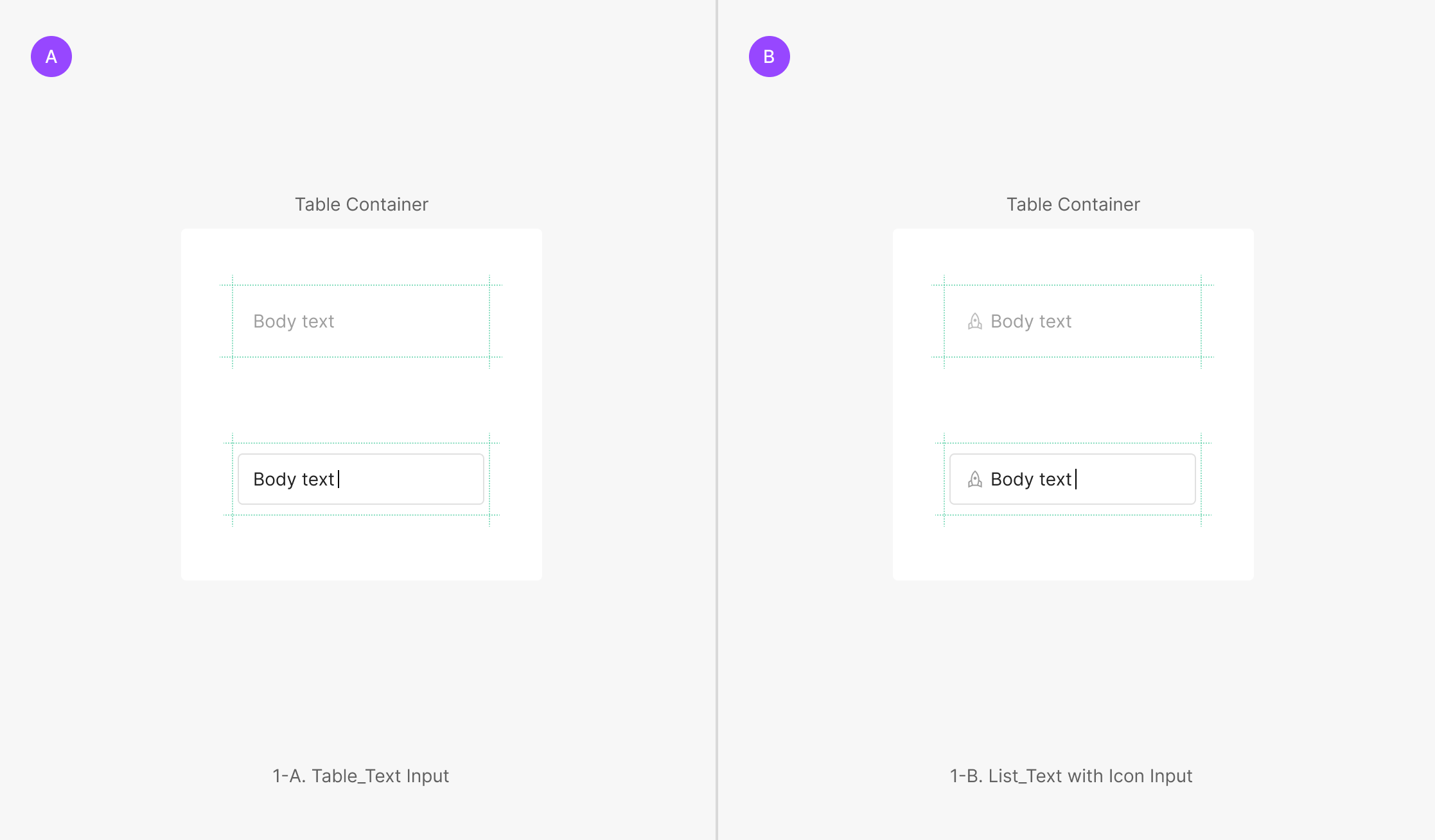
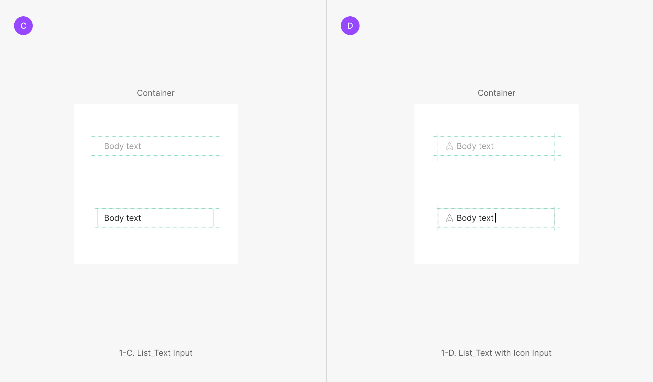
Outline hidden by default; when Focused, the input falls back to a Primary-style Text (with Icon) form. Two variants: Table Input and List Input. Table Input keeps the area's padding; List Input fills the entire cell (padding = 0).
Extra Type
Forms outside Primary and Secondary — Description Text Area (height flexes with content up to a max), Comment Text Input (fixed height), and Numerical Text Input (numeric data only).
Variants
State
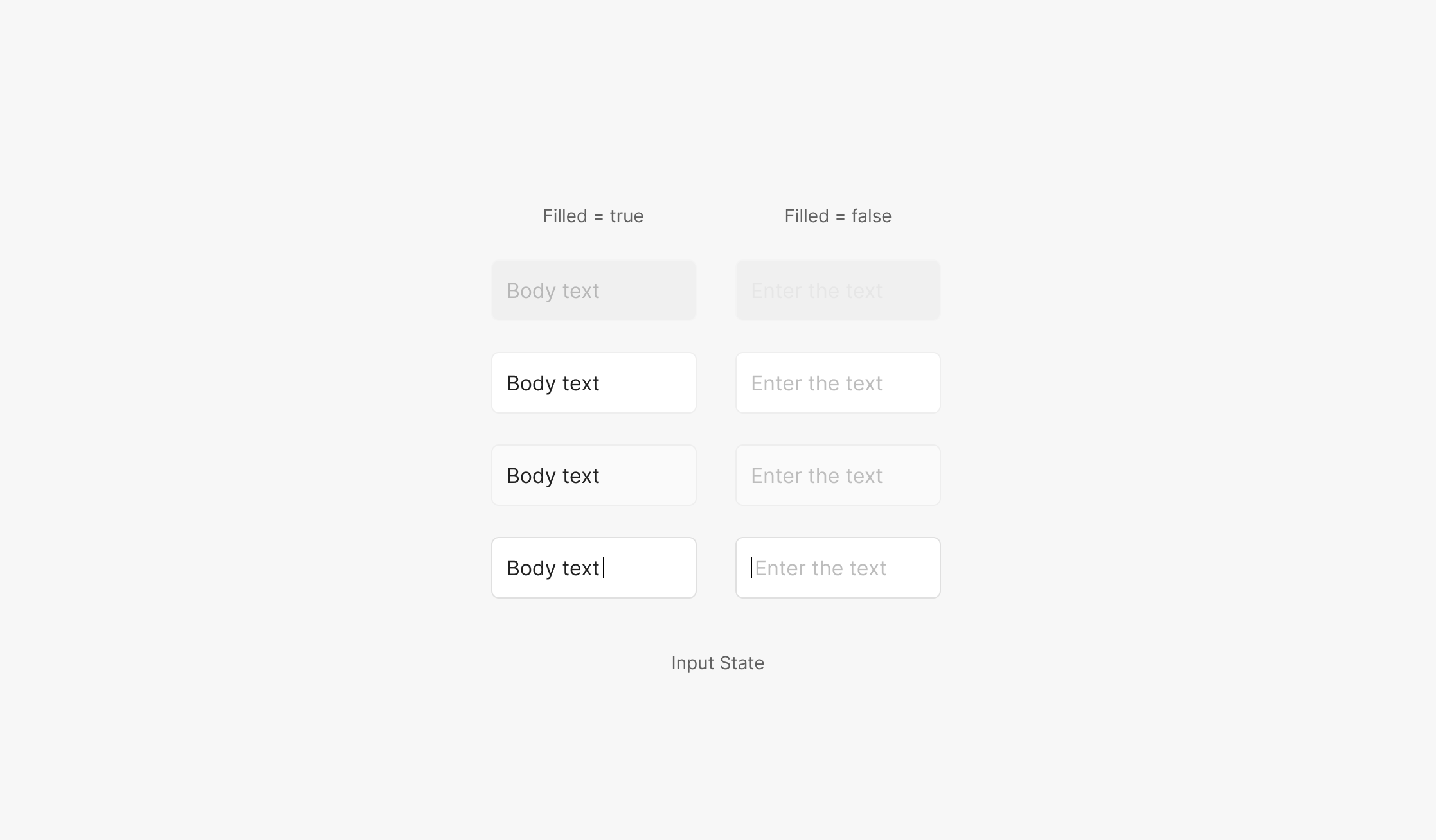
Input has 4 states — Disabled, Default, Hover, Focused.
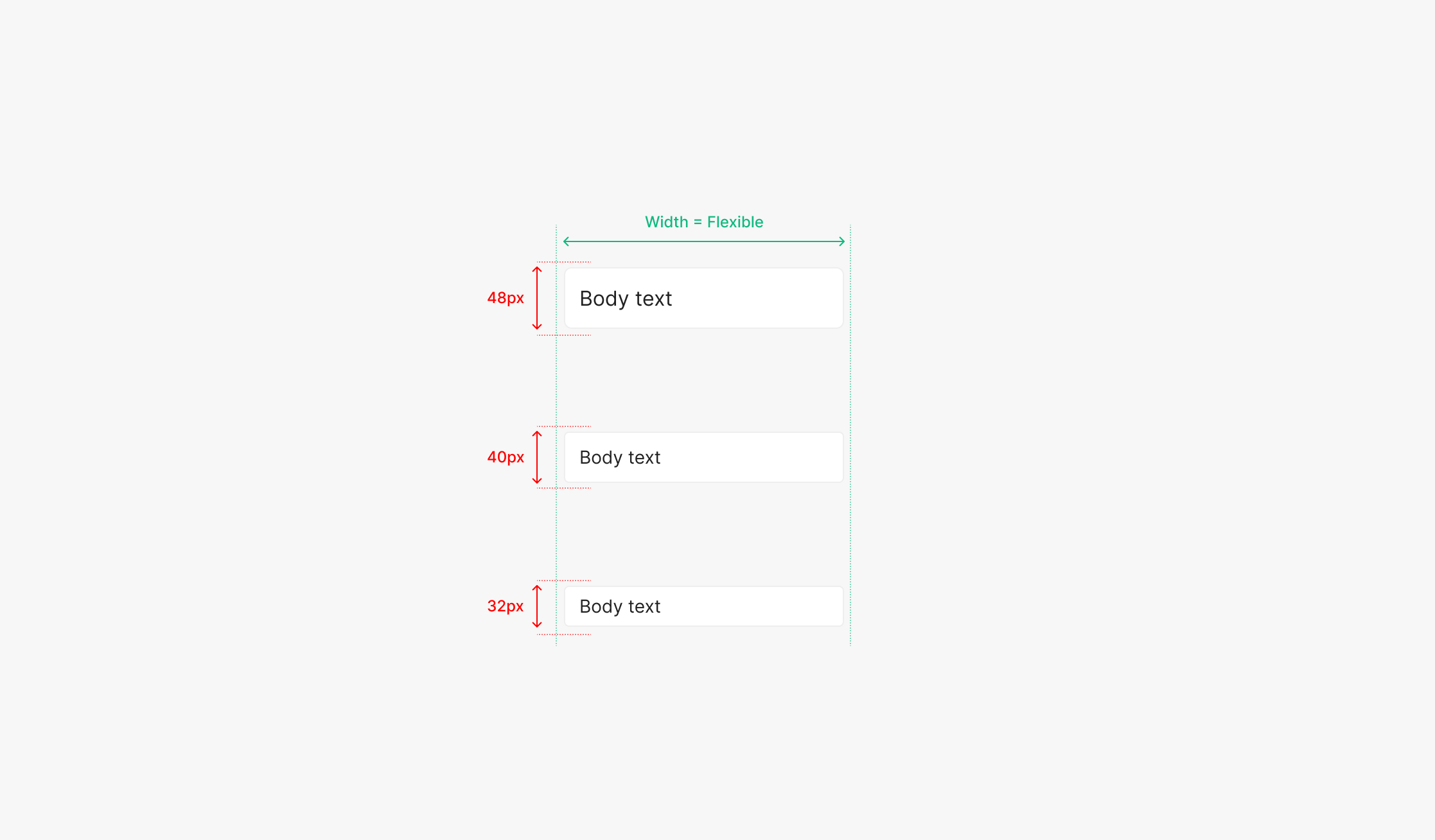
Size
Sizes use height — Large, Medium, Small. Width stays flexible.
Sizing
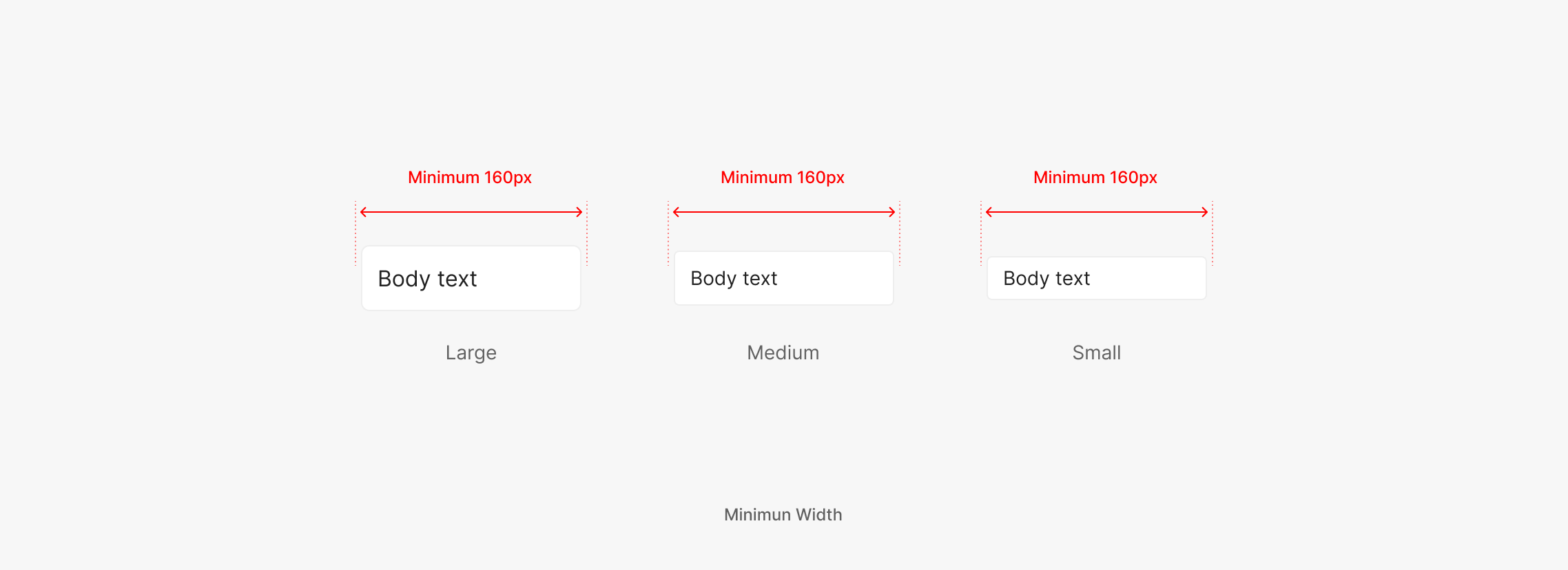
Minimum Width
Width flexes with the surrounding area. Minimum width is 160px.
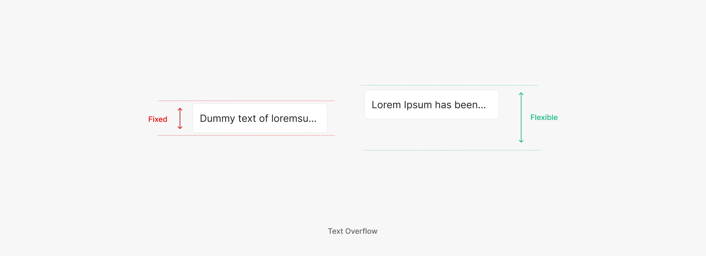
Text Overflow
Overflowing text renders one of two ways — truncate with "…" at a fixed height, or wrap to the next line beyond the given width. Choose per feature intent.
Table of Figma Properties — Input
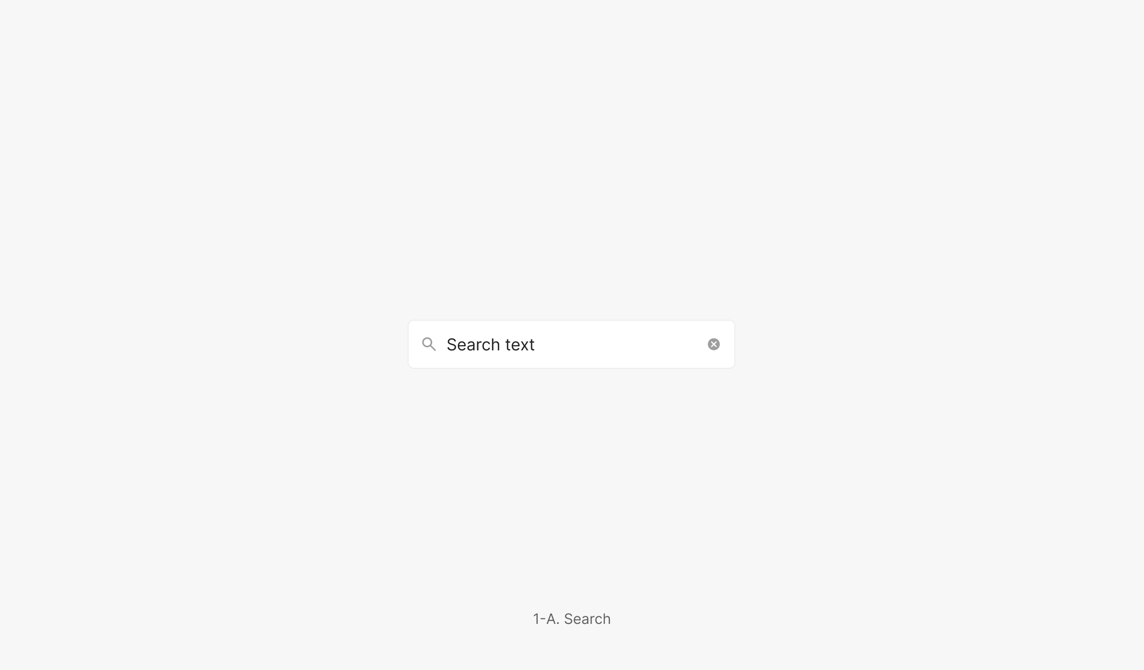
Search
Search Input lets users query for specific information. Unlike other Input components, when Fill = On, the Cancel (Clear All) Icon Button surfaces.
Text Input with Field Label
For in-page item search — uses the Container outline form.
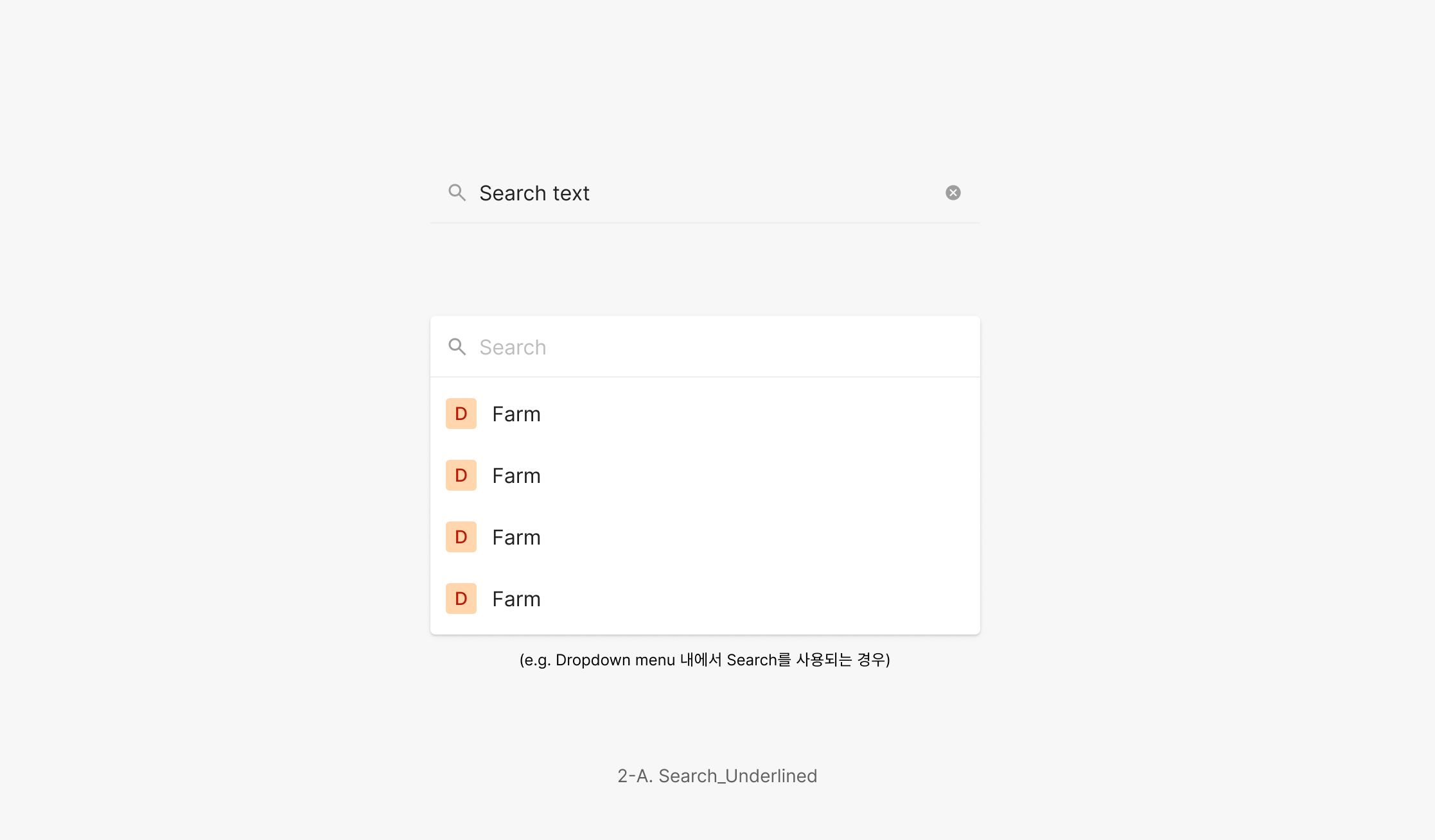
Text Input without Field Label
For searching inside another component — uses the underline form.
Text (with Icon) Input
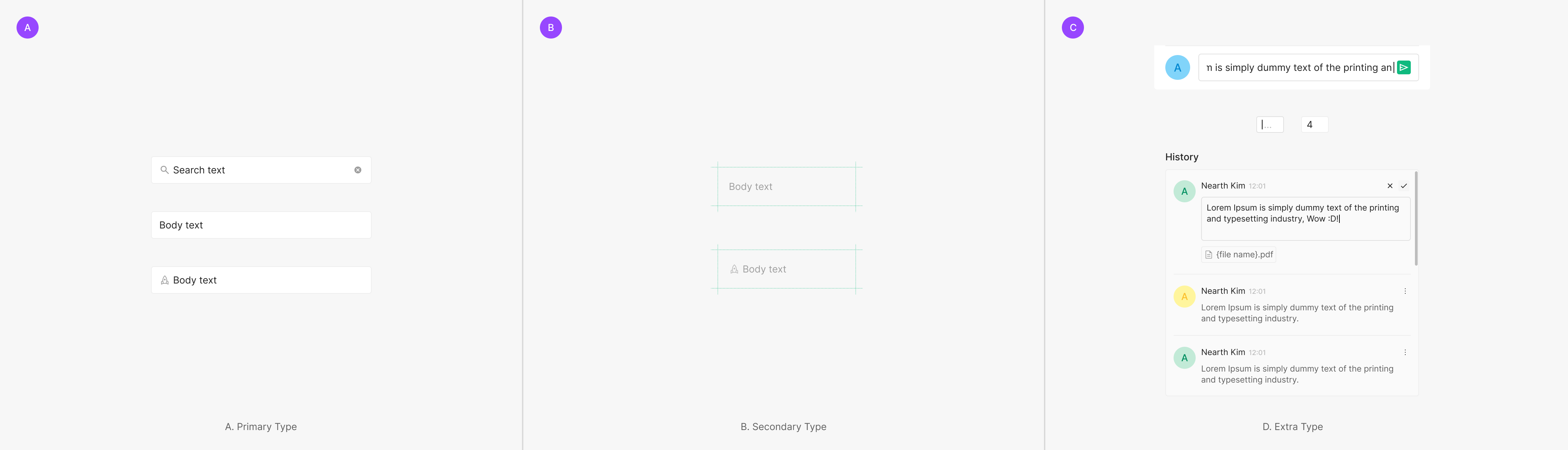
Surfaces a field for text entry. Typically paired with a Field Label. (e.g. Status / Comment text in the OSD Viewer panel, History panel text entry, Login form input.)
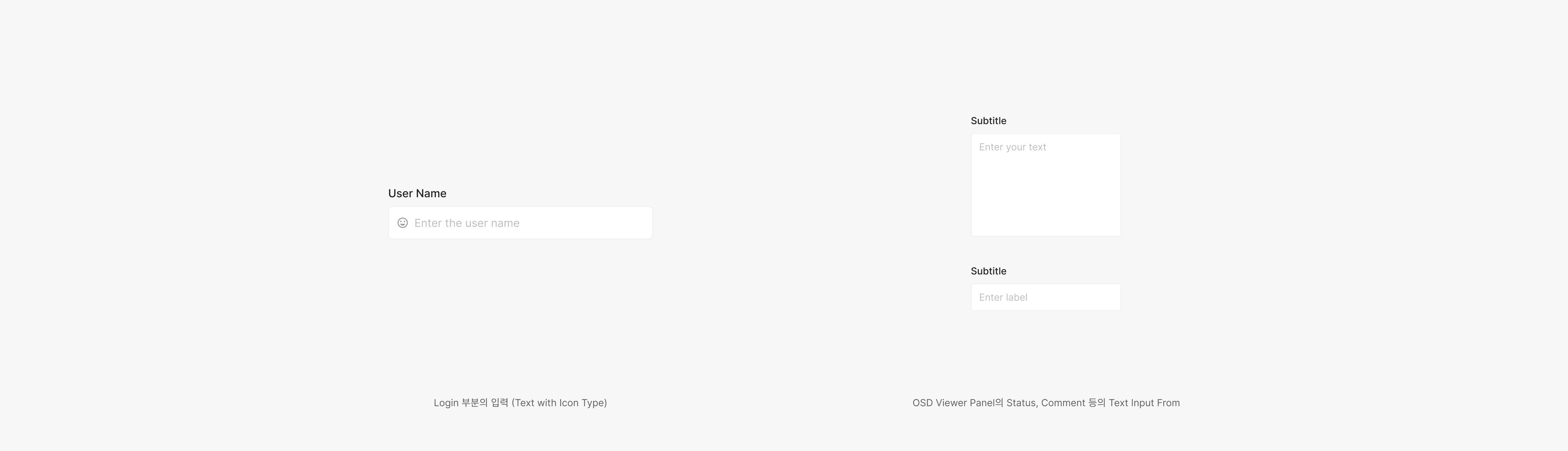
Table / List Input
Edit values inline inside a Table or List. On Hover and Focused, Table / List Inputs match the Primary Type Input behavior.
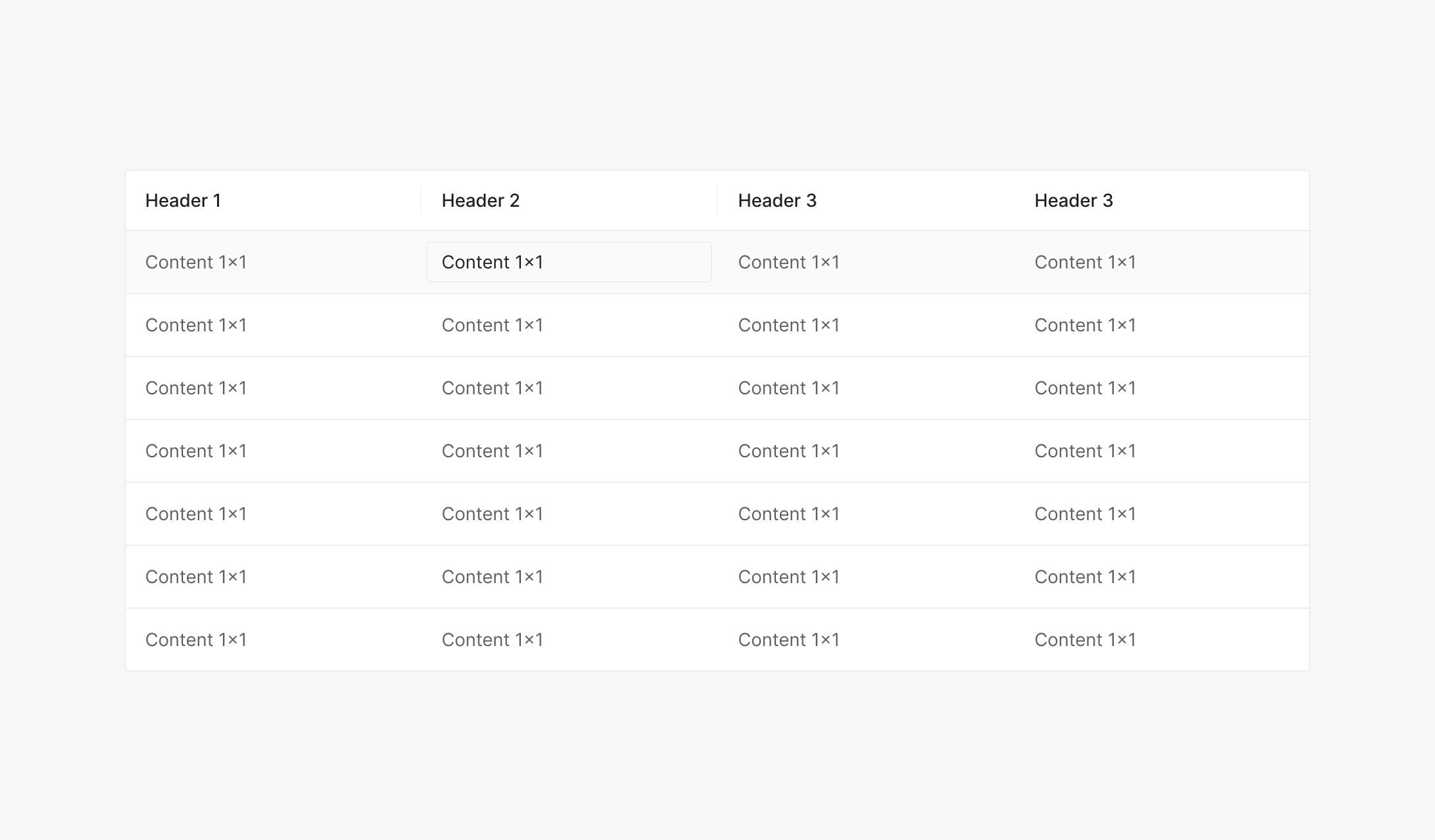
Text Input in Table
Edits content inside a table.
Text Input in List
Edits content inside a list.
Numerical Input
Accepts numeric values only. Used without a Label — the Unit sits to the right with a small gap.
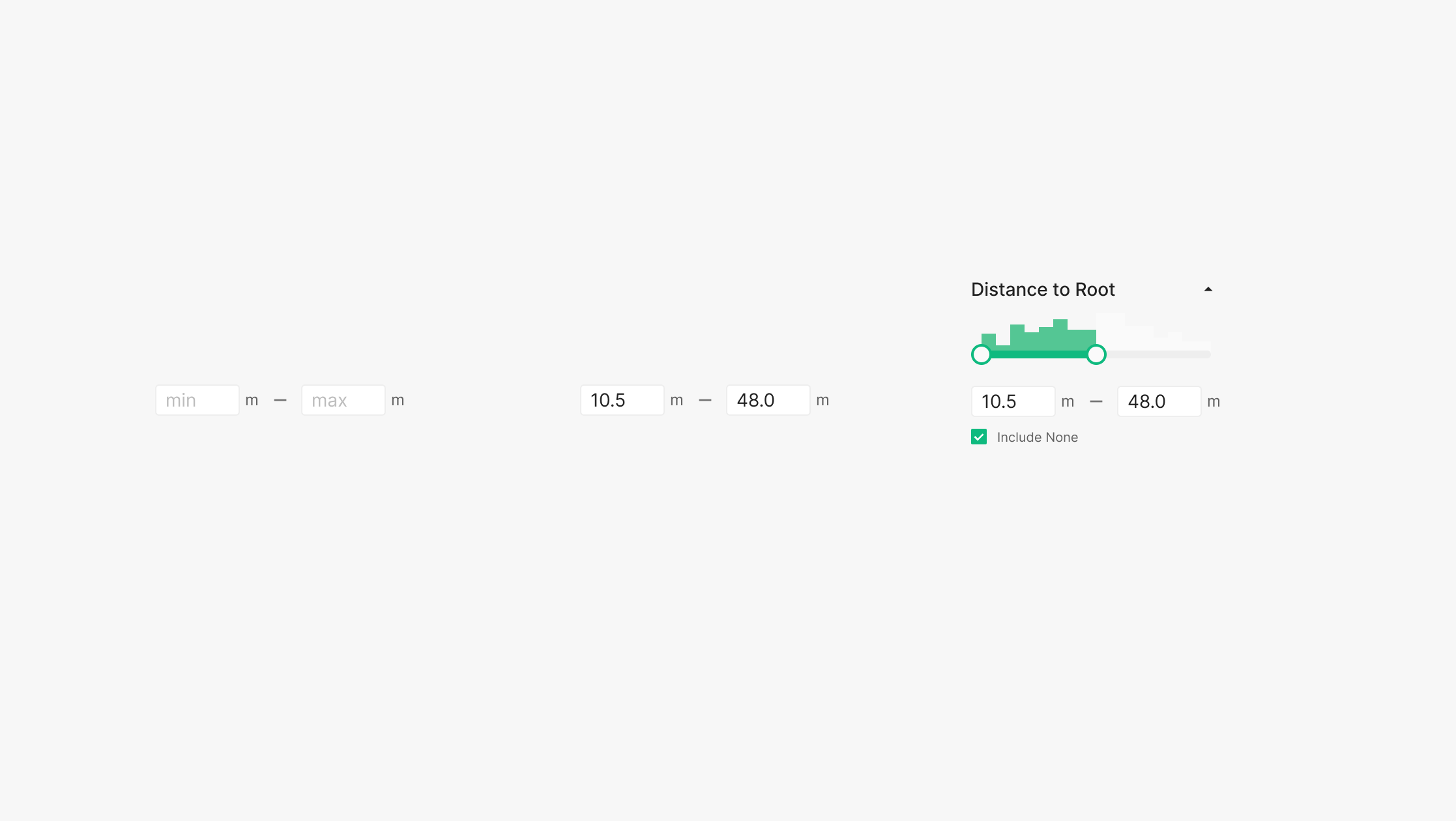
Numerical Input with unit
Paired with a unit — often combined with other controls (checkbox, slider, etc.).
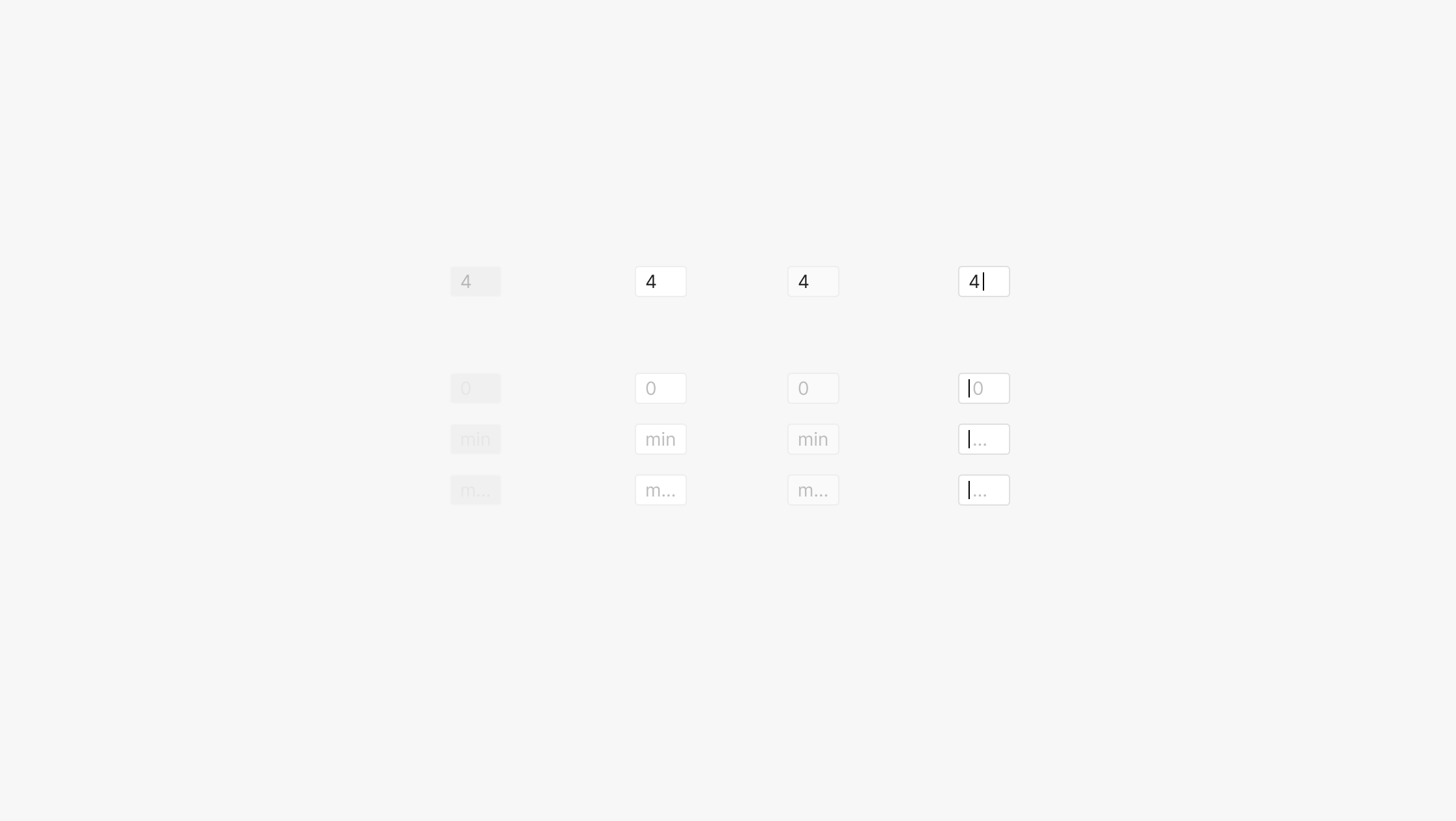
State of Numerical Input
Four states — Disabled, Default, Hover, Focused — each with Filled or Unfilled. Unfilled placeholders carry one of three values: "0", "min", "max".
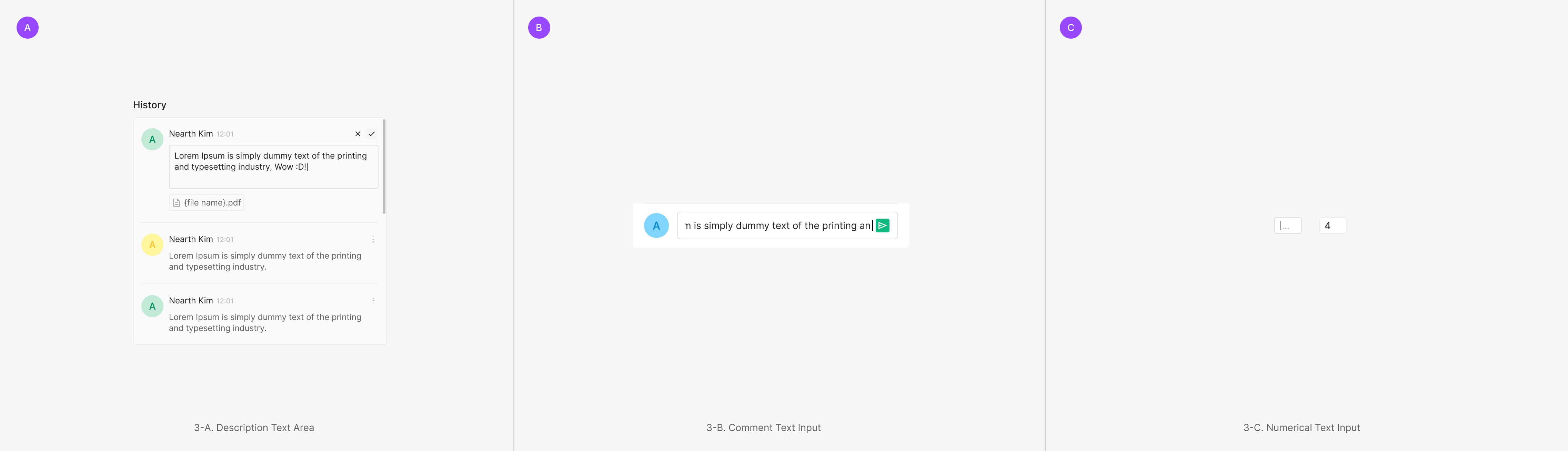
Description / Comment
Description and Comment patterns surface text for reading or capture text from users. Read-focused Text Area vs. entry-focused Text Input — the container height flexes or stays fixed by context. The same text-based component delivers a consistent input experience tailored to each surface's purpose and flow.
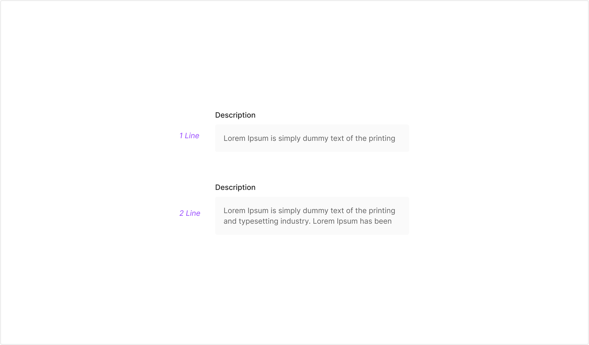
Description Text Area
Conveys descriptive text for easy reading. Used for guidance copy, status descriptions, supplementary info — read-focused content. Expands across one line or multiple lines based on content.
Description Text Input
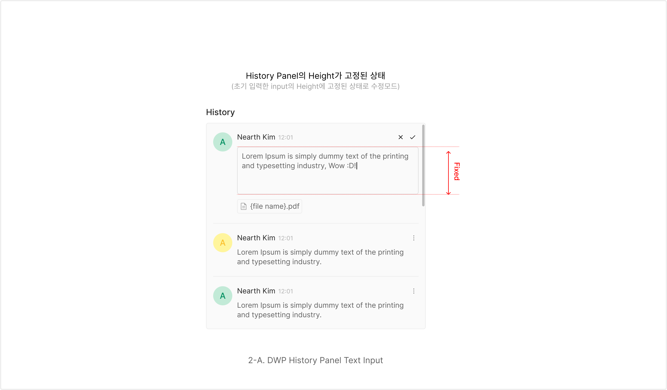
For user-entered descriptions or detail text. In fixed-height panels like the History Panel, input runs within the panel's preserved structure.
Comment Text Area
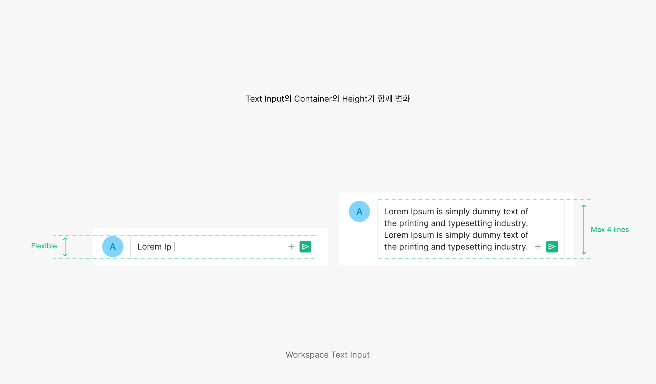
For free-length opinions or comments. The container height expands with the entered text — supports natural multi-line capture.
Commnet Text Input
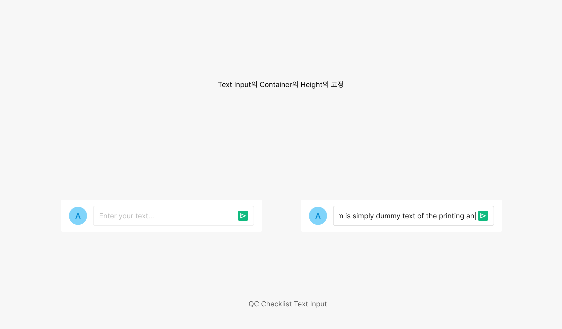
For short comments or quick replies. Fixed input height — efficient, concise capture in a constrained area.
Usage & Placement
Input most commonly appears in form layouts, often paired with Dropdown.
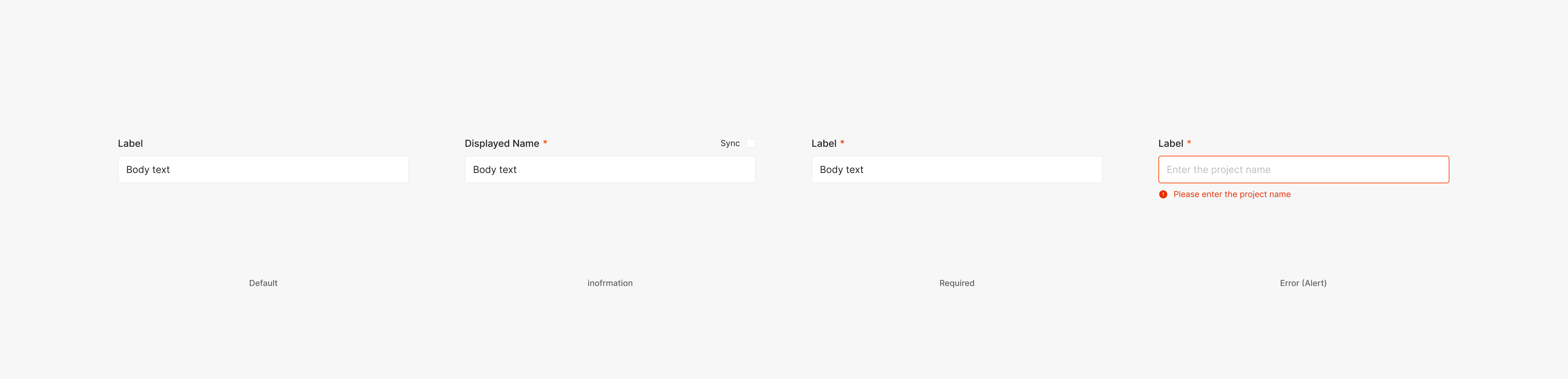
Label
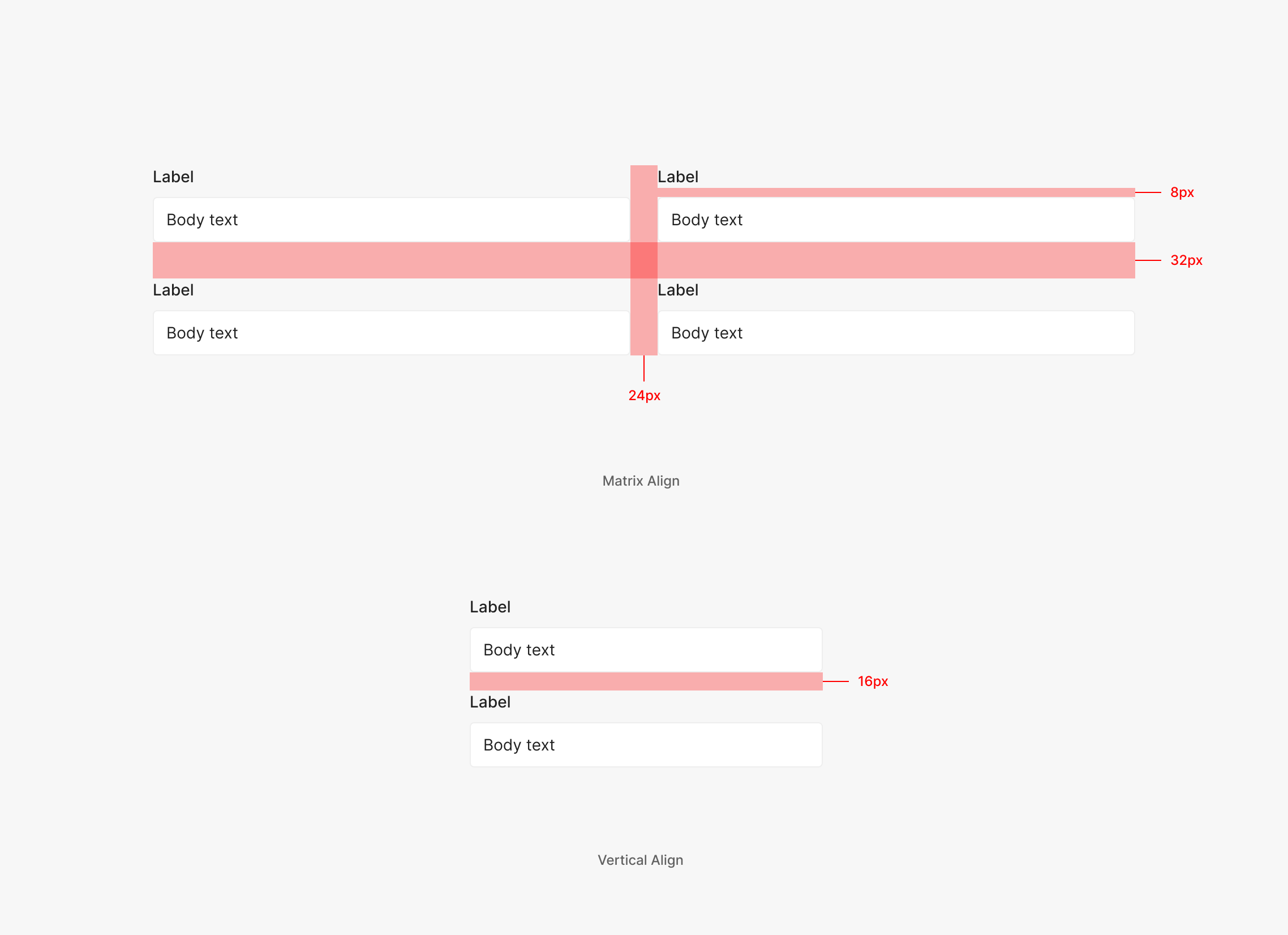
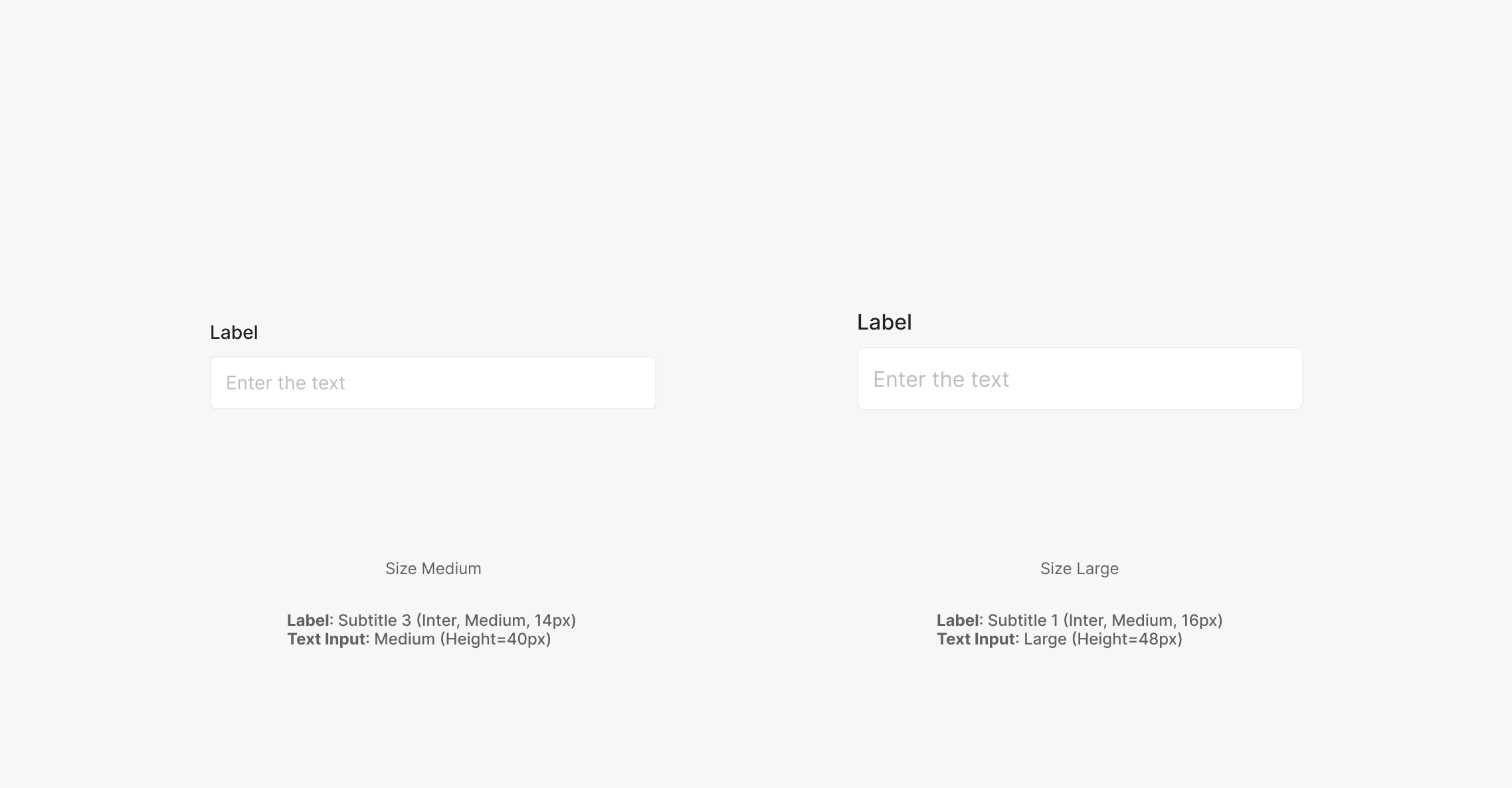
Forms with a Dropdown surface a Label for the field. Use Subtitle 3 (Inter, Medium, 14px), with Required, Error, and Information variants as needed. Label + Dropdown / Input combinations are often used together. Use 8px between Label and Dropdown, 24px between horizontally arranged elements, and 32px between vertically arranged. In vertical-only layouts, use 16px between elements.
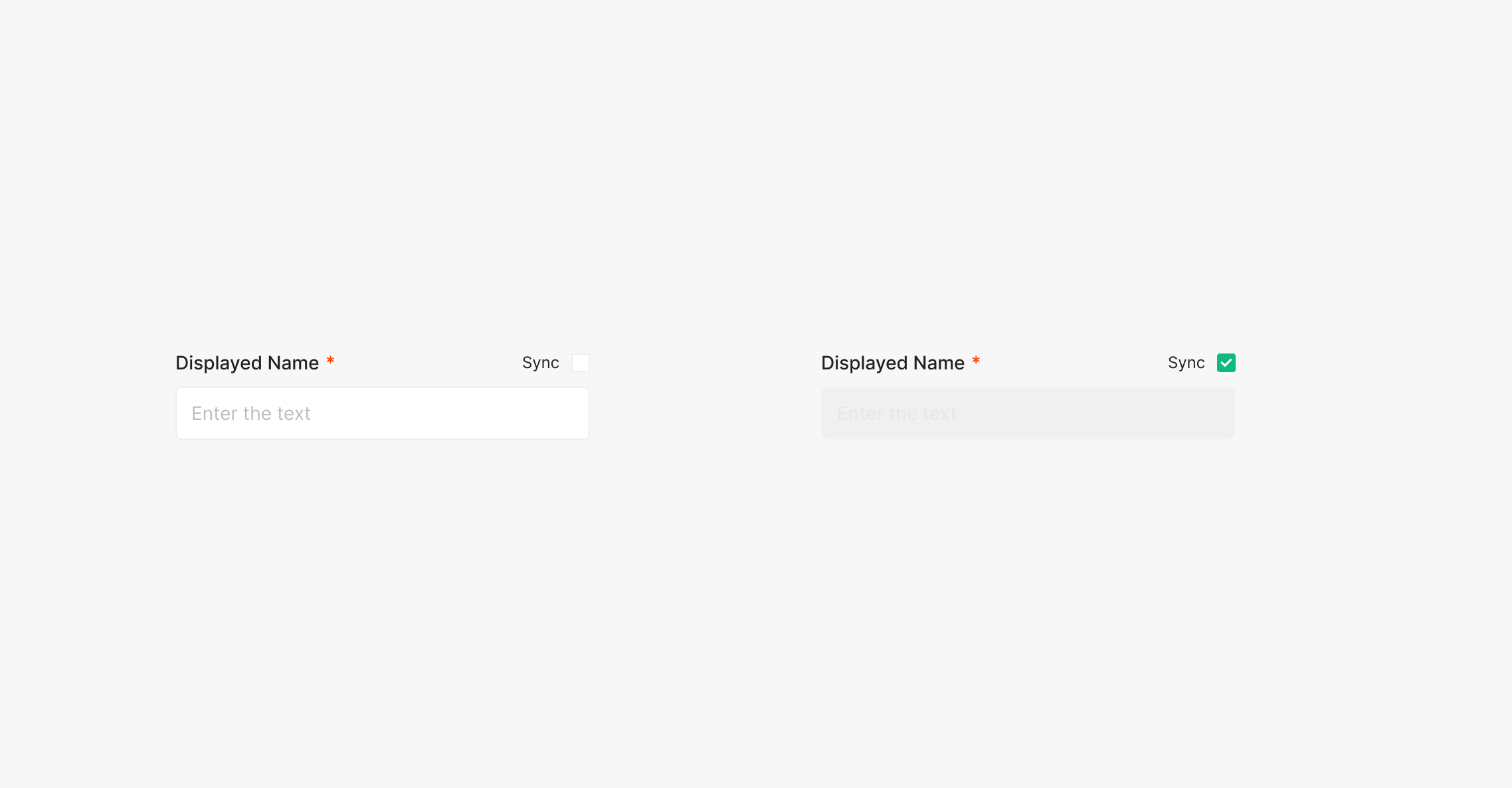
Label: Sync
A Sync Checkbox to the right of the Label auto-syncs the data entered into the field.
Label: Information
Surfaces supplementary information about the input value to the user.
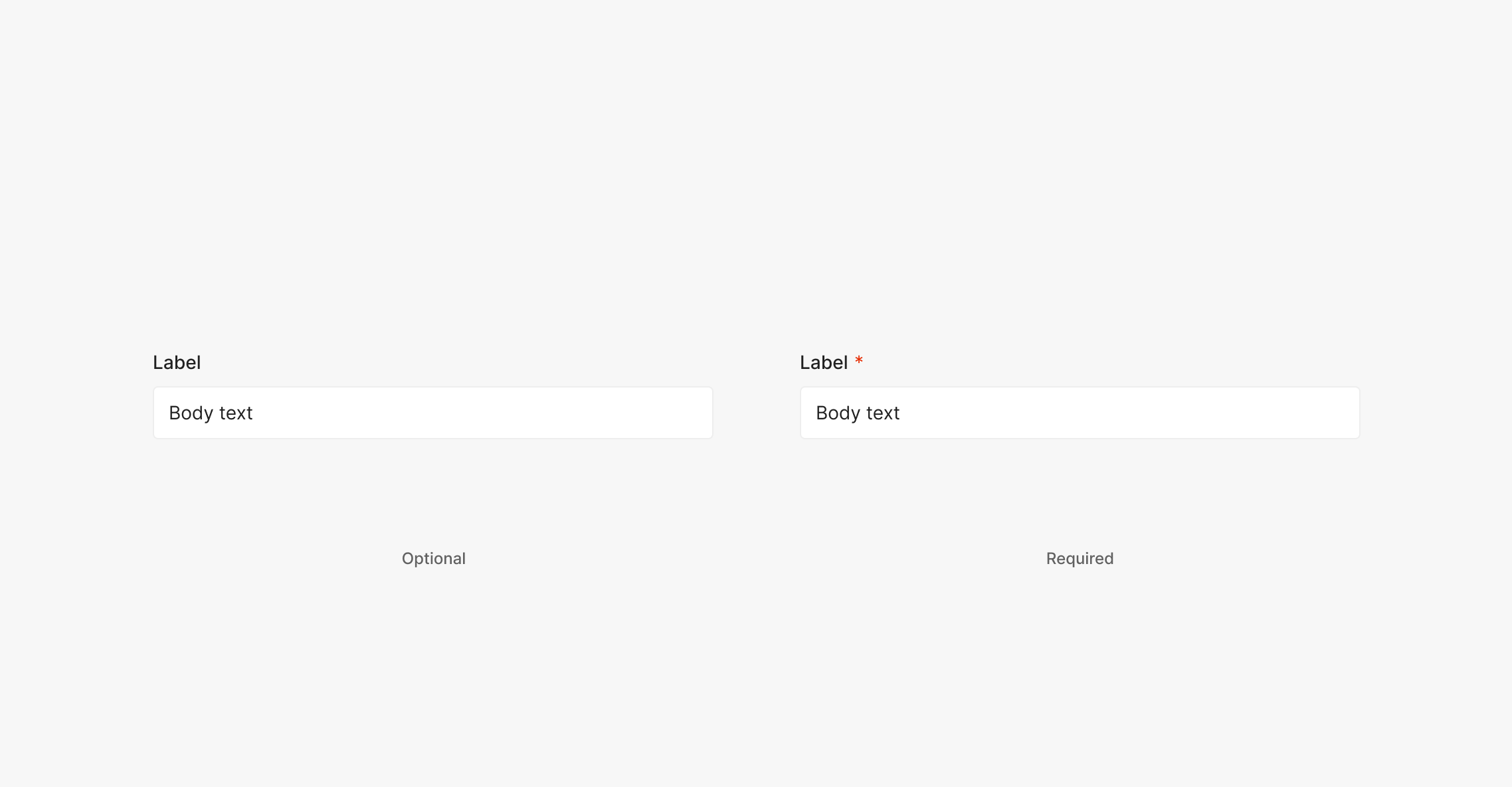
Label: Required
Marks the field as required. Place 4px after the Label and use "*". Optional fields use no marker — just the Label. Use Body 2 (Inter, Regular, 14px) for "*", at the same text size as the Label.
.png)
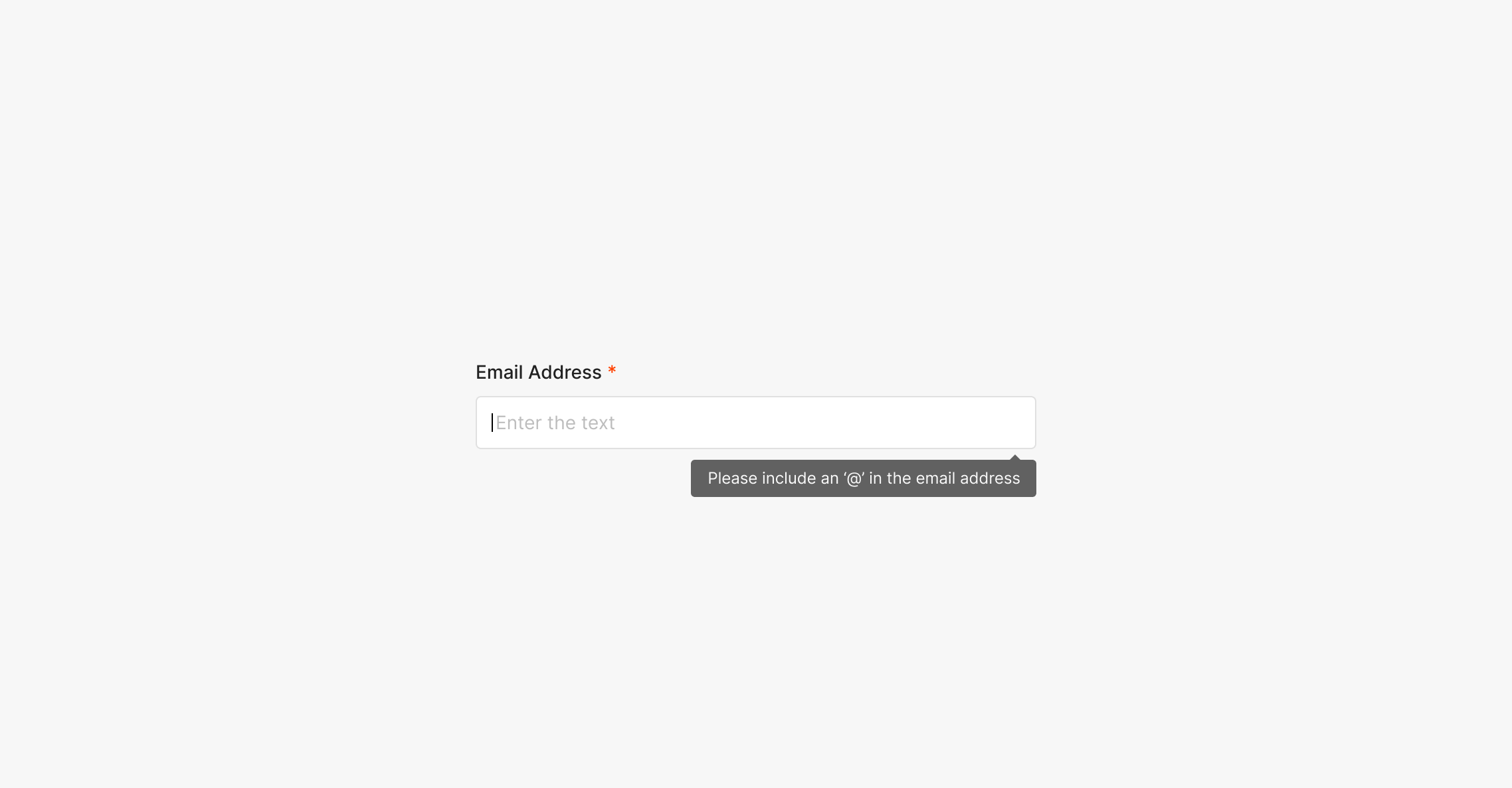
Label: Error(Alert)
Surfaces an alert about the input value. Typically triggered after an action (e.g., Confirm Button). The Dropdown Button outline color and a Text Alert both surface. Error state outline color: Red 500. Use the Medium-size Alert.
Label Size
Form-resident Inputs with Labels use the Large or Medium Primary Type Text Input. Label typography differs per size.
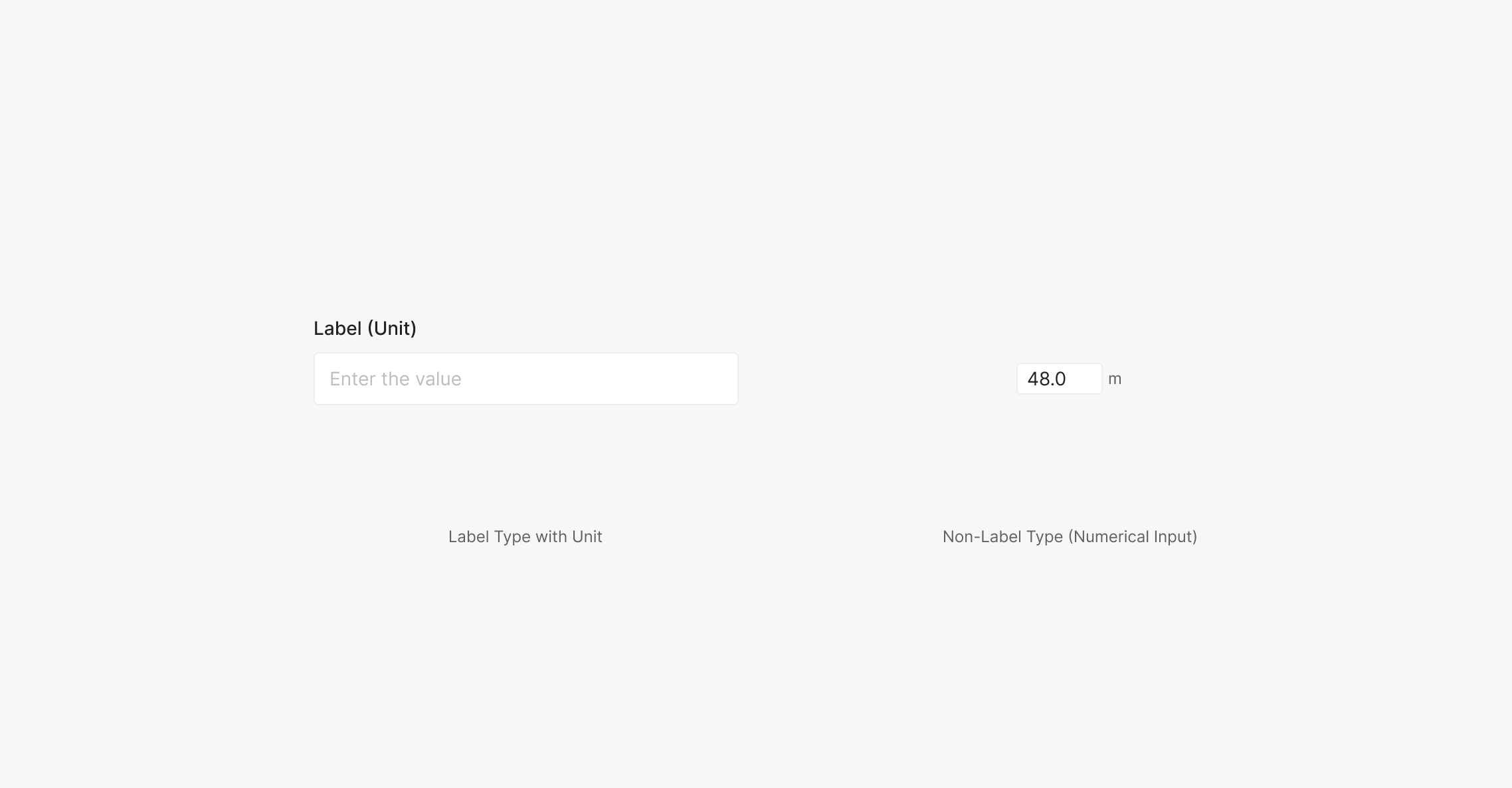
Unit
When the Input value is numeric, surface its unit information in the Label. Format as Label (Unit) using parentheses. Numerical Inputs aren't paired with a Label — when a unit is needed, place it 4px outside the right edge of the field.