Feedback Message
Feedback Message communicates system change to the user. It splits into Alert and Toast based on whether the system DB has changed.
Components
Feedback Message splits into Alert and Toast. Alert surfaces actions the user must complete; Toast delivers short, non-blocking results.
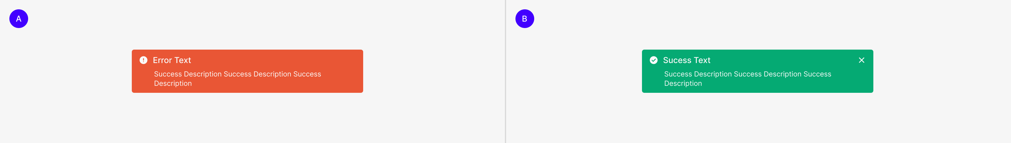
A. Alert B. Toast
Message Contents Criteria
Writing guidelines for Feedback Message content. These can flex depending on context but should be followed where possible.
| Conciseness | Messages are written as a single sentence by default. Keep to a single conditional clause. |
| Information Clarity | Messages must include the keyword that names the cause of the conveyed information (Information, Success, Warning). Messages should be composed with a verb — not just word combinations — so they deliver clear information and help users complete their task. |
Feedback Message
| Alert | Toast | |
| Duration | Till Completion Task | 3 Sec |
| Message Type | 3 (Error / Warning, Success, Information) | 3 (Warning, Success, Information) |
| Expression Standard | Error / Warning | Success |
| Relation to Others (Expression) | Mutually Exclusive (Mutually exclusive with a specific element group) | Independent of Each Other (Independent from other elements) |
Alert
Alerts surface mandatory user actions — they provide the information needed for the user to complete that action.
Anatomy

1. Icon 2. Header 3. Description Text 4. Container
Component
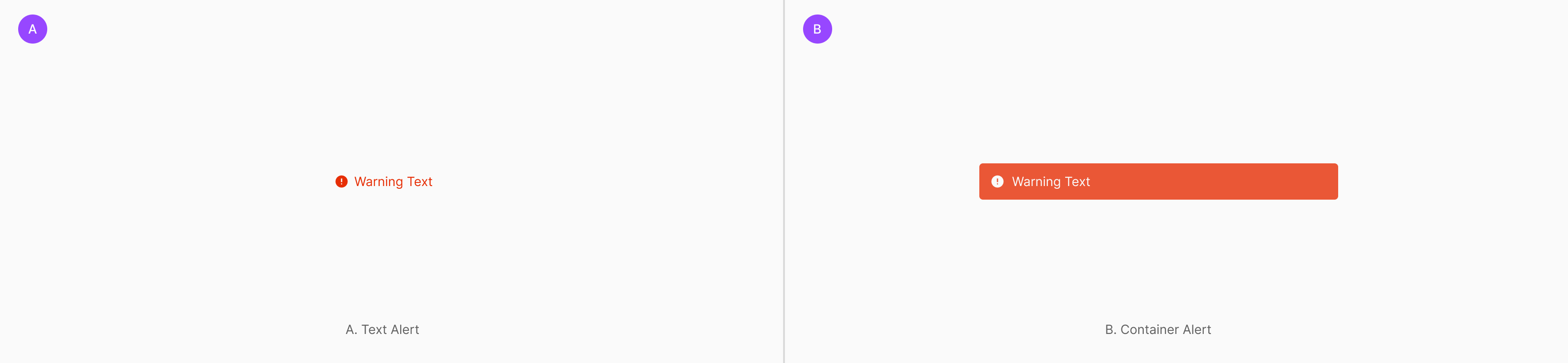
Alert has two types based on placement and visual form — Text Alert, tightly coupled with a specific component, and Container Alert, wrapped in a container.
Message Type
Alert splits into three by information type — Information for brief action feedback, Success for completed actions, and Warning for failed actions. Success Alert is provisionally not used.
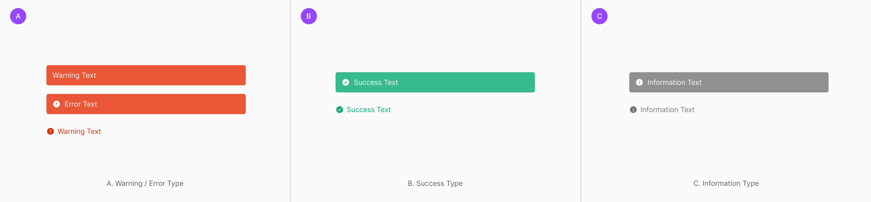
Table of Figma Properties
| Property | Values | Default Value |
| Type | Warning, Information, Success | None |
| Size | Large, Medium | None |
| Container | True, False | None |
| Description | True, False | False |
| Icon | True, False | True |
Placement
Alert delivers state, error, guidance, or processing results immediately. Based on component structure and message scope, place it as Contained Type, Floating Type, or Inline Text Type. Even for the same Alert, choose the right Placement based on whether the target is an individual component, a component group, or an inline-level supplementary message.
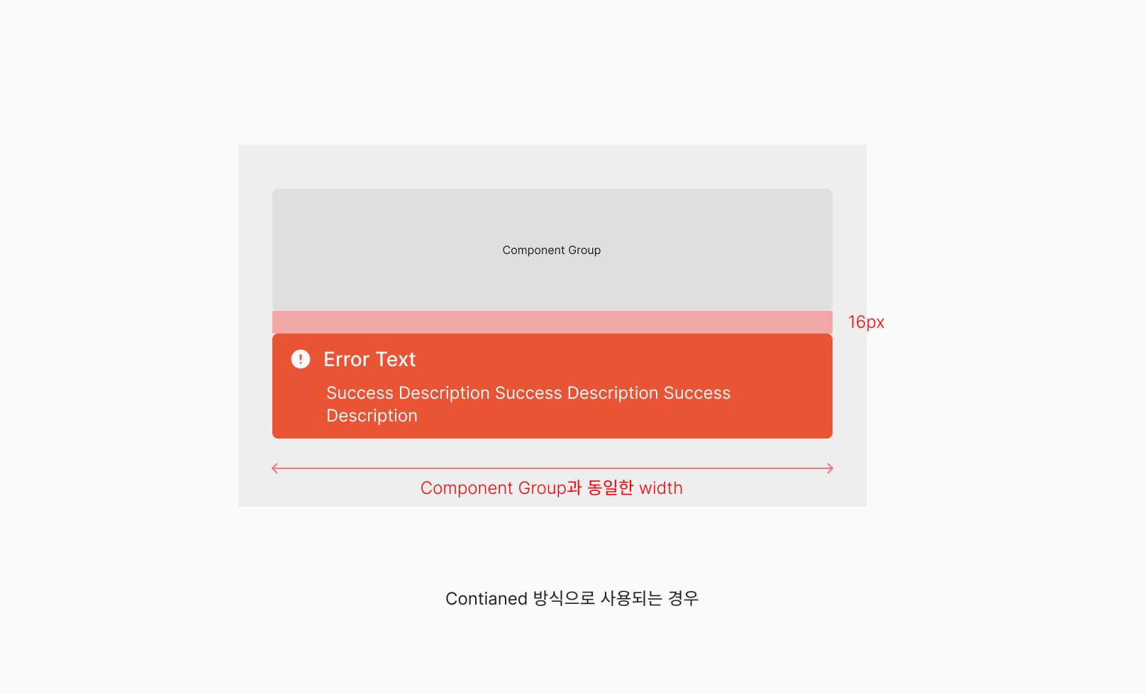
Contained Type
When related components form a visual group, use this to communicate state or error across the entire group. Alert places within the same width as the Component Group — well-suited to delivering a shared message that applies to multiple elements at once. Fits when verification results need to be shown per section or grouped unit, so the user clearly understands the scope. (e.g., Change Tag, Swap Tag)
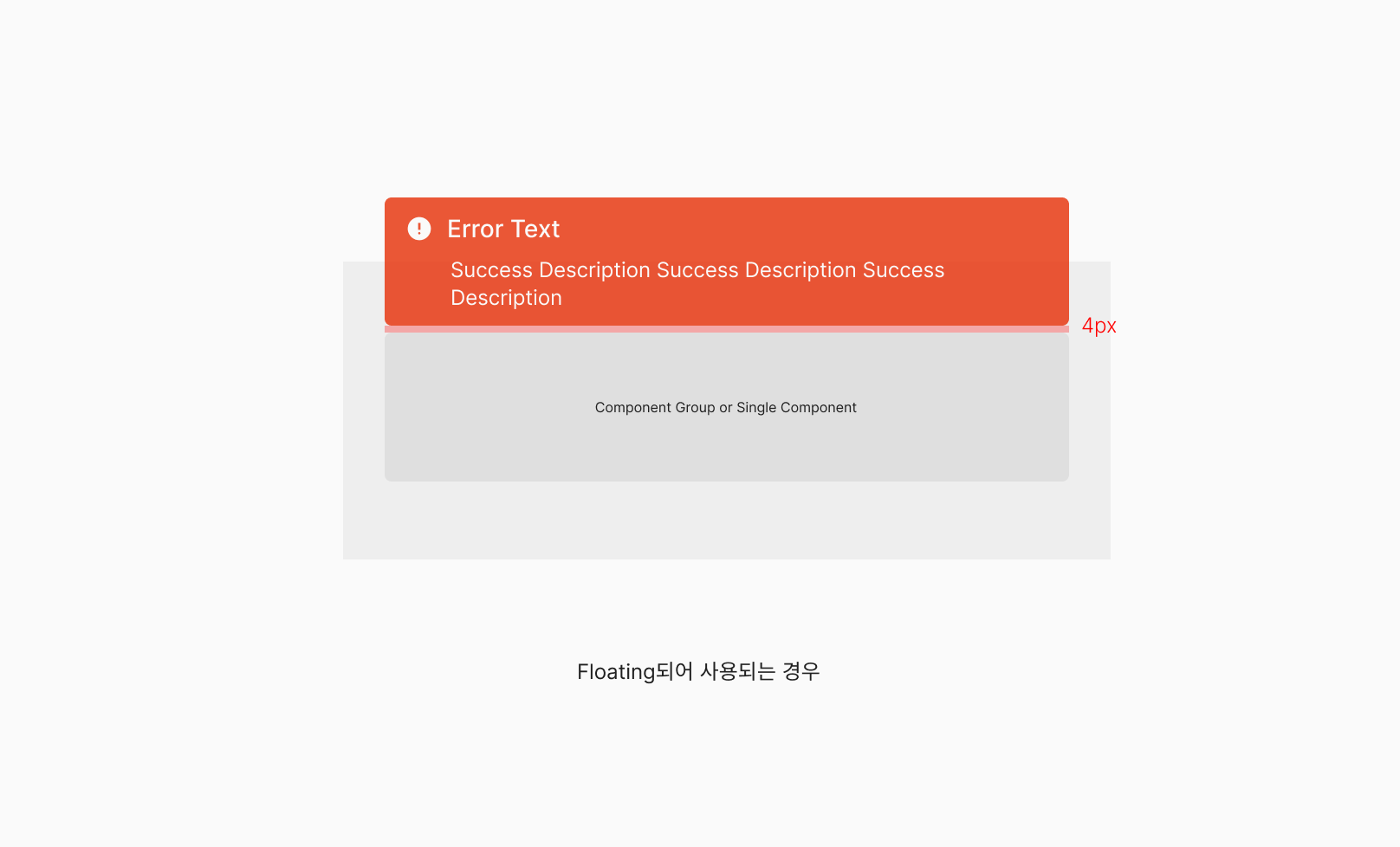
Floating Type
Floating Type sits independently above a component group or single component to deliver a more emphasized state message. Perceived as a separate layer from the base layout — fits when an error, success, or guidance message needs immediate user attention.
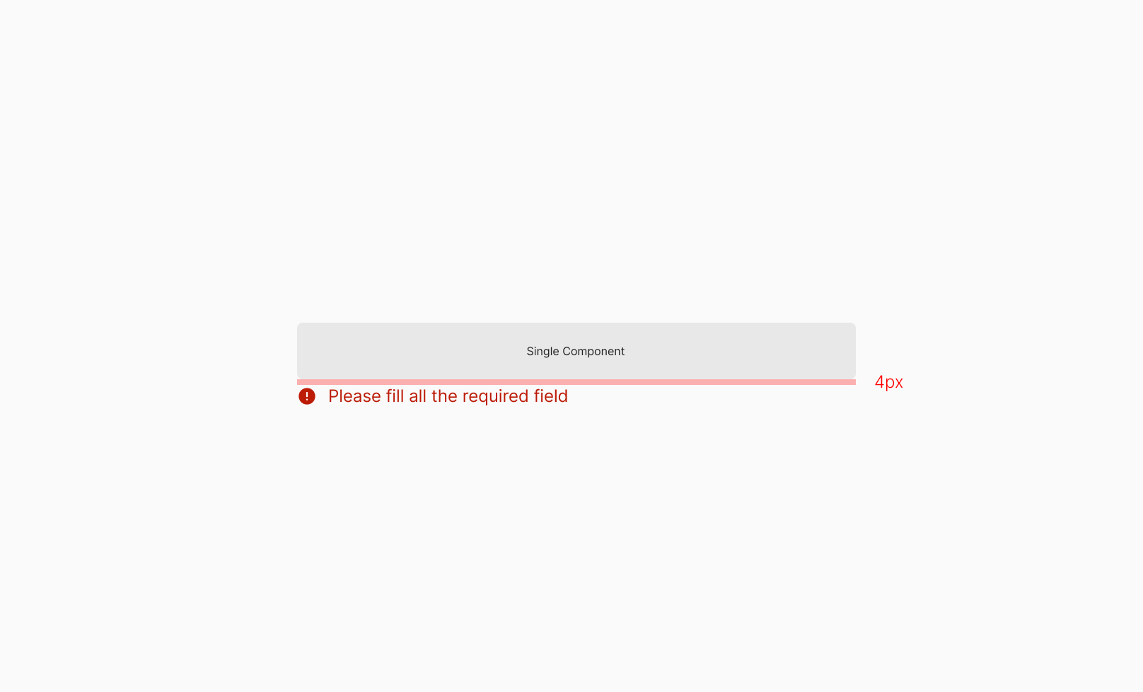
Inline Text Type
Inline Text Type surfaces auxiliary messages directly tied to a single input field or component. Used to deliver field-level validation results or input guidance — placed inline directly below the component so the message's target is immediately obvious.
Spacing
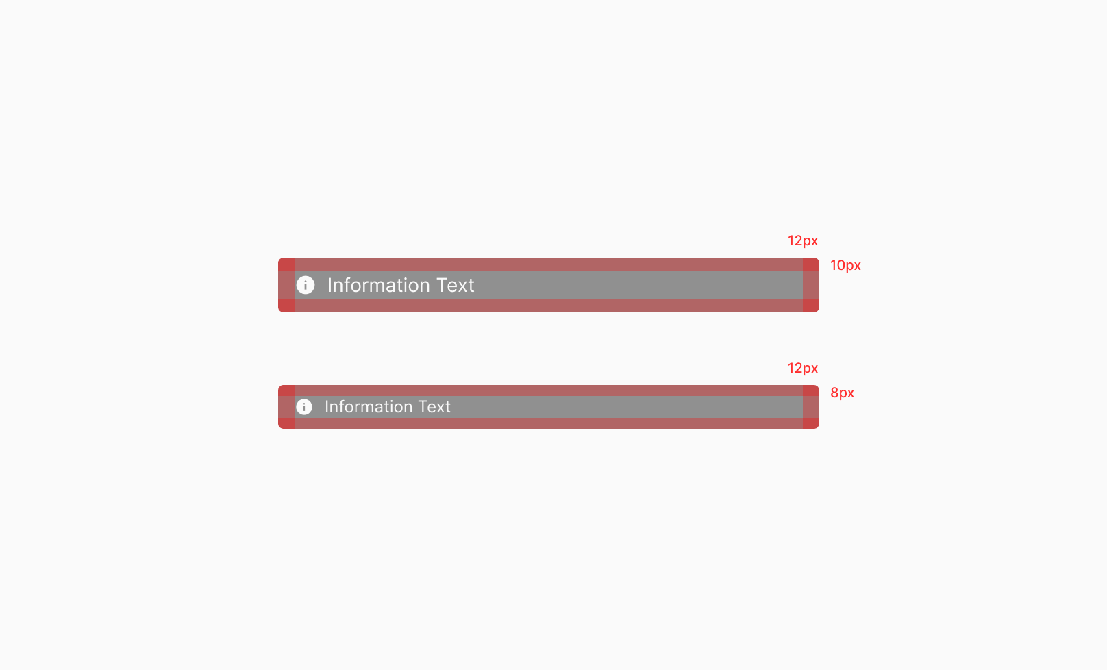
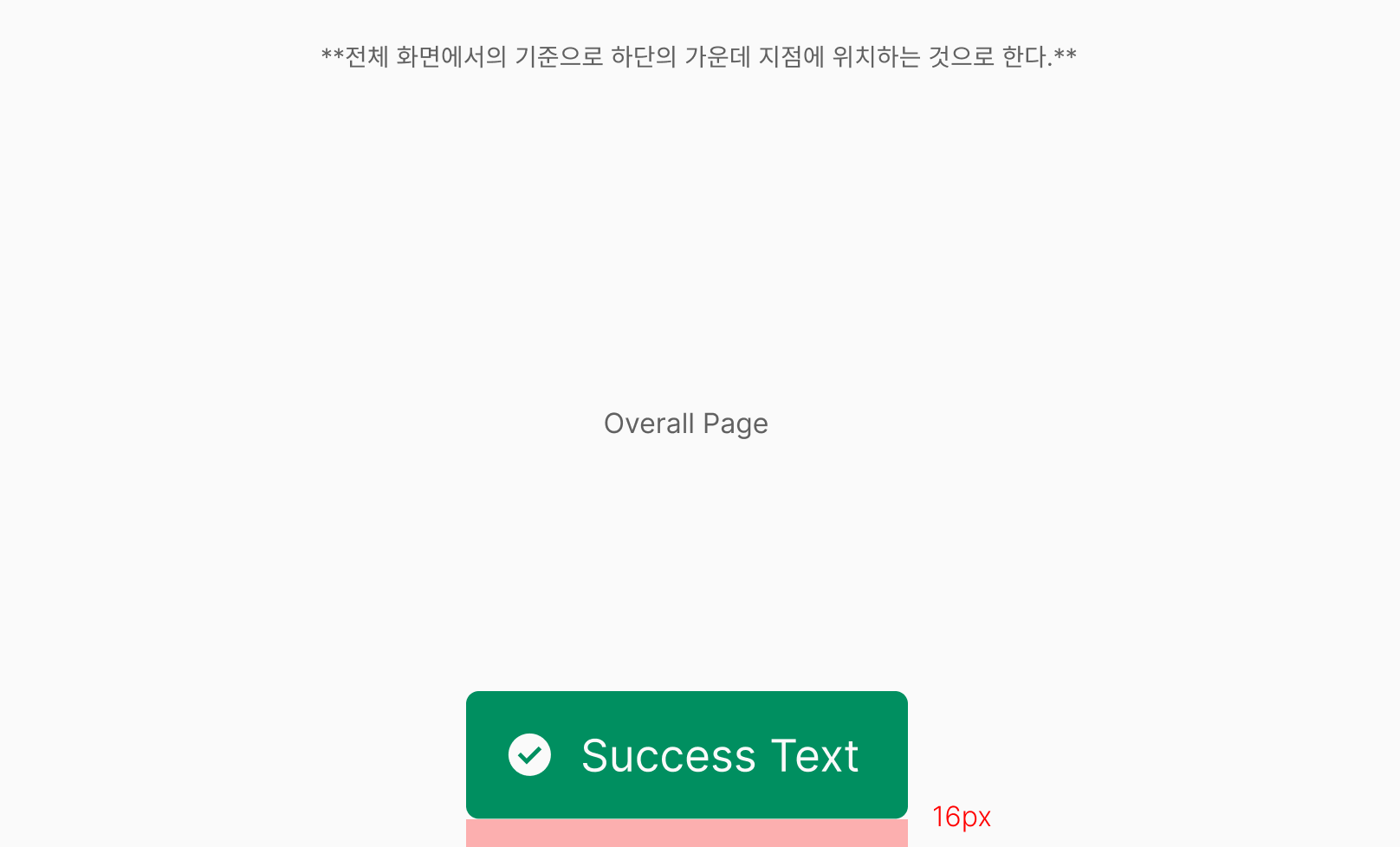
Alert's inner padding is defined per size to keep text readable and balance icon and text. All sizes use 12px horizontal padding as a base. Vertical padding varies by size: Large uses 10px top/bottom; Medium uses 8px top/bottom. This adjusts density per size while keeping readability and information delivery consistent within the same structure.
Padding Rule
Alert uses 12px horizontal padding as a base across both Large and Medium sizes. Vertical padding is 10px for Large and 8px for Medium, adjusting density per size.
Toast
Toast is a non-blocking feedback component that delivers task results or state changes briefly and clearly. Typically surfaced right after actions like save, copy, create, or delete — it doesn't interrupt the user's flow and helps them recognize results quickly.
Anatomy

1. Icon 2. Header 3. Description Text 4. Container 5. Close Icon Button
Component
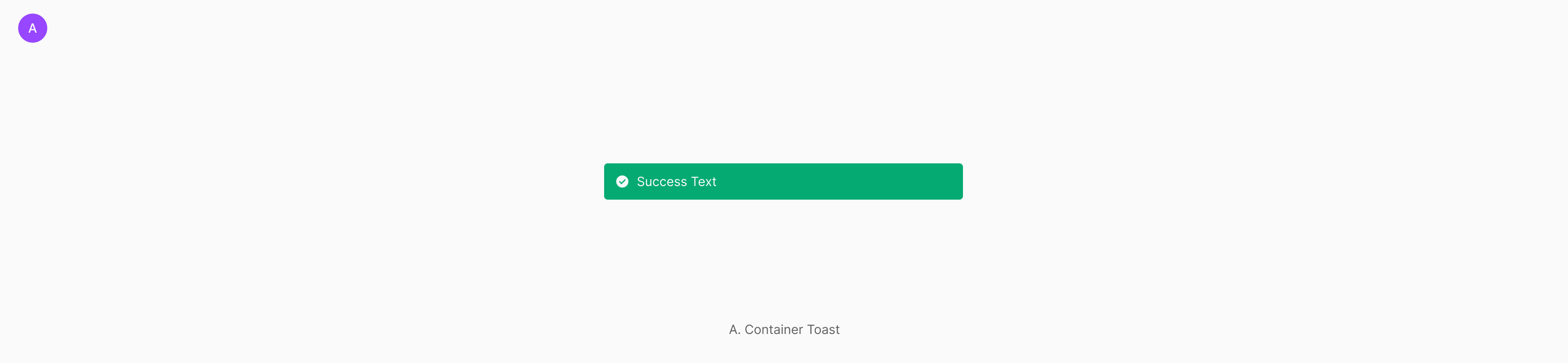
Toast surfaces in a Floating layout — only one type: Container Toast (wrapped in a container).
Message Type
Toast splits into three by information type — Information for brief action feedback, Success for completed actions, and Warning for failed actions. Most Toasts are used as Success type.
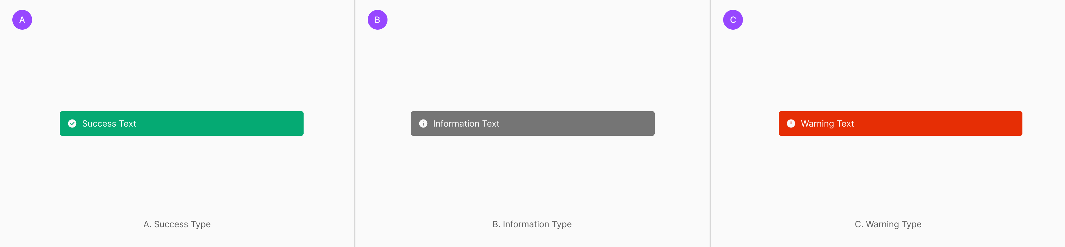
Table of Figma Properties
| Property | Values | Default Value |
| Type | Warning, Information, Success | None |
| Size | Large, Medium | None |
| Container | True, False | None |
| Description | True, False | False |
| Icon | True, False | True |
Placement
Toast is a feedback component that delivers task results briefly and clearly. Based on message tone and user context, place it at Bottom Center, Top, or Nearby Component. All placements share the same Toast structure — choose the right position based on message priority, occurrence context, and the user's natural eye flow.
Bottom Center
Bottom Center is the default placement when task results need to be announced globally — such as creation, deletion, or save completion. Surfaces briefly at the bottom center of the screen right after the user completes a primary task. Delivers results clearly without disrupting flow. Fits when success or completion feedback applies to the entire page.
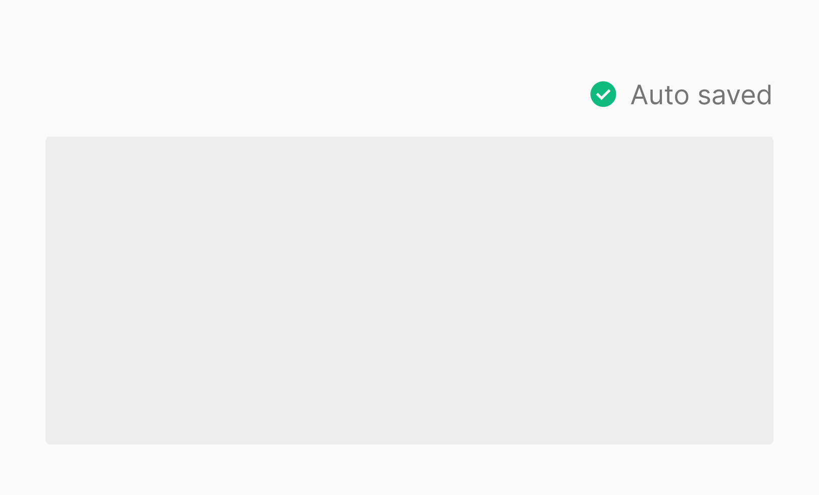
Top
Top placement fits state feedback that occurs relatively often but should stay minimally intrusive — like Auto saved. Sits fixed at the top so it doesn't cover primary content, letting users recognize the current state naturally while continuing their task. Fits repetitive system state announcements and short-lived informational messages.
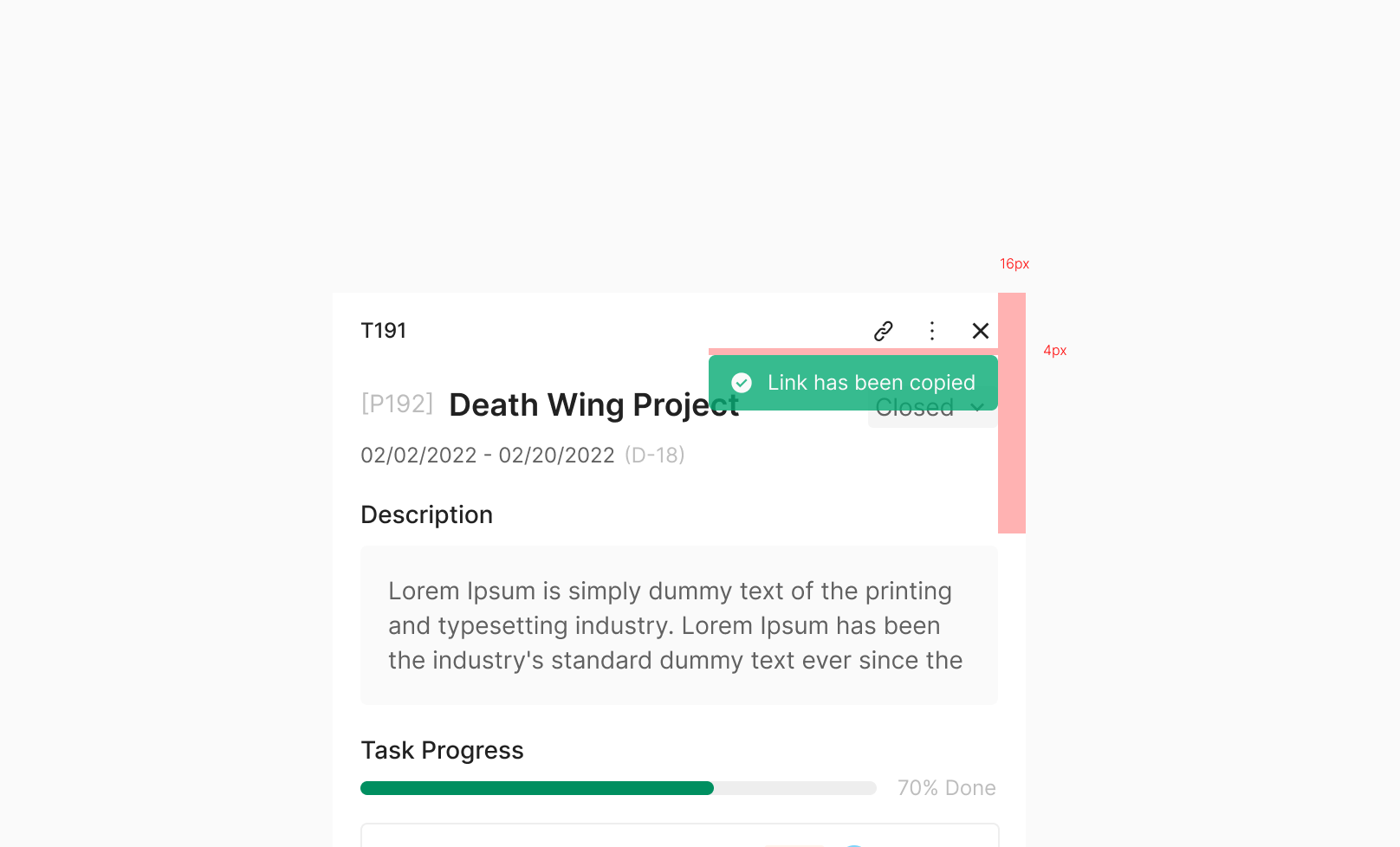
Nearby Component
Nearby Component delivers a task result tied directly to a specific button or action icon, right next to that component. Fits when more contextual feedback is needed than a global success message — users immediately understand which action the result belongs to, without extra interpretation. Typically used for short success feedback on a single action — Link copied, Shared, Added, Moved — surfaced briefly near the related UI element and dismissed automatically as the default rule.