Dropdown
Dropdowns let users pick an option, filter content, or change sort order. They expose a Menu of selectable Items, surfaced through a Dropdown Button paired with an icon that signals the menu can be opened.
Anatomy
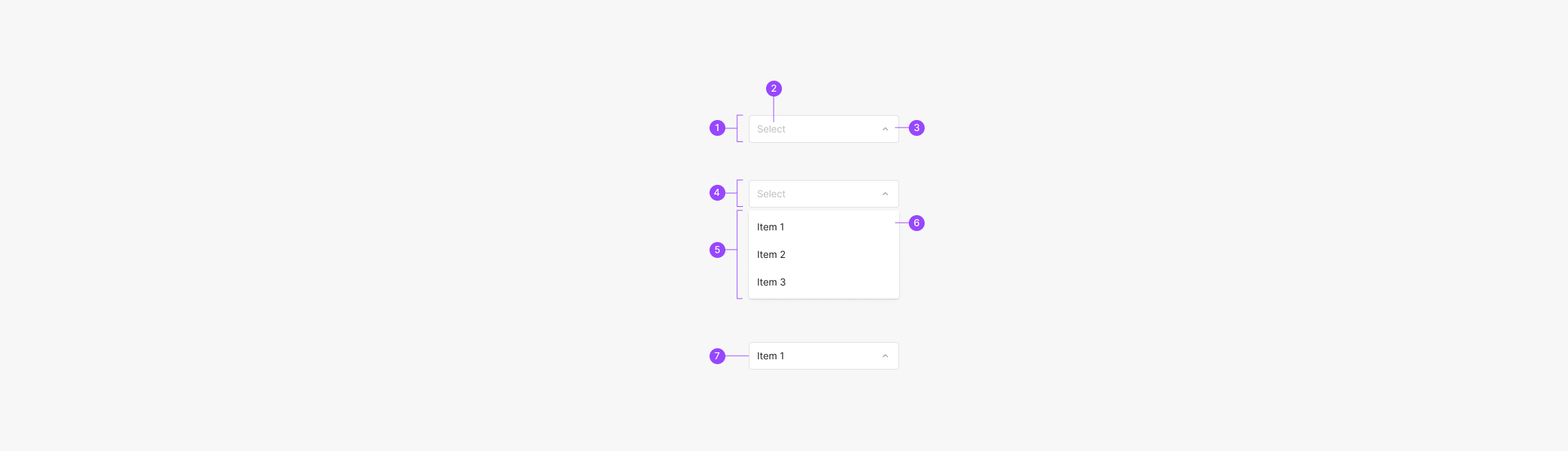
- 1. Dropdown Container
- 2. Dropdown Field
- 3. Arrow Icon
- 4. Dropdown Button
- 5. Dropdown Menu
- 6. Menu Item
- 7. Selected Item Field
Extra Type
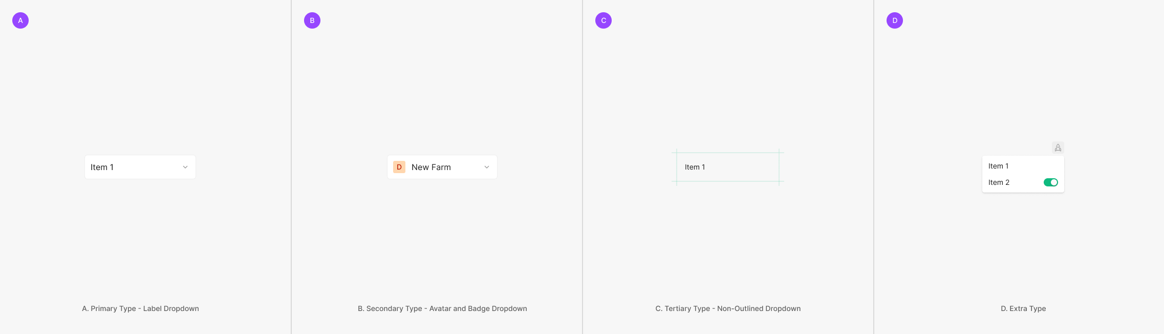
Dropdowns surface Menu Items used to filter or sort page content. Variants split by Dropdown Button type — Primary (Label), Secondary (Avatar & Badge), and Tertiary (Non-Outlined).
Components
Dropdowns split by style, intent, and the field type they expose — Primary (Label Dropdown), Secondary (Avatar and Badge Dropdown), Tertiary (Non-Outlined Dropdown), and Extra Type.
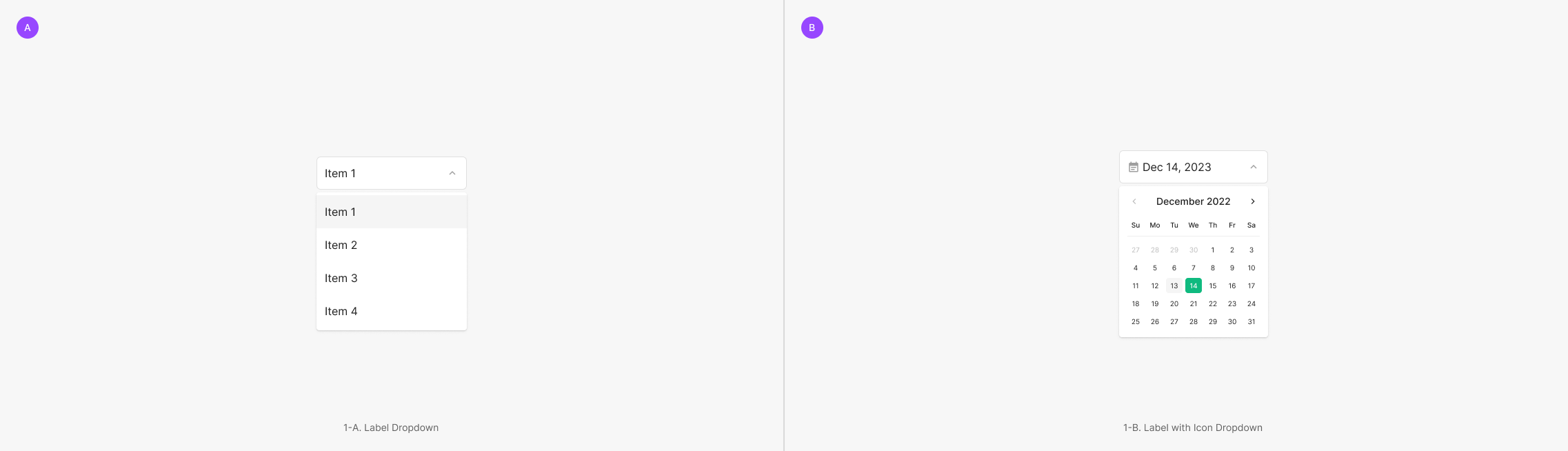
Primary Type
The most common type — composed of a Label Dropdown (text-only field) and a Label with Icon Dropdown (icon + text).
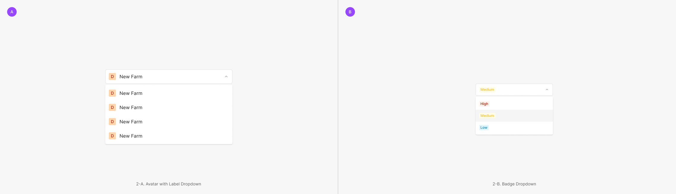
Secondary Type
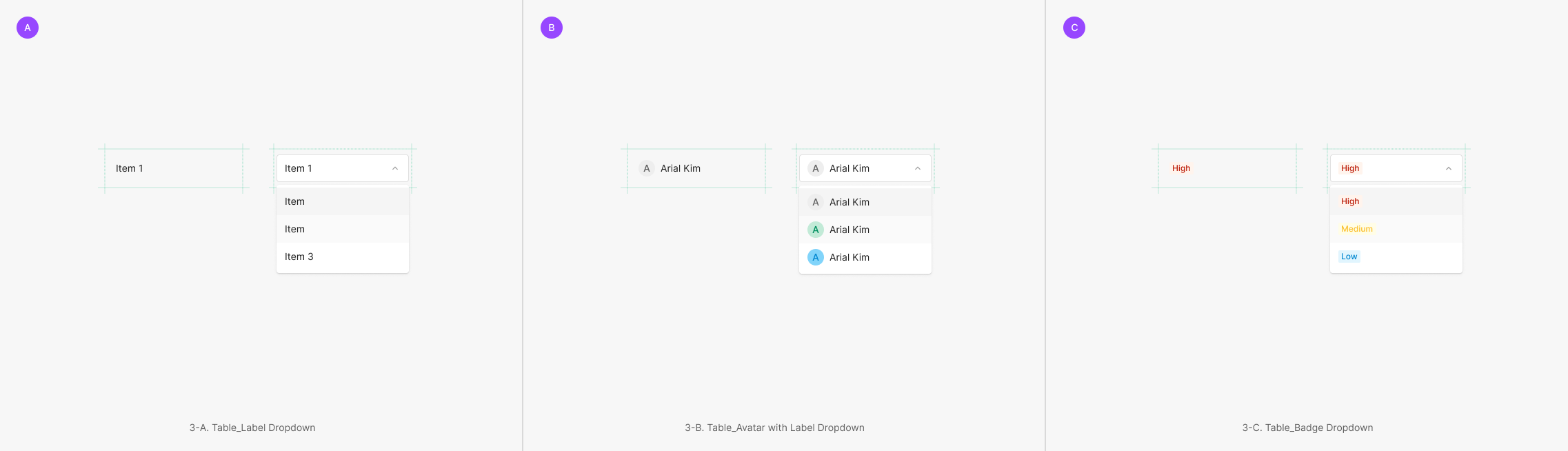
Uses non-text components inside the field — most commonly Avatar or Badge.
Tertiary Type
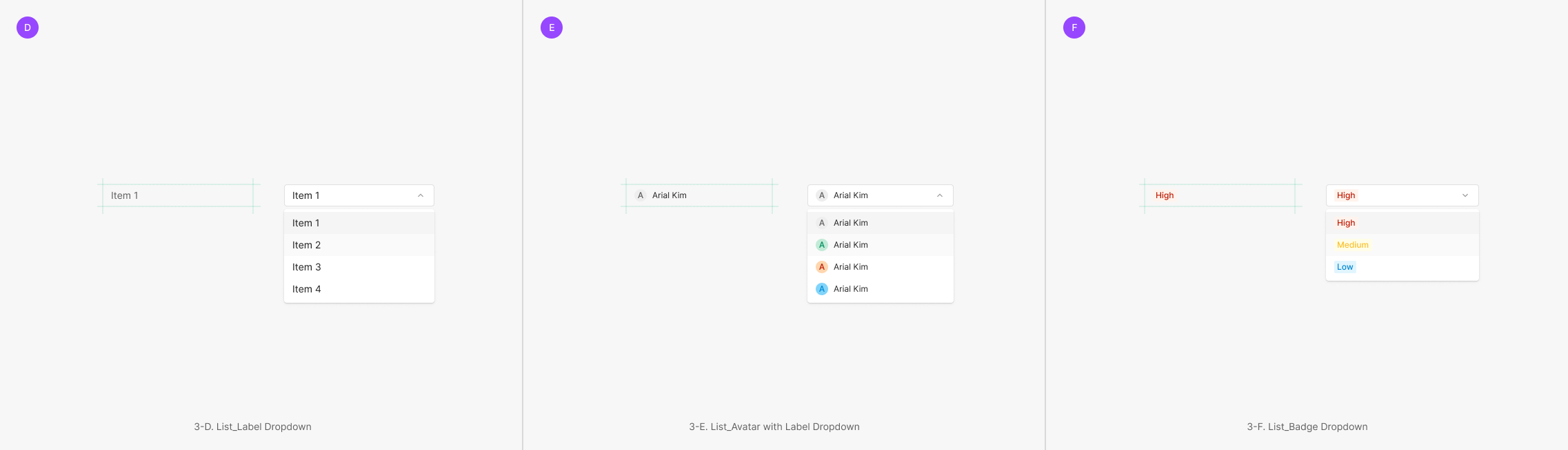
Dropdowns with no visible outline — Clicked state shifts to the Secondary form. Split into Table Dropdown and List Dropdown, each using different field components.
Extra Type
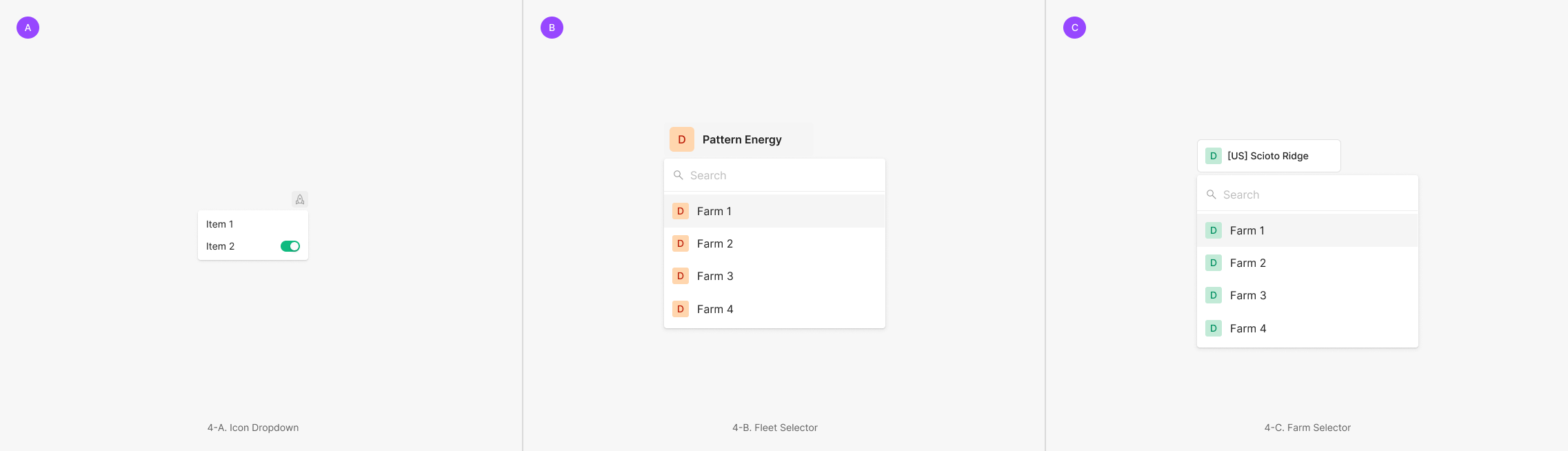
Use-case-specific variants — Icon Dropdown, Inspection Selector, Fleet Selector.
Variants
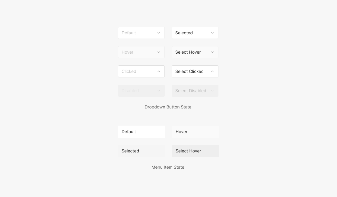
State
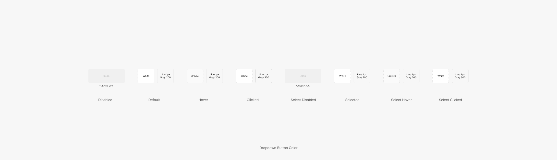
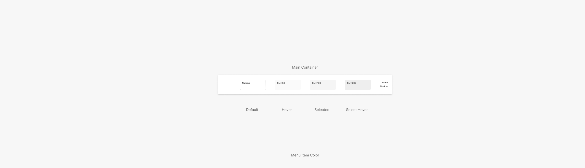
Dropdown Button supports 8 states — Disabled, Default, Hover, Clicked, Select Disabled, Selected, Select Hover, Select Clicked. Menu Item supports 4 — Default, Hover, Selected, Select Hover.
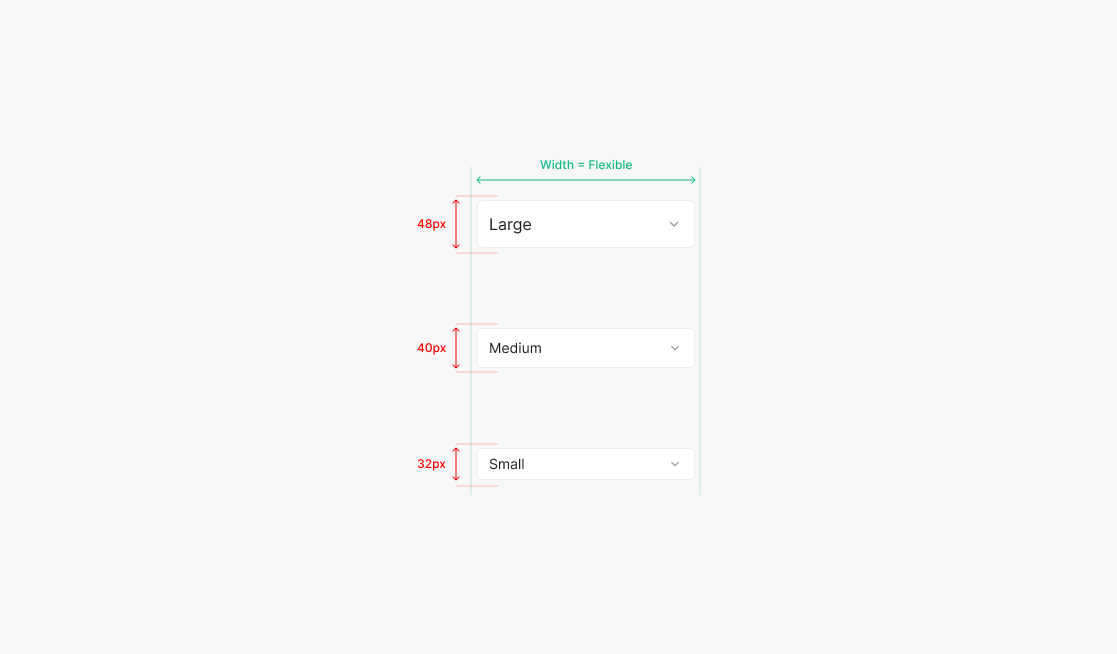
Size
Sizes use height — Large, Medium, Small. Width remains flexible.
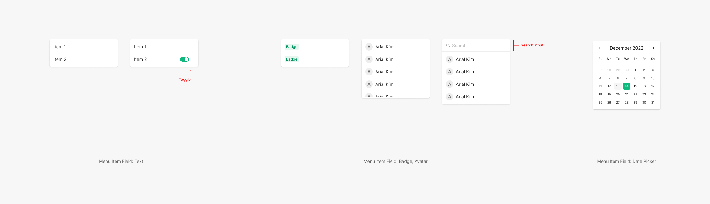
Menu Item
Menu Item fields compose from a core set — Text, Avatar, Badge — with optional Toggle or Icon. A Search Input matching the Dropdown Button height is also supported.
Table of Dropdown Component
Table of Properties — Dropdown Button
Table of Properties — Menu Item
Color
Dropdown color shifts per state. The content filling the field keeps the same color across states; outline and container shift per state.
Dropdown Button Color
Menu Item Color
Spacing
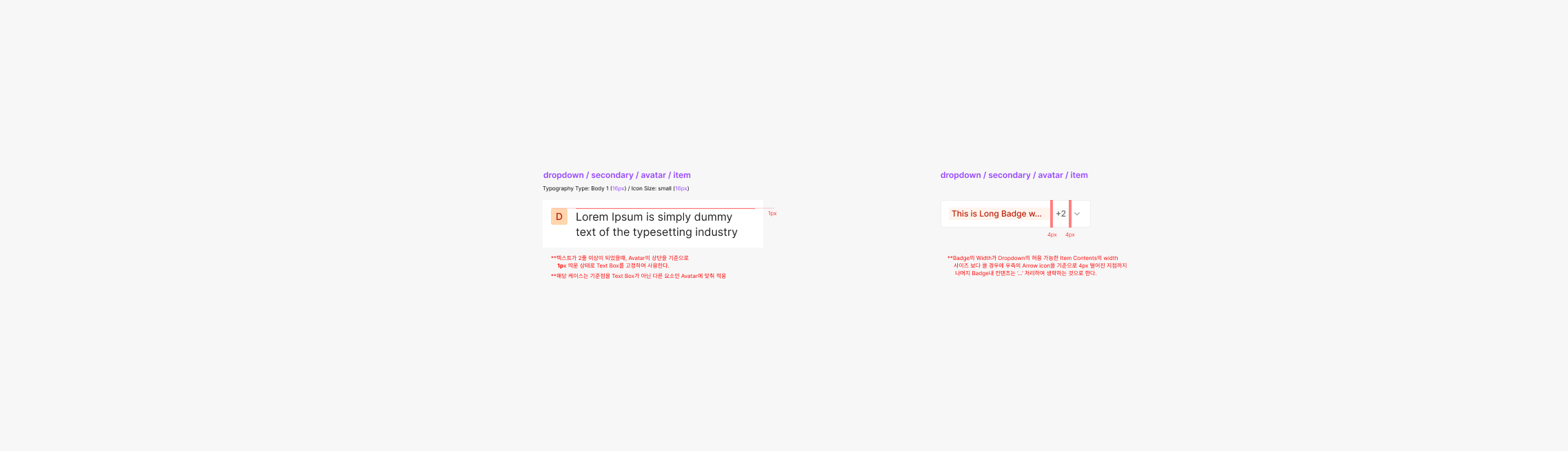
When Menu Item content wraps to two or more lines — and combines with other components (Icon, Avatar) — apply the following spacing. Single vs. multi-selection patterns also differ.
Contents
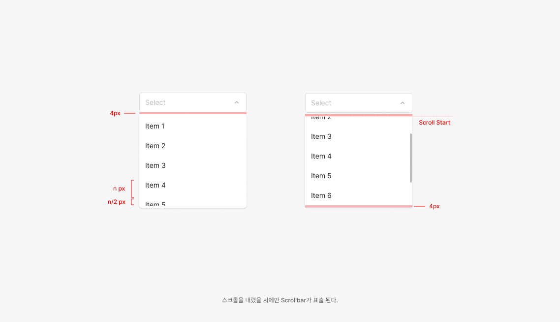
Aim to surface up to 4.5 Menu Items at once. With 5 or more, use a scrollbar — preserving the 4.5-item visible window.
.png)
Table / List Empty State (Placeholder)
Unlike the standard placeholder used elsewhere, Tertiary Type Table and List use "—" instead of text. This distinguishes empty cells from filled cells across many data rows in a single view.
Type of Field
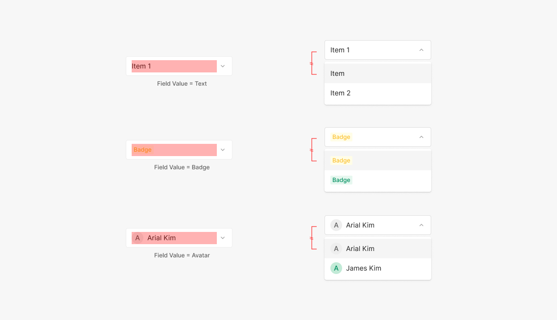
Dropdown fields default to a Label Dropdown with text — other components can take over. Common alternatives include Badge and Avatar. Other component types can be composed as needed.
Menu Item List
Surface up to 4 Items by default; beyond that, apply overflow scroll. When 4 isn't enough for usability, raise the Menu height max situationally.
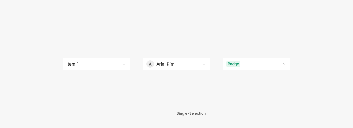
Single-Selection
The most common Dropdown — only one selection is allowed. If the value is required, hide the Close (Clear All) button. If optional, surface the Close button.
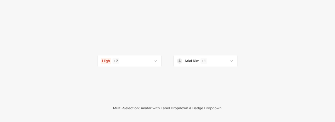
Multi-Selection
Multiple selections are allowed. The selected items can render two ways — a Badge that shows the count, or the full content text of each selected item.
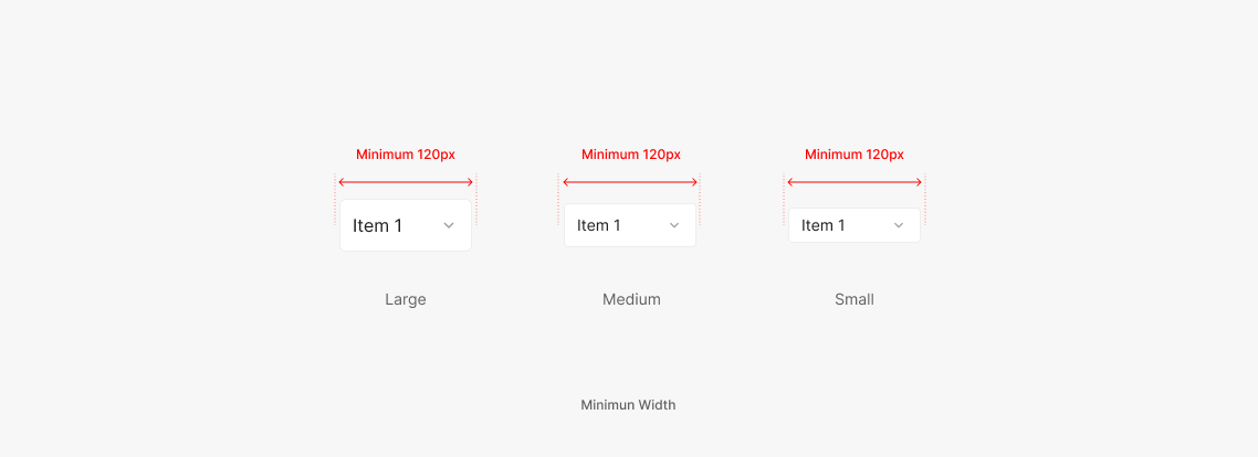
Minimum Width
Width flexes with the surrounding area. Minimum width is 120px.
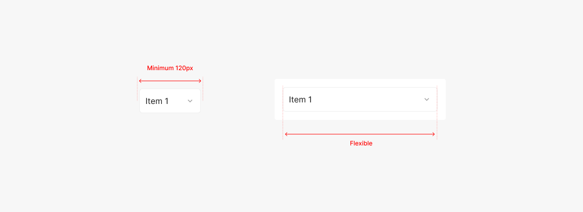
Flexible Width
Dropdowns flex. Set the width by accounting for the longest Menu Item content. When used inside a parent container, honor the container's defined padding.
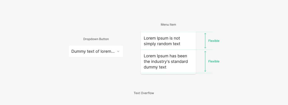
Text Overflow
When the Dropdown Button field text exceeds the horizontal area, truncate with "…". Menu Item text doesn't truncate — it wraps and shows in full.
Usage & Placement
Dropdowns most commonly pair with Labels in form input layouts, alongside Text Inputs. Multiple elements compose to deliver information to the user.
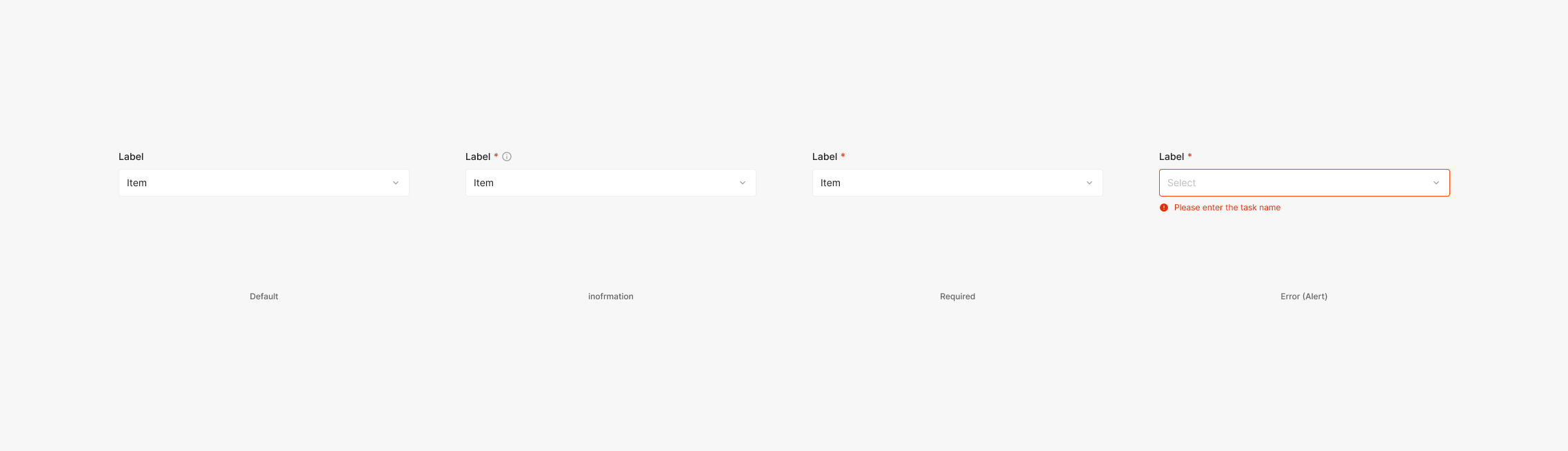
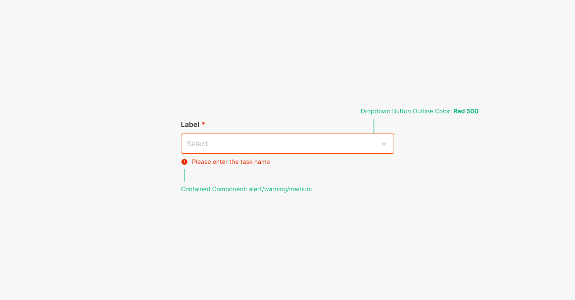
Label
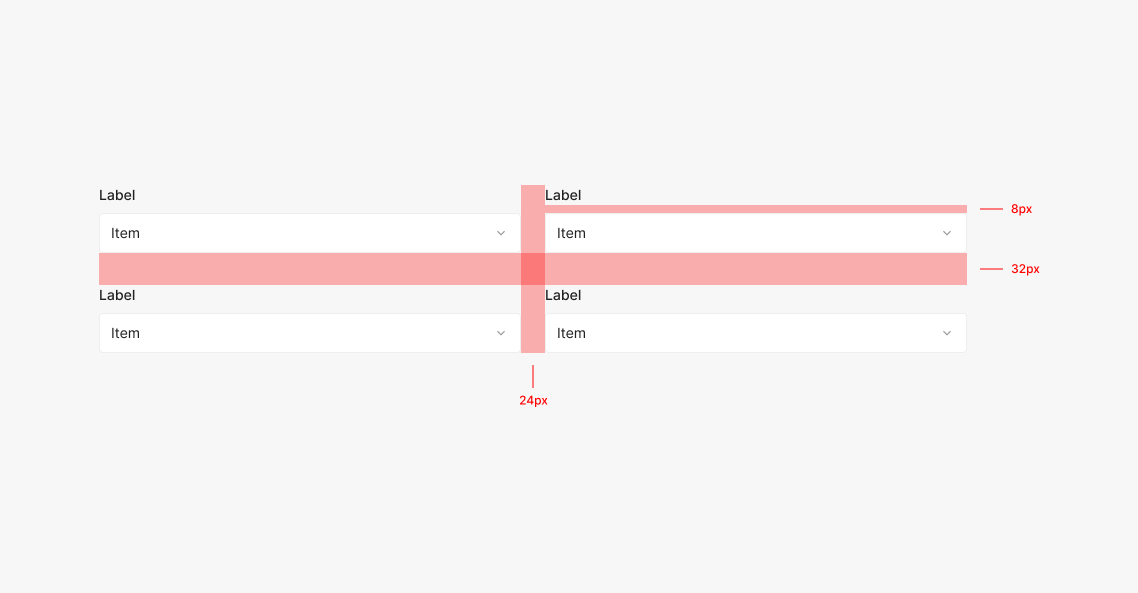
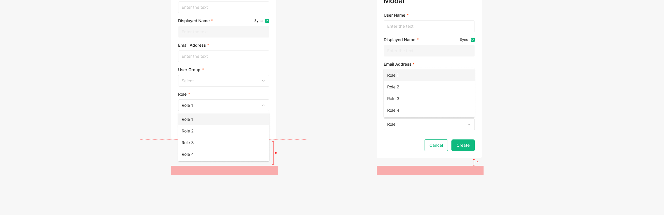
Forms with a Dropdown surface a Label for the field. Use Subtitle 3 (Inter, Medium, 14px), with Required, Error, and Information variants as needed. Label + Dropdown / Input combinations are often used together. Use 8px between Label and Dropdown, 24px between horizontally arranged elements, and 32px between vertically arranged elements.
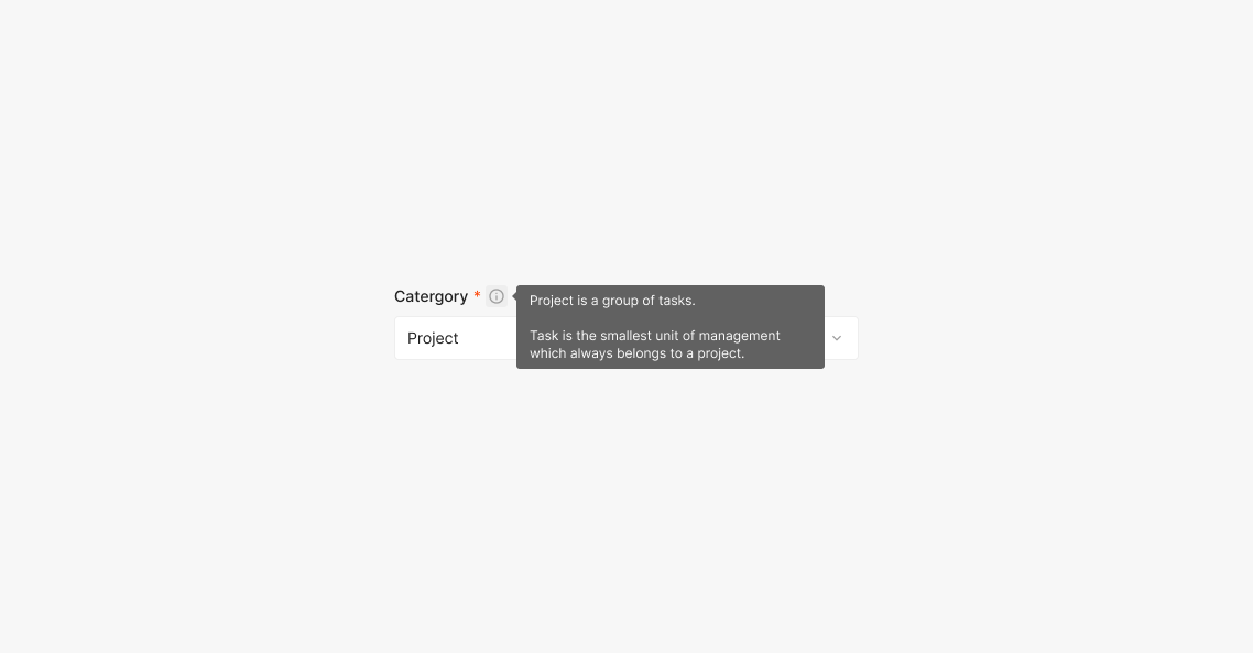
Label: Information
Surfaces supplementary information about the input value to the user.
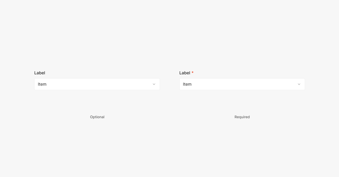
Label: Required
Marks the field as required. Place 4px after the Label and use "*". Optional fields use no marker — just the Label. Use Body 2 (Inter, Regular, 14px) for "*", at the same text size as the Label.
.png)
Label: Error (Alert)
Surfaces an alert about the input value. Typically triggered after an action (e.g., Confirm Button). The Dropdown Button outline color and a Text Alert both surface. Error state outline color: Red 500. Use the Medium-size Alert.
Label Size
Match Label size to the Dropdown component's height and information density. When field size changes, Label scales within the same ratio system to preserve component balance and readability. Medium Dropdown uses Subtitle 3 (Inter, Medium, 14px); Large Dropdown uses Subtitle 1 (Inter, Medium, 16px). This rule clarifies the visual hierarchy between Label and Input field, and keeps a consistent rhythm across different form-element sizes.
Loading Status
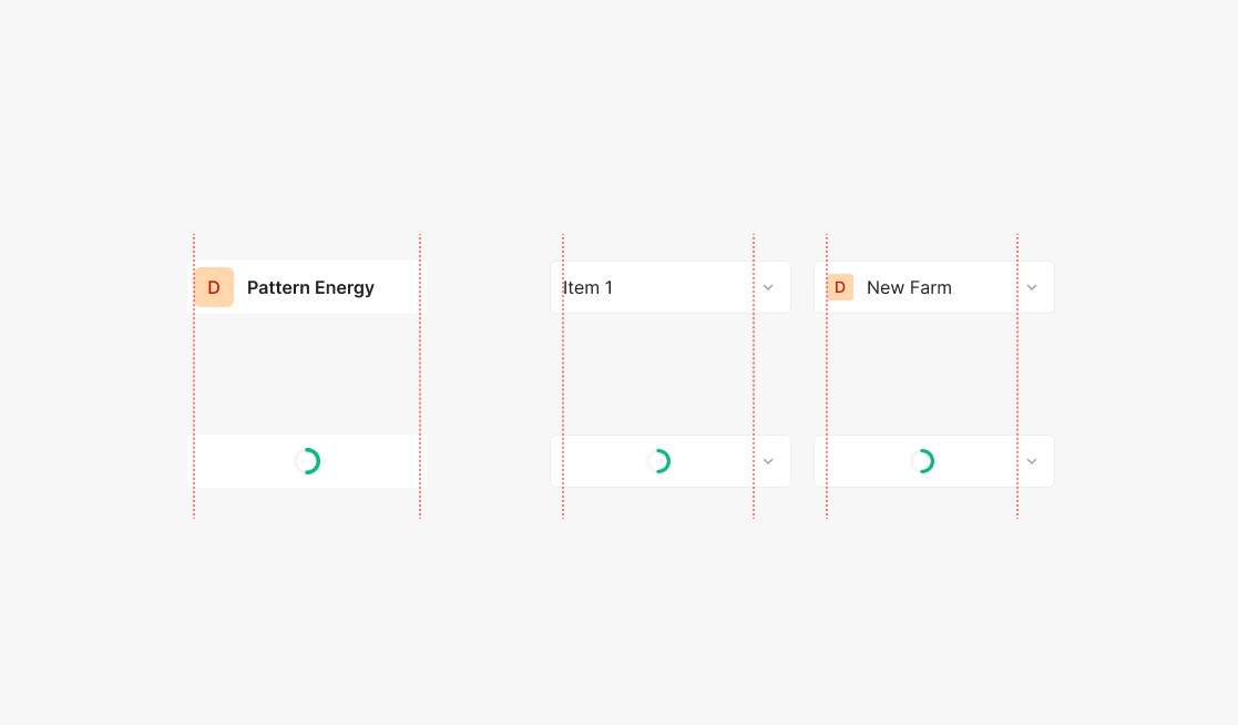
Loading Type
Loading uses a single Spinner type, paired with the standard Dropdown Arrow. The Spinner centers within the area where Items would surface.
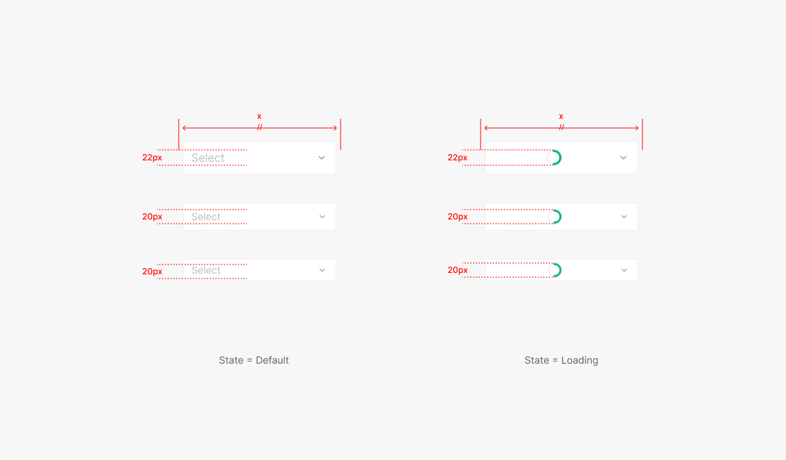
Loading Spinner Size
The Spinner inside the Dropdown Container matches the height of the Item Text. While loading, width stays equal to the width used immediately before loading began.
Menu Placement
The Menu's position is decided by where the user triggered the action on screen. Default to top placement, but stay within the screen's 32px minimum padding.
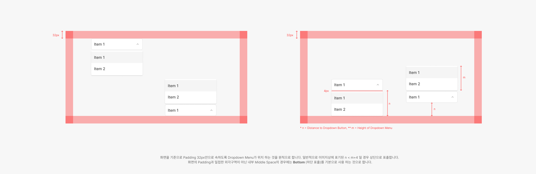
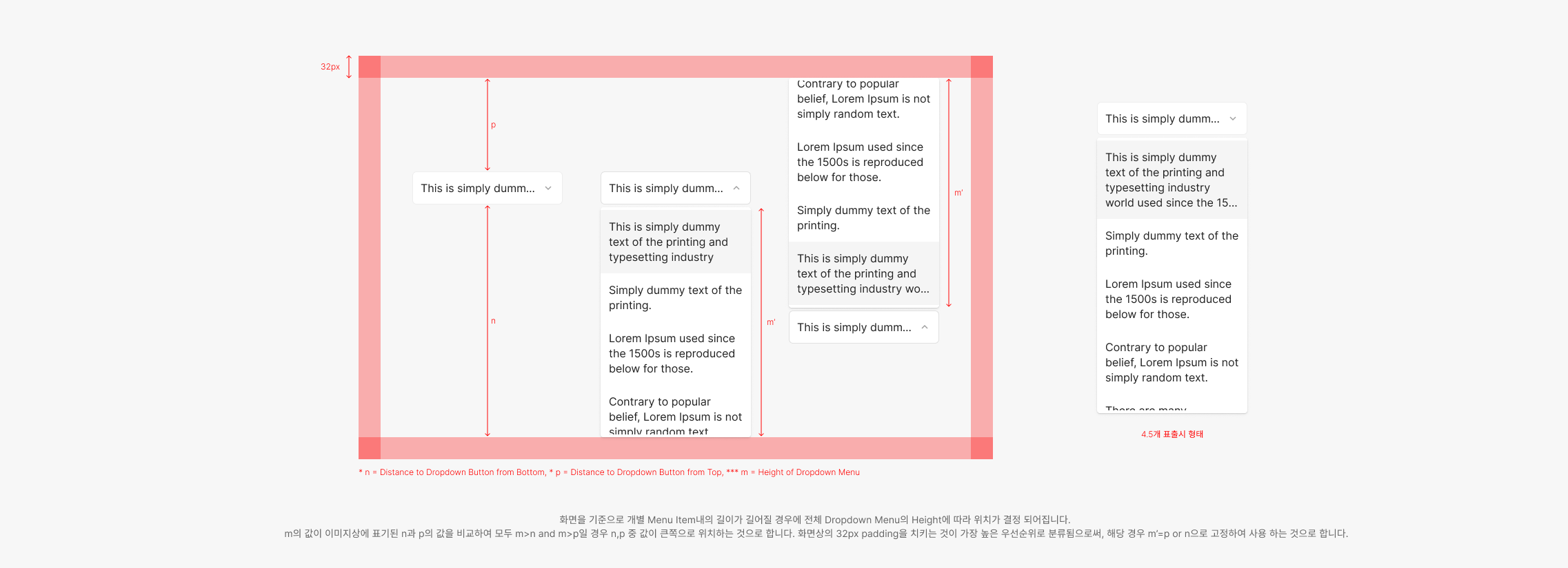
Menu Items
Menu height behaves in two ways depending on item count: flexible up to 4 items, fixed beyond that.
.png)
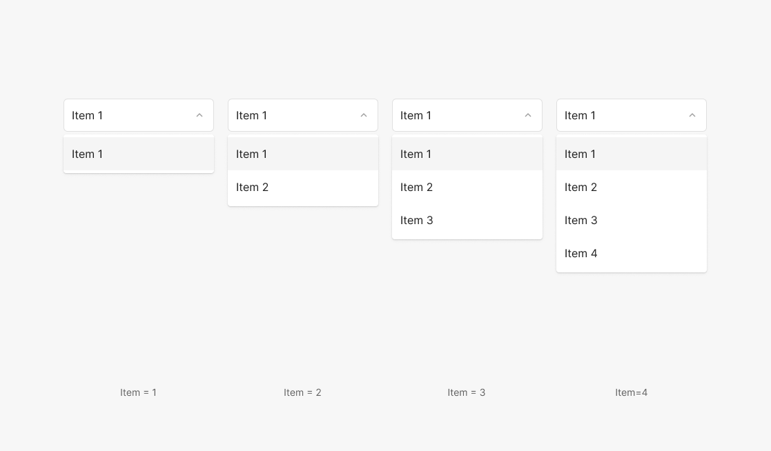
1. Menu Item ≤ 4
When item count is 4 or fewer, the Menu height is the sum of item heights plus 4 × 2px (top + bottom Menu padding) — flexed per count. Avoid Menus with a single Item.
2. Menu Item > 4 (with Scroll)
When item count exceeds 4, Menu height equals 4.5 item heights plus 4 × 2px (top + bottom Menu padding) — flexed by item content. The 0.5 reveals the next item halfway, signaling scrollability.
.png)
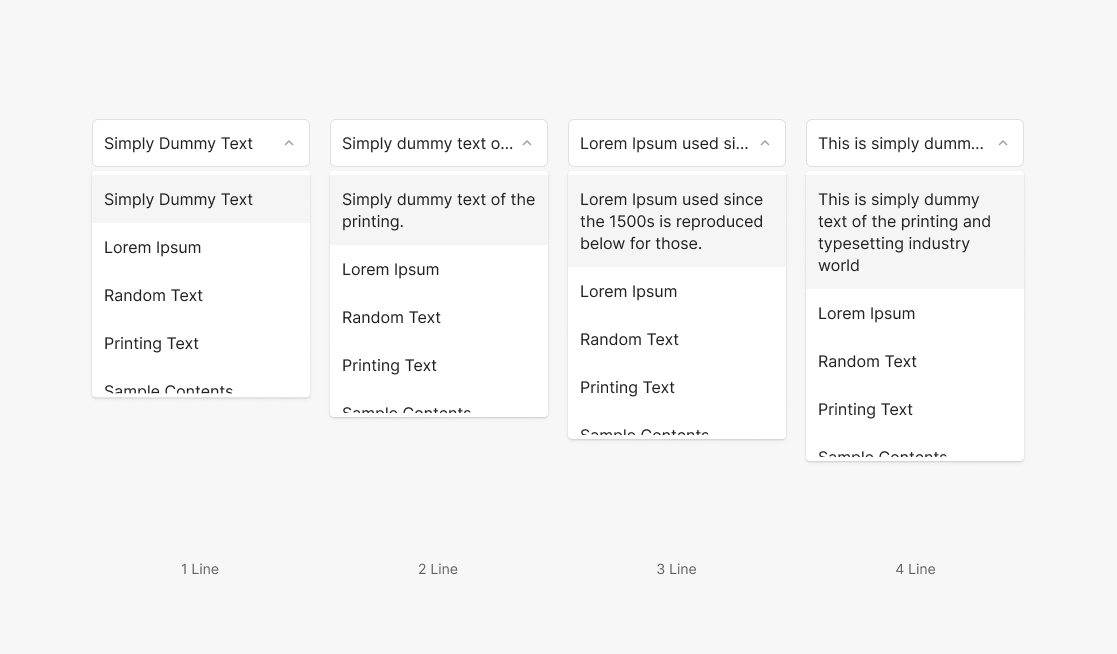
3. Menu Item Text Line ≤ 4
Unlike the Dropdown Button, where text truncates with "…" in a fixed height, Menu Item text wraps up to 4 lines. Heights flex from 1 to 4 lines.
4. Menu Item Text Line > 4 (with Scroll)
Maximum visible items default to 4.5, but each item's height flexes by content. Max visible text lines is 4 — beyond that, truncate with "…".
Item List Contents Arrangement
Menu Item list content defaults to A–Z order. When a meaningful sequence applies, follow that sequence instead.
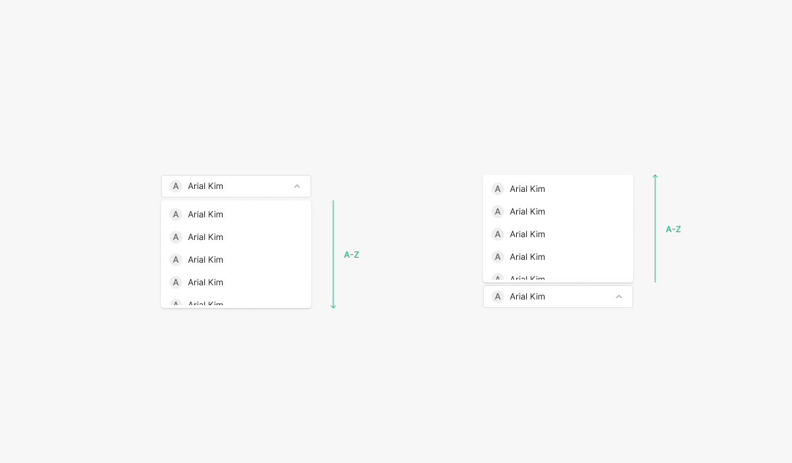
1. Default Item List
Applies to all text-bearing items. Except for Sequence Item Lists, all Menu Item lists default to alphabetical order — Primary, Secondary, Tertiary, and Extra Type.
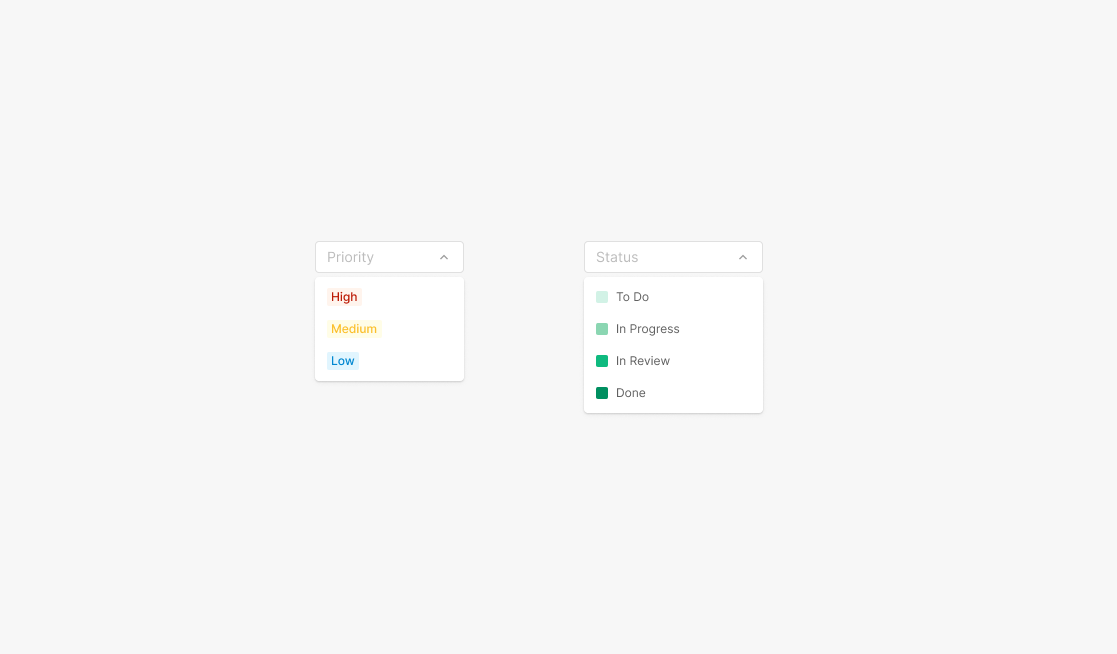
2. Sequence Item List
Applies when the task itself carries a meaningful sequence the user already recognizes (e.g., Roadmap — Priority and Status Filter Dropdown).