Colors
Color carries brand recognition, information hierarchy, and state — all at once.
Color in the design system sets the baseline for a consistent product experience. Every UI surface applies the defined tokens; ad-hoc color is avoided.
Color Usage Guidelines
- Reference colors by token name, not by hex.
- Each color exposes 10 steps (50–900) per WCAG 2.0; the primary step is 500.
- Apply defined tokens first across every surface. Avoid arbitrary colors to preserve accessibility and visual consistency.
- Text and background must meet readable contrast. If a new color is required, extend through the existing system first; add new colors only when extension isn't viable.
Brand Colors
Brand Colors carry brand identity most directly across the product.
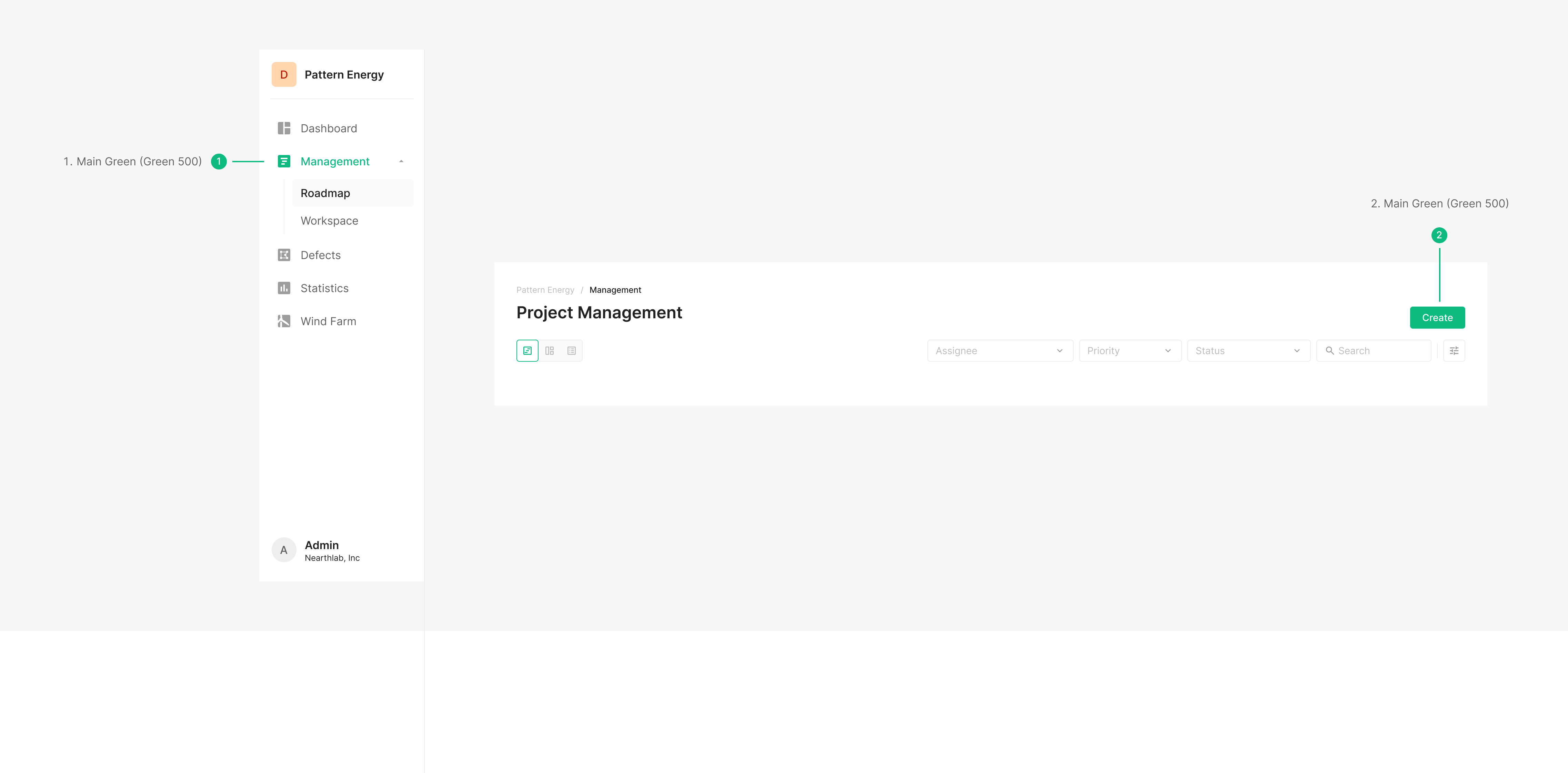
Primary Green is the signature color — apply it to primary actions, active states, and points of emphasis that should align the user's attention with the brand.
Primary Green isn't an accent; it's the visual anchor for the product.
Apply it consistently against the defined tokens and rules — reinforcing brand recognition and information hierarchy together.
Main Green Colour Variation
The Green Scale extends from Primary Green into a graded set. Use it consistently across backgrounds, text, and state representation, scaled to the level of emphasis and context.
Text Colour
Hierarchy steps through CTA, Primary, Secondary, and Tertiary text colors. Beyond these, other tokens may apply per screen composition.

| Name | Usage | Hex |
| Gray 700 | Titles (Title, Subtitle, Body), tabs, filters, OSD viewer, and body text | #616161 |
| Gray 900 | Headings, titles, icon labels, button info, and emphasized text | #212121 |
Background Depth
Use background depth for backgrounds and outlines only — not for text.
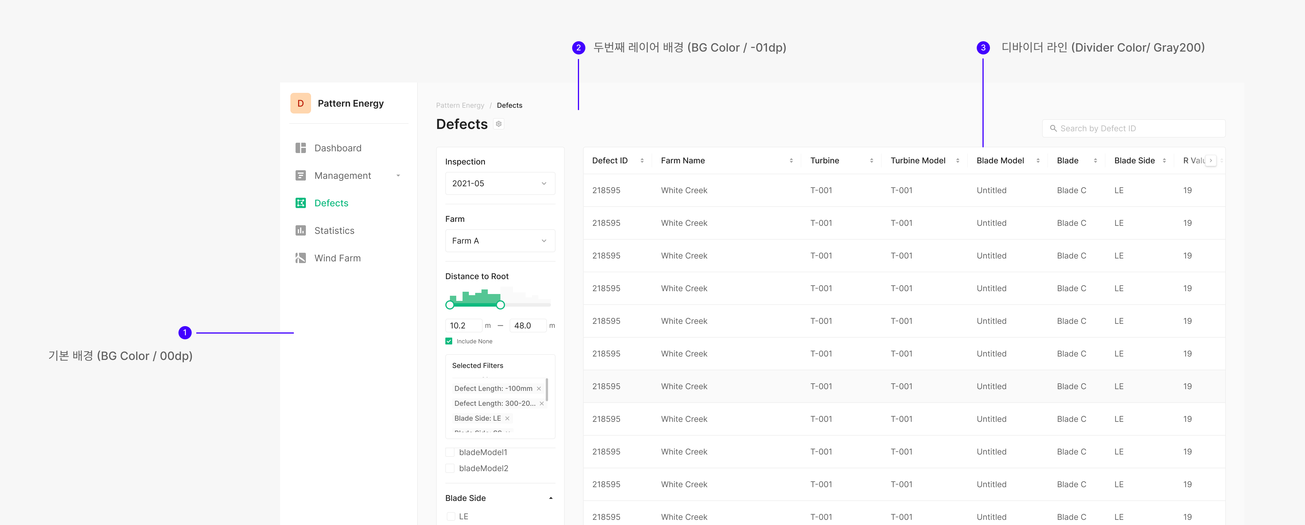
| Name | Usage | Hex |
| BG Color / 00dp | Default background; separator for list-like compositions | #FFFFFF |
| BG Color / −01dp | Second-level background | #FAFAFA |
| BG Color / −02dp | Third-level background | #F5F5F5 |
| BG Color / −03dp | Fourth-level background | #EEEEEE |
| Divider Color / Gray 200 | Divider lines | #EEEEEE |
Selected Color
Color tokens for component Selected states.

| Name | Usage | Hex |
| (Table) Selected Color / 01dp | Selected table row | #E6F7EF |
| (Table) Selected Hover Color / 02dp | Hover over a selected table row | #D2F2E6 |
| Selected Color / −02dp | Selected element (e.g. Dropdown item) | #F5F5F5 |
| Selected Hover Color / −03dp | Hover over a selected element (e.g. Dropdown item) | #EEEEEE |
Border Colour
Border tokens delineate regions. They aren't applied to backgrounds or text.
| Name | Usage | Hex |
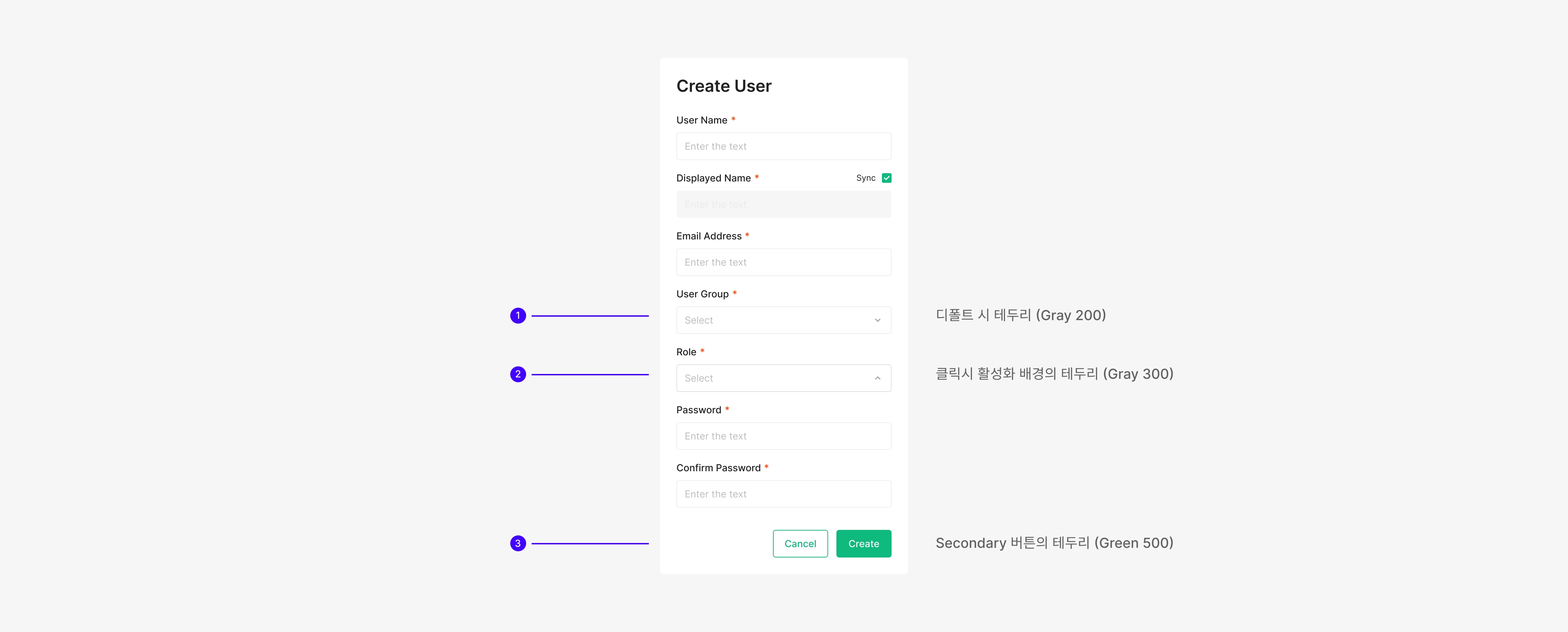
| Gray 200 | Default or Hover border on interactive components | #EEEEEE |
| Gray 300 | Active border (e.g. Input, Dropdown) | #E0E0E0 |
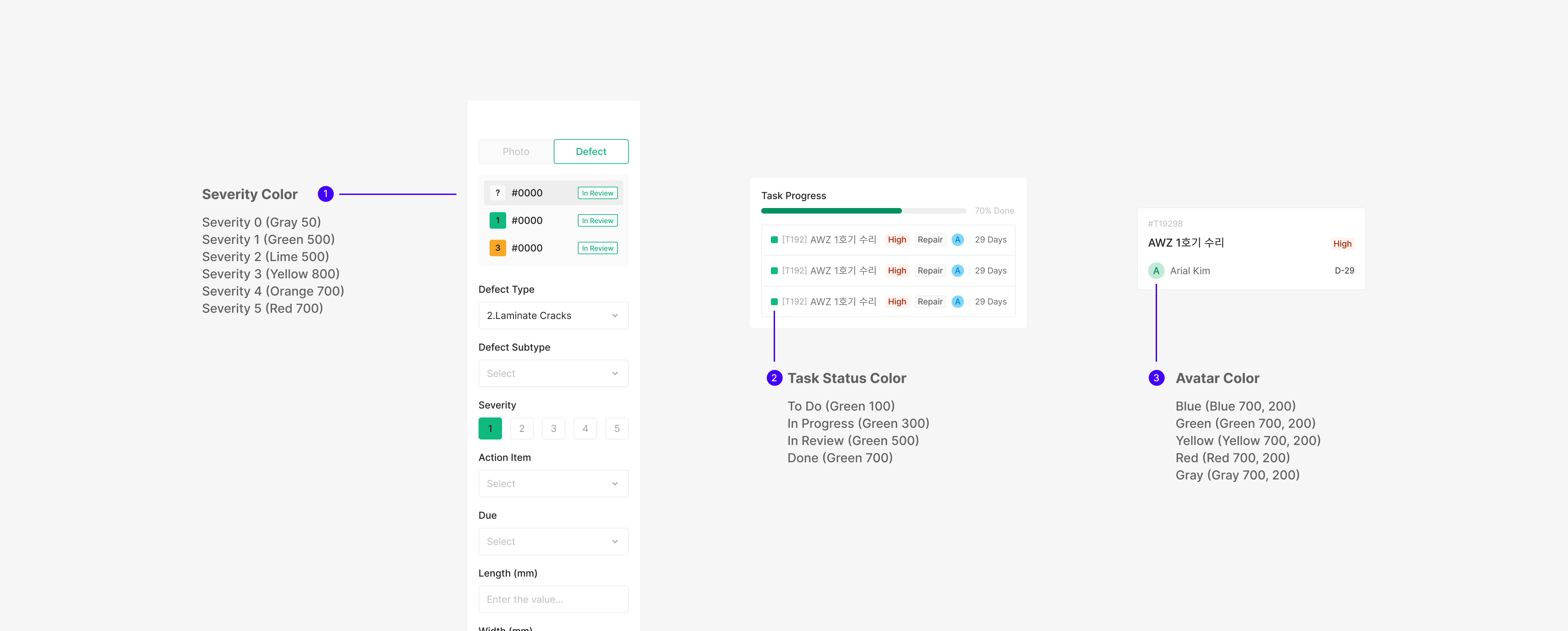
Secondary & Extra Colours
Used in Chip, Badge, and Avatar colors — and across state colors. Categorized to cover a range of primary uses.