Tree
Tree lets users navigate nested, hierarchical items.
Anatomy
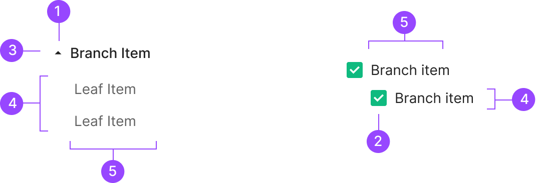
1. Expand and Collapse Icon
2. Checkbox
3. Branch Item
4. Leaf Item
5. Text Label
Usage
Tree View splits into two forms by purpose — Text Type and Checkbox Type. Both express hierarchy visually, but they differ in how users interact with each item and in the intent behind selection. Text Type fits when users select a single Node to drill into details or trigger a per-item action. Checkbox Type fits when users select multiple Nodes at once to apply a bulk action.
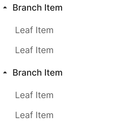
1. Text Type
Text Type renders each Node as a text-based list item that conveys the tree's hierarchy. Each item acts as an independently selectable label — users click a Node to view details, navigate, or trigger an individual action.
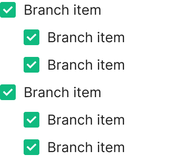
2. Checkbox Type
Checkbox Type pairs a checkbox with each Leaf or Branch Item, letting users select multiple items at once. Best when bulk actions or shared operations are needed across many Nodes — selection-management contexts where Text Type doesn't fit.
Spacing
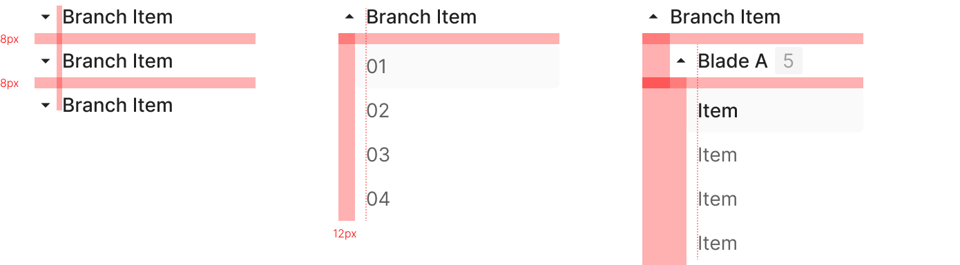
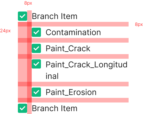
Tree View spacing follows alignment rules driven by hierarchy and depth. Both Text Type and Checkbox Type share the same spacing system — consistent indentation and vertical rhythm make the hierarchy easy to read. Leaf Items carry no additional gap between each other; Branch Items and their child item groups carry an 8px gap. The system keeps information flow continuous while making parent-child relationships visually clear.
Text Type
Text Type aligns Branch and Leaf within the same spacing rules, varying only the indentation by depth. Leaf Items sit back to back with no added gap, letting the list flow naturally.
Checkbox Type
Checkbox Type follows the same hierarchy and spacing rules as Text Type. The added checkbox doesn't change the overall alignment. Hierarchy between Branch and Leaf reads through indentation and inter-group spacing.
Variants
Leaf Item
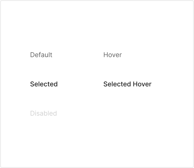
Leaf Item carries 5 states — Disabled, Default, Hover, Selected, Select Hover.
Branch Item
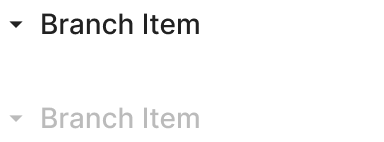
Branch Item ships with 2 states — Disabled and Default — plus its Expansion state reflected in the form.