Product Design · 2026–
DNK Investment Manager
Turning complex BI into decision-ready workspace
Cutting the analysis overhead out of real estate investing,
and giving the whole org one set of numbers they trust.
Overview
Built for decisions,
not just for looking at data.
DNK Investment Manager turns real estate portfolio performance into decisions. Before this, the only analysis surface was a BI-driven dashboard — powerful, but a wall to anyone who wasn't a BI expert.
We didn't redesign a data tool. We built a decision-support interface. Read portfolio health on Home, compose purpose-driven views in Dashboard Builder, execute deals in Deal Pipeline, and explore freely in AI SQL — six tabs that move you through the analysis workflow as one piece, not six.
Problem
The data was there.
Reading the same numbers? Not guaranteed.
Across the existing IM environment, the recurring problem wasn't 'missing tools.' It was missing a shared interpretation and a way to actually reach the data.
No shared interpretation
Cash flow structures and normalization rules weren't aligned, so the same dataset produced different numbers depending on who was reading. The data existed, but purpose-fit interpretation and comparison didn't.
BI was too high a wall
BI tools are powerful, but unforgiving for non-experts. Chart configuration was technical, and there was no quick path from 'what I need to know' to 'a view I can read.'
No role-aware views
Executive, Asset Manager, Analyst, and Data Manager all need information at different depths — yet the existing interface treated them as one user.
Same data · different interpretations · different numbers
Users
Four roles. Four different questions.
Each IM user reads information at a different depth and angle, depending on their role. The design respects that difference while keeping everyone on the same data foundation.
“Where is the portfolio heading overall?”
Scan AUM, NOI, Yield, and Growth fast, and catch outliers early.
Home, Dashboard“What's actually pulling this portfolio or asset's performance?”
Go deep on Rent, Occupancy, Expense, NOI — toggling between charts and tables.
Dashboard Builder, Deal Pipeline“What patterns emerge across vintages and asset classes?”
Comparative analysis and drill-down — AUM mix, yield comparison, Rent per Tsubo.
Dashboard Builder, AI SQL“Are the assumptions behind the executive's numbers correct?”
Govern PMR completeness, CFC templates, and data quality — and control them.
Data Management, Cash Flow ConfigDesign Strategy
Three strategies
set the product's judgment.
Every design decision was made against these. The goal wasn't a feature list — it was a structure where users trust the numbers and act quickly.
Trust the Numbers
Show the assumptions before the numbers. Scope and CFC templates are always visible, one dashboard maps to one CFC, and global filters control the shared conditions — so the whole organization reads the same number.
Lower the Barrier
Don't open on a blank canvas — give people a usable starting point. Eleven preset charts let you start instantly. Executives and analysts can each work at their own depth without switching surfaces. Intuitive and extensible at the same time.
AI as Copilot
AI summarizes, but it always has to be verifiable. It explains chart patterns in natural language and suggests follow-up questions — while letting users check the source directly through Data Table and SQL.
Information Architecture
Tabs and an expansion layer, bound into one analytical system
IM's tabs aren't independent features. They're one investment analysis workflow, wired together. Enter from Home, analyze in Dashboard, execute in Deal Pipeline, govern the assumptions through Data Management and CFC. On top of that, the Command Palette (⌘K) sits as the IA's expansion layer — so the sidebar doesn't grow heavier as features grow.
Feature 01
Home
An entry hub that reads portfolio health at a glance. Not a list of dashboards — Trust Bar surfaces data confidence first, Key Metrics lets you pick what matters, and the Action Center suggests what to do next.
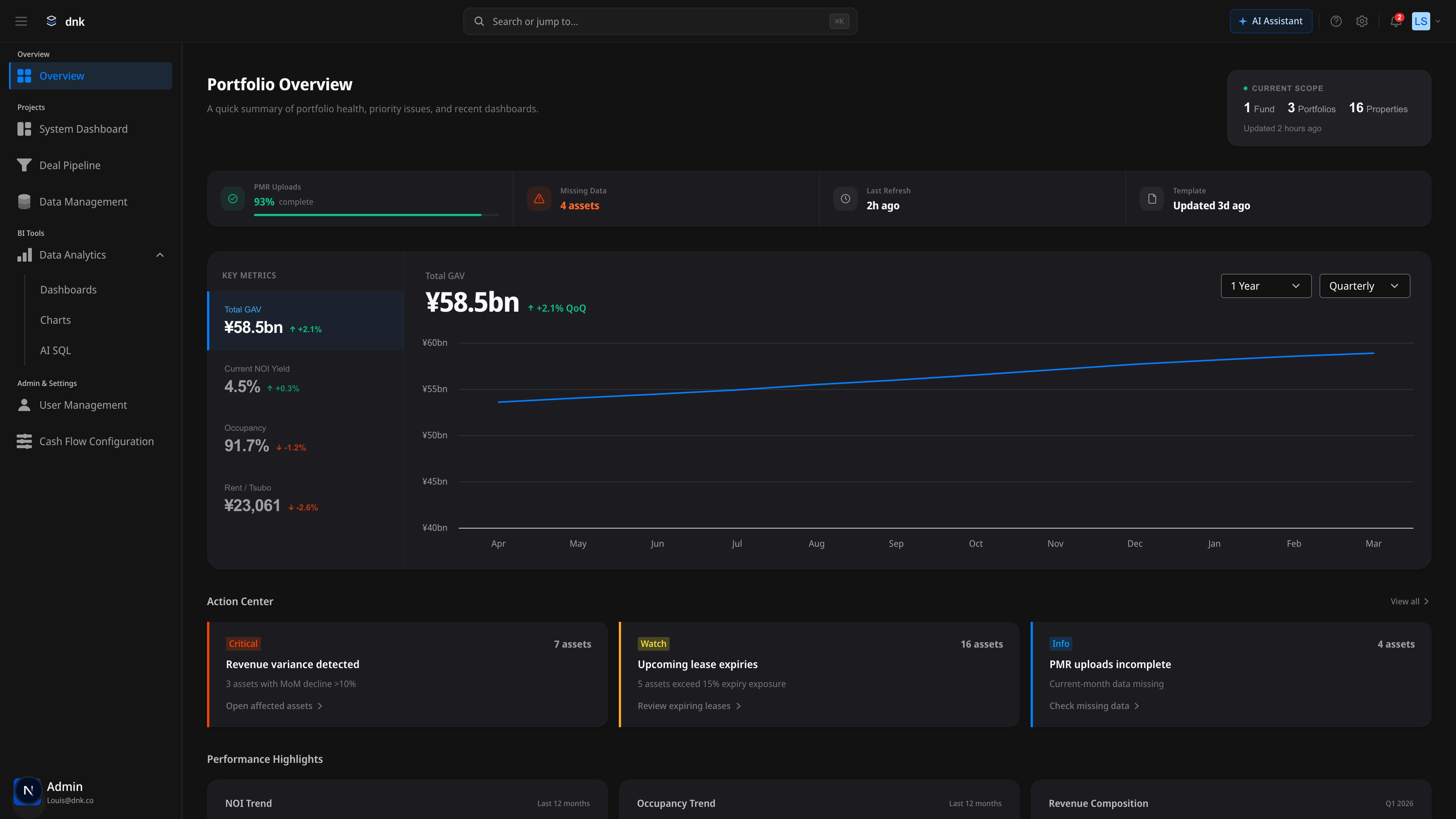
Trust Bar
Assumptions before numbers. PMR upload rate, missing data, and last refresh sit at the top — data confidence reads instantly.
Action Center
A hub that doesn't end with observation. Critical, Watch, and Info alerts suggest the next action and link straight to the affected assets.
Key Metrics
A different first number for each role. Pick AUM, NOI Yield, Occupancy, or Rent per Tsubo, and the right-side chart syncs immediately.
Feature 02
Dashboard Builder
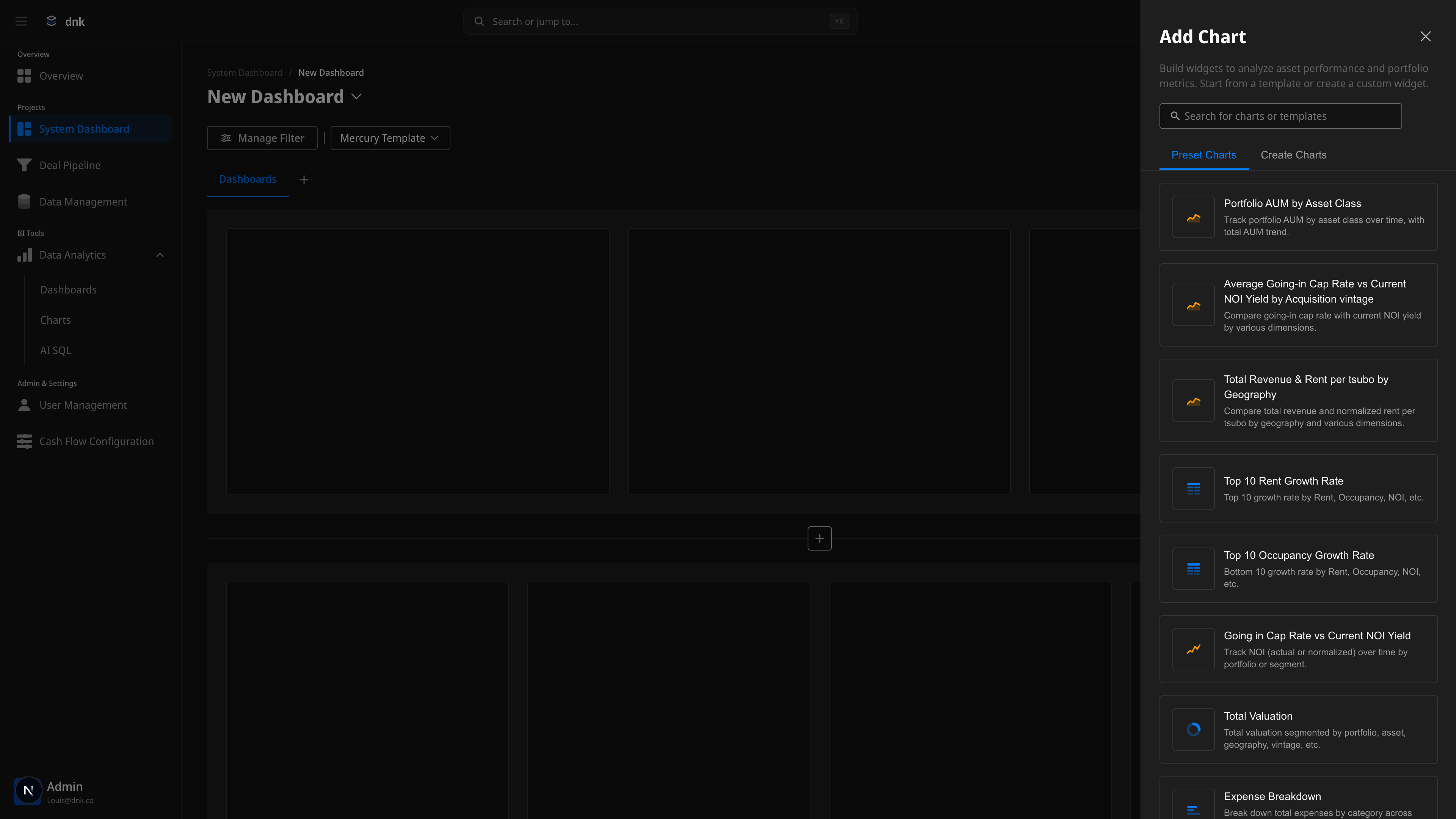
A self-serve builder for purpose-driven dashboards — no BI tool required. Eleven preset charts give you a usable starting point instead of a blank canvas. Drag and drop arranges sections and cells freely.
2-Level Drag & Drop
Dual-level drag at the cell and section level. Place widgets, group them into sections, and preview the result through visual feedback as you go.
Preset Chart Panel
Eleven usable starting points instead of an empty page. Add AUM, Cap Rate, Revenue, Occupancy, and other core investment metrics in one click.
Real-time Preview
Selecting a chart renders an immediate preview. See the result in edit mode and finish the dashboard with confidence.
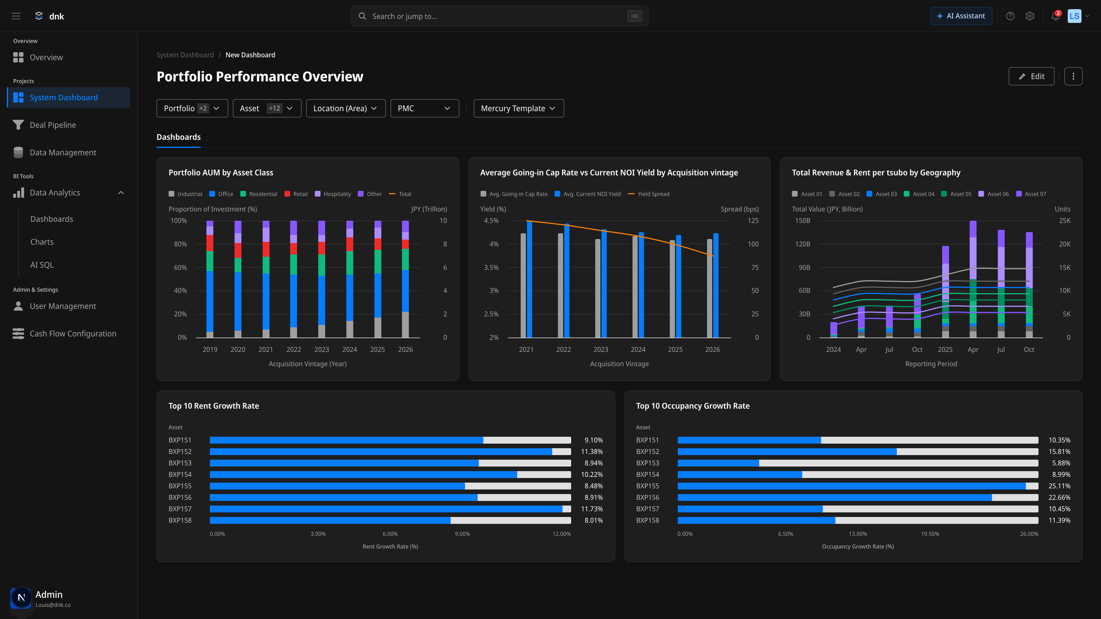
Completed Dashboard
Portfolio Performance Overview
How a built dashboard actually reaches the user. Five preset charts laid out in a 3+2 grid, with the header's filter chain and AI Insights wrapping the whole analysis flow.

Hover-only Chrome
The AI · Expand · Edit · More buttons on a chart are hidden by default and surface only on hover. Resting state stays at zero visual noise; chrome appears only when you reach for it.
Count-badge Filters
Multi-select counts show inside the chips — Portfolio +2, Asset +12 — so the current filter state reads instantly without opening anything.
Scoped AI
Every chart has an AI Insights entry point wired in. Interpretation follows naturally from the numbers, without breaking the flow.
Feature 03
Deal Pipeline
A Kanban view that reads the flow of investment deals at a glance. Track deals across six pipeline stages from Sourcing to Closing, and read full detail on click — no page transition.
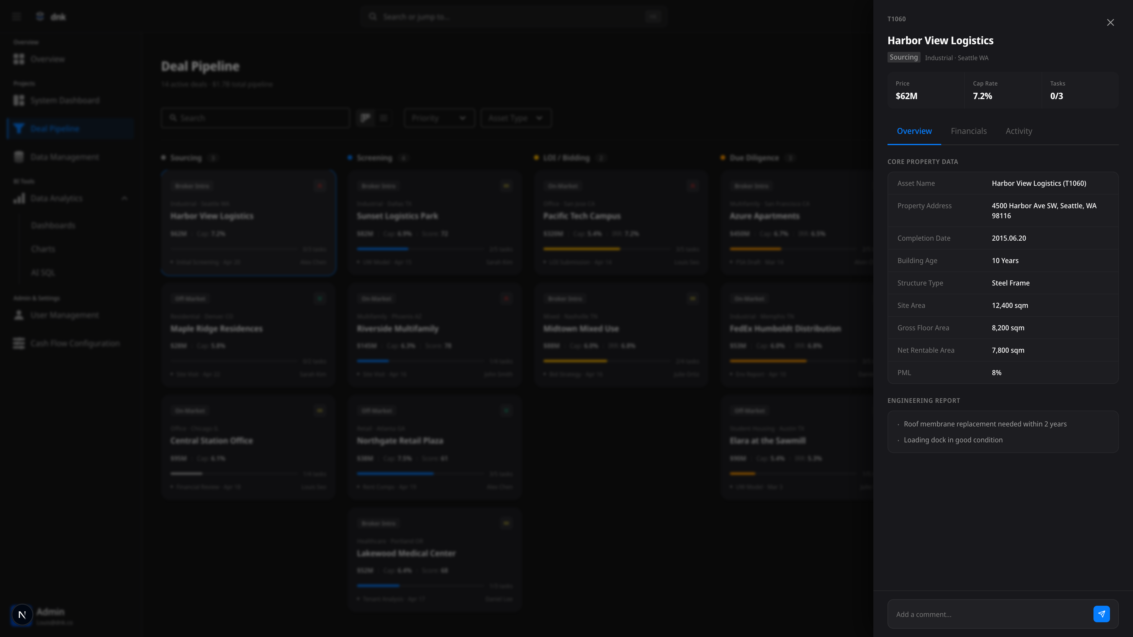
6-Stage Pipeline
Sourcing, Screening, LOI/Bidding, Due Diligence, IC Review, Closing — every stage of a deal's lifecycle, on one screen.
5-Layer Card
Source, priority, price, Cap Rate/IRR, and progress with milestones — five layers of information packed into a single card without overwhelming it.
3-Tab Detail Drawer
Click a card and a three-tab drawer opens — Overview, Financials, Activity. The full context of the deal, no page change.
Feature 04
Cash Flow Config
The core system that defines the meaning behind every metric. The implementation of 'One Dashboard = One CFC' — Revenue, Expense, and NCF structures, managed in an intuitive tree editor.
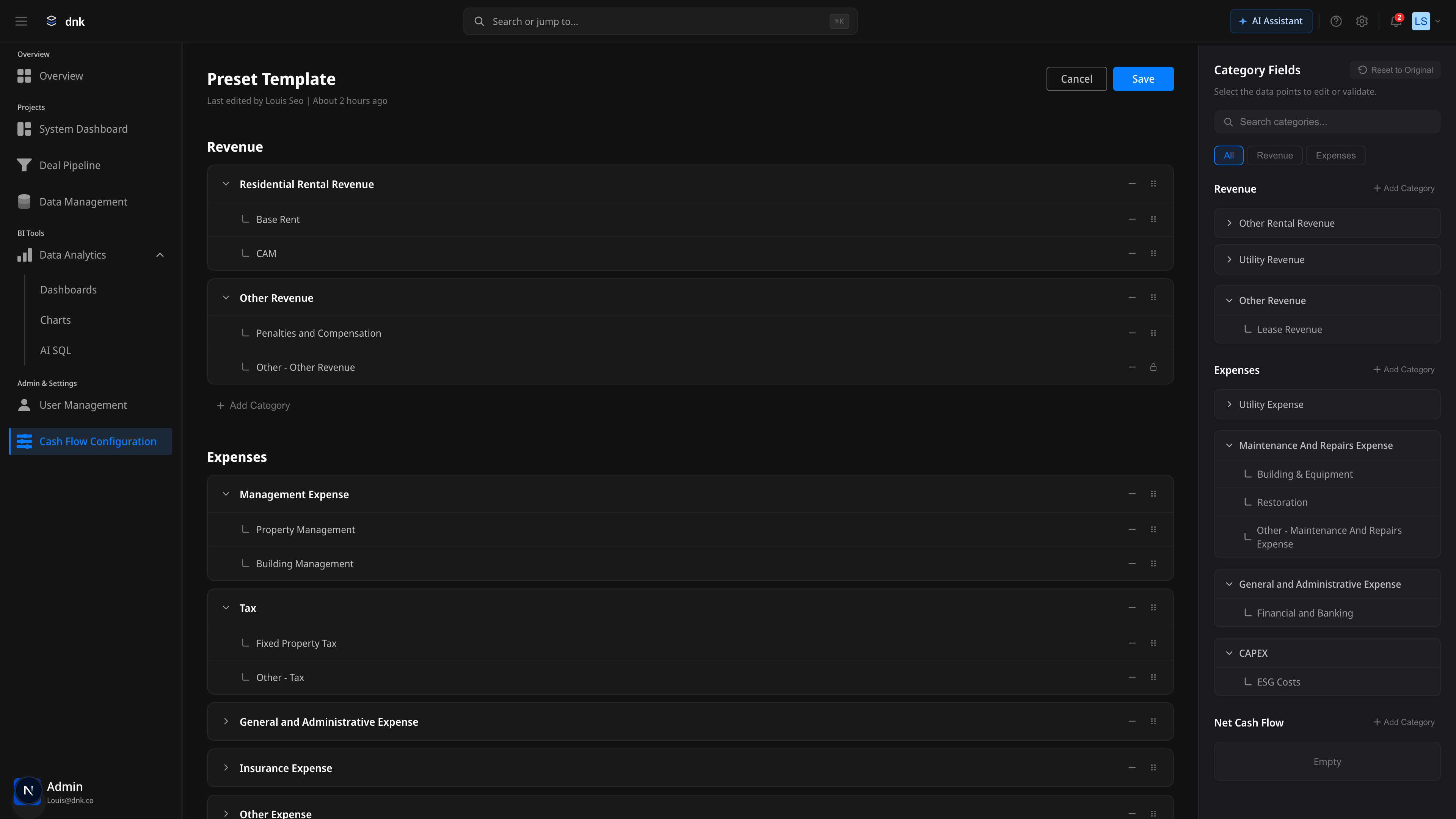
Split View
Edit the Revenue/Expense tree on the left, browse category fields on the right. Edit and reference at the same time.
Tree Structure Editor
Expand, collapse, and drag-reorder categories and subcategories. Hierarchical financial data managed intuitively.
Lock vs Drag
System-protected nodes show a clear lock icon. The boundary between editable and protected is always visible.
Feature 05
Data Management
Where the assumptions behind the executive's numbers get governed. Monitor data source connections, import activity, and quality metrics in one place — and catch problems before they hit the dashboard.
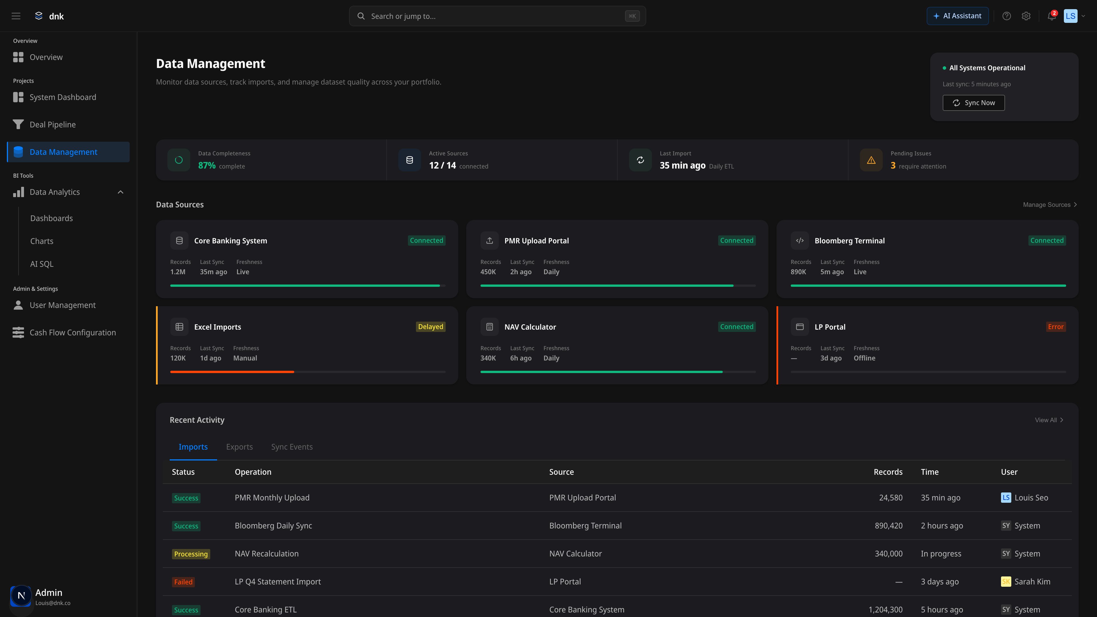
Trust Bar
Data completeness, active source count, last import, and unresolved issues summarized in one line. System health reads at a glance.
Data Quality
Pick Completeness, Accuracy, Timeliness, or Consistency — the 12-month trend chart syncs immediately.
Source Cards
Connection status and a Health Bar for each of six sources — Core Banking, PMR, Bloomberg, and more — monitored card-by-card.
PMR Review
AI-assisted review for numbers you can trust
Where monitoring tracks 'overall environment health,' PMR Review handles cell-level integrity of the monthly reports coming in. Coverage, AI Fix Queue, and Anomaly Detection run on one screen — absorbing friction before the executive's numbers are ever formed.
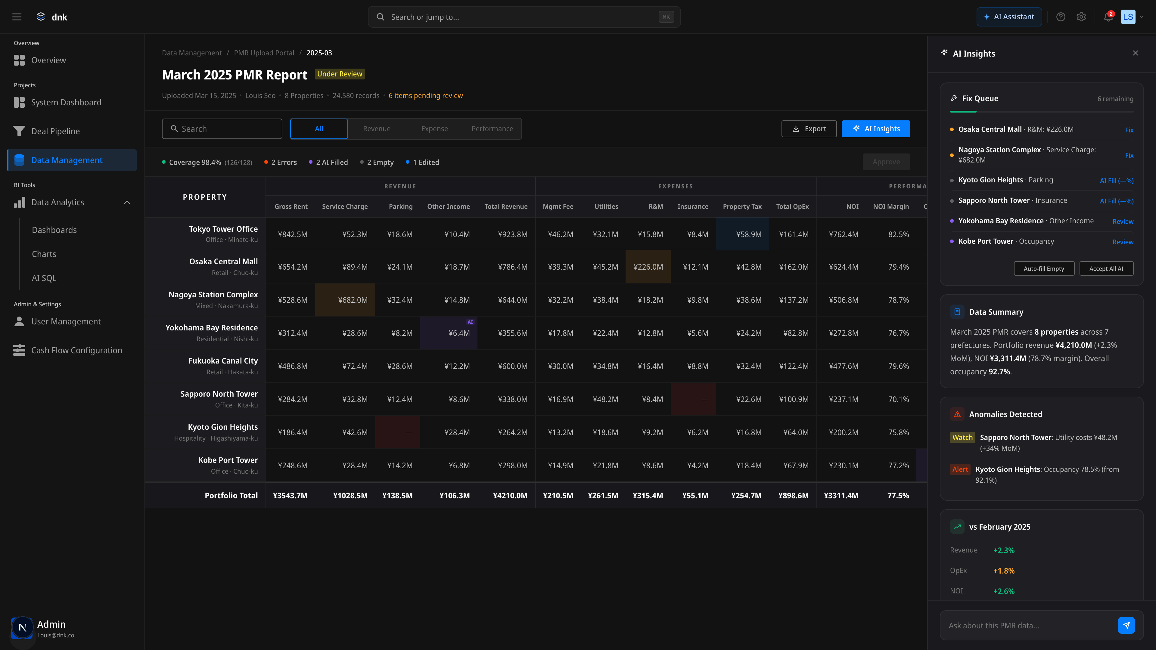
Coverage at a Glance
128 cells, summarized in one line — Errors · AI Filled · Empty · Edited. Color sets priority immediately.
AI Fix Queue
Fix, AI Fill, and Review actions sort by item. Auto-fill Empty and Accept All AI also handle batch operations.
Anomaly Detection
Large month-over-month shifts auto-flagged at Watch or Alert level. Signals like 'Sapporo Utility +34% MoM' surface without slipping through.
Feature 06
AI SQL
Ask in natural language; AI generates SQL and visualizes the result as a chart. The implementation of 'Insight with Proof' — AI gives the answer, but always pairs it with a verifiable path.
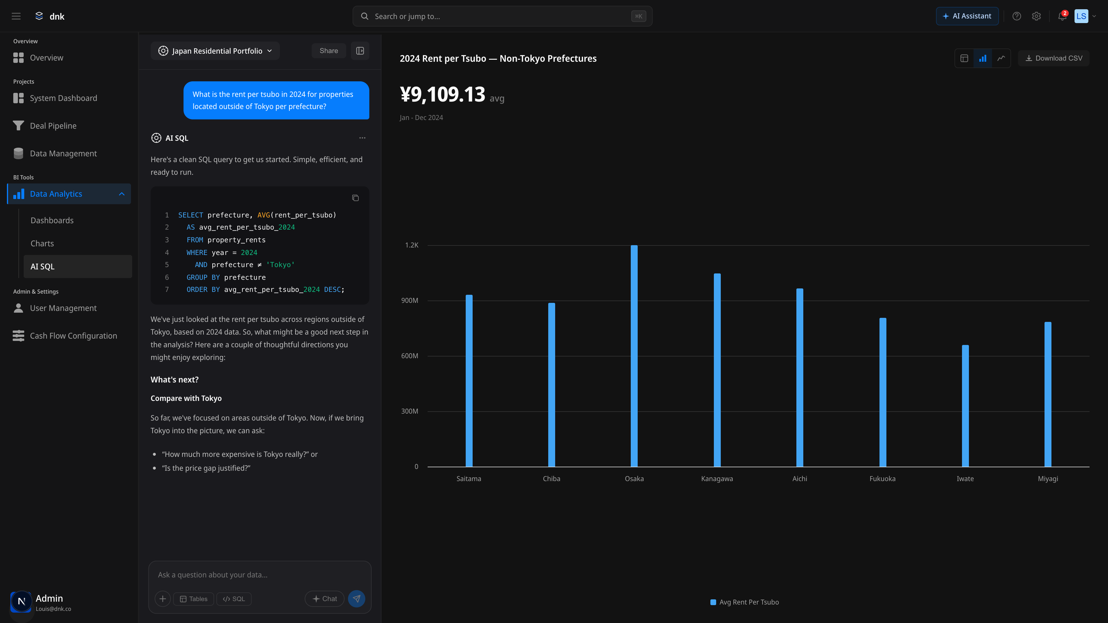
Chat-based Query
Ask in natural language; AI generates the SQL. Questions like 'What's the average rent in Tokyo?' convert to a query instantly.
SQL Highlighting
Read and edit the generated SQL directly. Not a black box — a transparent AI, with keyword highlighting that keeps queries readable.
View Toggle
Switch the result between Table, Bar, and Line views as you explore. See the same data from multiple angles and find the insight.
Feature 07
AI Insights
Dashboards surface numbers, but interpretation always landed on the user. Where AI SQL is the 'question → answer' loop, AI Insights is the 'number → interpretation' loop. Every chart has a hover-revealed AI Assistant entry point; clicking it opens an explanation panel injected with the chart's context. Copy maintains the verification and sharing path, and Suggested Prompts remove the friction of follow-up.
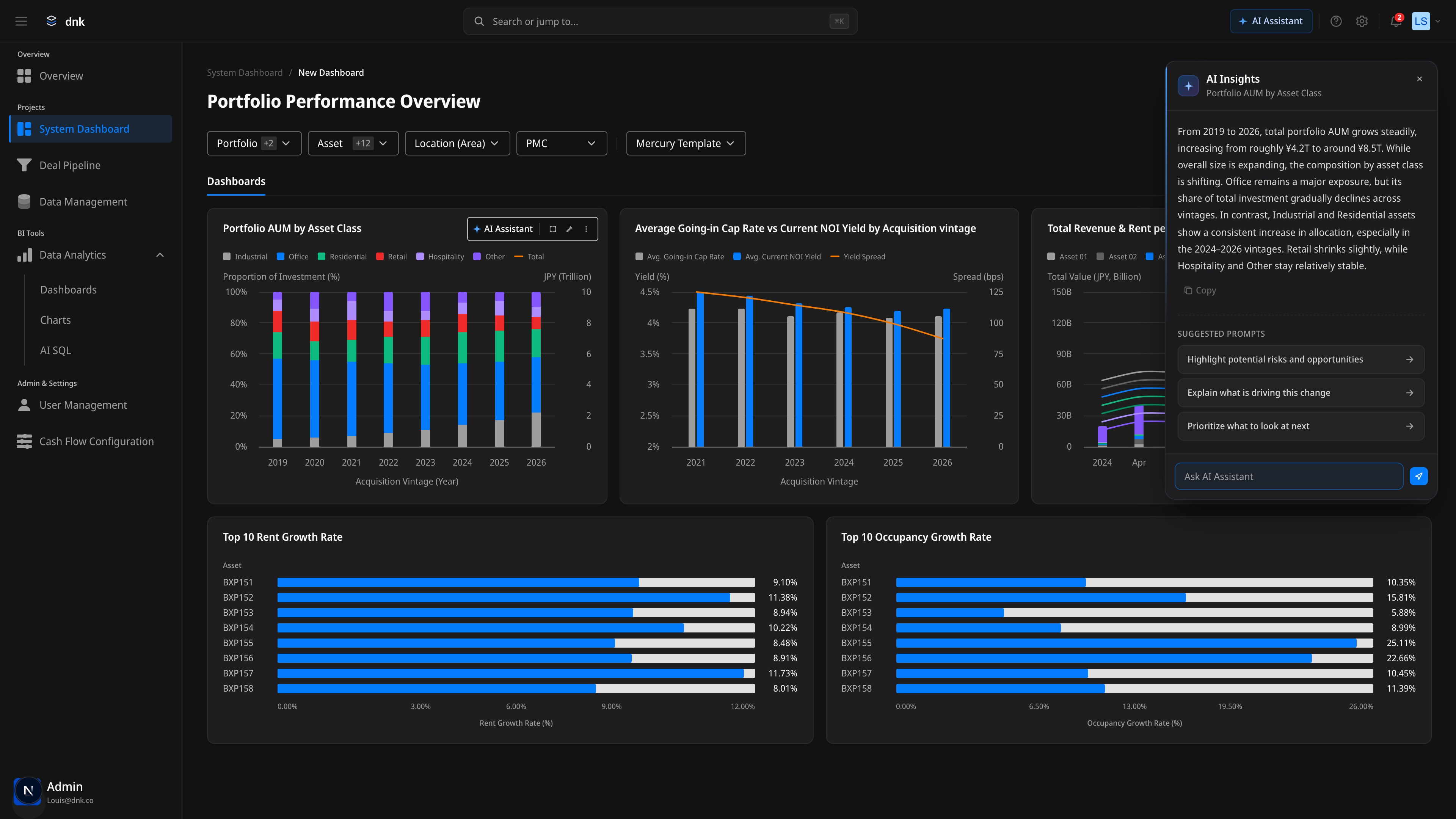
Chart-contextual Header
The chart name appears in the panel subtitle — no confusion about which chart's interpretation you're reading. The AI's subject is visually pinned.
Suggested Prompts
Two to three follow-up questions surface as arrow chips. Click to auto-fill the input and shift focus — friction-to-start drops to near zero.
Draggable Persistence
Grab the header and move the panel anywhere in the viewport. Position holds for the session, so you can compare across charts without losing your view.
Feature 08
System Chrome
A sidebar alone isn't enough. As the product grows, navigation weight grows with it — and product-wide utilities like notifications, account, and theme inevitably converge at the top corner. We redesigned the whole shell to converge input on a single ⌘K command palette and tuned notifications, the user menu, and the AI Assistant entry into one consistent register. The goal: make keyboard-first an implementation, not a tagline.
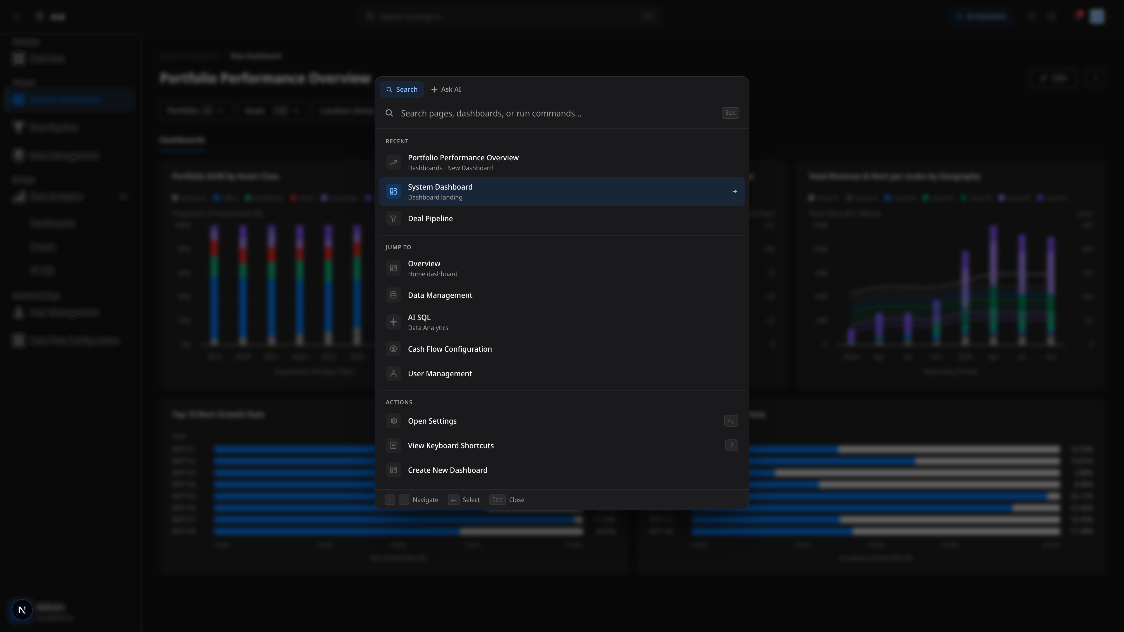
Command Palette (⌘K)
Jump to · Recent · Actions · Ask AI converge into one input. Anywhere in the app is two seconds away — no sidebar expansion required.
Notifications Center
Signals split into Alert · Report · Mention · Info. Unread badge, All/Unread tabs, and individual or bulk read — signal management closes cleanly.
Keyboard-first Tooltips
Every icon button surfaces its shortcut as a tooltip. Shortcuts like ⌘K · ? · ⌘, stay discoverable even for mouse users.
Design Decisions
Key decisions and the reasoning behind them
The most consequential structural calls on this project. Here's the alternative I rejected and why I chose what I chose.
Why CFC lives in its own tab — not inside the dashboard
Embed CFC inside the dashboard's settings panel. Configure it as part of dashboard creation.
CFC as a separate tab. Templates are defined ahead of time; dashboards just pick one.
CFC templates get reused across dashboards. Embedding means repeating the same configuration each time, and permissions can't separate. The real point was role separation — the Data Manager owns templates, analysts pick from them.
Why Preset Charts are the default — not an empty dashboard
Blank canvas plus onboarding guidance. A high-freedom approach where users build from scratch.
Eleven preset charts alongside custom creation. Start from a purpose-fit point; extend as needed.
A blank screen triggers the 'what should I make' state. Naming the recurring analysis patterns lets non-experts start analyzing immediately, and lets experts customize from the preset.
Why Trust Bar lives on the main view — not in settings
Show data quality info only in the Data Management tab. Hide it from the analysis surface.
Trust Bar persistent at the top of Home. Data confidence reads before any number.
'Can I trust this number?' is the first question in any investment decision. Bury data quality in a settings page and nobody checks. We placed it on the entry view so every read passes through it.
Why AI entry points split between the global palette and chart-level Insights
One global AI Assistant panel handles everything — generic questions and chart interpretation through a single chat.
Command Palette Ask AI (general) and per-chart AI Insights (contextual), split two ways. Different entry points, shared AI principles.
General questions and contextual questions don't behave the same way. 'Jump to deal pipeline' is a fast, one-shot ask. 'Why did this Yield Spread drop?' is exploratory and multi-turn. Force them into one UI and both get worse. Two entry points, one shared register.
Why topbar search triggers the Command Palette — instead of inline input
Direct input in the topbar with inline autocomplete — pages, deals, and assets handled in one dropdown.
Topbar input is a ⌘K trigger only. The actual search and execution run in the central modal Command Palette.
Navigate, Recent, Action, and Ask AI in one inline dropdown gets crowded fast. Splitting into a modal makes group boundaries clean and lets us serve keyboard navigation, large input, and section divisions in parallel. The Palette absorbs future sidebar/topbar expansion pressure, so the shell stays light as features grow.
Outcome
Less BI complexity,
and an analysis flow Executive through Analyst
can actually trust.
Reflection
The most consequential call on this project wasn't 'improve the BI tool.' It was 'build a different kind of interface — one made to support decisions.' Hold the freedom of BI, give non-experts a path to start analyzing with intent — that's why Dashboard Builder and AI SQL live as separate things.
Trust Bar isn't a UI element. It's a product decision: show whether a number is trustworthy before you show the number. Scope-first, One-CFC follow the same logic — structural choices that make the whole organization read the same number.
Designing six tabs, what I came back to most was this: each tab can't be a standalone feature. They have to be a connected workflow. Spot an anomaly in Home → drill into Dashboard → trace the assumption back through Data Management. That flow has to feel inevitable.