UX/UI Design · 2025–
DNK Resident Portal
An admin-first rental operation in Japan,
redesigned around the people who live there.
Overview
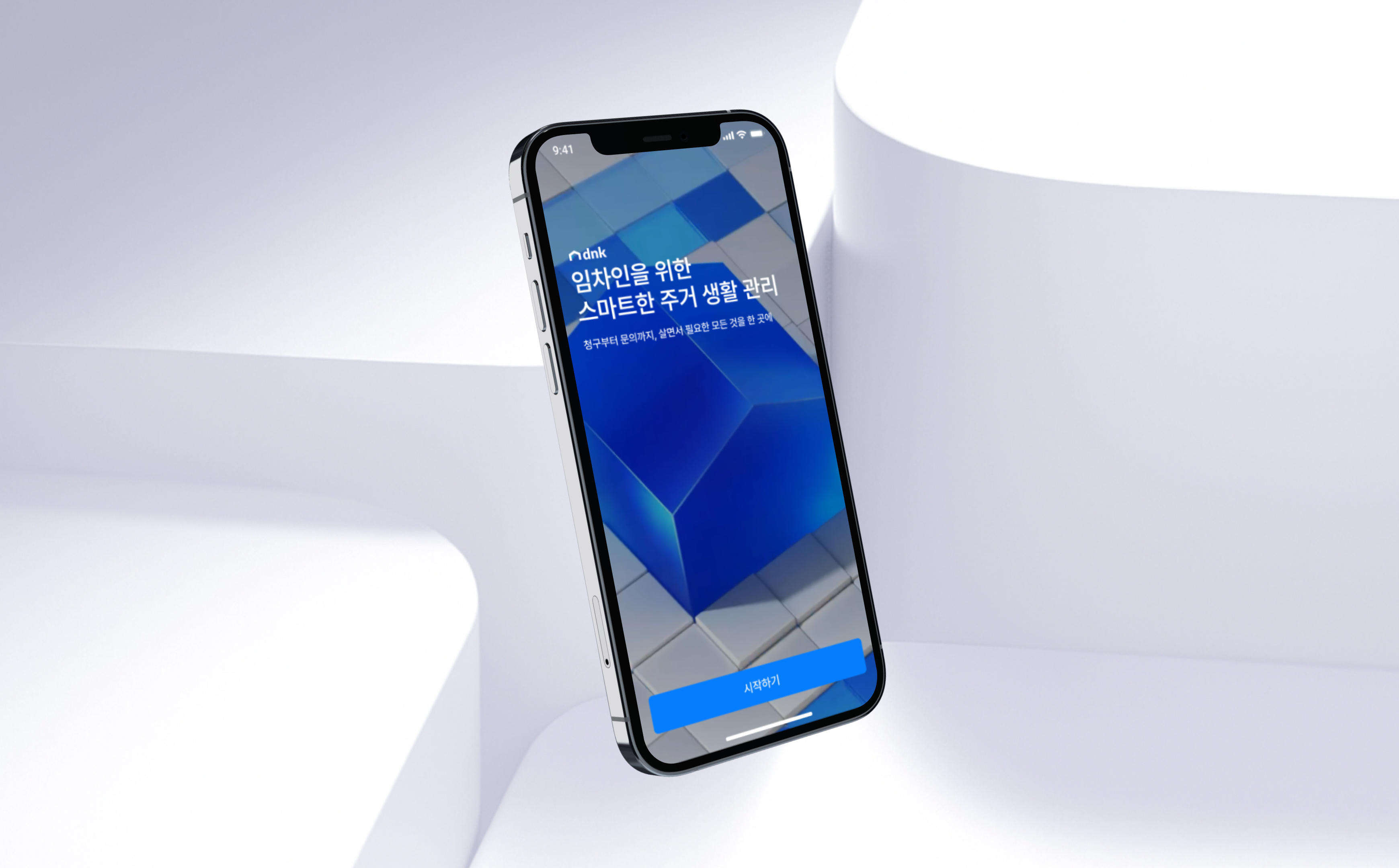
A resident-first,
two-sided housing platform
Japan's housing market runs on complex mechanics: guarantor registration, recurring lease cycles, separate maintenance and system fees. The admin-side PMS that drives operations sits entirely apart from the resident's experience.
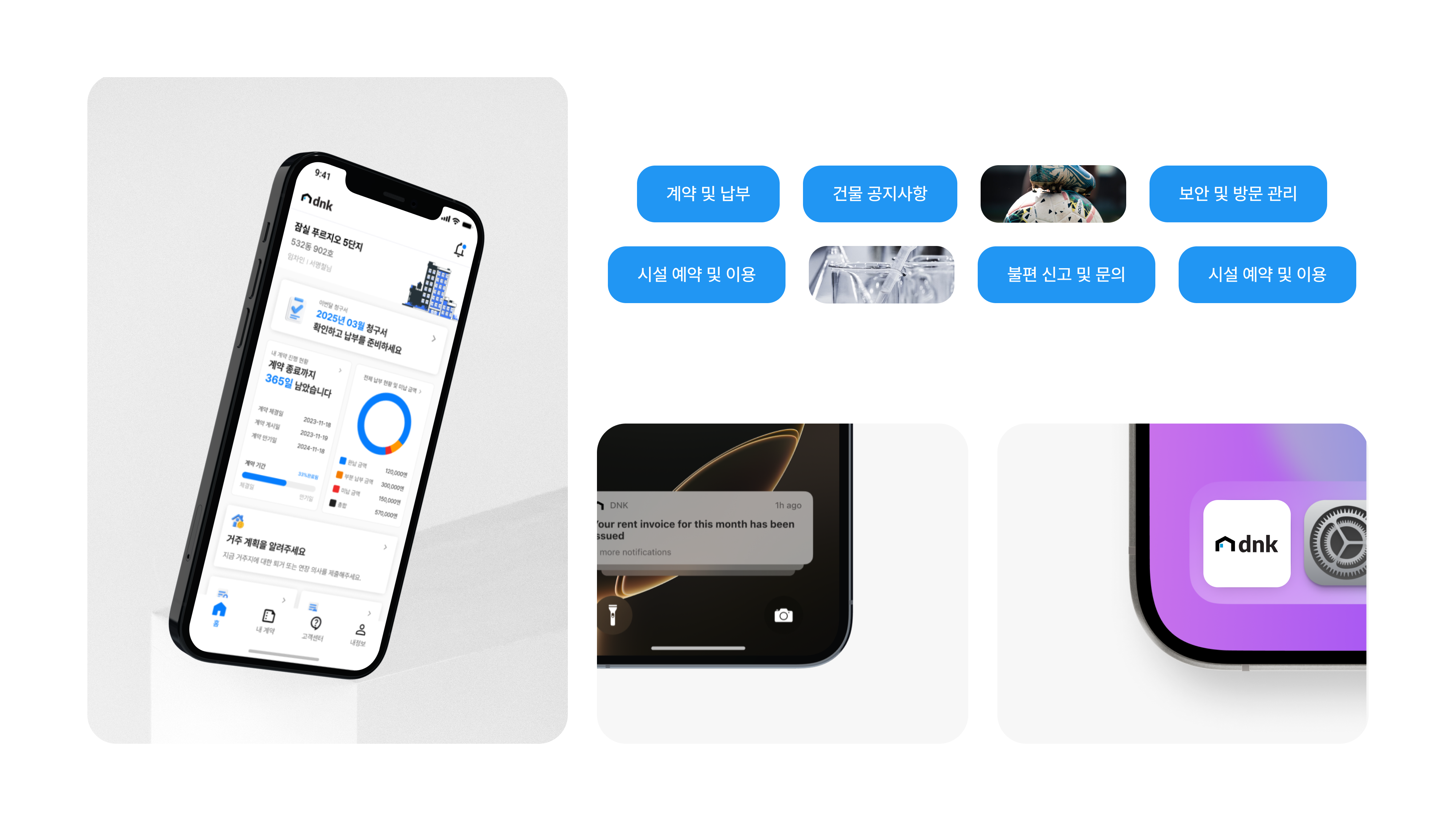
I designed a two-sided platform on a single contract data model — RP App for residents, RP Admin Web for operators, and the PMS — connecting all three. Residents can view contract details, payments, announcements, facility bookings, and intent submissions directly from the app. Operators handle contract issuance, announcements, push notifications, request management, and invoicing through Admin Web.
This is a PMS-integrated housing platform built around the resident — designed to honor Japan's local regulations and operational norms while giving residents the agency to verify and act on their own information.
Market Research
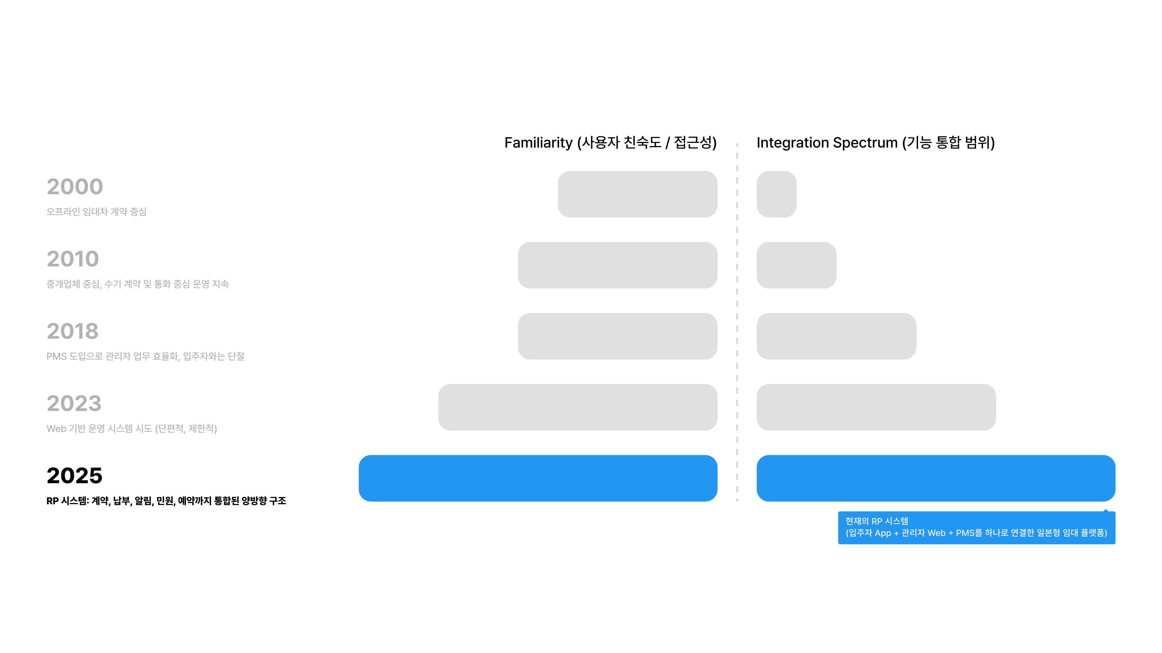
The rental system has evolved.
The experience hasn't followed.
Traditional Japanese rentals run admin-first. Residents receive everything — contracts, payments, announcements — second-hand. When PMS adoption digitized the admin workflow, the resident touchpoint stayed broken. The right job wasn't redesigning the ops system. It was redesigning the entire living experience.
Product
RP App Overview
User Research
Residents had to go find
what they needed — every time.
In Japan's legacy rental systems, everything flows one way: from the admin, on their terms. Residents go looking. Talking to actual tenants made the real problem clear — it wasn't missing features. Contract, payment, announcement, and request never connected into one resident flow.
I can't see how much I owe this month in one glance, so I get confused every time.
Finding my contract details or payment history takes way too many steps.
I got hit with a late fee, but I can't tell from the app when it was added or how much.
I want to book a facility but I can never figure out how, so I keep asking the manager.
My family living with me can't see anything. We need separate logins for residents.

Direction
We grounded the UX in how residents
actually live, and pulled out four directions.
Drawing on Korean and Japanese tenant research, behavioral analysis, PMS integration constraints, and lived resident scenarios, I defined the UX directions that anchor the Resident Portal App.
Accessibility
Information at the speed of need
"What do I need to do right now? How much do I owe, by when?" Residents should know without searching. The home screen surfaces this through a status-based structure.
Contextuality
Adapt to where the resident is in their lease
Pre-move-in, in residence, planning to leave — each state demands different info and actions. Notifications, menus, and submission rules branch automatically by state.
Clarity
Translate the money clearly
Lease cycle invoices, late fees, refunds, payment status — complex financial structures need a visual translation. Within the constraints of PMS data, I simplified and layered the information so it lands immediately.
Autonomy
Put the resident in the driver's seat
The legacy PMS was admin-centric. RP App lets tenants submit, verify, and track their own contracts, bills, and facility usage.
UX/UI Concept
From Fragmented Touchpoints
To A Connected Living Experience
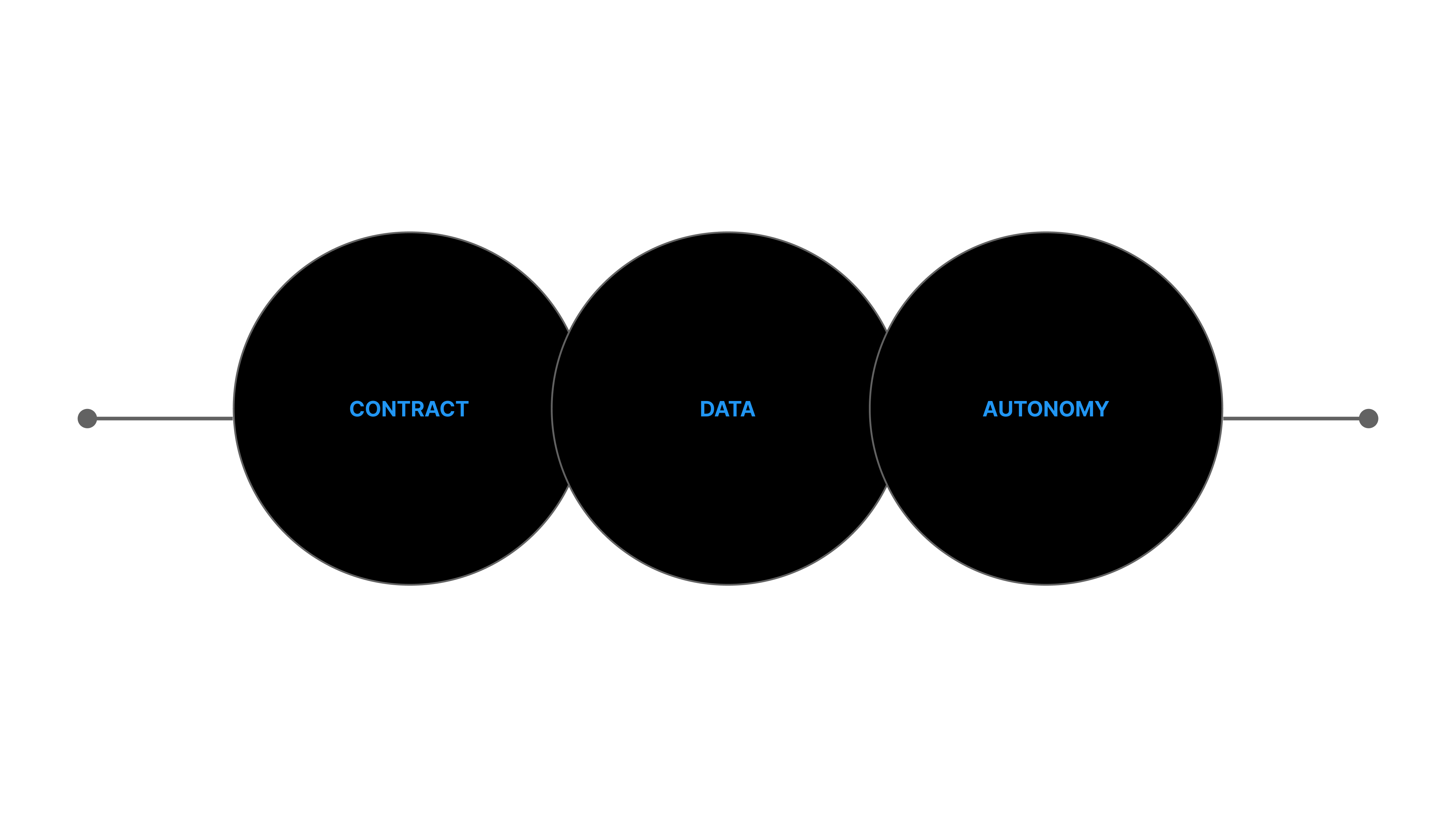
We structured the data around the contract, then built an environment on top where residents can manage and decide for themselves. Contract → Data → Autonomy. That stack is the core of the RP System.
Step 01
Contract
Unify contract data into a single model. Residents and operators share the same contract in real time — lease cycle, guarantor, and corporate-vs-individual all managed as one model.
Step 02
Data
Layer billing, payment, notifications, announcements, and requests on top of the contract. Two-way PMS sync removes data drift and double entry.
Step 03
Autonomy
On top of the structured data, give residents a self-serve environment to verify, submit, and manage. They run their living arrangement themselves — without asking the operator.
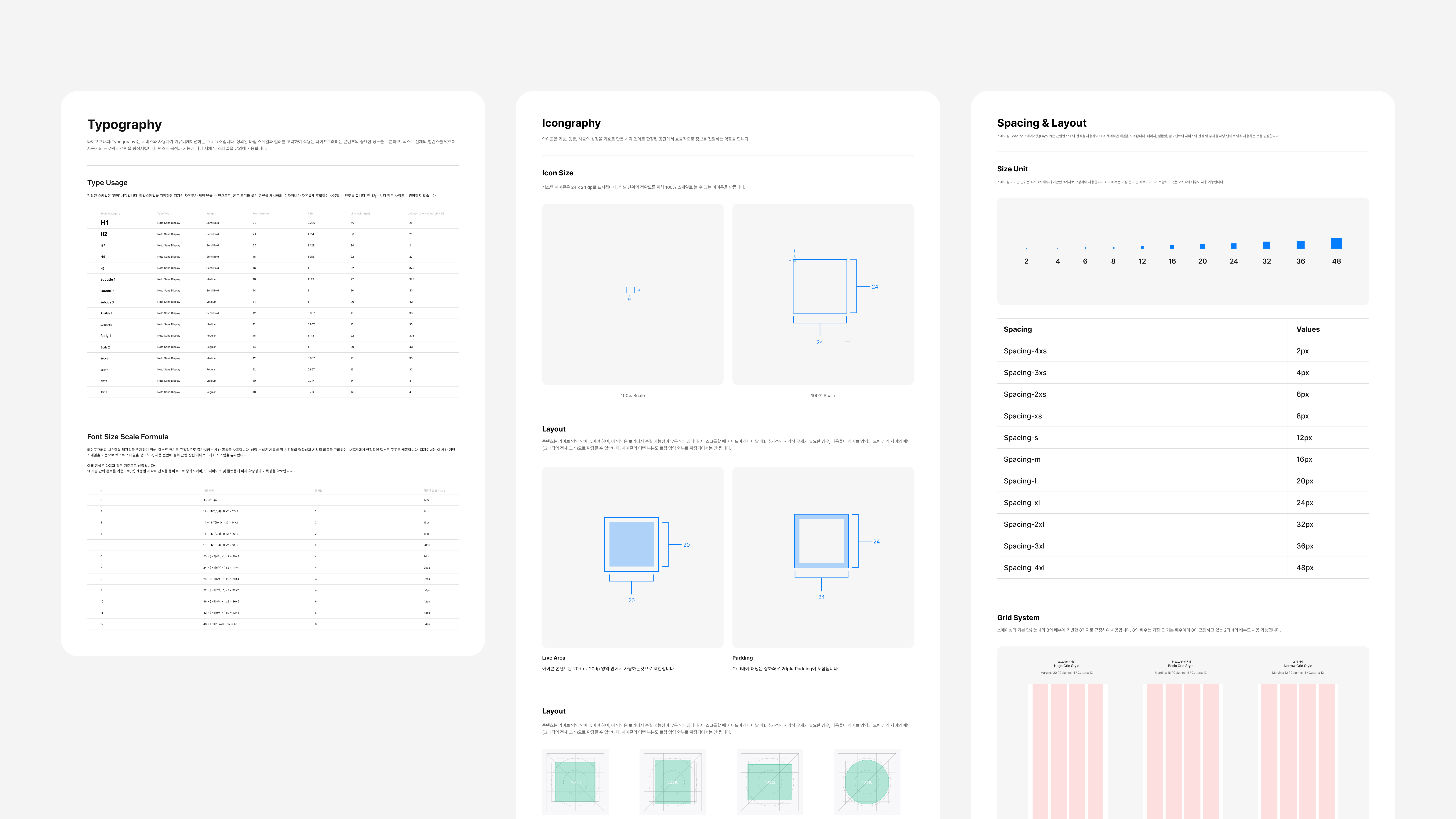
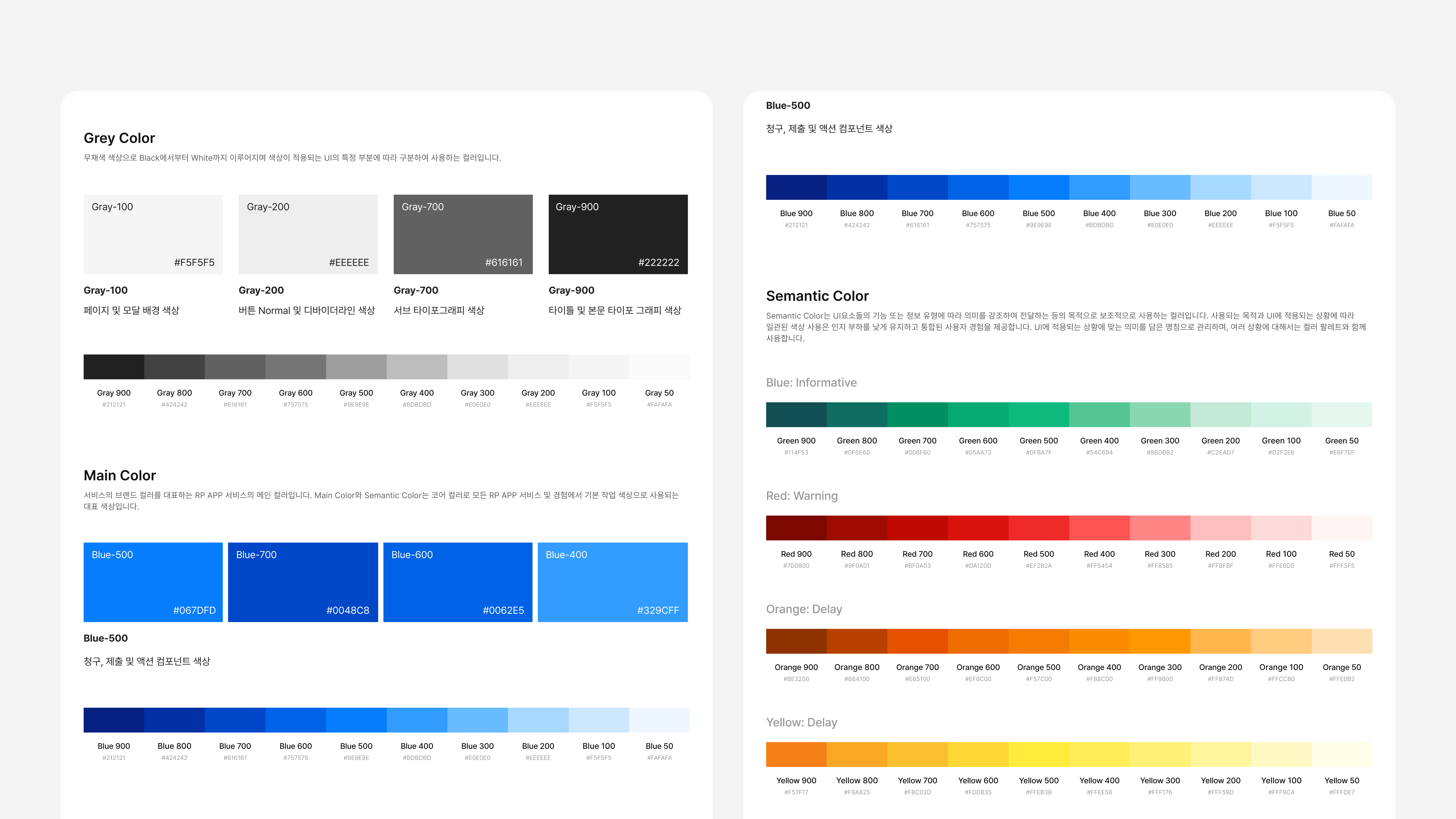
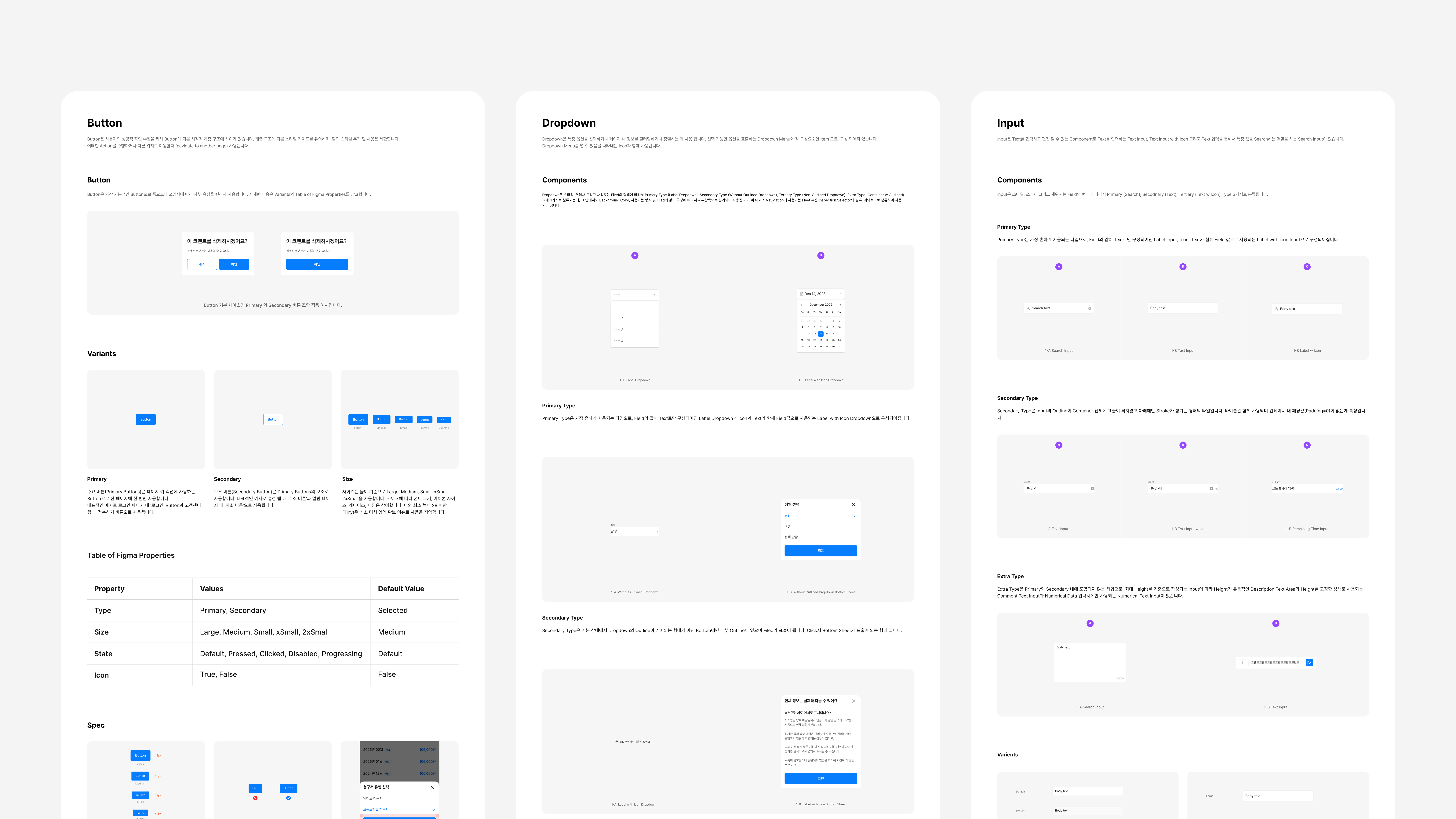
Design System
One UI/UX system spanning
the mobile app and admin web
RP App and RP Admin Web express the same contract data in different contexts. A resident's billing status tag in the app and the payment-status column an operator sees in Admin Web are the same data — but presented and prioritized differently. Add the reality of PMS field changes and new feature asks, and a shared design system became non-negotiable. It's how we kept both platforms scaling in sync without the experience drifting.
Unified visual language across App and Admin Web
The 'unpaid' tag in the app and the payment-status column in Admin Web share the same color and icon system. Same information, different surfaces, no confusion.
Built to absorb PMS changes
When PMS adds billing items or changes contract fields, we don't redesign screens from scratch. Figma Tokens and a structured component library let us recombine existing elements to ship the response fast.
No interpretation gap between design and dev
We specified boolean variants, semantic color usage, and spacing rules upfront. No more 'which style is right for this state?' — engineers ship from the spec directly.
Category
My Contract
Japanese rental contracts are structurally complex — cycle renewals, guarantor registration, corporate vs. individual. In the app, residents see lease terms, payment history, guarantor info, and submitted documents directly, and can share them on the spot. In Admin Web, operators handle tenant detail, status changes, and blacklist management from a single view. The result: a contract flow where both sides can operate independently, without phone calls or paperwork.
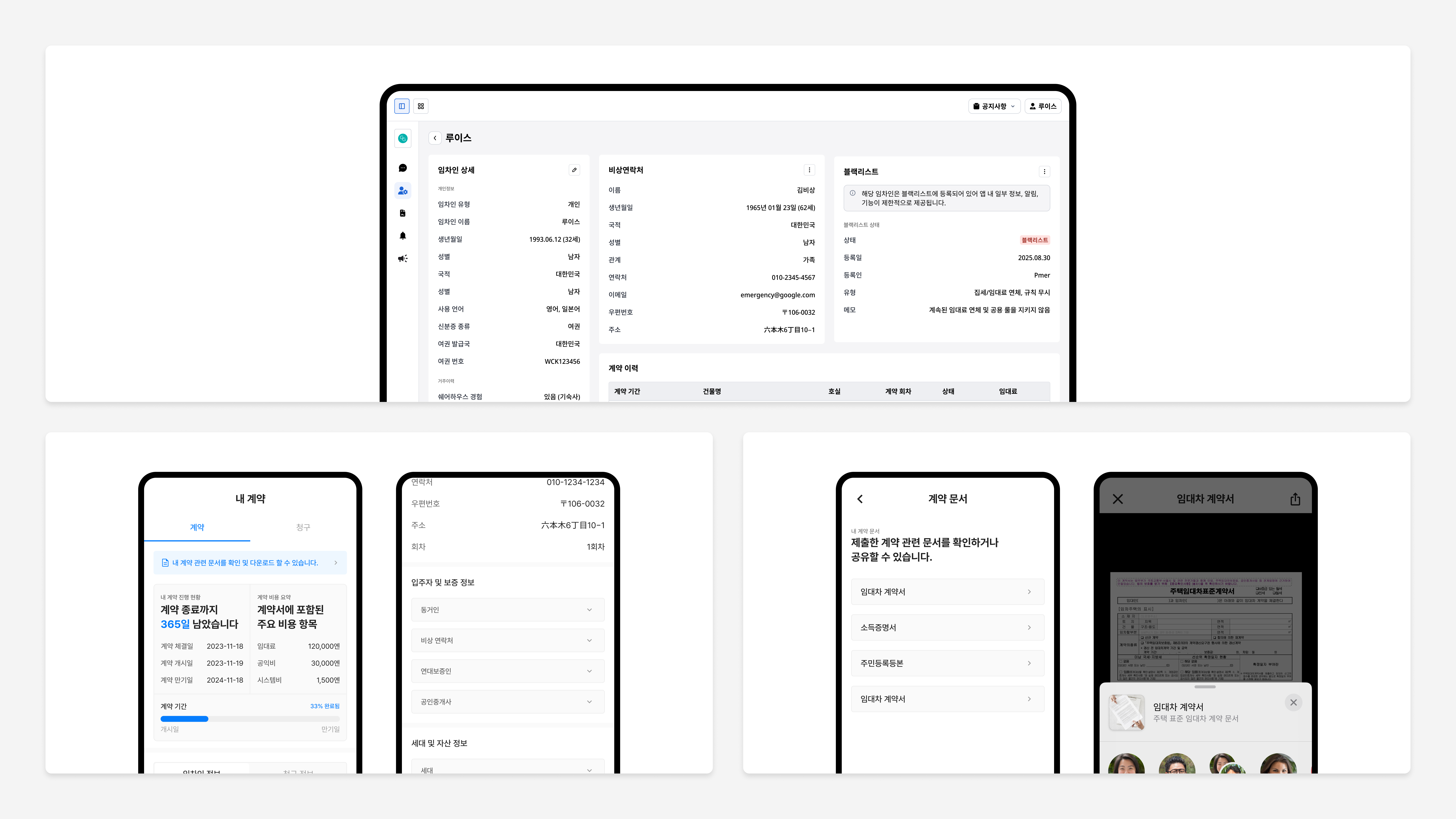
App: Contract info + document sharing
Residents view lease terms, payment history, and guarantor info directly. They can share lease agreements, income certificates, and other documents through AirDrop, email, or message — no need to ask the operator again.
Admin Web: Live contract operations
Operators see tenant details, contract history, blacklist status, and emergency contacts in a single view. Contract status changes propagate to the app immediately — no calls, no manual cross-checks.
Cycle history + corporate/individual handling
Multiple contracts (cycles) under one account are differentiated, and corporate-only fields (company name, contact person, etc.) are separated. Internal ops measured contract and document inquiries dropping by ~47% after rollout.
Category
Billing & Overdue
PMS billing data was built for operators — feed it straight to residents and it's unreadable. The core job was translating it into the resident's view. The app surfaces amount, due date, and account on one screen; Admin Web manages per-unit invoice lists, transactions, deposits, and late-fee logs from one place.
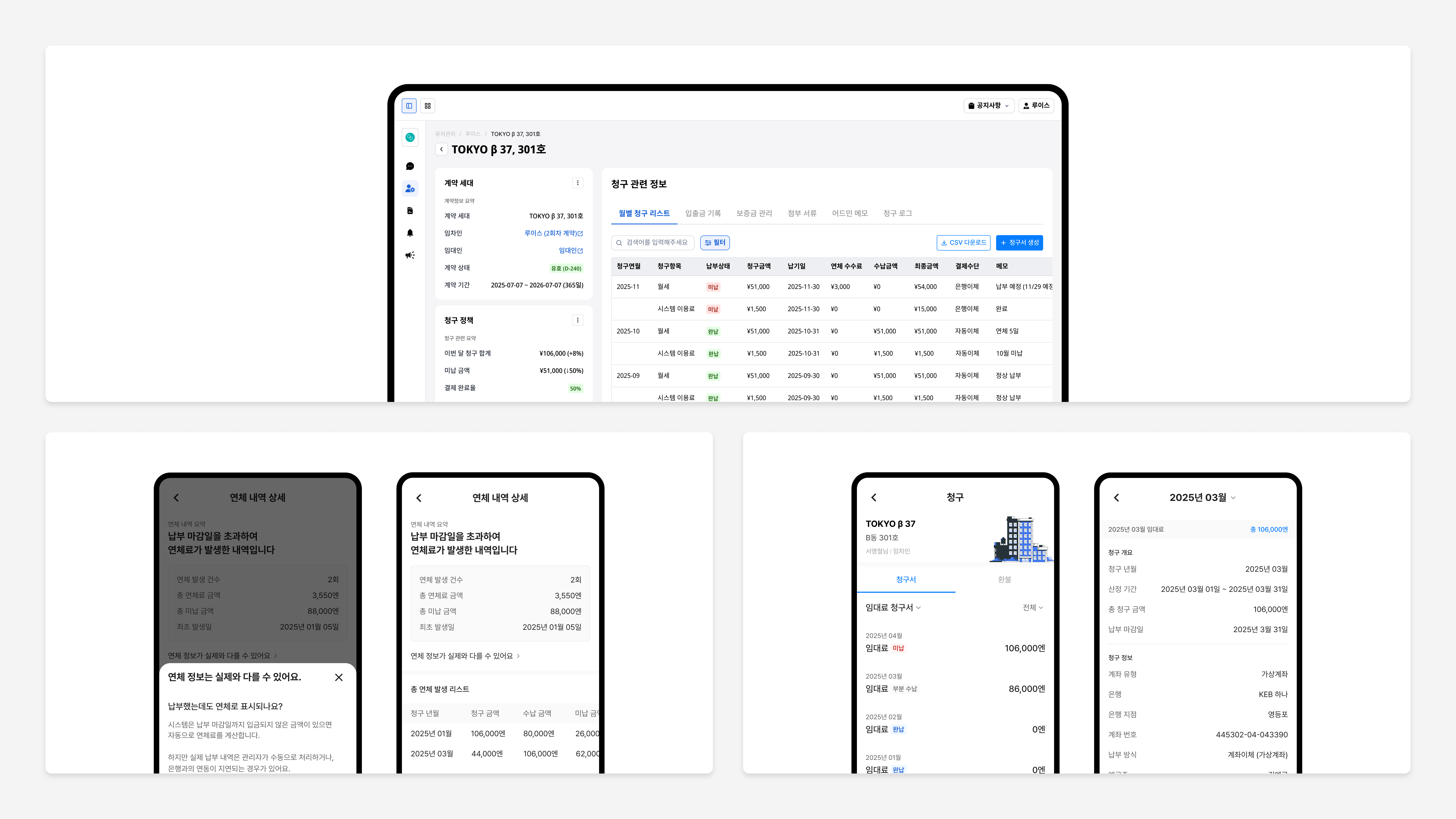
App: Billing status + payment guidance
Color and tags shift by state — unpaid, partial, overdue. Amount, due date, and account info live on a single screen, so 'when, how much, where to' is immediate.
Handling the delay between real payment and system
There's a lag between auto-calculated late fees and confirmed deposits. To cut down on 'I already paid, why am I overdue?' inquiries, we designed a separate lag-aware UI — repeat inquiries dropped significantly.
Admin Web: Unified billing operations
Monthly invoice lists by unit, transaction records, deposit management, late-fee logs — all on a single screen. Information that used to live across multiple views is consolidated, and the ops team reports ~40% less time spent on unpaid checks and collection workflows.
Category
Intent Submission
Move-out, renewal, and room change used to live on phone calls and paper forms. We turned them into a mobile self-serve flow. Residents go from checking their contract, to choosing an intent, to entering conditions, to submitting — all in one motion. Admin Web supports approval/rejection/hold per request, plus e-contract integration and automatic eligibility checks.
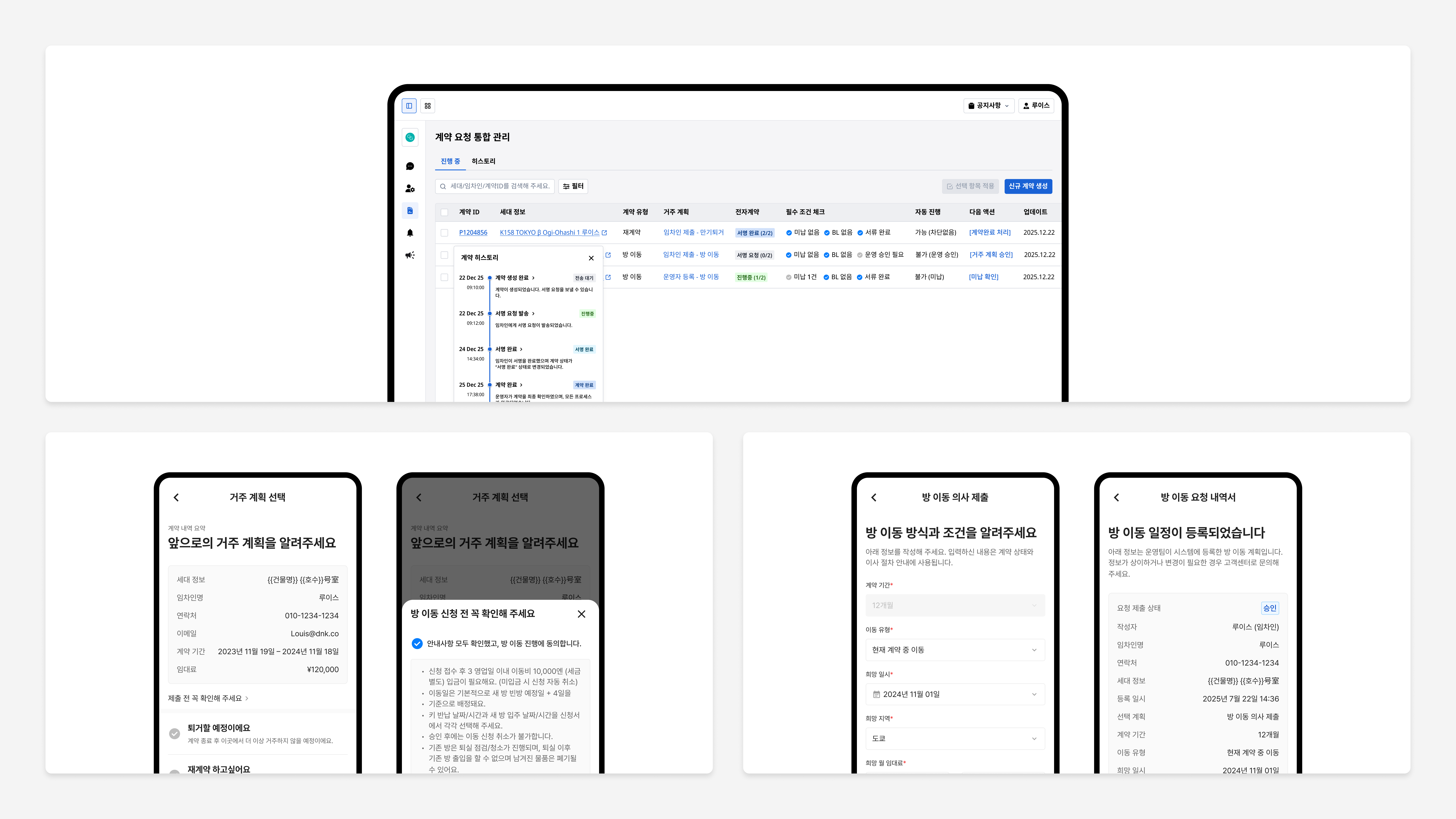
App: Move-out, renewal, room change — self-serve
Residents submit their living plans directly from mobile. Before/after rollout, related inquiries from the phone-and-paper era dropped by ~65%. The full flow — submission to history — completes inside the app.
Condition-based room-change requests
Residents enter preferred area, rent range, and move-in date; the request links to PMS for candidate matching. Submission history is always visible in the app, so follow-up inquiries drop.
Admin Web: Status management + auto-filters
Operators handle approve/reject/hold per request from Admin Web. Auto-reject filters fire for blacklist, unpaid balance, or unmet early-termination conditions — fewer dropped requests, and ops measures roughly 2x processing speed.
Category
Notifications System
The old bulk-broadcast model sent every resident the same message. We replaced it with a condition-based system that only sends what's relevant — driven by contract state, payment status, and request progress. The app drives action; Admin Web tracks who got what and whether they responded.
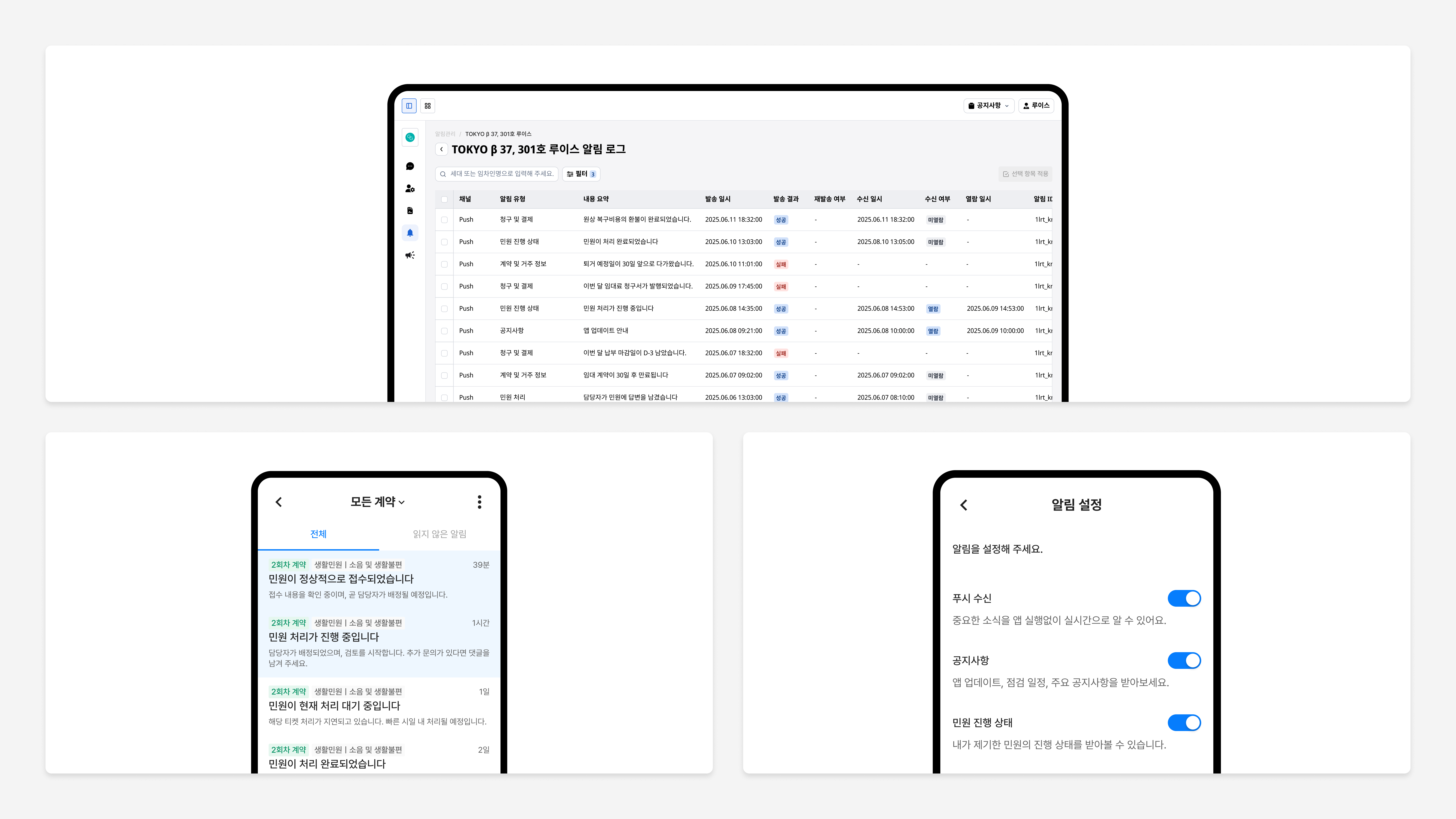
App: Five categories + opt-in settings
Notifications are split by contract, payment, overdue, announcement, and request states. Residents can opt in or out per category — fewer unwanted pushes, more focus on the ones that matter.
Auto-sends tied to contract state
If an overdue balance isn't paid, a reminder follows. Push notifications go out at 30 days, 7 days, and on the day a lease ends. 'When was that due again?' kind of inquiries dropped sharply.
Admin Web: Delivery log + tracking
Operators see per-notification send time, success/failure, and read state. Failed sends can be retried, and a per-resident notification history sits on a single screen.
Category
Tenant Requests
Filing a request was a black box — residents had no idea what was happening, so they asked again. We built a ticket system where requests filed in the app flow straight to Admin Web, and both sides see assignment, status updates, and resolution transparently.
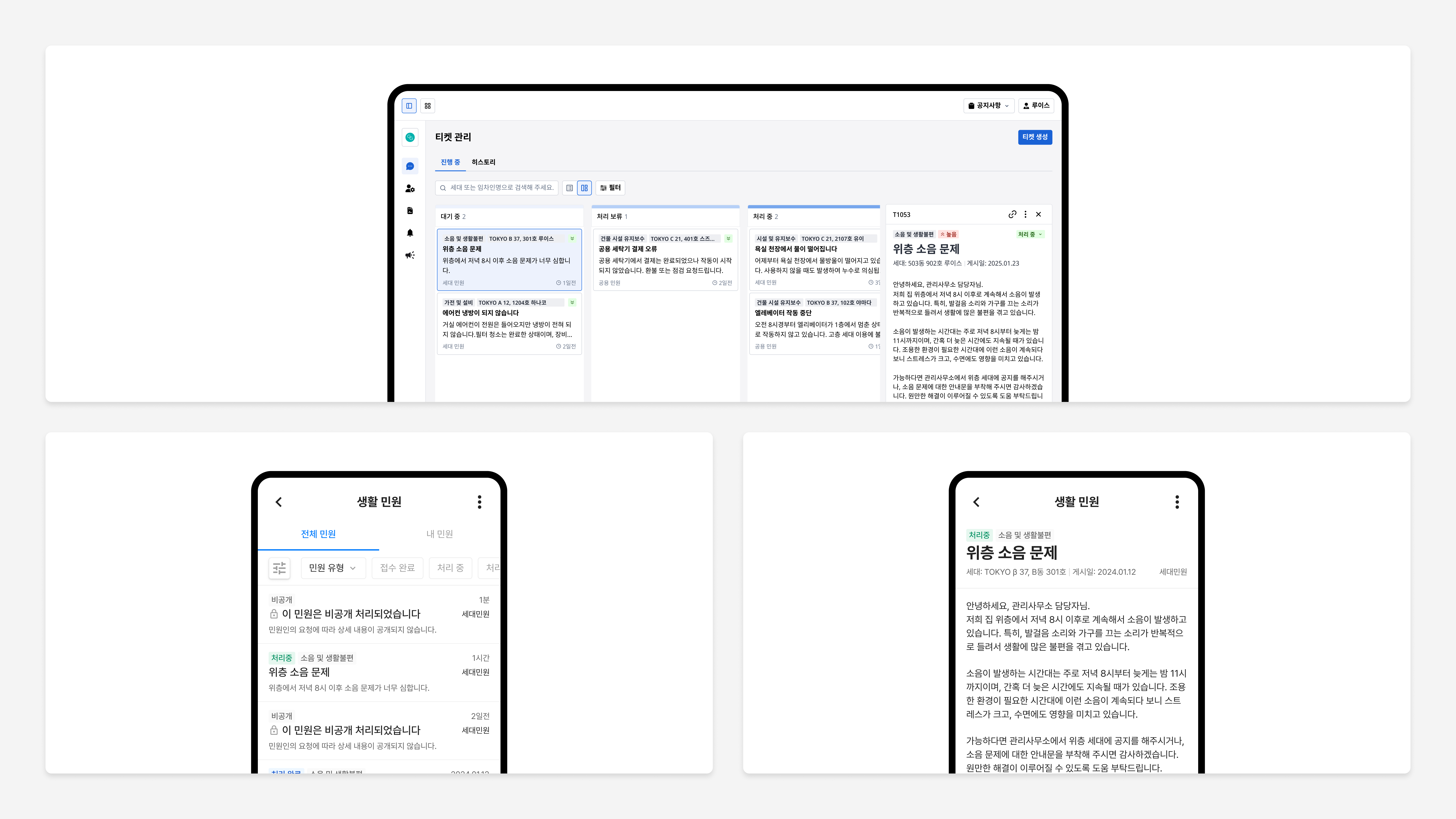
App: Categorized intake + photo attachment
Requests are split into 'unit issue' and 'common-area issue' upfront. Residents add a description and photos, so the responder can read the situation before showing up.
Admin Web: Kanban-based ticket handling
Received → in progress → resolved → reopened, managed as a Kanban flow. Structured assignment and status transitions cut down on dropped requests and silent gaps.
Live status sharing → fewer follow-up inquiries
Status changes surface in the app in real time, so 'is this received?' and 'when will it be handled?' inquiries drop sharply. Clearer intake also speeds up assignment — ops reports average resolution time cut by more than half.
Category
Building Announcements
Operators sent announcements with no idea who read them — and no way to reach the people who didn't. To solve the last mile, we built a system with multilingual support, automatic read-tracking, and re-broadcasting to non-readers. In the app, residents filter by type; in Admin Web, operators watch read rates in real time.
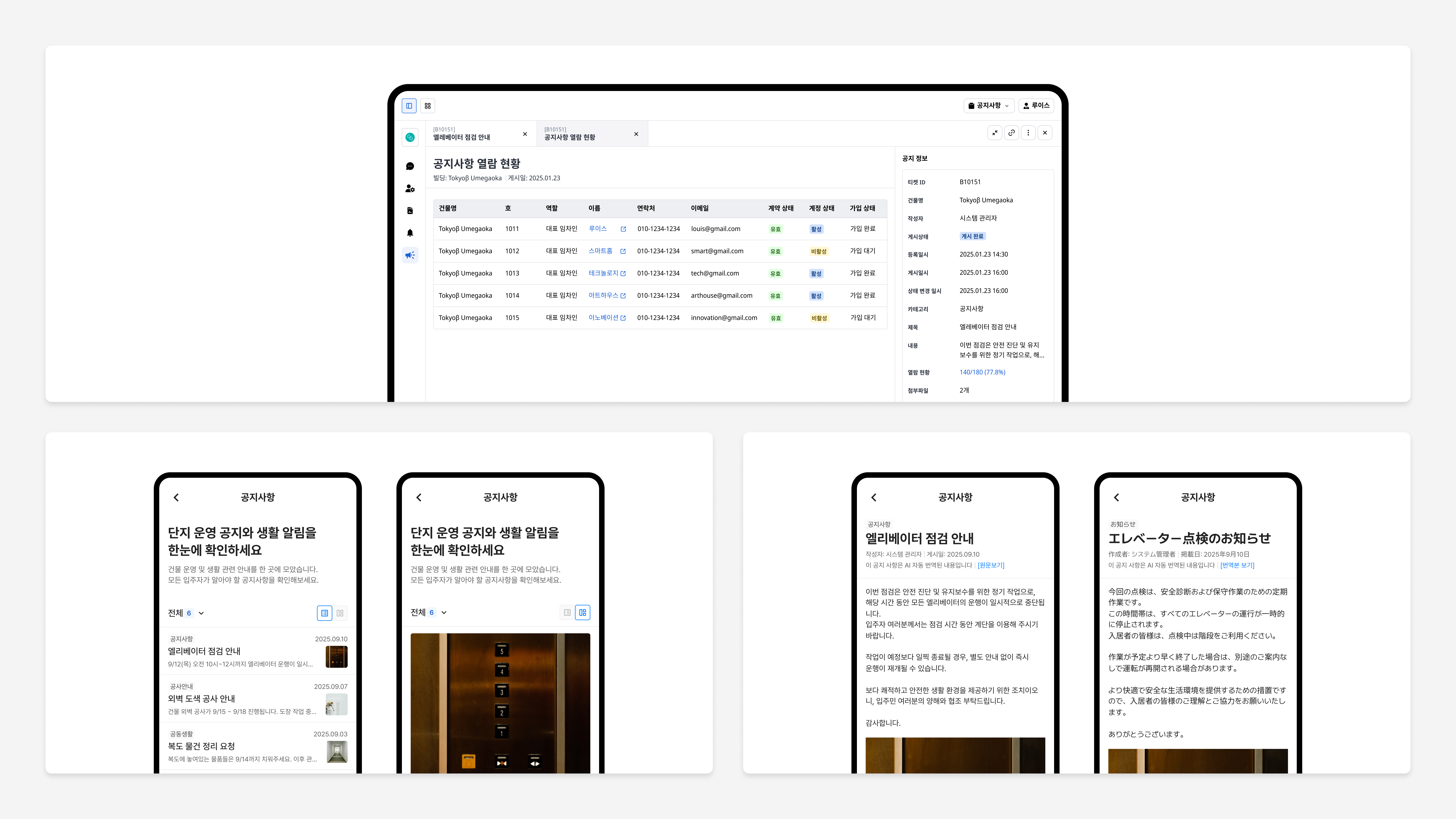
App: Type filters + multilingual reading
Residents filter by category — community news, common areas, construction notices. More than half of users read announcements through these filters. Multilingual content (JP, KR, and more) is supported, and opened announcements are auto-marked as read.
Admin Web: Read-rate tracking + re-send
Operators see per-announcement read rates in real time, with per-resident read status including account state. Pushing only to non-readers lifts read rates further on re-broadcast.
Fewer 'I didn't get the notice' inquiries
After rollout, missed-announcement inquiries dropped sharply. Internal ops data shows the average announcement read rate clearing 80%, taking real load off the announcement workflow.
Outcome & Reflection
Project results
RP App + RP Admin Web + PMS, connected on a single data model as a two-sided housing platform.
Contract, billing, intent, notifications, requests, and announcements unified into one system.
Self-serve structure — internal ops comparison, before vs. after rollout.
Phone and paper-form processes migrated to mobile — before vs. after.
Reflection
This project was never just about redrawing screens. Guarantor registration, lease cycles, separate utility and system fees — Japan's rental operations come with structural complexity that UI alone can't resolve. The real work was understanding the limits of what PMS could give us, and designing an information layer on top that residents could read and act on themselves.
The hardest part was showing the same data to two different users. For operators, billing data is a collection-management tool. For residents, it's an answer to 'how much do I owe this month?' Putting two contexts cleanly on top of one data model meant designing for both scenarios from the system level, not after.
RP System isn't a single app. It's a two-sided structure — resident App, operator Admin Web, and PMS connected on one data model — built to give residents real agency inside Japan's local regulations and norms.
In the end, the project wasn't another app on top of the stack. It was a shift from admin-first operations to a resident-first platform.